

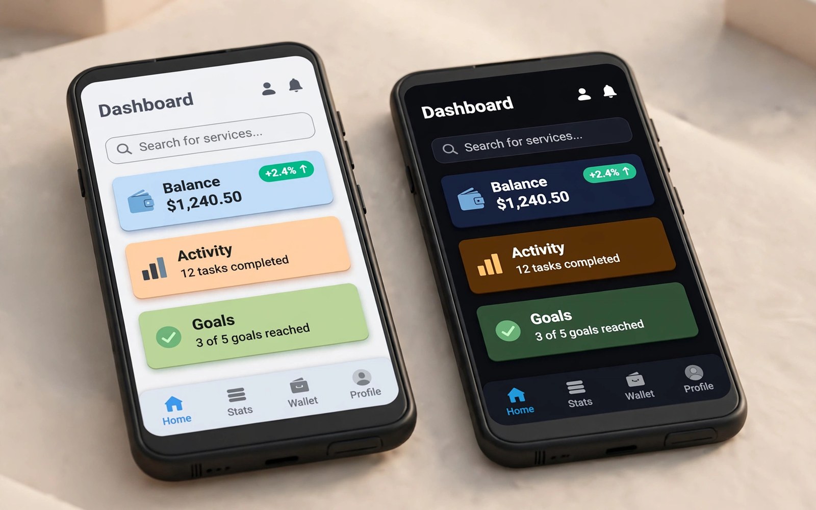
Dark theme support has become an expected feature because many users prefer darker interfaces at night and because dark screens can reduce eye strain in low light environments. Material Design provides a systematic way to support dark themes through theme attributes and night resources that adapt colours automatically without duplicating every layout file. A good dark theme is not simply an inverted light theme because colours need careful adjustment to maintain contrast and hierarchy and brand identity in both modes. This guide explains theme attributes and night resources and user choice so you can implement dark mode that looks intentional rather than accidental. You will also learn testing habits that catch contrast problems before users encounter them in daily use.
The foundation of dark theme support is to avoid hard coded colours in layouts and code and to reference theme attributes and colour resources that change with the current theme. When a text view uses a theme attribute for its colour the system resolves that attribute to a light value in light mode and to a dark value in dark mode automatically. That indirection means a single layout works in both themes and a design change requires updating colour resources rather than editing dozens of screens individually. Material components already use theme attributes for their default colours so standard buttons and cards and navigation bars adapt well when your theme defines proper colour roles. Building on theme attributes from the start makes dark mode a natural extension of good design rather than a painful retrofit at the end.
Theme Attributes and Colour Roles
Material colour roles include primary and secondary and surface and background and error colours with on colours that describe text and icons placed on each surface. Using these roles consistently gives your app a coherent look because each role has a clear purpose that designers and developers can share across screens. A primary colour should remain recognisable in dark mode but it often needs a lighter variant to maintain contrast against a dark surface where a saturated colour would look muddy. Surface colours in dark mode are usually dark grey rather than pure black because pure black can make shadows invisible and can create harsh contrast with white text. Elevation overlays in Material Design lighten a surface slightly as elevation increases so cards and dialogs stand out from the background in dark mode in a subtle way.
Define colours in resource files with a default values folder for light mode and a night qualified values folder for dark mode values that override the same names. That structure keeps naming consistent because code references a colour name and the system selects the correct value based on the current theme at runtime. Avoid creating separate colour names for light and dark variants because that approach forces code to choose a colour manually and defeats the automatic theme system. Test colour choices for contrast because text that looks fine on a light background may fail readability standards on a dark background with a slightly different surface colour. Accessibility checkers can measure contrast ratios and they help you adjust colours before release rather than after user complaints about unreadable text.
- Use theme attributes instead of hard coded colours in layouts and code.
- Define colour roles consistently so primary surface and background have clear purposes.
- Use dark grey surfaces in dark mode rather than pure black for better elevation.
- Override the same colour names in night resources so the system selects values automatically.
- Check contrast ratios for text on every surface in both light and dark modes.
Night Resources and Layout Adaptation
Night resources extend beyond colours because drawables and dimensions can also have night variants when a design needs a different image or spacing in dark mode. Most layouts need no night variant because theme colours handle the change while the structure and spacing remain identical across themes. Use night drawables only when an image contains light background elements that would look wrong on a dark surface or when a logo needs a light variant for visibility. Keep night resources minimal so maintenance stays manageable and a design update does not require editing two parallel sets of files for every small change. A lean night resource set also reduces app size because duplicated files for every screen would waste storage for a feature that should be lightweight.
Images and illustrations deserve attention in dark mode because a photo with a white border or a light background can look like a bright rectangle floating on a dark screen. Choose images with transparent backgrounds or with backgrounds that blend into both themes when possible for icons and illustrations inside the app. For photos from users or from a server you cannot control the background so a card surface around the photo provides a consistent frame in both themes. Test screens with real content in dark mode because placeholder content often hides problems that real photos and long titles reveal immediately. Thoughtful image handling makes dark mode feel polished rather than like a light design with colours hastily swapped at the last minute.
Letting Users Choose a Theme
Android offers a system dark theme setting and most apps should follow that system setting by default so the app matches the rest of the device without extra configuration. Some users want an app specific choice that differs from the system setting for reading at night or for battery reasons on certain devices. Provide a simple choice with three options for light and dark and system default when your audience is likely to want control beyond the system setting. Persist the choice in app settings so it survives restarts and apply it early during app startup to avoid a flash of the wrong theme when the first screen appears. A clear setting location in the app settings screen helps users discover the option without searching through advanced menus.
Applying a theme change should recreate activities or update the interface in a way that preserves user state such as scroll position and entered text in a form. Test theme switching during a form entry and during navigation because losing user input during a theme change feels like a bug even when the theme itself works correctly. You can learn state handling in Android app lifecycle and fragment states because theme recreation interacts with lifecycle callbacks. You can also explore modern interface work in Jetpack Compose for modern declarative UI because Compose themes adapt to dark mode through theme values. A smooth theme switch shows attention to detail that users notice even if they cannot name the technique behind it.
Testing Dark Mode Thoroughly
Test dark mode on every screen with real content because a screen that looks perfect in light mode can hide low contrast text or an invisible icon in dark mode. Walk through onboarding and settings and empty states and error states because those screens are often forgotten during theme work yet users see them frequently. Check dialogs and bottom sheets and menus because those surfaces use elevation overlays and surface colours that differ from the main screen background. Check third party components too because a library view with a hard coded light background will stand out as a bright patch inside an otherwise dark screen. Fix library issues by theming the component through its attributes when possible or by wrapping it in a surface that matches the surrounding theme.
Automated screenshot tests for both themes can catch regressions when a colour change accidentally breaks contrast on a screen that no one manually reviewed after an update. Keep screenshot tests focused on key screens so they remain fast and reliable across devices and font scales that also affect layout in both themes. Manual testing remains important for feel because a screenshot can pass contrast checks while still looking unbalanced due to colour choices that clash in dark mode. Ask a colleague to review dark screens with fresh eyes because familiarity with a design can hide problems that a new viewer notices immediately. A thorough test pass across themes is the difference between claiming dark support and actually delivering it well.
Common Mistakes and Polish
Avoid pure white text on pure black backgrounds for long reading passages because that extreme contrast can cause eye strain and halation for some users in dark environments. Use off white text and dark grey surfaces to soften contrast while keeping readability strong for body text and headings alike. Avoid simply inverting brand colours because an inverted primary colour may clash with other colours in the palette and lose the brand recognition that the light theme established. Adjust saturation and lightness thoughtfully so the dark palette feels related to the light palette without copying it exactly in a mechanical way. Small adjustments to icon colours and divider colours also matter because faint elements can disappear completely on a dark surface if their light mode values are reused unchanged.
Polish dark mode with attention to status bar and navigation bar colours so system bars blend with the app theme instead of appearing as bright strips at the edges. Ensure that splash screens and loading screens respect the theme too because a bright splash before a dark home screen creates a jarring flash on every launch. You can plan responsive work alongside theme work in building responsive layouts for phones tablets and foldables because both adaptations improve the app across devices. You can also review setup habits in setting up Android Studio for beginners when previewing themes in the editor. With careful colour roles and thorough testing dark theme becomes a valued feature rather than a checkbox on a release list.
A final habit keeps dark theme polished because you should review every new screen in both light and dark mode with real content before you mark the screen as complete. That dual review catches low contrast text and bright image patches that a light only review would miss entirely during development. Check dialogs and menus in dark mode too because those surfaces use different colours than the main screen and they often reveal theming gaps first. With that habit dark mode stays a valued feature that users can rely upon at night without eye strain or visual surprises.
The steps above follow the approach described in the official developer documentation for this platform and reflect common practice used by experienced developers when they build and test Android apps in a careful and organised way.

