

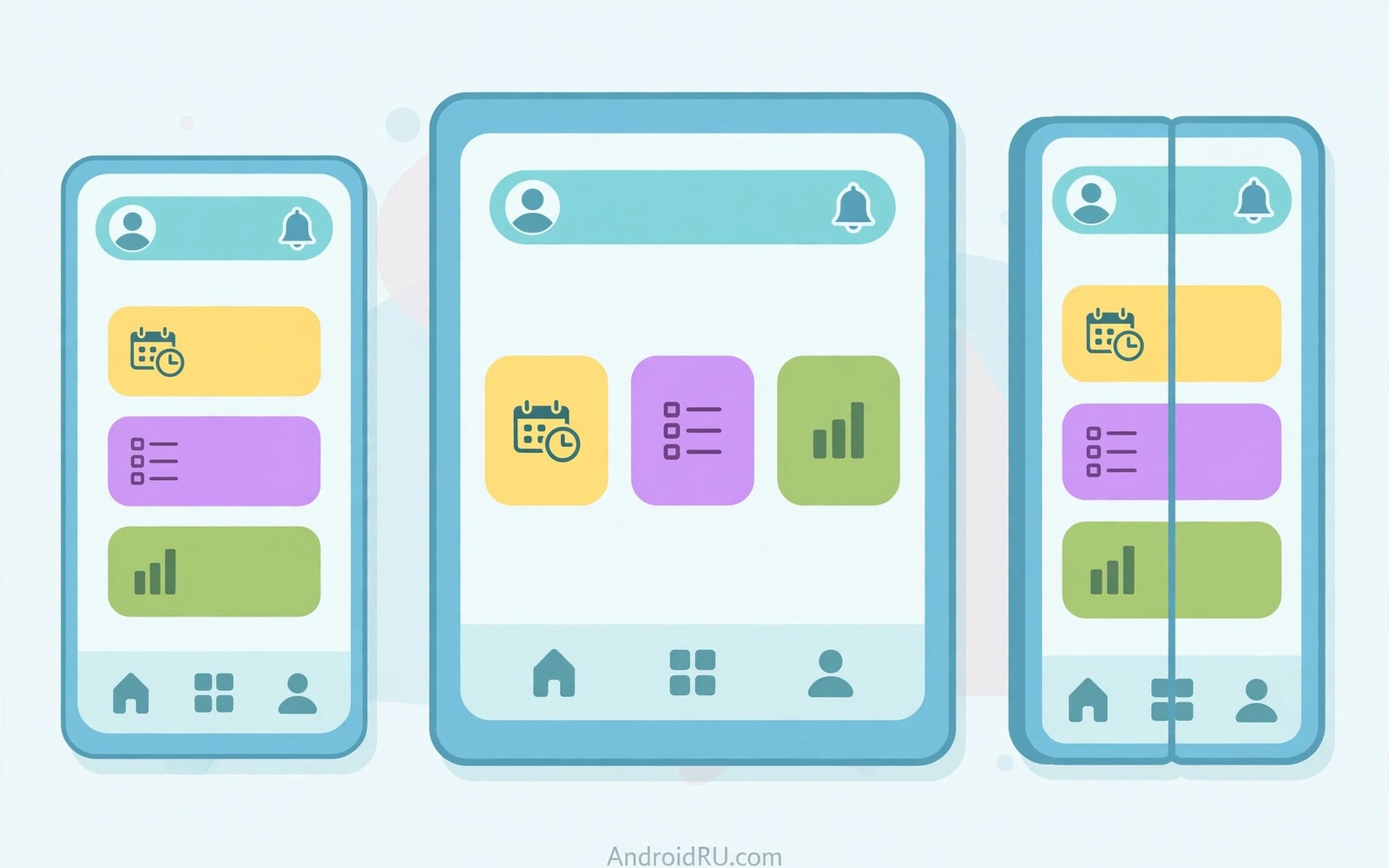
Android apps now run on phones and tablets and foldables and laptops with a wide range of screen widths and heights that no single fixed layout can serve well. A layout designed only for a small phone looks stretched and empty on a tablet while a layout designed only for a tablet feels cramped and hard to reach on a phone. Responsive design solves this problem by letting the interface adapt its structure based on available space rather than based on a specific device model that will soon be outdated. This guide explains window size classes and adaptive layouts and flexible components that help one codebase serve many screens gracefully. You will learn practical patterns that keep navigation clear and content readable on every form factor.
The core idea is to think in terms of available width and height instead of device names because a foldable in unfolded mode behaves like a small tablet while the same device folded behaves like a phone. Window size classes group widths and heights into compact and medium and expanded buckets that give you a manageable set of layout decisions instead of an endless list of pixel values. A compact width usually means a single column with bottom navigation while an expanded width can support a navigation rail and a two pane detail view beside a list. Height classes matter for landscape mode where vertical space is limited and controls must stay reachable without scrolling through a tall header. Designing for buckets keeps your code understandable and it prevents fragile checks that break on the next new device size.
Use Window Size Classes as Your Guide
Window size classes come from the current window rather than the whole device screen and that distinction matters for multi window mode where an app may occupy only part of a large display. Your layout code should observe the current window size class and choose a layout variant that fits that space at that moment in a smooth and predictable way. A list detail pattern works well on expanded widths because users can see a list and a detail pane together without losing context when they select an item. On compact widths the same pattern becomes two separate screens where the list fills the screen and tapping an item navigates to a full detail screen. That transformation preserves the same data and actions while respecting the space that is actually available to the user.
Do not hard code pixel thresholds everywhere because thresholds scattered through code become hard to maintain when design guidance changes or when a new bucket appears in a future release. Centralise size decisions in a small helper or in a layout state object that screens can observe and react to in a consistent way across the app. Test transitions between buckets by resizing a window on a large screen device or by using an emulator with different profiles that cover compact and medium and expanded widths. Pay attention to state preservation during transitions because a selected list item should remain selected when the layout changes from two panes to a single pane. A thoughtful transition feels like the same app adapting rather than a different app appearing after a rotation or a fold change.
- Compact width usually means one column and bottom navigation for easy thumb reach.
- Medium width can support a navigation rail and wider content with comfortable margins.
- Expanded width supports two panes and a navigation rail with a detailed content area.
- Height classes guide landscape layouts where vertical space is scarce and precious.
- Window size classes follow the app window not the full device screen in multi window mode.
Flexible Grids and Adaptive Components
Flexible grids use weights and constraints rather than fixed sizes so content can stretch and shrink gracefully as the window changes shape during use. A grid that shows two columns on a phone can show three or four columns on a tablet without a separate layout file for each column count when you calculate columns from available width. Cards and lists should use flexible padding and max widths so text lines do not become extremely long on a wide screen where reading becomes tiring. A content max width centred on a very wide screen looks more polished than text stretched edge to edge across a landscape tablet display. These small constraints make a layout feel intentional on large screens instead of merely stretched from a phone design.
Adaptive components change their internal structure based on space while keeping the same purpose and the same actions available to the user in every variant. A navigation component can appear as a bottom bar on a phone and as a rail on a tablet and as a drawer on a very wide screen without changing the destinations it offers. A detail screen can show a compact header on a phone and a richer header with extra metadata on a tablet where space allows more context without crowding. Component libraries now include adaptive versions of common patterns and using them saves time compared with building every variant from scratch for each screen. Consistency across variants matters because users should recognise the same app even when its layout adapts to a new device in their hands.
Foldables and Posture Awareness
Foldables add a new dimension because the same app can run folded and unfolded and half folded in a tabletop posture that suits video playback and hands free use. Your layout should respond to window size changes when a foldable unfolds rather than assuming a fixed screen size for the whole session. Avoid placing critical controls across the hinge area because a fold line can obscure a button or split text in a way that looks broken to the user. A two pane layout naturally suits an unfolded foldable because the hinge can sit between panes where it separates content in a logical way. Test on a foldable emulator with different postures so you can see how your layout behaves when the device changes shape during use.
Posture awareness goes beyond size because a half folded device invites a different interaction style where the top half shows content and the bottom half shows controls for media or typing. You do not need to support every posture for every screen but you should ensure that no screen becomes unusable when the device folds or unfolds during a session. Save scroll position and selection state across posture changes so users do not lose their place when they adjust the device for comfort. You can learn related interface skills in Jetpack Compose for modern declarative UI because declarative layouts adapt cleanly to size changes. You can also study dark theme support with Material Design because theme and layout adaptation often ship together in a polished app.
Navigation That Scales Across Sizes
Navigation should scale with width because bottom navigation works well for a few destinations on a phone but it wastes vertical space and looks crowded when many destinations compete for a narrow bar. A navigation rail on medium and expanded widths moves destinations to the side where they stay visible without covering content at the bottom of the screen. A navigation drawer can hold many destinations on a large screen but it should not hide primary destinations behind an extra tap when a rail can show them directly. Keep destination order consistent across variants so users build muscle memory that transfers from phone to tablet without relearning the app structure. Consistent navigation reduces cognitive load and it makes the app feel like one product rather than several different products sharing a name.
Deep links and back navigation must also work across layout variants because a two pane layout may show a detail beside a list while a single pane layout uses a back stack to return to the list. Your navigation logic should handle both cases so a back press on a phone returns to the list while a selection change on a tablet simply updates the detail pane. Avoid duplicating navigation code for each layout variant because duplicated logic drifts apart and creates bugs that appear only on one screen size. A single navigation state that layout code observes keeps behaviour consistent and testable across all sizes. Test back navigation on each bucket because back behaviour is one of the first things users notice when it feels wrong.
Testing Responsive Layouts Thoroughly
Testing responsive layouts requires more than one emulator profile because a single phone profile cannot reveal problems that appear only on tablets or foldables or in landscape orientation. Create test profiles for compact and medium and expanded widths and run through core user flows on each profile with real content that includes long titles and empty states. Check text scaling too because users who increase font size need layouts that wrap gracefully instead of clipping important buttons or labels. Check landscape mode on phones because a layout that works in portrait may hide a primary action below the fold when height shrinks in landscape. A systematic test pass across sizes catches most responsive problems before users encounter them on their own devices.
Automated screenshot tests can help but they should complement manual exploration rather than replace it because a screenshot can look correct while interaction feels awkward on a real device. Walk through each screen with a thumb on a phone and with two hands on a tablet to judge reachability and comfort in realistic use. You can strengthen your workflow with tips for faster emulator testing so testing many profiles does not become slow and painful. You can also apply testing Android apps with unit and Espresso tests to verify layout logic that automated tests can check quickly. Responsive design is a habit of testing across sizes and not a single layout trick applied once.
A final habit improves responsive design because you should test every new screen on a compact phone and on a medium tablet and on an expanded foldable before you consider the screen finished. That three size check catches navigation and spacing problems that a single phone test would miss completely during development. Record screenshots for each size in your review notes so reviewers can see adaptation decisions without running the app on three devices themselves. Over time that habit builds a library of patterns that your team can reuse for new screens with confidence.
@Composable
fun AdaptiveLayout(widthClass: String) {
    if (widthClass == "Expanded") {
        Row { ListPane(); DetailPane() }
    } else {
        Column { ListPane() }
    }
}
The steps above follow the approach described in the official developer documentation for this platform and reflect common practice used by experienced developers when they build and test Android apps in a careful and organised way.

