

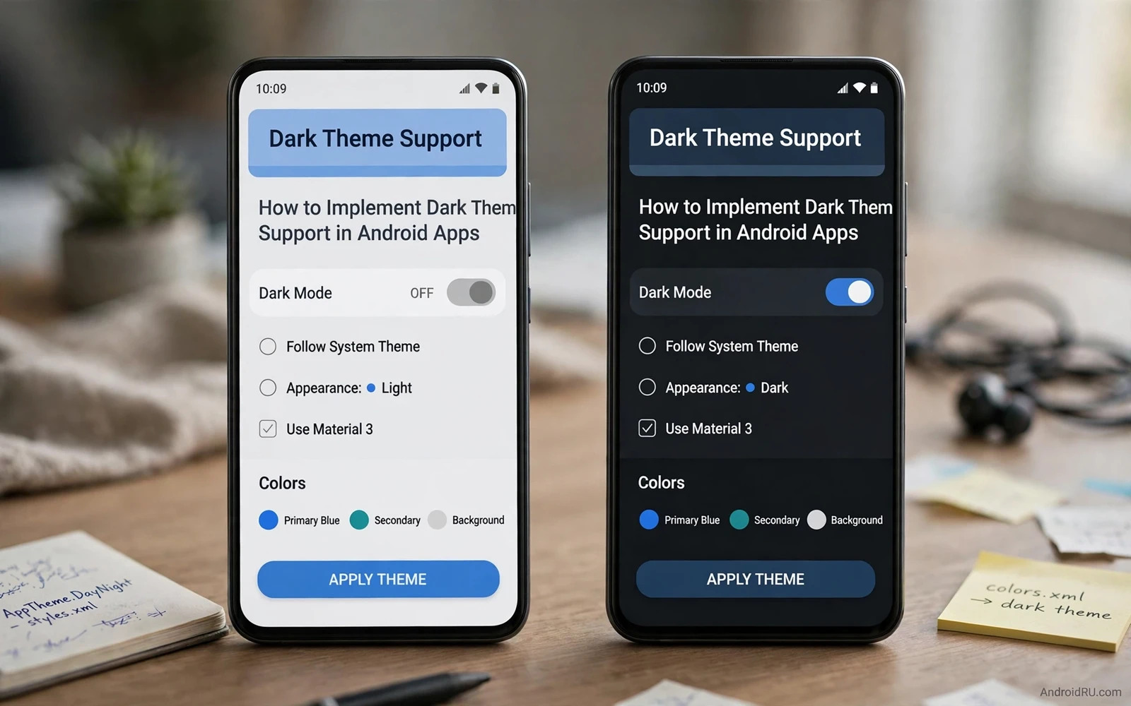
Dark theme replaces bright backgrounds with dark surfaces and light text. Users choose it for comfort in low light and for battery saving on OLED screens and for personal taste. An app that supports it well feels modern and considerate. An app that supports it poorly shows unreadable text and glaring white patches. This guide shows how to implement dark theme with tokens and testing rather than with scattered colour overrides.
Theme tokens are the foundation. A token names a colour role such as surface or primary or on surface. Layouts reference tokens instead of fixed colour values. The light theme assigns light values to the tokens. The dark theme assigns dark values to the same tokens. Switching themes then changes every layout at once without editing layouts. An app that hardcodes colours in layouts cannot switch themes cleanly.
Plan the theme choice early. Users expect three options in many apps. System default follows the device setting. Light forces the light theme. Dark forces the dark theme. Store the choice in app settings and apply it at startup before the first screen draws. Applying the theme after the first screen appears causes a visible flash from one theme to the other. Early application avoids that flash.
<!-- values-night/colors.xml -->
<resources>
    <color name="surface">#121212</color>
    <color name="on_surface">#E6E6E6</color>
    <color name="primary">#8AB4F8</color>
</resources>
Build token based themes
Define colour tokens for backgrounds and surfaces and text and icons and accents. Give each token a light value and a dark value. Use semantic names that describe the role rather than the colour. A token named surface works in both themes. A token named white background breaks in dark theme because the dark value is not white. Semantic names keep the theme logic clear for future developers.
Define separate values for elevated surfaces. A card on a dark background needs a slightly lighter surface to stand out. A simple black background with black cards hides card boundaries. Use a tonal elevation system where higher surfaces get lighter tones in dark theme. That system preserves hierarchy without borders on every card. Test card visibility on a real device because emulator contrast can mislead.
Images and illustrations need theme awareness too. A light illustration with a white background looks like a bright patch in dark theme. Provide dark variants for key illustrations or place illustrations on a container that matches both themes. Icons should use tintable vectors that follow token colours. A bitmap icon with baked in black lines vanishes on a dark background.
Handle every screen
Audit every screen for hardcoded colours. Search layouts and code for fixed colour values that bypass tokens. Replace each one with the matching token. Pay attention to dialogs and bottom sheets and menus because those surfaces often hide hardcoded values. A single white dialog in an otherwise dark app breaks immersion at once. The audit takes time but it is the difference between theme support and theme decoration.
Third party components need review as well. A library view with fixed colours may ignore the app theme. Check whether the library supports theme tokens or offers a dark variant. Wrap or replace components that cannot follow the theme when they appear on key screens. A date picker or a chart that stays bright in dark theme will draw complaints even when the rest of the app is perfect.
Web content inside the app needs a theme strategy too. A web view that loads bright pages in a dark app creates a jarring transition. Apply a dark style to web content when the platform allows it or show web content in a container that sets expectations. At minimum avoid a sudden full screen white flash when opening web content from a dark screen.
Contrast and readability
Dark theme contrast rules differ from light theme rules. Light text on a dark surface needs sufficient contrast for its size. Pure white text on pure black can feel harsh and cause halation for some readers. Slightly off white text on a dark grey surface often reads more comfortably. Avoid pure black backgrounds for large text areas because the extreme contrast strains eyes during long reading sessions.
Secondary text needs special care in dark theme. Grey text that reads fine on white may vanish on dark grey. Lighten secondary text more than intuition suggests and then test with real users. Disabled states and hints and captions all need a contrast check. A hint that disappears in dark theme looks like a missing feature rather than a styling choice.
Status bar and navigation bar colours must match the theme. A dark app with a bright navigation bar looks unfinished. Set system bar colours from theme tokens and set icon contrast accordingly. Light icons suit dark bars and dark icons suit light bars. Test the bars on devices with gesture navigation and with button navigation because bar behaviour differs.
Design system harmony
Material design guidance defines dark colour roles that work together. Readers who want the full system can continue with the piece on Material Design 3 guidelines for developers and apply its dark scheme rules to their token set. A token set built on the system roles stays harmonious without manual tuning for every pairing.
Widgets should follow the app theme choice where the system allows it. A widget that stays bright while the app turns dark feels disconnected. Readers who build widgets can continue with the piece on building custom widgets for home screens and carry theme tokens into widget layouts. Consistency between widget and app strengthens the product identity.
Launchers show the app in both themes through icons and shortcuts. Readers who build launchers can continue with the piece on building a custom launcher application and see how host theme choices affect app presentation. An adaptive icon that works on light and dark backgrounds protects the app identity everywhere.
Battery and performance notes
Dark theme saves battery mainly on OLED screens where black pixels draw little power. On LCD screens the backlight stays on regardless of pixel colour so the saving is small. Do not promise large battery savings for all devices. Present dark theme as a comfort and readability feature with a battery benefit on OLED devices. Honest claims build more trust than exaggerated savings.
Theme switching itself should not reload data. A user who toggles dark mode should keep the same list and the same scroll position. The state holder pattern that protects rotation also protects theme changes. Recreate views with new tokens while keeping data in the holder. A theme toggle that reloads the whole screen feels like a restart rather than a preference change.
Test theme switching during playback and during form entry. Media should keep playing across the switch. Form input should survive the switch. A theme change is a configuration change and the same state rules apply. Test it with the same rigour as rotation because users toggle themes at real moments during real tasks.
Test and ship dark theme
Test every screen in both themes with real content. Use long titles and empty states and error states in both themes. Test with large font sizes because text growth interacts with dark surfaces. Test on OLED and LCD devices when possible. A checklist per screen with light and dark screenshots makes review concrete. Screenshots also help designers spot contrast issues that code review misses.
Gather feedback after launch and watch for theme specific bug reports. Users notice a missed surface fast and report it with a screenshot. Fix missed surfaces promptly because each one undermines confidence in the whole theme. Add new screens to the theme checklist so the theme stays complete as the app grows. A theme is a living system rather than a one time conversion.
Good dark theme feels calm and readable in low light. Text stays clear and surfaces stay distinct and nothing glares. Build it with tokens and audit every screen and test contrast honestly. An app that masters dark theme shows respect for user comfort at every hour of the day.
Theme settings experience
Theme settings should live where users expect them. Place the theme choice in app settings near appearance options. Offer system default and light and dark as three clear choices. Show a small preview of each choice beside its label. A preview removes doubt about what each choice looks like. Users choose confidently when they can see the result before applying it.
Apply theme changes without a full app restart when possible. Recreate the current screen with new tokens while keeping data intact. A theme change that restarts the whole app feels heavy for a simple preference. A smooth in place change feels polished. Test theme switching from every major screen because some screens handle recreation worse than others.
Respect system theme changes while the app runs. A user who toggles system dark mode at night expects open apps to follow. Listen for system theme changes and apply them when the app uses the system default choice. An app that ignores a system toggle until restart feels disconnected from the device. Live following keeps the app in sync with user intent.
Document theme behaviour for support teams. Note which screens use custom illustrations and which use token colours. Support staff who understand the theme system can answer theme bug reports accurately. A support answer that explains a known illustration limitation satisfies users more than a generic promise to fix an unknown issue.
Theme and accessibility together
Dark theme and accessibility testing belong together in one pass. Test contrast for text and icons and secondary labels in both themes. Test focus indicators in dark theme because a focus ring that works on light backgrounds may vanish on dark backgrounds. Test with a screen reader in dark theme because reading order does not change with theme but visual grouping cues do. A combined theme and accessibility pass catches issues that separate passes miss. Users who need both dark theme and assistive tools benefit most from that combined care.
Theme preview in settings
A theme preview inside settings helps users choose with confidence. Show a miniature screen with a card and a button and a line of body text in the chosen theme. Update the preview at once when the user taps a different choice. A live preview removes the need to leave settings to judge the result. Users who preview before applying report fewer theme surprises after applying. Keep the preview small and focused so it loads instantly on every device.

