

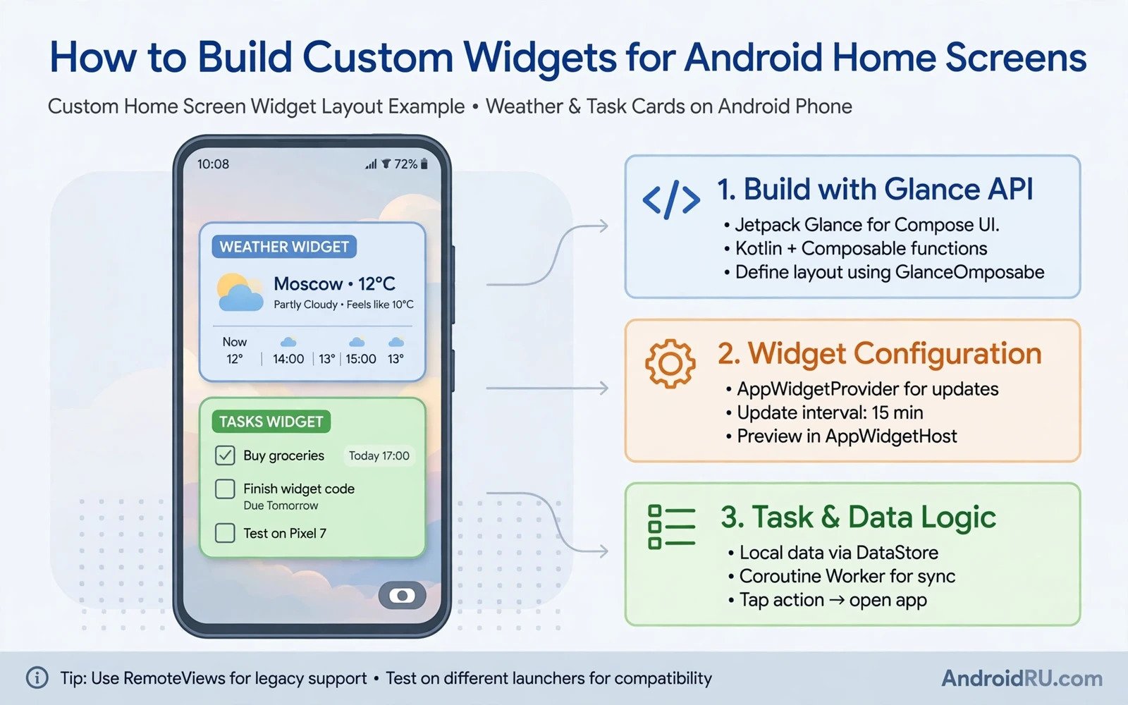
A home screen widget puts live information where users see it without opening the app. A weather widget shows the forecast at a glance. A task widget shows the next item on the list. A music widget shows the current track with play controls. Building a widget means designing for a small space and for updates that happen while the app sleeps. This guide covers layout and taps and updates and the limits that keep widgets fast.
Widgets run through a provider component that the system manages. The system creates widget views from a remote views layout. The app cannot run arbitrary view code inside a widget. It builds a remote views object and hands it to the system. The system draws that object on the home screen. This limit shapes every widget design decision. Layouts must use supported views and updates must stay light.
Start with one clear job for the widget. A widget that tries to show everything becomes crowded and hard to tap. Choose the single piece of information the user checks most often. Design around that job and add at most one secondary action. A focused widget earns a permanent home screen place. A crowded widget gets removed after a week.
<appwidget-provider
    android:minWidth="180dp"
    android:minHeight="110dp"
    android:updatePeriodMillis="1800000"
    android:previewImage="@drawable/widget_preview"
    android:initialLayout="@layout/widget_main" />
Design for small spaces
Widget sizes vary by launcher and by device and by user choice. Design layouts that adapt to several sizes instead of one exact size. Use flexible containers and test at the smallest size the widget supports. Text must stay readable at small sizes. Icons must stay tappable without overlapping neighbours. A layout that only works at full width will break when the user shrinks it.
Keep the visual style calm and consistent with the app. Use the app colours and typography in a restrained way. Dark and light home backgrounds both need testing. A widget that looks clean on a dark wallpaper may vanish on a light wallpaper. Test with several wallpapers and with system dark mode on and off. Contrast matters more on a home screen than inside the app because the wallpaper competes for attention.
Show a useful empty state when data is missing. A new widget with no data should explain what it will show and how to set it up. A widget that shows a blank box looks broken. A widget that shows a short setup hint guides the user to the next step. Handle the signed out state with the same care. Never show a loading spinner forever when the data source is empty.
Handle taps and actions
Every tappable area in a widget needs a pending intent. A tap on the widget body usually opens the app at the matching screen. A tap on a button performs a focused action such as marking a task done or toggling playback. Keep actions simple because a widget cannot show a complex dialog. Confirm destructive actions inside the app rather than inside the widget. A widget tap that deletes data without confirmation is a support problem waiting to happen.
Deep links make widget taps feel precise. A task widget tap should open that exact task. A calendar widget tap should open that exact day. A generic tap that always opens the home screen wastes the advantage of the widget. Test each tap target on a real launcher because tap areas can shift with widget size. A button that works at large size may become unreachable at small size.
Lists inside widgets need a remote views service for scrolling content. A task list or a news list can scroll inside the widget on launchers that support it. Keep list items simple with one line of text and one small icon. Avoid images in every row when the list is long because images slow updates. Limit the list to a sensible number of items and let a tap open the full list in the app.
Update data wisely
Widgets update on a schedule and on demand when data changes. Periodic updates suit weather and calendar data that changes slowly. Event driven updates suit task changes and playback changes that the app already knows about. Avoid updating every minute when the data changes hourly. Frequent updates drain battery and trigger system limits. Choose the slowest update rate that still feels fresh to the user.
Update work must stay short and efficient. Fetch only the data the widget shows. Cache the last good result and show it while a fresh fetch runs. Never block the update on a slow network call without a fallback. A widget that goes blank during a network outage feels broken. A widget that shows the last known data with a stale hint feels honest and useful.
System limits protect battery life by batching widget updates. Respect those limits instead of fighting them with workarounds. A widget that abuses updates may be throttled and then looks stale anyway. Design the data model so an update is a small read from a local store. Let a background sync fill that store on its own schedule. The widget then reads locally and updates fast.
Configuration and resizing
A configuration screen lets users choose what a widget shows. A weather widget may offer a city choice. A task widget may offer a list choice. Keep configuration to a few choices that change the widget visibly. A configuration screen with dozens of options belongs in the app settings rather than in widget setup. Save the choice per widget instance because a user may place the same widget twice with different settings.
Handle resizing gracefully. A widget that grows should reveal more detail rather than just stretching the same content. A widget that shrinks should hide secondary rows first and keep the primary value visible. Test resize behaviour on a real launcher because emulators hide some launcher quirks. A widget that handles resize well feels native. A widget that breaks on resize gets removed fast.
Preview images help users choose the widget from the picker. Provide a clear preview that matches the real layout. A preview that promises a rich layout while the real widget looks plain disappoints users. Update the preview when the layout changes in a major release. The picker preview is the widget advertisement and it should stay honest.
Design system harmony
Material design guidance helps widgets feel at home on modern Android. Rounded corners and consistent spacing and readable type all matter at small sizes. Readers who want the full design language can continue with the piece on Material Design 3 guidelines for developers and apply its colour and shape rules to widget layouts. A widget that follows the system language looks intentional rather than pasted on.
Dark theme support is essential for widgets because home screens vary widely. Test the widget with dark theme on and off and with light and dark wallpapers. Readers who build theme handling can continue with the piece on implementing dark theme support in apps and reuse the same theme tokens inside widget layouts where the system allows them. Consistent tokens keep the widget and the app in visual sync.
Launchers show widgets in their own style. Some launchers round corners more aggressively. Some launchers add padding around widgets. Design with breathing room at the edges so launcher padding never clips content. Avoid text that touches the widget border. A small inner margin protects the layout across launchers without hurting the design on any single launcher.
Test and ship
Test on several launchers including the stock launcher and at least one popular third party launcher. Test on a phone and on a tablet when the app supports tablets. Test after a reboot because widget state must survive restarts. Test after an app update because widget instances persist across updates and old layouts must still render. A widget that breaks after an update loses its home screen place at once.
Custom launchers give widgets a larger stage because users who install them care about home screen design. Readers who build for that audience can continue with the piece on building a custom launcher application and learn how launchers host and size widgets. Understanding the host side helps widget developers avoid assumptions that only hold on one launcher.
Ship the widget as a small focused feature and gather feedback before expanding it. Watch which sizes users choose and which taps they use most. Add a second widget type only when users ask for a distinct job. A widget family with one excellent widget beats a family with five mediocre widgets. Keep updates light and taps precise and the widget will earn its place on the home screen.
Widget analytics and iteration
Widget analytics should respect privacy while guiding design. Track which widget sizes users choose in aggregate. Track which tap targets users use most in aggregate. Never track the content of a widget such as task text or message text. Aggregate size and tap data reveal design preferences without exposing user data. Use those signals to prioritise the next widget improvement.
Iterate widgets in small steps. Change one element at a time such as the layout for the small size or the tap target for the primary action. Measure adoption and retention after each change. A widget that loses placements after a change signals a regression in the changed element. Small steps make regressions easy to attribute. Large redesigns make attribution guesswork.
Seasonal content can refresh a widget without a code change. A task widget can highlight a holiday list when the user creates one. A weather widget can show a seasonal background that matches the forecast. Keep seasonal changes subtle so the widget stays recognisable. A widget that changes appearance drastically each month feels unstable. Subtle refresh keeps it familiar and alive.
Support users who remove the widget with a graceful path. A removed widget should not leave stale data or scheduled updates running. Clean up per widget state when the system reports deletion. A clean deletion keeps the app tidy and respects the user decision. Users who remove a widget today may add it again later when a new version improves it.
Widget placement habits
Users place widgets for different reasons. Some users want a weather glance before leaving home. Some users want a task list that stays visible during work. Some users want music controls without opening the app. Interview a small group of users about why they placed the widget and where they placed it. Placement reasons reveal which information deserves the largest area. A widget designed around real placement reasons earns a longer stay on the home screen than a widget designed around assumed reasons. Revisit placement reasons after each major update because user habits change as the app grows and as new features appear.

