

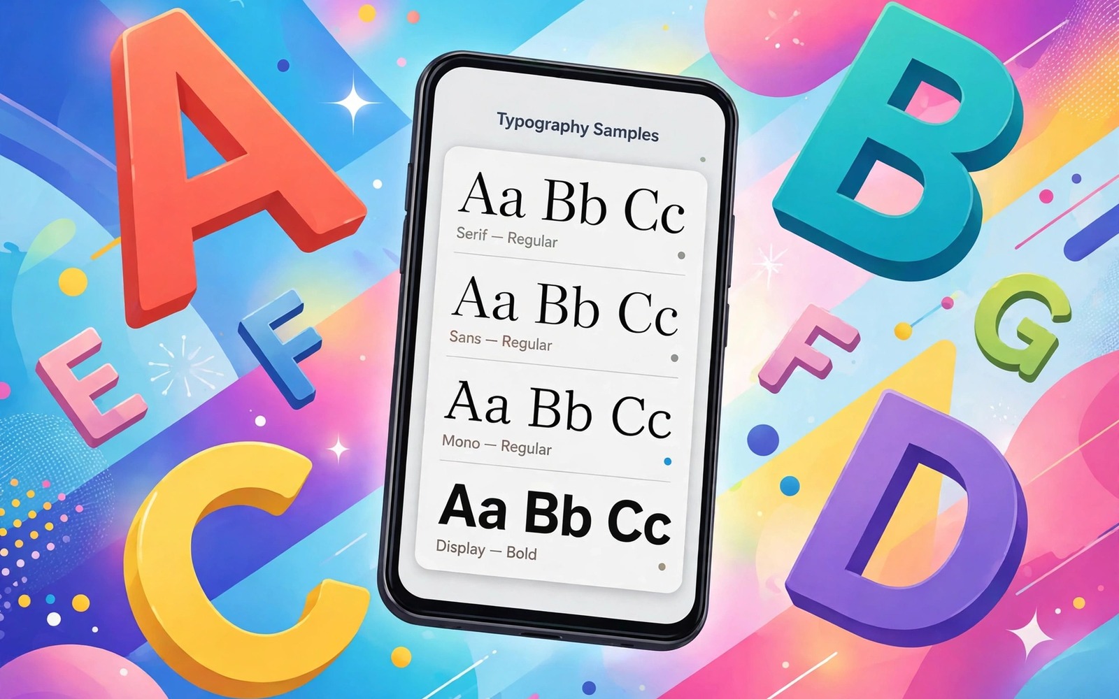
A font change transforms a phone more than most people expect. The same apps feel different when headings gain character and body text gains breathing room. Reading long messages becomes easier and the whole interface feels owned rather than rented.
Without root you cannot replace the deepest system font files on every phone. You can still change fonts on many phones through built-in settings and through font apps and through launcher options. This guide covers all three paths in order of simplicity.
Start with the built-in path because it is the safest and the most stable. Move to font apps only if your phone lacks a font setting. Use launcher fonts last for the home surface when nothing else works.
Path one: use the built-in font setting
Open display settings and look for font size and style. Some phones place the font style under a themes section instead. Browse the preinstalled fonts first and apply one for a full day before buying or downloading more.
Test the font in three places. Read a long message thread and scan a settings list and glance at the home screen labels. A font that looks elegant in a preview can feel cramped in a dense list. Legibility beats personality for a font you will read thousands of times.
Built-in fonts pair well with color work in Material You color tweaks because font weight and theme color together set the interface mood. Change the font first and then tune the color to match its weight.
Path two: use a font app safely
If your phone has no font setting then use a font app from the official app store with strong reviews. Prefer apps that install fonts through the system theme engine rather than through accessibility tricks. Read the permission list before installing and reject any font app that asks for contacts or messages.
Download two or three fonts and test each for a day. Delete the losers promptly because a large font library slows the picker and tempts constant switching. Keep one serif option for reading and one clean sans option for daily use.
Font apps sometimes bundle icon themes too. Keep the focus on type by pairing the font with secret icon packs for a next generation look only after the font is settled. Changing both at once makes it hard to know which change helped.
Path three: change fonts in the launcher
A third party launcher can change home screen fonts even when the system font stays fixed. Set the launcher font for icon labels and drawer text and folder names. The home surface will feel personal even though apps keep their own text.
Match the launcher font size to the system font size so the transition between home and apps feels smooth. A large home font beside small app text looks broken. A small step in either direction is safer than a dramatic jump.
Launcher fonts work best beside a clean layout like a flagship style layout for a budget phone where labels stay short and the grid stays calm. A busy home screen hides even the best font choice.
Tune size and weight for reading comfort
Set font size one step above default if you read on the phone for hours. Set display size to default so layouts do not break. Bold text helps on small screens but heavy bold everywhere tires the eyes and breaks some app layouts.
Check your banking app and your messaging app after any font change. Some apps render custom fonts poorly and show clipped buttons. If an important app breaks then revert to the default font for system use and keep the custom font in the launcher only.
Live with the final font for a week before judging it. Fonts feel novel on day one and honest on day seven. The right font disappears into reading and that disappearance is the compliment.
Font change decision tree
Follow this decision tree from top to bottom. Stop at the first path that works on your phone. Do not combine all three paths at once.
if built_in_font_setting exists:
    apply font and test for one day
elif theme_engine_font_app available:
    install one font and test for one day
else:
    set launcher font for home surface only
final check = banking app + messaging app render correctly
The decision tree above was written for this guide as a plain reading aid. It is not software to execute. Follow it by hand through your phone settings screens.
Match fonts to screen size and eyesight
Font choice depends heavily on screen size. A small phone needs a slightly larger font with open letter shapes. A large phone can use a smaller font because the screen gives letters more room.
Test fonts with your actual eyesight conditions. Read a message in bright sunlight and in a dim bedroom. A font that passes both tests earns its place. A font that passes only indoors will frustrate you outdoors daily.
Older eyes benefit from fonts with taller lowercase letters and wider spacing. Younger eyes may prefer compact fonts that fit more text per screen. There is no universal best font only a best font for your eyes.
Pair font size with display size carefully. Increasing both together makes everything huge and wastes screen space. Increase font size alone first and adjust display size only if layouts still feel cramped.
Revisit font choice after buying new glasses or changing screen protectors. A matte protector softens text edges and may demand a bolder font. Vision changes slowly and font choice should follow it.
Font licensing and safety for downloaded typefaces
Free font downloads carry risks that built-in fonts do not. Some sites bundle installers with unwanted software alongside the font file. Others distribute fonts without proper licenses for commercial use. Stick to well known font libraries and check the license before installing anything on your daily phone. A font preview that demands a separate installer program is a warning sign worth heeding.
Font files themselves can hide problems on rare occasions. A corrupted font file can crash the app that tries to render it. Test a new font in one app first rather than applying it system wide immediately. If the test app crashes or shows boxes instead of letters then delete the font file and try another source. System wide application multiplies a bad font problem across every screen.
Readability research favors fonts with distinct letter shapes for commonly confused characters. The capital I and the lowercase l and the number one should look clearly different. The zero should differ clearly from the capital O. Fonts that blur those distinctions cause misreading of codes and passwords. Test those specific characters before committing to a font for daily use.
Font weight interacts with screen technology in ways previews hide. OLED screens render thin fonts crisply because each pixel lights independently. LCD screens can make thin fonts look washed out at low brightness. If you use an LCD phone then prefer regular weight over light weight for body text. The bolder choice costs a little elegance and gains a lot of readability.
Finally remember that fonts affect other people who read your phone too. A message shown to a friend should read clearly at arm’s length. A decorative font that impresses you may frustrate someone borrowing your phone to read an address. Choose fonts that serve readers generally and save decorative type for wallpapers and artwork where reading speed does not matter.
Fonts in messaging and social apps
Messaging apps render fonts differently from system menus because they prioritize emoji and sticker display alongside text. A font that looks elegant in settings may render awkwardly beside large emoji in a chat thread. Test any new font inside your most active chat thread before applying it system wide. A font that breaks chat readability fails daily use regardless of its beauty elsewhere.
Social apps often override system fonts with their own brand typefaces. Those apps will ignore your font choice entirely and keep their house style. That behavior is normal and not a sign that your font change failed. Judge font success by system menus and messaging apps that respect system fonts rather than by branded social feeds that never will.
Group chats expose font weaknesses faster than one to one chats because many names and timestamps crowd each message. A font with poor number shapes makes timestamps hard to scan. A font with narrow spacing makes long group messages feel dense. Read a busy group thread for five minutes as your font test. If your eyes tire then the font fails group use even if it passes solo reading.
Font size interacts with message bubbles in ways that matter for accessibility. Larger fonts expand bubbles and reduce messages visible per screen. Smaller fonts fit more conversation history but strain reading. Find the size where you can read the last ten messages without scrolling excessively. That balance point differs by screen size and by eyesight and it deserves a deliberate test.
Status updates and stories use overlay text on photos where font choice matters differently. Overlay text needs strong contrast and simple shapes to survive busy photo backgrounds. A decorative font that works on plain backgrounds fails on photos. If you post stories often then test your font as overlay text on three different photos before committing to it for everything.
Finally remember that recipients see your messages in their own fonts regardless of your choice. Your font affects only your reading experience and not theirs. That fact frees you to choose purely for your own comfort. Pick the font that makes reading pleasant for you and ignore whether recipients would approve of the style.
Common mistakes
Font changes go wrong in familiar ways. Avoid these.
- Picking a decorative script font that makes messages hard to read quickly.
- Setting font size to maximum so app buttons clip and layouts break.
- Installing five font apps that all fight over the same theme engine.
- Granting a font app access to messages or contacts it never needs.
- Judging a font from a preview instead of a full day of real reading.
Frequently asked questions
Will a font change void my warranty?
No because built-in settings and official store font apps use supported paths. Root font replacement is a different story and it is not covered here. Stay on the no root paths in this guide.
Why do some apps ignore my new font?
Some apps bundle their own fonts for brand consistency. Those apps will keep their own type no matter what you set. Your system menus and most apps will still follow the new font.
Can I return to the default font?
Yes because every path here keeps the default font available. Reopen the same setting and choose the default or system option. A launcher font reverts when you clear the launcher font choice.
Conclusion
You now have three no root paths to a personal font and a method for testing each one honestly. The best font is the one you stop noticing because reading simply feels easy.
Your concrete next step is to apply one font tonight and read twenty messages with it before bed. If your eyes feel relaxed then keep it for a week and stop shopping for fonts.

