

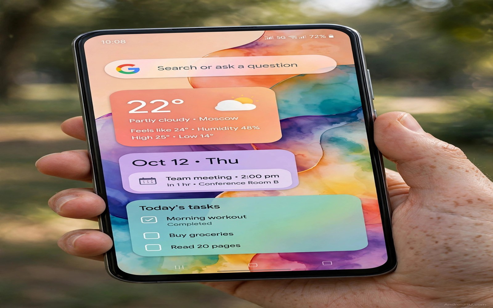
Material You promised a phone that dresses itself from your wallpaper. In practice most people accept the first palette the system suggests and never look again. That first palette is often the loudest rather than the best.
Seven tweaks in this guide take you from accepting a palette to directing it. You will learn to seed the palette with the right wallpaper and to override weak colors and to extend the theme into icons and widgets. Each tweak is small and the combined effect is a phone that looks designed.
Work through the tweaks in order. The early tweaks control the source color. The later tweaks control how far that color spreads. Changing the spread before the source is fixed only spreads a bad color further.
Tweak one to two: seed and pick the palette
First choose a wallpaper with one dominant color family. A sunset photo gives warm oranges. A forest photo gives deep greens. A photo with five competing colors gives a muddy palette because the extractor cannot choose a leader.
Second open the wallpaper style settings and compare all four palette options side by side. Do not pick the first option by habit. Look at the quick settings background and the button colors for each option. Pick the palette where buttons stay clearly visible against the background.
Palette choice sets the stage for the whole look described in a flagship look for a budget phone where one calm palette sells the premium feel. Spend ten minutes here and save hours of later fixes.
Tweak three to four: themed icons and contrast
Third turn on themed icons so app icons adopt the palette. Accept that some icons will look odd at first because themed icons simplify logos into flat shapes. Give your eyes two days to adjust before judging the set.
Fourth check contrast in bright light. Open settings and messages outdoors and confirm that text stays readable. If a pastel palette washes out in sunlight then switch to a deeper variant of the same family. Beauty that fails outdoors is not a working theme.
Themed icons deserve a companion read in secret icon packs for a next generation look if themed icons leave too many apps uncovered. A full icon pack can finish what themed icons start.
Tweak five to six: widgets and quick settings
Fifth apply the palette to your main widget by choosing a widget style that follows system colors. A widget with fixed brand colors will clash with every palette change. A system colored widget updates itself when you change wallpaper.
Sixth trim quick settings to tiles that show the palette well. Large tiles display color better than tiny ones. A short panel with clear tiles shows the theme at its best every time you swipe down.
Quick settings polish is covered further in customizing quick settings tiles which explains tile order and reach. Combine that order with your palette and the panel becomes both beautiful and fast.
Tweak seven: lock the palette for a season
Seventh stop changing the wallpaper for a month once the palette feels right. Constant wallpaper changes reset the palette and force your eyes to relearn button colors. A stable palette builds the same muscle memory as a stable layout.
Take a screenshot of the final palette and save it in a notes app. When a system update resets your theme you can rebuild it in minutes from the screenshot. That backup turns a frustrating reset into a two minute task.
A stable palette also helps the system color work in controlling SystemUI colors independently if you later want finer control. Master the standard palette first and advanced controls will make more sense.
Palette evaluation checklist
Score each palette candidate against this checklist before you commit. A palette must pass every line. A single failure means you should try the next candidate.
wallpaper_dominant_color = one family only
button_contrast = readable in sunlight
themed_icons = acceptable after two days
widget_colors = follow system palette
quick_settings = clear at a glance
stable_for = one month minimum
The checklist above was written for this guide as a judging tool for palettes. It runs nowhere. Read each line against the palette on your screen and pick the candidate that passes all of them.
Extend the palette into apps that resist theming
Some apps ignore system palettes and keep their own brand colors. Those apps create visual islands in an otherwise themed phone. You cannot force them to theme but you can reduce the clash.
Place resisting apps together in one folder so the clash stays contained. A folder with three brand colored apps looks intentional. The same three apps scattered across the home screen look accidental.
Choose a wallpaper palette that sits near the most common brand colors in your apps. A blue leaning palette softens the clash with blue brand apps. A neutral gray palette softens clashes with every brand at once.
Use dark mode inside resisting apps when they offer it. Dark mode inside the app plus a dark system theme creates a consistent frame even when accent colors differ. The frame unity matters more than exact accent matching.
Accept that perfect theming is impossible while apps keep brand identities. A phone that themes ninety percent of surfaces looks designed. Chasing the last ten percent costs hours for almost no daily gain.
Why Material You palettes fail on some phones
Material You works beautifully on phones that implement it fully and poorly on phones that implement it halfway. Some manufacturers replace the standard palette engine with their own theme system. Those phones may ignore wallpaper colors for key surfaces such as settings or notifications. If your phone behaves that way then no wallpaper trick will fix it. The honest path is to use the manufacturer theme tools instead of fighting them.
Wallpaper extraction also fails on photos with strong skin tones or complex scenes. The extractor may pick a color from a face or a bright object rather than the dominant background. That choice produces a palette that clashes with most of the interface. Cropping the photo to emphasize the background color before setting it as wallpaper often fixes extraction without changing the photo subject.
Accessibility contrast rules sometimes override palette beauty. A palette that looks stunning in a preview may fail contrast checks for small text. The system may then substitute a safer color that breaks the intended harmony. Test palettes with the smallest text sizes you actually use. A palette that passes large heading tests but fails small label tests is not a working palette.
App developers can also opt out of Material You theming for brand reasons. Banking apps and social apps often keep fixed brand colors regardless of system palette. Those islands of brand color are normal and unavoidable. Design your palette to sit neutrally beside the most common brand colors in your app library rather than demanding total harmony.
Version differences add one more failure mode. Older Android versions implement fewer Material You surfaces than newer ones. A guide written for the newest version may promise theming for surfaces your version never themes. Check which surfaces actually change on your phone after applying a palette. Build your expectations around observed behavior rather than marketing promises.
Material You and third party launchers
Third party launchers interact with Material You in inconsistent ways that surprise new users. Some launchers adopt system palettes fully for their own menus and widgets. Others ignore system palettes and apply their own theme engine instead. A launcher that ignores palettes can make your careful Material You work invisible on the home screen. Check launcher palette behavior before investing hours in palette tuning.
Widget theming splits along the same line. System widgets follow Material You colors automatically. Third party widgets often use fixed colors chosen by their developers. A home screen mixing both widget types can look disjointed when the palette changes. Choose widgets from one family when palette harmony matters most to you. Consistency across widget sources beats variety for themed setups.
Icon theming adds a third layer of complexity. Themed icons in the system sense differ from icon packs in the launcher sense. System themed icons adapt to palette changes dynamically. Launcher icon packs stay fixed until you change packs manually. A setup using both can produce icons that match today and clash tomorrow after a wallpaper change. Pick one icon system and commit to it for stability.
Quick settings theming usually follows the system regardless of launcher choice. That consistency helps because quick settings remain the most palette visible surface. Even users with a non themed launcher still see Material You colors when they swipe down. That partial theming is enough for many people who care about palette mainly in quick settings and notifications.
Notification theming follows system rules more reliably than home screen theming. Notification cards adopt palette accents for buttons and highlights. That adoption makes notifications feel designed even when the home screen uses a different theme engine. Judge Material You success by notifications and quick settings if your launcher ignores palettes elsewhere.
Finally accept that launcher choice is a tradeoff between palette harmony and launcher features. A feature rich launcher that ignores palettes may still be the right choice if its gestures save you minutes daily. Palette harmony is visual pleasure while gestures are functional gain. Weigh the two honestly for your own priorities rather than following a community consensus about theming purity.
Common mistakes
Material You theming has its own traps. Avoid these.
- Choosing a wallpaper with five loud colors that produce a muddy palette.
- Picking the first suggested palette without comparing the other options.
- Turning on themed icons and judging them after five minutes of use.
- Changing wallpaper daily so the palette never stabilizes in memory.
- Forcing a pastel palette that vanishes in bright sunlight outdoors.
Frequently asked questions
Why does my palette change after an update?
System updates sometimes reset wallpaper style settings to defaults. Reopen the style settings and reapply your saved palette. A screenshot of your old palette makes this rebuild fast.
Can I pick a custom color instead of a wallpaper color?
Some phones offer a basic color picker beside the wallpaper palettes. Use it when the wallpaper extraction keeps missing your taste. A manual color gives you full control over the seed.
Do themed icons work for every app?
No because themed icons depend on each app providing a simple icon shape. Apps without that shape keep their normal icon. A full icon pack covers more apps if the gaps bother you.
Conclusion
Seven tweaks now give you a directed Material You theme instead of an accidental one. The wallpaper seeds the color and the palette spreads with intent and the stable month lets the look settle into habit.
Your concrete next step is to pick one wallpaper with a single color family tonight and compare all four palettes outdoors tomorrow. Commit to the winner for a full month.

