

The Secret Hack to Control SystemUI Colors Independently
SystemUI colors usually move as one block. Change the theme and the status bar, the navigation bar, and quick settings all shift together. That unity looks tidy, but it prevents one surface from solving its own readability problem. I lived with that block for months before I realised the status bar that looked fine indoors vanished in sunlight, while the quick settings panel I needed to read in a hurry was the dimmest surface on the phone.
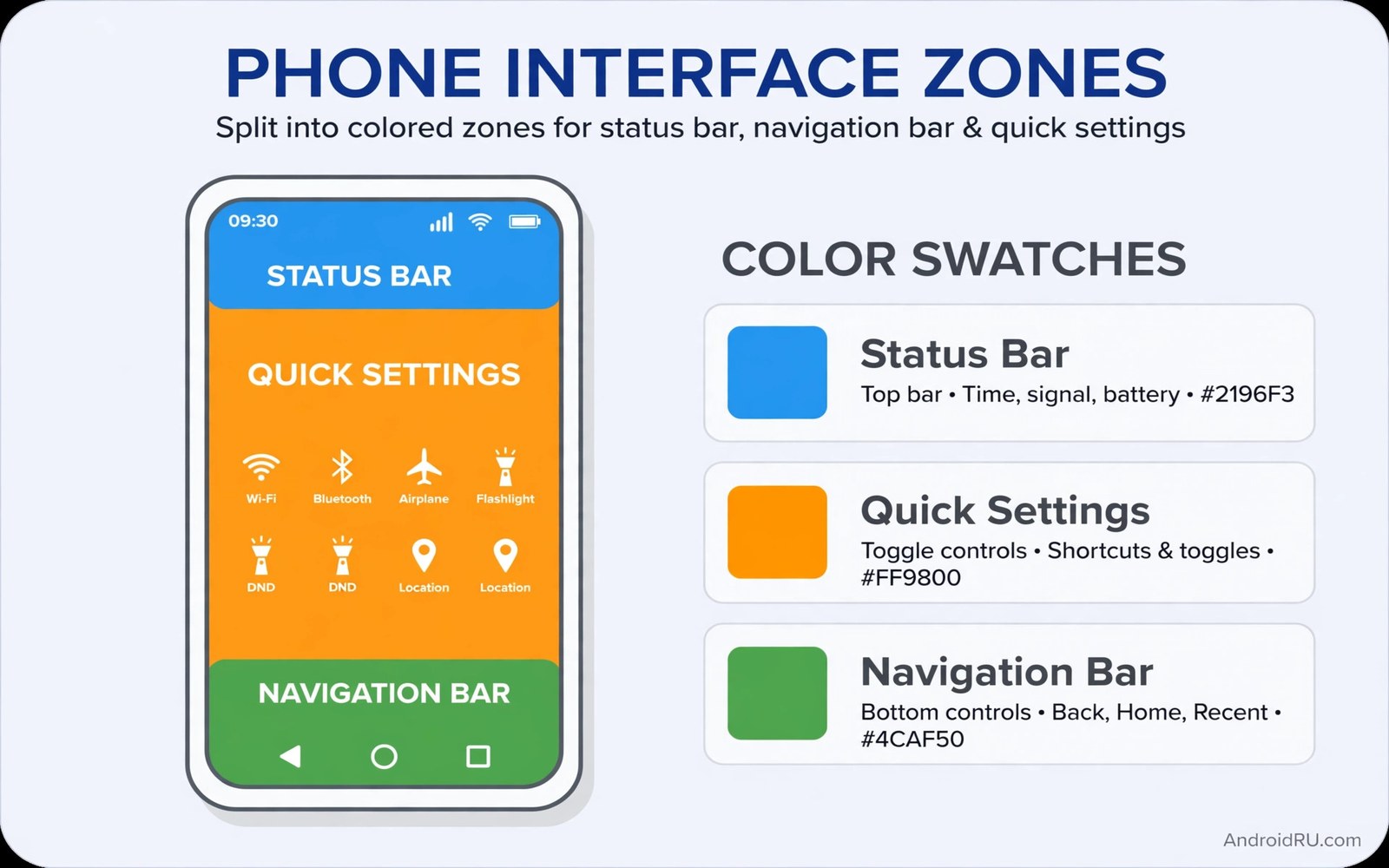
Independent control breaks the block apart. The status bar can stay dark for sunlight readability while quick settings use a light theme for evening comfort, and the navigation bar can carry an accent that neither other surface uses. This guide uses supported theme tools and overlay options to separate the three surfaces. It stays with no-root methods first and notes where deeper control needs more access, and readability stays the judge for every color choice.
That said, independent color is not about making the phone louder. The best separated setups look calmer than a single loud theme, because each surface does one job well instead of shouting for attention. In practice, I changed one surface, lived with it for a week, and only then touched the next. That slow pace is the whole method, and it is why my current setup has survived three system updates without a rebuild.
What Independent SystemUI Colors Actually Mean on Android
SystemUI is the layer that draws the status bar at the top, the navigation bar or gesture pill at the bottom, and the quick settings panel that drops down from the top. On most phones, one theme setting paints all three. Independent control means giving each surface its own background, its own icon color, and its own contrast target, so a change to one surface never drags the other two along with it.
Three tools make this possible. Theme settings on Samsung, Pixel, and many other phones expose bar colors and accent colors. Launcher options from launchers such as Nova Launcher and Niagara Launcher can set a navigation bar color and a status bar scrim. Overlay tools, including Material You colour options, Hex Installer themes, and Repainter-style overlays on supported devices, can paint quick settings separately. You do not need all three tools; you need one tool per surface, and you need to know which tool owns which surface so a reset does not surprise you.
The three surfaces and their different jobs
The status bar is a frame: time, battery, and signal must stay legible over any app, in any light. The navigation bar is a floor: it grounds the bottom of the screen and separates app content from system controls. Quick settings is a control panel: you read it in a hurry, often outdoors, and you need to find one tile in under two seconds. Those jobs need different colors, and a single theme cannot serve all three at once.
No-root first, deeper access only when needed
Start with supported tools. On a Pixel, open Settings, Wallpaper and style and test the Material You palette, then check the bar colors it produces. On Samsung, open Settings, Display, Navigation bar and the theme options in Galaxy Themes. Partial control through theme tools and launcher options is enough for most people. Full per-surface control may need deeper access on some phones, including Shizuku-based overlay tools or, on older devices, root with a Substratum-style overlay. Judge the no-root result first, and only reach for deeper access when a specific surface still fails your readability test.
How to Control the Status Bar Color Separately
Set the status bar to a dark translucent background with white icons. Dark translucent bars stay readable over both light and dark wallpapers because the scrim evens the contrast. Test the bar over a bright photo and over a dark photo before committing, because a bar that passes one wallpaper and fails the other is not independent, it is lucky.
Keep status bar icons white and avoid colored icons that clash with app content below. White icons on a dark scrim form a neutral frame, while colored icons turn the frame into another competing element. On my phone, white icons with a dark translucent scrim survived a bright beach photo, a white document, and a dark video, which is the test I now run before I call a status bar done.
Set a dark translucent scrim that survives bright wallpapers
Open your theme or launcher settings and look for Status bar, Status bar background, or Scrim. Choose a dark translucent option, often shown as black at 40 to 60 percent opacity, and set icons to white. Open the gallery, pick the brightest photo you have, and check the time and battery at the top. Then open a dark app and check again. If either check fails, deepen the scrim before you touch any other surface.
Fix status bar icons that vanish over bright apps
Some apps draw their own light status bar and override your scrim. When icons vanish, check the app first: open Settings, Apps, the app name, and look for any full-screen or edge-to-edge option. A launcher option to force a dark status bar, or a theme setting for Icon colour, usually fixes the rest. A dark translucent status bar with white icons is the safest starting point on any Android phone.
Status bar separation builds on the live bar work in a live control center in the status bar, where readability already matters most. Independent color simply gives that bar its own stable background, so the controls you add there stay legible in sunlight as well as indoors.
How to Control the Navigation Bar Color Separately
Set the navigation bar to a solid dark color with a subtle accent for the gesture pill. A solid bar grounds the bottom of the screen and separates app content from system controls. A transparent bar looks modern but often clashes with scrolling content, and I removed transparency after a week of watching text slide underneath the gesture pill.
Choose an accent that matches your icon pack rather than your wallpaper. The navigation bar sits beside icons all day, so icon harmony matters more than wallpaper harmony. Test the accent in three apps with different background colors: a white notes app, a dark video app, and a colourful social app. If the accent fights any of the three, soften it.
Choose a solid bar and a quiet gesture pill accent
On Samsung, open Settings, Display, Navigation bar and pick a button or gesture style, then set the bar background in your theme. On Pixel, use Wallpaper and style or your launcher settings for Navigation bar colour. Pick a solid dark grey or a deep navy, then pick a pill accent one or two shades lighter, or a muted version of your icon pack accent. The pill should be visible without glowing, because a glowing pill pulls the eye to the bottom of the screen during every scroll.
Test the navigation bar across light and dark apps
Open a light app and scroll to the bottom, then open a dark app and do the same. A solid bar passes both. A transparent bar usually passes one and fails the other, and the failure shows as text bleeding through the bar. Take a screenshot of both states and compare them side by side; a screenshot makes the bleed obvious in a way live scrolling hides.
Navigation accent choice connects to icon pack logic in secret icon packs for a next generation look, where one shape family unifies the surface. Let the bar accent echo the pack accent quietly, so the bottom of the screen feels like part of the same design rather than a separate decoration.
How to Control Quick Settings Colors Separately
Set quick settings to a light theme even if the rest of the system stays dark, or the reverse, whichever gives the panel higher contrast. Quick settings benefit from high contrast because you read them in a hurry. A theme that suits long reading may fail for quick glances, and I learned that on a sunny pavement when I could not find the torch tile in a panel I had designed for evening use.
Test the quick settings panel outdoors after separating its colors. Sunlight exposes weak contrast faster than any indoor test. If tiles blur together, deepen the tile background before you call the separation done. A tile that needs a second look outdoors is a tile that will fail you when you need Wi-Fi or mobile data in a hurry.
Give tiles a solid background and a clear active state
Open Settings, Display or your overlay tool and look for Quick settings, Quick panel, or Tile colour. Set the tile background to a solid light grey or a solid dark grey, set active tiles to a strong accent, and set inactive tiles to a muted grey. The active state must differ by more than colour alone: pair it with a filled icon or a bolder label, so the state stays clear for people who cannot distinguish the two colours. Quick settings independence follows the panel discipline in customizing quick settings tiles, where order and contrast together create speed, and color separation adds the contrast half of that equation.
Keep the panel readable with one hand and one glance
Put the four tiles you use daily in the first row: Wi-Fi, mobile data, torch, and Do not disturb, in that order on my phone. A panel that needs scrolling for a daily tile is a panel that wastes the glance. Check the panel with one hand while walking, because that is how you will actually use it, and move any tile you fumble for into the first row.
Quick settings colors for OLED screens
Dark surfaces on OLED screens save a small amount of power, and light surfaces cost slightly more, but the difference is small compared with screen brightness itself. Choose readability over tiny power differences. A dark panel with off-white text, rather than pure white on pure black, also reduces the halo effect that troubles some eyes with astigmatism.
A Per-Surface Color Plan You Can Copy
Apply this plan surface by surface. Finish one surface and test it over light and dark apps before moving to the next. Skipping the test spreads a bad color across all three surfaces, and changing all three at once hides which surface failed.
| Surface | Background | Icons and text | Accent | Test |
|---|---|---|---|---|
| Status bar | Dark translucent, 50 percent black | White | None | Bright photo and dark app |
| Navigation bar | Solid dark grey | Light grey pill | Muted icon pack accent | Light app and dark app scroll |
| Quick settings | Light solid or dark solid, high contrast | Dark text on light, off-white on dark | Strong accent for active tiles | Outdoor sunlight glance |
| Lock screen clock | Keep with status bar scrim | White | None | Bright wallpaper |
Live with the separated colors for a week before adding more custom colors. Three independent surfaces already offer many combinations, and stability lets your eyes learn the new frame before you change it again. The plan above was written for this guide to summarise the independent color setup; it is not code to run. Apply each line through your theme and display settings, and write the values down as you go.
Document your color setup for future rebuilds
Independent colors are easy to lose because they live in several settings screens. Document each surface color in a notes app with its exact name or value, and note which tool set each color, whether theme settings, launcher options, or overlay tools. Different tools reset at different times, so knowing the source speeds up rebuilding after each kind of reset. Screenshot each surface separately rather than only the full screen, because separate screenshots show the status bar, navigation bar, and quick settings clearly, while full screenshots often hide one surface behind app content.
What to write in your rebuild note
Write the surface name, the exact colour name or hex value, the tool that set it, and the date you set it. Add one screenshot per surface. Update the note whenever you change a color deliberately, because stale documentation misleads future you more than no documentation at all. A two-minute update after each change keeps the record honest, and a setup you can teach to a friend is a setup you truly own.
Contrast, Readability and Colour Blindness Checks That Matter
Readability science gives clear rules for SystemUI color choices that taste alone cannot provide. Contrast ratio between text and background is the primary rule. Normal text needs a ratio that survives glare and low vision, and small status bar icons need even higher contrast because their size leaves no room for error. Test ratios with a contrast checker tool rather than trusting your eyes indoors, and aim for a ratio of at least 4.5 to 1 for text and higher for small icons.
Colour blindness affects a significant minority of users, and SystemUI colors should never rely on colour alone to convey state. A recording indicator that changes from grey to red fails for users who cannot distinguish those colours. Pair colour changes with shape or text changes so state remains clear without colour vision. That pairing helps every user in bright sunlight, where colours wash out anyway.
Ageing eyes need larger effective contrast because the eye lens yellows with age and scatters light. A subtle grey on white combination that looks elegant to a young designer may vanish for an older user. Choose bolder contrasts for system surfaces that everyone must read quickly, such as time, battery, and signal strength.
Dark mode readability and the halo effect
Dark mode readability follows different rules from light mode, because bright text on dark backgrounds can halo for users with astigmatism. Pure white text on pure black creates the strongest halo effect. Slightly off-white text on dark grey reduces halo while preserving contrast, and that small adjustment improves readability for a large group of users silently. Prefer instant stable colour changes over animated transitions for system surfaces, because a quick settings panel that flashes through colours during theme changes may distract sensitive users.
Brand colors and professional use
Companies that issue phones to employees often want SystemUI colors matching brand identity. Brand-coloured status bars and navigation bars make company devices instantly recognisable, and that recognition supports security because employees can spot a company device quickly. Brand colour implementation must still respect readability rules: a brand colour with poor contrast for status icons fails usability even if it matches the logo perfectly. Choose a brand-adjacent colour with sufficient contrast rather than the exact brand hex when contrast demands it, and offer a choice between two or three approved brand-adjacent colours to preserve some personal agency. Contrast beats brand exactness on every system surface, because a logo colour nobody can read is a failed design.
Common Mistakes When Separating SystemUI Colors
Independent colors fail through contrast loss, and the same five mistakes cause most failures. Avoid them, and the rest of the setup is forgiving.
- Setting all three surfaces to different loud colors that fight each other. Pick one accent and let the other surfaces stay neutral.
- Using a transparent navigation bar that clashes with scrolling content. A solid bar is less fashionable and far more readable.
- Coloring status bar icons so they vanish over bright app content. White icons on a dark scrim survive almost every background.
- Choosing a quick settings theme that fails in outdoor sunlight. Test the panel outside before you call it done.
- Changing all three surfaces at once so the failing surface hides. Change one surface, test it, and only then move on.
Here is the catch with loud colors: they look striking in a screenshot and tiring after a day. A setup that photographs well and reads badly is a failed setup. If your phone feels louder after a change, soften the accent before you blame the tool. One accent, two neutral surfaces, and a week of living with the result will beat any loud three-color scheme.
How to recover when a color choice fails
Revert one surface at a time to its last good value, using your rebuild note. If you have no note, reset the theme to default, then reapply the plan surface by surface, testing each one. A full reset feels like a defeat, but it takes ten minutes and it removes the guesswork that a partial revert keeps.
Frequently Asked Questions About Independent SystemUI Colors
Can I control these colors without root?
Partially yes, through theme tools and launcher options that expose bar colors. Full per-surface control may need deeper access on some phones, including Shizuku-based overlay tools. Start with the supported tools in this guide and judge the result before you reach for anything deeper.
Will separated colors break after an update?
System updates sometimes reset theme overlays to defaults. Keep screenshots of your winning combination and a rebuild note with the exact values. Rebuilding from screenshots takes minutes after a reset, and the note tells you which tool owns each surface.
Do independent colors affect battery?
Dark surfaces on OLED screens save a small amount of power, and light surfaces cost slightly more. The difference is small compared with screen brightness itself, so choose readability over tiny power differences and keep brightness at a comfortable level.
Why does my status bar disappear over some apps?
Some apps draw edge-to-edge and override the system scrim with their own light background. Force a dark status bar in your launcher or theme settings, or deepen the scrim, and test the bar over that specific app. If the app still overrides it, the app controls that surface, and no theme setting will win.
What to Try Tonight for Clearer SystemUI Colors
Your concrete next step is to open one light app and one dark app tonight and check all three surfaces in each. Fix any surface that disappears before you change another color. Start with the status bar, give it a dark translucent scrim and white icons, and live with that one change for a day.
Your three SystemUI surfaces can now carry independent colors that each solve their own readability job. The status bar stays legible, the navigation bar grounds the screen, and quick settings stay high contrast. Do the light-app and dark-app check tonight, write the values down, and you will have a setup that survives updates instead of collapsing at the next one.

