

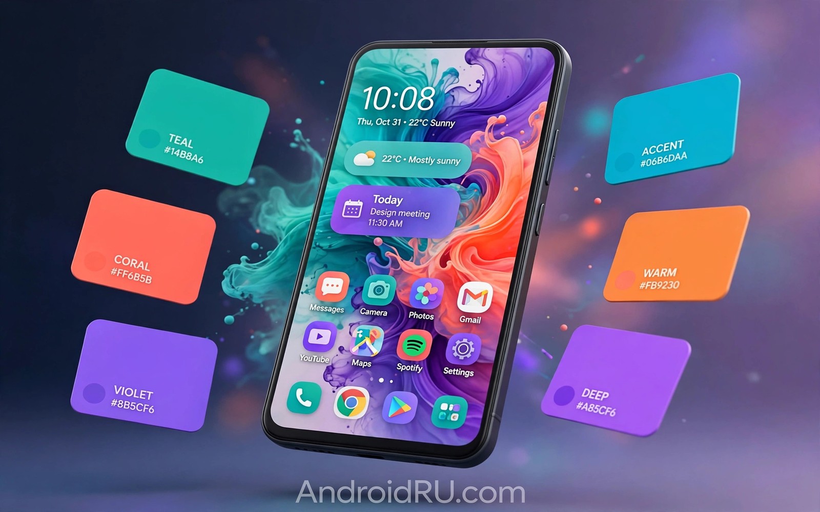
The Material You dynamic color engine is the quiet system that turns a single wallpaper into a complete look for your phone. It studies the image you choose and it builds a palette that covers buttons and backgrounds and text and icons. The result feels personal because the colors come from an image you picked yourself. The result also feels calm because the engine checks contrast before it applies anything.
This guide explains the pipeline in plain language and it shows where each decision happens. You will learn how seed colors are picked and how tonal palettes are built and how apps read the final values. You will also see why two phones can look different even when they use the same wallpaper. If you want a related skill then read about theme customization steps after you finish this introduction and keep that guide open while you test palettes on your own device.
How the engine reads a wallpaper
The process starts when you set a wallpaper and the system samples the image for dominant hues. It does not copy every pixel and it does not pick the brightest color by accident. It scores candidate colors for richness and balance and it favors a hue that can support both light surfaces and dark surfaces. A photo of a sunset may yield a warm seed while a forest photo may yield a deep green seed.
Once a seed is chosen the engine expands it into tonal steps that range from near white to near black. Each step keeps the same hue family and it changes only lightness and chroma in a controlled way. Designers call this a tonal palette and apps use different steps for different jobs. A surface may use a light step while a button may use a mid step and text may use a dark step on a light theme. You can also explore wallpaper color extraction if you want to see the exact values behind a palette and compare them with the colors on your screen.
Contrast checks run through the whole pipeline and they protect readability at every step. The engine pairs each background step with a text step that passes a clear contrast bar. If a pairing fails then the engine shifts the text step until the pairing passes. This is why themed apps stay readable even when the seed color is bold or unusual. It is also why a wild wallpaper rarely produces an unreadable interface.
Test the engine on your own phone
You do not need a developer setup to watch the engine work. You only need a phone with dynamic color support and a few wallpapers with clear dominant hues.
- Pick a wallpaper with one strong color area and set it as your home wallpaper from the gallery app.
- Open Settings and then Wallpaper and style and note the palette options that appear for that image.
- Choose a different palette option and watch buttons and toggles change across Settings at once.
- Open a themed app such as Messages or Settings and check that headers and buttons match the new palette.
- Switch to a wallpaper with a very different hue and repeat the same check to see the seed change.
- Turn on dark theme and confirm that surfaces darken while accent colors stay recognizable.
- Return to your favorite wallpaper and pick the palette that reads best in bright sunlight.
- Take a screenshot of each palette so you can compare them later without changing wallpapers again.
Practical tips for better palettes
Wallpapers with a single hero color give the cleanest results and they avoid muddy palettes. A busy collage can confuse the sampler and it can produce a dull seed that pleases nobody. If your favorite photo gives a weak palette then crop it around the strongest color area and set the cropped version instead. You can also explore Monet engine capabilities to understand why some images yield richer palettes than others and how tone steps shape the final look.
Test every palette in both light mode and dark mode before you settle on one. A palette that looks soft in light mode can look harsh in dark mode and the reverse is also true. Check small text on buttons and check icon labels on the home screen and check the notification shade. The best palette is the one that stays comfortable in both modes and in both bright rooms and dark rooms.
Remember that app support varies and some apps ignore dynamic color entirely. System apps usually follow the palette at once while older third party apps may keep their own brand colors. That gap is normal and it does not mean your phone is broken. You can theme the system shell and the launcher and still enjoy a consistent core even when a few apps stay fixed.
<resources>
    <color name="seed">#6750A4</color>
    <style name="AppTheme" parent="Theme.Material3.DayNight">
        <item name="colorPrimary">@color/seed</item>
    </style>
</resources>
The snippet above follows the pattern shown in the official Android developer documentation for Material Design themes and in the Material Design guidelines for dynamic color. It is a starting point for study and you should adapt the seed value and the parent theme to your own project before you ship anything.
Common mistakes
Many users blame the engine when the real problem is the wallpaper choice or a single missed setting.
- Using a near white wallpaper. A washed out image gives the sampler little hue to work with and the palette turns grey. Pick an image with visible color depth instead.
- Expecting every app to follow. Apps must opt in to dynamic color and older apps may never update. Judge the system shell first and treat full app coverage as a bonus.
- Judging a palette from one screen. A palette can look great in Settings and poor in a messaging app. Check three different apps before you decide.
- Forgetting dark mode. A palette tuned only for light mode can strain your eyes at night. Test dark mode on the same day you pick a palette.
- Changing wallpapers constantly. Constant changes make it hard to notice which palette you truly prefer. Live with one palette for a full day before you switch.
FAQ
Does the engine change my wallpaper itself?
No it does not alter the image file or the image you see on the home screen. It only reads color data from the image and it builds theme values from that data. Your photo stays exactly as you saved it.
Why does my palette differ from my friend’s palette?
Different wallpapers produce different seeds and different phone makers tune the sampler in different ways. Even the same image can yield a different palette when the crop or the screen size differs.
Can I set a seed color by hand?
Stock Android does not expose a manual seed picker on most phones. Some launchers and theme tools offer manual palettes and they can approximate the same effect with hand picked colors.
A seven day routine
Day by day you will notice the palette logic more clearly when you test it against real photos and real apps.
- Day one: set a bold photo wallpaper and note the first palette the system offers for it.
- Day two: switch to the second palette option and compare button contrast in Settings.
- Day three: open a messaging app and check whether headers match the system accent.
- Day four: turn on dark theme and note which tones shift most after dark.
- Day five: try a pale wallpaper and see how the engine handles a weak seed.
- Day six: crop a busy photo around its hero color and test the palette again.
- Day seven: pick the palette you liked most and keep it for the following week.
Troubleshooting quick answers
Most palette surprises have a simple cause and a simple fix that you can test in minutes.
- Palette looks grey. The wallpaper likely lacks a strong hue area. Choose an image with visible color depth and test again.
- Apps ignore the palette. Those apps may not adopt dynamic roles yet. Judge the system shell first and update the apps when possible.
- Dark mode looks harsh. The chosen palette may use a loud accent that glares at night. Pick a softer palette option for night comfort.
- Palette changes unexpectedly. A new wallpaper or a launcher change can rebuild the palette. Reopen Wallpaper and style to confirm the current choice.
Putting it all together
A week of deliberate testing beats a month of random wallpaper changes because you learn cause and effect. You will see which images give rich seeds and which images give muddy seeds. You will also see which apps follow the system and which apps stay fixed. That knowledge turns theme choice from luck into skill.
Keep a short note of winning combinations so future changes start from evidence. Note the wallpaper name and the palette position and the dark mode result. A note with three lines can rebuild a favorite look after any reset. Share the note with yourself in a cloud note so it survives a phone swap.
The engine rewards patience because its best palettes reveal themselves in real light and real use. A palette that looks fine in a preview may fail outdoors or at night. A palette that survives a full week of varied light is a true keeper. Trust the week test over the preview test every time.
Real world scenarios
A morning commuter sets a mountain sunrise photo and the phone blooms with warm amber accents for the whole day. Buttons and toggles share that warmth and the interface feels like an extension of the trip. The commuter never opened a theme menu after the first setup. The wallpaper did the design work silently.
A student uses a deep ocean photo for focus weeks and the resulting palette stays calm across notes and mail. The calm palette reduces visual noise during long study sessions. Small text stays readable because contrast checks protect every pairing. The student credits the quiet theme for fewer distractions.
A parent hands a phone to a child for a video call and the themed interface still reads clearly at a glance. Large buttons in a soft palette guide the child without confusion. The parent trusts the theme because nothing glows harshly or hides labels. The same palette serves both adult work and family sharing.
Checklist before you finish
Run through this checklist once and your dynamic color setup will be solid for months.
- Wallpaper has one dominant hero color area that the engine can score confidently.
- Chosen palette keeps button text readable in bright daylight and indoors.
- Dark mode version of the palette was checked on the same day as light mode.
- Three daily apps were opened to confirm they follow the system palette.
- Screenshots of favorite palettes are saved for rebuilding after a reset.
- Unthemed apps are listed so expectations stay honest about coverage.
- Palette was lived with for a full day before final judgment was made.
- Notes about the winning wallpaper and palette position are stored safely.
What changes after a month
After a month the palette stops feeling like a setting and starts feeling like the phone itself. You stop noticing accents because they match your daily images so well. That invisibility is the highest praise a theme can earn. Friends may notice the calm before you do because familiarity hides good design from its owner.
Seasonal wallpaper changes refresh the system without any settings work. A new season photo rebuilds the palette in seconds. The phone feels renewed while layouts and habits stay stable. That combination of novelty plus stability is rare in software and worth protecting.
Long term users develop an instinct for seeds that work on their specific phone. Maker tuning becomes familiar rather than mysterious. You learn which crops yield calm results and which yield noise. That instinct is a genuine skill built from a month of attention.
Share winning wallpapers with friends who use the same phone model for best transfer. Same model plus same tuning gives the closest palette match. Different models will still diverge slightly and that divergence is normal. Shared seeds still give a useful starting point for anyone.
Looking further ahead
The most valuable habit for dynamic color users is slow comparison across real days rather than rapid switching in one sitting. A palette that looks exciting in a preview can feel tiring after a week of notifications and messages and settings screens. A palette that looks quiet in a preview can feel perfect after the same week because it never demands attention at the wrong moment. Time is the only honest judge of a theme because time exposes glare and fatigue and boredom that previews hide completely. Users who respect the week test end up with themes that last for months without any urge to change them again.
Developers and enthusiasts can go further by studying tone tables from their own devices and comparing them across wallpapers with different hues. The comparison reveals how the engine protects readability when seeds turn extreme or pale or saturated. That study builds intuition faster than any article can because it connects theory to the exact phone in your hand. Over time the intuition becomes automatic and wallpaper choice becomes confident rather than experimental. The phone then feels less like a gadget to configure and more like a personal object that reflects taste without effort.
Conclusion
The dynamic color engine is best understood as a translator between your taste and your interface. It takes one personal choice and it turns that choice into a system wide language of color. When you grasp the seed step and the tonal step and the contrast step then you can predict the result before you apply it. You may also enjoy launcher styling options when you want another angle on the same theme.
Your next step is concrete and it takes five minutes. Set a bold wallpaper today and cycle through every palette option in both light mode and dark mode. Note the palette you like best and keep it for a full day so you can judge it in real use.

