

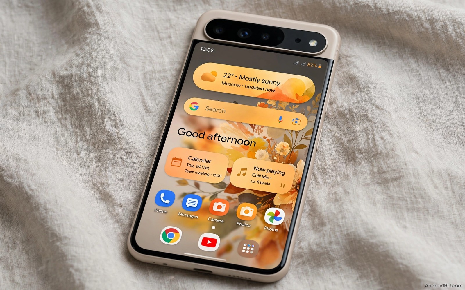
The Monet engine is the color brain inside Material You and it deserves a closer look than a quick settings tour. It takes one seed color and it grows a full family of tones that apps can share. It also enforces contrast rules that keep the family readable. Understanding its capabilities helps you predict themes instead of merely reacting to them.
This guide compares what Monet does well and where it stops short. You will learn how seed scoring works and how tonal steps differ from simple lightening. You will also learn why phone makers produce different results from the same idea. If you want the hands-on side then read about wallpaper color extraction to see real values behind the theory in this article.
Seed scoring and tonal construction
Seed scoring is the first capability and it decides the whole theme from one choice. The engine rates candidate colors for chroma and population and visual weight. A color that covers a large area with rich chroma scores well. A tiny neon speck scores poorly even when it is vivid. This scoring keeps themes grounded in the image rather than hijacked by noise.
Tonal construction is the second capability and it is more subtle than a brightness slider. Each tone step adjusts lightness and chroma together along a curve. Light tones lose chroma gently so surfaces stay calm. Dark tones keep enough chroma to stay recognizable without glowing. The curve is the reason Monet themes feel designed while naive lightening feels washed out.
Role mapping is the third capability and it turns tones into jobs. Primary roles cover key actions and secondary roles cover supporting actions and tertiary roles cover highlights. Surface roles cover backgrounds and containers. Error roles stay fixed so warnings remain recognizable across themes. When an app uses roles correctly then a theme change recolors the app without any app update.
Compare Monet behavior across phones
Use the same wallpaper on two devices or two launchers to see maker tuning in action.
- Pick a wallpaper with a strong single hue and save the original file for reuse.
- Set it on the first phone and note the palette options offered in Wallpaper and style.
- Screenshot the Settings screen and the notification shade on the first phone.
- Set the same file on the second phone or launcher and repeat the screenshots.
- Compare accent colors side by side and note which device shifted hue or lightness.
- Check dark mode on both devices because tone curves can diverge most at night.
- Note which apps follow the theme on each device to map support differences.
- Keep the screenshots as a reference for future wallpaper choices on each device.
Practical tips for working with Monet
Choose wallpapers that give Monet a confident seed and the rest of the pipeline will reward you. A hero color area with clean edges beats a noisy collage every time. If a favorite photo yields a dull theme then crop to the hero area and let the engine score that crop alone. You can also explore visual consistency across apps to see how role mapping turns one seed into a calm app ecosystem.
Design around roles when you build anything themed and avoid hardcoding brand colors for core controls. A button that uses the primary role will follow every future theme. A button with a fixed hex value will clash with half of all user themes. Role discipline is the cheapest way to look native on every phone.
Accept the fixed points in the system because some colors must not move. Error red and success green stay stable so users can trust warnings in any theme. Trying to recolor those signals for style alone harms usability. Let the stable colors do their safety job and spend your creativity on surfaces and accents.
// Tonal palette concept in Kotlin
val seedColor = 0xFF6750A4.toInt()
val lightTone = 90  // near white surface tone
val midTone = 50    // accent tone
val darkTone = 20   // deep surface tone
// Each tone keeps the seed hue family.
The snippet above follows the pattern shown in the official Android developer documentation for dynamic color and in the Material Design guidelines for tonal palettes. It illustrates the tone idea in simple numbers and you should use the real dynamic color library for production values.
Common mistakes
Monet misunderstandings lead to unfair blame and to bad custom themes.
- Calling Monet a filter. Monet is a color system with scoring and curves and roles. Treating it as a simple tint misses why themes feel coherent.
- Expecting identical output everywhere. Makers tune scoring and curves and launchers vary. Same seed plus different tuning equals different theme.
- Hardcoding accents in apps. Fixed accents break theme harmony and they age poorly. Use roles for core controls and reserve fixed colors for brand art.
- Judging Monet from one wallpaper. One weak seed does not prove a weak engine. Test three wallpapers with different hues before you judge.
- Recoloring error states. Warning colors carry meaning across themes. Keep them stable and theme around them instead.
FAQ
Is Monet the same as Material You?
Monet is the color engine inside Material You. Material You is the wider design language and Monet is the part that builds dynamic palettes.
Why do Pixel and Samsung themes differ?
Both use dynamic color ideas and each maker tunes scoring and tone curves for its own launcher and apps. The core idea matches and the output varies.
Can developers use Monet tones in apps?
Yes developers can read dynamic color roles from the system and apply them to their layouts. Apps that use roles follow user themes automatically.
A seven day routine
Monet understanding deepens when you compare the same seed across devices and themes over several days.
- Day one: set a red wallpaper and screenshot Settings and the shade.
- Day two: set a blue wallpaper and repeat the same screenshots.
- Day three: compare tone steps between the red and blue results.
- Day four: test both wallpapers in dark mode and note tone shifts.
- Day five: open three apps under each wallpaper and check role adoption.
- Day six: crop one wallpaper to its hero area and test the seed again.
- Day seven: write a short note on which seed gave the calmest theme.
Troubleshooting quick answers
Monet confusion usually comes from expecting one seed to behave identically everywhere.
- Same wallpaper different palette. Maker tuning and launcher differences shift scoring. Compare devices to map the divergence.
- App ignores new palette. The app may cache theme values until restart. Restart the app and recheck its colors.
- Dark theme looks unrelated. Tone curves diverge most at night by design. Pick a seed that survives both modes.
- Seed feels random. A noisy image gives the scorer weak candidates. Crop to a hero area for a confident seed.
Putting it all together
Monet is best judged as a system of tradeoffs rather than as a magic color picker. Scoring trades noise resistance for surprise. Tone curves trade vividness for readability. Role mapping trades brand freedom for system harmony. Each tradeoff serves daily comfort over screenshot drama.
Developers who respect the tradeoffs gain native feel almost for free. Role based layouts follow every user theme without extra releases. Fixed color layouts fight every theme and they age with each wallpaper trend. The economics favor roles for any app that wants to feel at home on Android.
Users who understand the tradeoffs stop fighting the engine and start feeding it better seeds. A hero area crop is a small act of collaboration with the system. The reward is a theme that feels personal and calm at once. That collaboration is the heart of Material You.
Real world scenarios
An app developer tests a new layout under five user wallpapers in one afternoon. Role based buttons adapt to every palette without code changes. A hardcoded header clashes under two palettes and gets replaced with a role. The app ships feeling native on every test phone.
A reviewer compares two phones with the same wallpaper for a buying guide. Pixel output leans cooler while Samsung output leans warmer from tuning differences. The reviewer explains tuning rather than declaring one phone broken. Readers gain a fair expectation before purchase.
A theme enthusiast collects seeds that produce calm palettes across seasons. Spring greens and autumn ambers and winter blues each get a hero crop. The collection becomes a personal palette library for the year. Monet knowledge turns random wallpapers into reliable themes.
Checklist before you finish
Monet understanding is solid when these statements all hold true.
- Seed scoring concept is understood as chroma plus population plus weight.
- Tonal steps are understood as lightness plus chroma curves rather than simple brightening.
- Role mapping is understood as jobs for primary and surface and error colors.
- Same wallpaper was tested on two devices or launchers for tuning differences.
- Dark mode behavior of a chosen seed was checked before adoption.
- Three wallpapers with different hues were tested before judging the engine.
- Error colors are left stable rather than recolored for style.
- Apps using roles were distinguished from apps using fixed colors.
What changes after a month
After a month of Monet study the user predicts palettes before applying wallpapers. Hero crops with strong chroma promise rich results. Noisy collages promise muddy results. Prediction skill turns theme choice into a calm routine rather than a lottery.
Developer friends benefit from role explanations because adoption spreads through understanding. A developer who grasps roles adopts them across an app quickly. Users of that app then enjoy native themes without extra effort. Knowledge sharing scales better than any single theme tweak.
Phone makers continue tuning dynamic color through updates over years. A seed that behaved one way last year may behave slightly differently now. Staying curious about tuning keeps expectations realistic. The engine evolves and users evolve with it.
The wider design language grows beyond color into shape and motion and type. Color remains the most visible part for most users. Shape and motion quietly support the color story across apps. A mature eye notices all three layers working together.
Looking further ahead
Color systems like Monet succeed because they encode design judgment into rules that any app can follow automatically. Individual designers no longer need to guess contrast pairings for every screen. The system guarantees readable results from any seed within reason. That guarantee scales good design across thousands of apps that could never hire dedicated color specialists. Systems beat individual heroics for consistency at platform scale.
Future color systems will likely add more personal control without abandoning automatic guarantees. Manual seed pickers and per app accents may arrive alongside automatic palettes. The challenge will be preserving readability guarantees while expanding choice. Users should welcome more control only when it preserves the contrast safety net. Freedom without guardrails produces beautiful screenshots and unreadable phones.
Conclusion
Monet earns its reputation through scoring and tonal curves and role mapping working together. No single part explains the calm feel of a good theme. The system works when all three parts agree. You may also enjoy light and dark theme behavior when you want another angle on the same theme.
Your next step is to run the two device comparison from this guide with one bold wallpaper. Note where the themes agree and where they diverge. Use that map to pick wallpapers that suit each device you own.

