

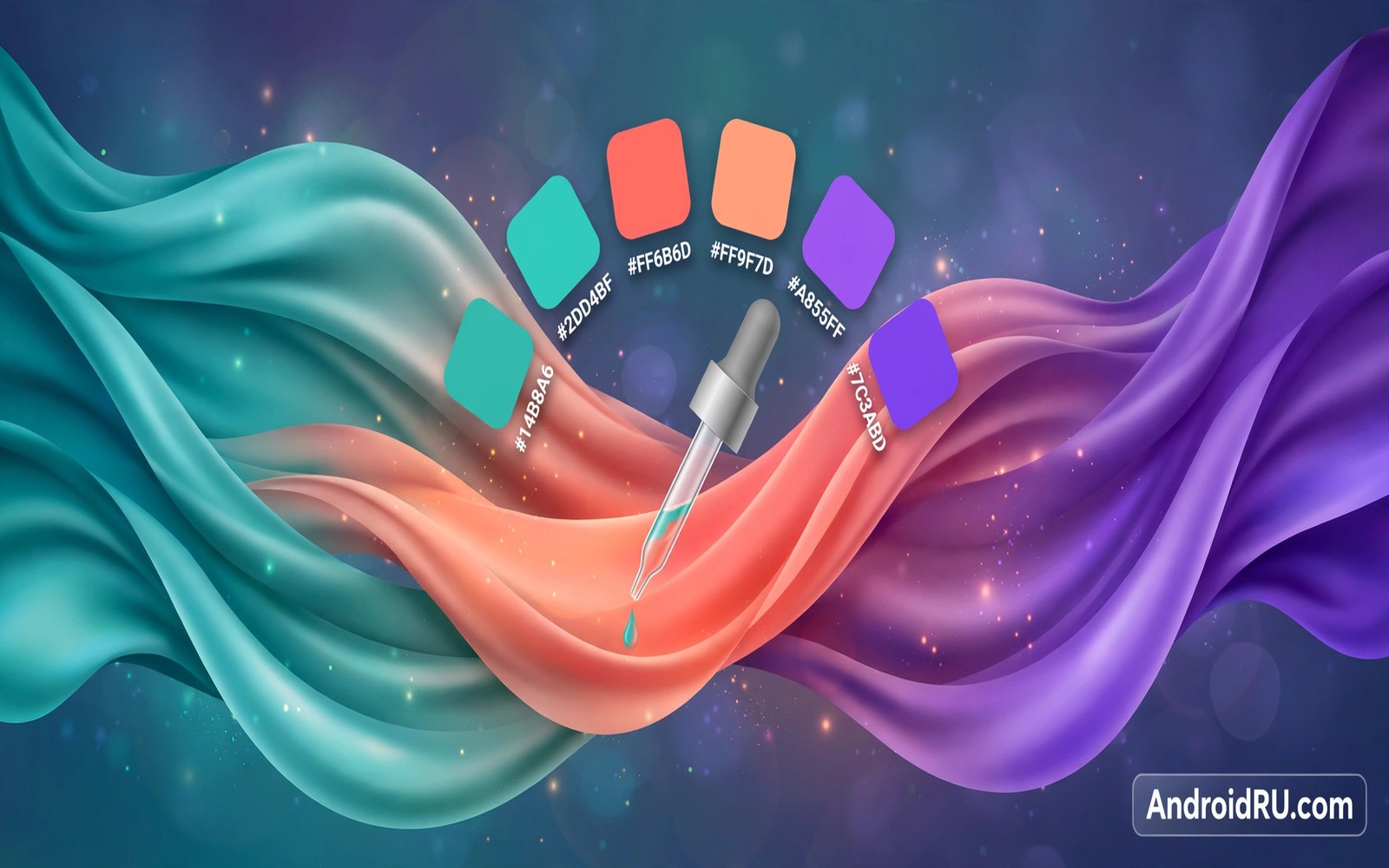
Hex colors from wallpapers turn a vague feeling about a theme into exact values you can reuse. A hex code lets you match a widget and a wallpaper and an icon pack with confidence. It also lets you share a palette with a friend who can reproduce it on another phone. Without hex values you are guessing and with them you are designing.
This guide shows how to extract hex colors from any wallpaper with tools already on your phone and with free picker apps. You will learn which pixels to trust and which ones to ignore. You will also learn how to test a hex value for contrast before you build around it. If you want the system view first then read about dynamic color engine basics so you understand where the system palette comes from.
Where hex values hide in a wallpaper
A wallpaper is a grid of pixels and each pixel holds one exact color. A picker tool reads that pixel and it prints the hex code for it. The trick is choosing pixels that represent the image rather than noise. A single bright speck in a sky photo is not the sky color. A broad area of sky sampled in five spots gives a honest average.
The system palette itself is a set of derived tones and not a copy of raw pixels. The engine shifts lightness and chroma to build readable steps. A hex value you pick from the raw image may therefore differ from the hex value the system uses for a button. Both values are useful and they serve different jobs. Use raw hex for widgets and custom art and use system tones for interface matching.
Shadows and gradients complicate sampling because one area can span many hex values. A sunset gradient may run from deep orange to pale gold across a short span. Sample the start and the middle and the end of the gradient and note all three. A palette built from the full range feels richer than a palette built from one endpoint alone.
Extract hex colors step by step
You can do this with a screenshot and a picker app or with a wallpaper app that exposes palette values directly.
- Set the wallpaper you want to sample and take a screenshot of the home screen without widgets covering it.
- Open a color picker app and load the screenshot or the original wallpaper image.
- Tap five spots inside the largest color area and write down each hex code shown.
- Tap the secondary color area in three spots and note the most common hex value there.
- Tap a neutral area such as sky or wall and note its hex value for backgrounds.
- Compare the sampled values and drop any outlier that appears only once.
- Test the lead hex value on a dark background and on a light background for contrast.
- Save the final three hex values in a note so you can reuse them for widgets and themes.
Practical tips for accurate sampling
Sample from the original image file when you can because screenshots can shift colors slightly. Compression and screen calibration both nudge values by a small amount. The shift rarely matters for a widget but it matters when you try to match a brand color exactly. Keep the original file in a palette folder for future edits. You can also explore personalized wallpaper tools to create images with clean color areas that sample more reliably.
Name each hex value by its job and not by its appearance alone. A value called hero accent is easier to reuse than a value called orange number two. A small note that says hero accent plus surface plus text support will guide every later choice. Future you will thank present you for the extra ten seconds of labeling.
Check contrast with a simple rule before you commit to a pairing. Dark text needs a light background and light text needs a dark background and mid tones need a clear gap on both sides. If a pairing looks doubtful in a thumbnail then it will fail in bright sunlight. Pick a darker text tone or a lighter surface tone until the pairing reads at arm’s length.
// Read a pixel color from a bitmap in Kotlin
val bitmap: Bitmap = wallpaperBitmap
val pixel = bitmap.getPixel(x, y)
val hex = String.format("#%06X", 0xFFFFFF and pixel)
println("Picked color: $hex")
The snippet above follows the pattern shown in the official Android developer documentation for bitmap handling and in the Material Design guidelines for color values. It shows how a single pixel becomes a hex string and you should sample several pixels rather than trusting one pixel alone.
Common mistakes
Sampling errors are small and they compound when you build a whole theme on one bad value.
- Trusting one pixel. One pixel can be noise or compression artifact. Sample five spots and trust the repeated value.
- Sampling a compressed thumbnail. Thumbnails blur colors together and they invent tones that do not exist in the original. Use the full image file.
- Ignoring gradient range. A gradient is many colors and one sample misleads the palette. Sample the full range and pick a working set.
- Matching hex without contrast. An exact match that fails contrast is a failed theme. Test every pairing before you apply it.
- Losing the values. A palette that lives only in memory vanishes after a reset. Save hex values in a note on day one.
FAQ
What is a hex color code?
A hex code is a six digit code that names one exact color with red and green and blue values. It lets any app or tool reproduce the same color without guessing.
Why do two pickers show slightly different values?
Different pickers may sample different pixels or apply different rounding. The difference is usually tiny and you should pick one picker as your reference.
Can I force the system to use my hex value?
Stock Android does not accept a raw hex seed on most phones. You can use hex values in widgets and launchers and custom themes instead.
A seven day routine
Color sampling skill grows when you practice on varied images rather than on one perfect gradient.
- Day one: sample five spots in a sky photo and note the repeated sky value.
- Day two: sample a sunset gradient at start and middle and end points.
- Day three: sample a portrait photo and note how skin tones vary by light.
- Day four: sample a busy street photo and see why it yields a muddy average.
- Day five: crop the street photo to one shop sign and sample again.
- Day six: build a three value palette note for your current wallpaper.
- Day seven: apply those three values to a widget and judge the match.
Troubleshooting quick answers
Sampling mistakes are easy to spot when you compare several samples instead of trusting one.
- Values differ between pickers. Pickers may sample different pixels or round differently. Pick one picker as your reference tool.
- Widget color looks off. The widget may apply its own tint over your hex value. Test the hex on a plain background first.
- Gradient sample misleads. One gradient point cannot represent the range. Sample the full range and pick a working set.
- Saved values get lost. A palette in memory vanishes after a reset. Save values in a note on the day you sample them.
Putting it all together
Hex values turn taste into a transferable skill because numbers travel where feelings cannot. A friend can reproduce your palette exactly from three codes. A future phone can rebuild your theme from one note. That portability is the quiet power of sampling well.
Sampling also teaches color judgment because repeated practice reveals which areas represent an image. Broad areas beat speckles and mid tones beat extremes for theme work. The eye learns to find hero areas before the picker even opens. That judgment speeds every future theme decision.
Keep a palette journal with the image name and the three values and a photo of the result. A journal across months shows your taste evolving and it prevents repeating failed combinations. The journal costs a minute per wallpaper and it pays back on every reset.
Real world scenarios
A widget designer samples a client brand photo to build matching home widgets. Three hex values from the photo guide widget backgrounds and accents. The widgets match the wallpaper without copying it exactly. The client phone looks professionally themed in an afternoon.
A student creates study wallpapers from textbook diagrams with strong color blocks. Sampling the diagram gives hex values for matching note widgets. The study phone becomes a coherent learning environment. Color coherence reduces friction between study tools.
A photographer builds a portfolio wallpaper from a favorite landscape shot. Hex values from sky and foliage guide a minimal widget set. The home screen showcases the photo instead of competing with it. Sampling turns art into a system rather than a backdrop.
Checklist before you finish
A sampled palette is ready when every point below is true.
- Five spots were sampled inside the largest color area.
- Outlier values appearing only once were discarded from the set.
- Secondary and neutral values were sampled separately from hero values.
- Final three values are saved in a note for reuse after resets.
- Lead value was tested on dark and light backgrounds for contrast.
- Original full resolution image file was kept for future sampling.
- Values were sampled from the original file rather than a thumbnail.
- Palette note names each value by its job for easy reuse.
What changes after a month
After a month of sampling the eye starts recognizing hero colors before the picker opens. Broad sky areas and foliage blocks and wall tones become obvious candidates. Sampling speed rises because judgment improves with practice. The picker confirms instincts rather than discovering colors blindly.
A personal palette library grows from saved notes across many wallpapers. Each entry holds three values plus the image name plus a result photo. The library speeds future widget design enormously. Reusing proven values beats fresh sampling for every small project.
Color trends in personal taste emerge from the library over time. Warm palettes may dominate winter entries while cool palettes dominate summer entries. Recognizing the pattern helps future wallpaper shopping. Taste becomes data rather than vague preference.
Sharing palettes with friends works best with hex values plus a screenshot. Values alone can mislead because screens render slightly differently. A screenshot shows the intended pairing in context. Values plus image together transfer the design faithfully.
Looking further ahead
Color sampling connects phone theming to the wider world of design where exact values replace vague impressions. Designers in print and web and architecture all rely on codes rather than memory for color reproduction. Phone users who learn hex codes join that professional habit at a small scale. The habit transfers to presentations and documents and social graphics beyond the phone itself. A small skill learned for wallpapers can improve visual communication everywhere.
Sampling discipline also teaches restraint because a limited palette forces better decisions than an unlimited one. Three honest values guide widgets and themes more effectively than thirty random values. Constraints focus creativity on relationships between colors rather than on collecting colors. That focus produces coherent results that random collection never achieves. Restraint is a design skill disguised as a limitation.
Conclusion
Hex extraction turns wallpaper taste into a portable palette. Three honest values beat thirty guessed values because they guide every later decision. Sample broadly and label clearly and test contrast early. You may also enjoy Material You icon packs when you want another angle on the same theme.
Your next step is to sample your current wallpaper tonight with the five spot method. Save the hero value and the secondary value and the neutral value in one note. Use those three values for your next widget and watch the home screen pull together.

