

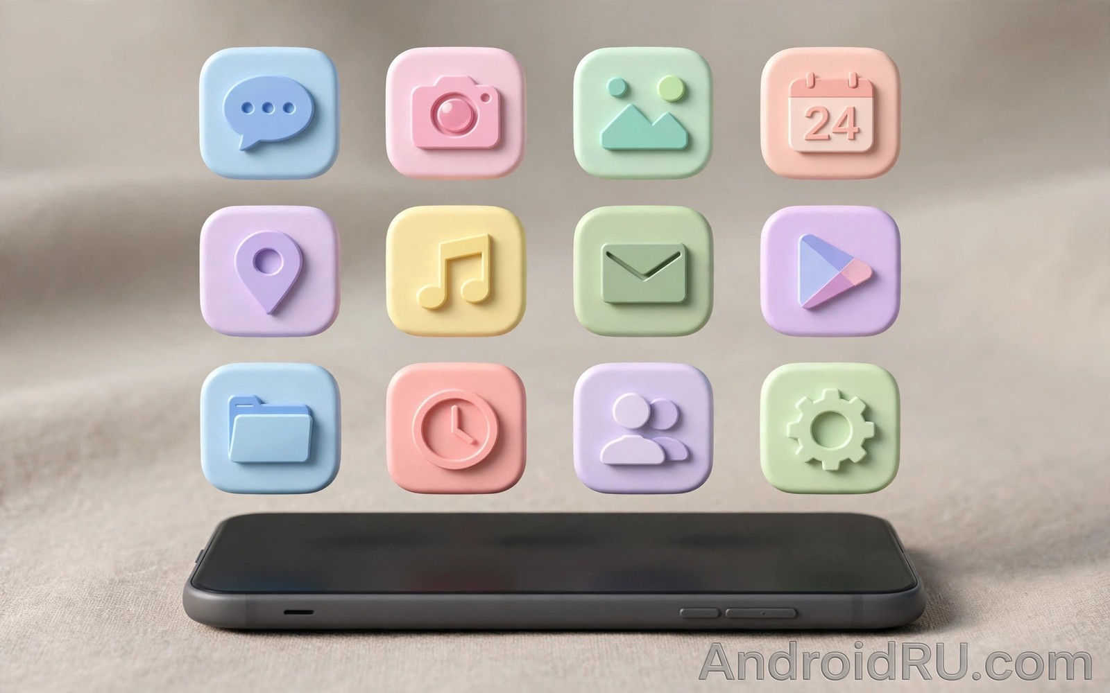
Icon packs compatible with Material You dynamic coloring let you keep a calm theme without losing app identity. A good pack draws clean shapes that survive tinting. A weak pack draws fussy details that melt into blobs under one tone. The difference shows up every time you scan the drawer.
This guide helps you judge packs by shape and coverage and launcher fit. You will learn why monochrome support matters and how to spot a pack that only pretends to support it. You will also learn how to mix a pack with themed icons for the best result. If you need the system baseline first then read about themed icons across the drawer before you shop for packs.
What makes a pack Material You friendly
True Material You support starts with a monochrome layer that the system can tint. A pack with that layer joins dynamic color cleanly and it shifts with every palette change. A pack without that layer keeps fixed colors and it clashes with the system palette whenever the wallpaper changes. Check the pack description for monochrome or themed icon wording before you buy.
Shape clarity is the second test and it matters more under tinting than in full color. Bold simple glyphs stay readable when color cues vanish. Thin line art and tiny details blur at small sizes and they slow recognition. Preview the pack at drawer size and not at store poster size. A pack that reads at small size will serve you daily.
Coverage depth is the third test and it decides how many icons stay mismatched. A pack with two thousand mapped apps will theme most of a normal drawer. A pack with two hundred mapped apps will leave half the drawer in default icons. Check the mapped count and check whether your banking and transit apps are covered before you pay.
Choose and apply an icon pack
Test a pack on one screen before you apply it everywhere so a bad pack costs minutes and not hours.
- Confirm that your launcher supports custom icon packs in its settings.
- Search for packs that mention monochrome or themed icon support in the description.
- Preview the pack at small size and check shapes for your ten most used apps.
- Install one pack and apply it from the launcher icon settings screen.
- Open the drawer and count how many icons stayed in default style.
- Use per app icon override for the few stubborn apps that matter most.
- Test the pack in dark mode because tint contrast shifts with the theme.
- Keep the pack updated so new app mappings arrive as apps change icons.
Practical tips for pack shopping
Favor packs with a consistent grid and consistent stroke weight across all icons. Consistency is what makes a drawer feel designed even when individual icons are simple. A pack with mixed styles feels patched even when each icon looks fine alone. Scroll the full preview set and reject packs where styles drift from page to page. You can also explore launcher styling options because launcher icon settings control how well any pack can shine.
Treat icon requests as a signal of pack health and not as a chore. A developer who answers requests and ships mappings regularly will keep your drawer themed as apps evolve. A pack abandoned a year ago will decay as apps rename and rebrand. Check the last update date and the request flow before you spend money.
Mix carefully when you combine a pack with themed icons because two systems can clash. Use the pack as the base and let themed mode handle only apps the pack misses. Or use themed mode as the base and override only a few apps from the pack. One clear hierarchy beats two competing systems.
<!-- Icon pack appfilter concept -->
<item component="ComponentInfo{com.example.app/.MainActivity}"
    drawable="ic_example" />
<!-- A pack maps each app component to one drawable. -->
The snippet above follows the pattern shown in the official Android developer documentation for app components and in the Material Design guidelines for icon systems. It illustrates how a pack maps apps to drawables and you should treat it as a study example rather than a full pack definition.
Common mistakes
Pack disappointment usually comes from previewing at the wrong size or skipping the coverage check.
- Buying from poster previews. Large posters hide small size blur. Preview at drawer size before you pay anything.
- Ignoring mapped app count. A beautiful pack with low coverage leaves a mixed drawer. Check coverage for your actual apps first.
- Assuming all packs support tinting. Fixed color packs clash with dynamic palettes. Confirm monochrome support in writing.
- Applying to every screen at once. A bad pack applied everywhere costs time to undo. Test one screen first and then widen.
- Forgetting launcher fit. Some packs need a specific launcher feature set. Confirm support in your launcher before purchase.
FAQ
Do icon packs work with themed icons mode?
Some packs ship a monochrome layer that works with themed mode. Others only work as a full pack replacement in a supporting launcher.
Why do some icons stay default after applying a pack?
Those apps lack a mapping in the pack or they changed their component name. Per app override or an icon request can fix the gap.
Can I mix two icon packs?
Most launchers apply one pack at a time. Per app overrides let you borrow single icons from a second pack for stubborn apps.
A seven day routine
Icon pack judgment improves when you live with a pack through varied apps and both themes.
- Day one: apply the pack to one screen and preview at drawer size.
- Day two: count unmapped icons across the full drawer honestly.
- Day three: test recognition speed for ten daily apps against the clock.
- Day four: check the pack in dark mode for tint and contrast issues.
- Day five: override two stubborn apps and note the override method.
- Day six: request mappings for missing daily apps from the developer.
- Day seven: keep the pack only if recognition stayed fast all week.
Troubleshooting quick answers
Pack problems usually trace to coverage gaps or to size illusions from store previews.
- Many icons stay default. The pack mapping count may be low for your apps. Check coverage before buying another pack.
- Icons blur at small size. Fine details fail at drawer size. Choose packs with bold simple glyphs instead.
- Pack ignores dark mode. Fixed color packs cannot adapt to dark surfaces. Switch to a monochrome friendly pack.
- Updates break mappings. App component names change over time. Update the pack and reapply overrides after major app updates.
Putting it all together
Icon packs are a long term relationship because apps evolve and mappings must follow. A pack with an active developer stays fresh across rebrands. A pack without updates decays quietly as icons revert to defaults. The developer track record matters as much as the artwork.
Shape discipline beats artistic flair for daily recognition because the drawer is a tool and not a gallery. Bold glyphs and consistent strokes guide the eye faster than detailed illustrations. A pack that looks plain in posters often wins in daily use. Trust the week test over the poster test.
Mixing packs needs a clear hierarchy so the drawer does not become a collage. One base pack plus a few overrides beats two competing packs. The hierarchy keeps the drawer calm while it fixes the worst gaps. Apply that rule and the drawer stays designed.
Real world scenarios
A new phone owner applies a monochrome pack and the drawer calms instantly. Banking and transit apps are covered so daily tools look consistent. Two rare apps stay default and nobody notices them in folders. The pack earns its price in the first week.
A designer mixes a base pack with themed mode for missing apps. The base pack covers most icons with bold glyphs. Themed mode fills gaps with system tints that blend well. The hierarchy keeps the drawer designed without manual work for every app.
A student on a budget tests free packs before paying for a premium set. Free pack coverage proves too thin for daily apps. The premium pack with deep mappings wins after a drawer size preview. Spending follows evidence rather than poster beauty.
Checklist before you finish
An icon pack is worth keeping when it clears every check below.
- Pack description confirms monochrome or themed icon support in writing.
- Preview was judged at drawer size rather than poster size.
- Mapped app count covers banking and transit and daily tools.
- Shapes stay bold and simple at small sizes without fine detail blur.
- Pack was tested in dark mode for tint contrast problems.
- Developer update history shows recent mappings and answered requests.
- Launcher support for custom packs was confirmed before purchase.
- One screen trial ran before the pack was applied everywhere.
What changes after a month
After a month a good pack feels like the native icon set of the phone. Drawer scanning relies on glyph shapes learned through daily use. New users of the phone may not realize a pack is installed. That invisibility marks a successful pack choice.
Pack developers who stay active keep mappings fresh through app rebrands. Quarterly pack updates rescue icons that would otherwise revert. Inactive packs decay slowly and users blame the launcher first. Checking update history prevents that misdiagnosis.
Icon taste matures toward simpler glyphs over months of drawer use. Detailed artistic icons lose appeal as recognition speed matters more. Simple bold shapes age gracefully across themes and wallpapers. The drawer rewards restraint consistently.
Occasional pack switching for seasons keeps the phone feeling fresh without harm. A winter pack and a summer pack can rotate with wallpapers. Rotation works when both packs share similar glyph boldness. Wildly different packs disrupt shape memory and should be avoided.
Looking further ahead
Icon design history shows a long move from detailed realism toward simple glyphs that read at small sizes. Early smartphone icons imitated physical objects with shadows and textures. Modern themed icons reduce objects to essential shapes that survive tinting and scaling. That evolution serves recognition speed over decoration. Pack designers who embrace simplicity follow the direction of the entire platform.
Community icon requests shape pack evolution because users report missing mappings constantly. A responsive developer turns requests into updates that benefit the whole user base. Request participation is therefore a contribution to a shared resource rather than a personal chore. Users who request mappings improve the pack for thousands of strangers. That community dynamic keeps good packs alive for years.
Conclusion
A strong Material You pack is simple in shape and deep in coverage and honest about tint support. Those three traits beat novelty shapes and huge poster galleries. Judge packs at drawer size and the right choice becomes obvious. You may also enjoy themed icons for unsupported apps when you want another angle on the same theme.
Your next step is to shortlist two packs this week and preview both at drawer size. Apply the winner to one screen and live with it for two days. Keep it only if recognition stays fast.

