

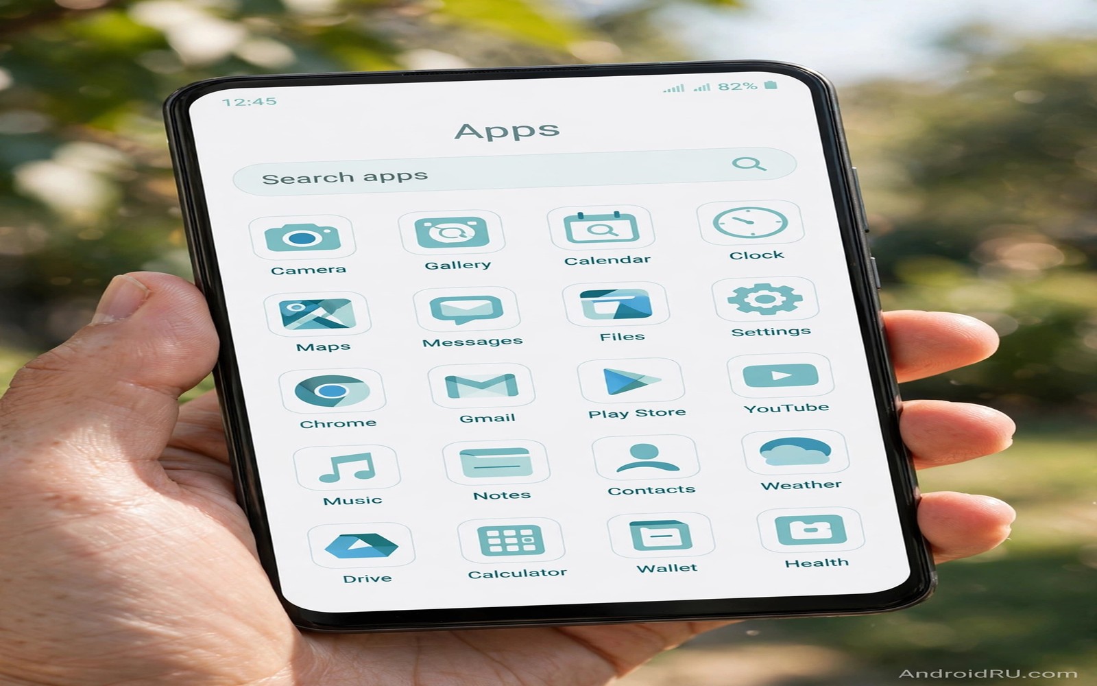
Dynamic system icons are the fastest way to make an app drawer feel unified. One toggle can turn a rainbow of brand icons into a calm set of tones drawn from your wallpaper. The drawer stops shouting and it starts reading as one designed surface. The change is small on paper and it is large in daily use.
This guide shows how to apply themed icons across the whole drawer and how to handle the apps that refuse to change. You will learn which settings control the mode and which launcher choices extend it. You will also learn when to accept an unthemed icon instead of forcing it. If you are still choosing a look then read about theme customization steps to set your palette first so the icons inherit colors you actually like.
How themed icons work
Themed icon mode does not repaint brand artwork by magic. It asks each app for a special monochrome layer that the system can tint with the current palette. Apps that ship that layer join the theme at once. Apps that lack the layer keep their normal icon and they stand out against the themed set.
The launcher controls the final rendering and different launchers handle the edges differently. The stock Pixel launcher applies themed icons in a strict way while some third party launchers add their own tinting for unsupported apps. That difference explains why the same app can look themed on one phone and unthemed on another. The app itself has not changed and only the launcher pipeline differs.
Color choice matters more than most users expect because tinted icons lose brand cues. A red messaging icon and a green banking icon may both turn teal under one palette. You must then rely on shape and label text for fast recognition. That trade is worth it for many users and it is a real cost for users who scan by color under pressure.
Apply themed icons everywhere
Follow these steps in order and check the drawer after each change so you can spot the exact step that causes a problem.
- Set a wallpaper and palette you like because themed icons inherit those colors directly.
- Long press the home screen and open Wallpaper and style from the popup menu.
- Turn on Themed icons and wait a few seconds for the drawer to repaint.
- Open the app drawer and scroll through the full list to spot apps that stayed unthemed.
- Check the launcher settings for an extra force theming option if your launcher offers one.
- Restart the launcher from its settings or reboot the phone if icons fail to repaint.
- Replace stubborn icons with shortcuts from an icon pack that supports monochrome mode.
- Review the drawer in dark mode as well because tint contrast changes with the theme.
Practical tips for a readable drawer
Keep labels visible while you adapt to themed icons because labels carry the recognition load that color used to carry. A drawer without labels looks cleaner in screenshots and it slows real use for the first week. Turn labels back on until shapes feel familiar and then decide if you still want them hidden. You can also explore Material You icon packs for sets that keep shapes distinct even when colors merge into one tone.
Group rarely used apps into folders so the themed set stays scannable. A drawer with two hundred icons will feel busy no matter how calm the palette is. Folders reduce the visible set and they let the theme breathe. Put daily apps on the home screen and keep the drawer as a reference library rather than a second home screen.
Test themed icons with your actual wallpaper and not with a demo image. A palette drawn from a blue photo tints icons blue and a palette drawn from an orange photo tints them orange. The same icon set can look crisp under one palette and muddy under another. Judge the mode only after your real wallpaper is in place.
<!-- AndroidManifest.xml -->
<application
    android:roundIcon="@mipmap/ic_launcher_round"
    android:icon="@mipmap/ic_launcher">
    <activity android:name=".MainActivity"
        android:exported="true">
    </activity>
</application>
The snippet above follows the pattern shown in the official Android developer documentation for adaptive icons and in the Material Design guidelines for monochrome icon layers. It shows where an app declares its launcher icons and why a themed mode can only recolor apps that ship the right icon layer.
Common mistakes
Most themed icon complaints trace back to one of these avoidable choices.
- Blaming the phone for unthemed apps. The developer must ship a monochrome layer and no phone setting can invent one. Check the app version before you reset anything.
- Hiding labels on day one. Hidden labels plus new icon colors remove two recognition cues at once. Keep labels until shapes feel familiar.
- Using a low contrast palette. Pale tints on pale backgrounds make icons melt into the drawer. Pick a palette with clear separation between icon and background.
- Forcing every icon with overlays. Aggressive overlay tools can break updates and they can distort icon shapes. Use them only for a few stubborn apps.
- Forgetting folders. A themed drawer still needs organization. Folders and search matter more than tint once the app count grows.
FAQ
Why do only some of my icons change?
Only apps with a monochrome icon layer can change. The system cannot safely recolor full color brand artwork without that layer in place.
Do themed icons work in dark mode?
Yes they adapt to dark mode by shifting the tint and the background tone together. Contrast is rechecked so icons stay visible on dark surfaces.
Can I theme one icon and leave the rest alone?
Stock themed mode is all or nothing for supported apps. Icon packs and shortcut tricks can theme single icons when you need a mixed result.
A seven day routine
Themed icons need a few days for your eyes to learn new shapes so judge the change after a week and not after an hour.
- Day one: enable themed icons and keep labels visible for recognition support.
- Day two: scroll the full drawer and list every app that stayed unthemed.
- Day three: group rarely used apps into folders to reduce drawer noise.
- Day four: test drawer scanning speed by finding five apps against the clock.
- Day five: check the drawer in dark mode for tint contrast problems.
- Day six: replace the worst holdout with a shortcut or a pack icon.
- Day seven: decide whether labels can hide now that shapes feel familiar.
Troubleshooting quick answers
Drawer problems after theming are usually recognition problems and they fade with the right support.
- Apps look identical. Monochrome tints remove color cues. Keep labels on and rely on shape until recognition returns.
- Icons repaint slowly. The launcher may need a restart to finish repainting. Restart the launcher or reboot once.
- Some icons stay bright. Those apps lack a monochrome layer entirely. Use a pack mapping or accept the holdout.
- Folders look messy. Folder previews mix themed and unthemed icons. Organize folders by use so previews stay meaningful.
Putting it all together
A themed drawer is a reading system and reading systems improve with practice. The first day feels slower because color cues vanished overnight. The seventh day feels faster because shapes and positions carry recognition. Patience converts an unfamiliar drawer into a calm one without any extra tool.
Labels are training wheels and not a failure of the theme. Keeping them for a week costs nothing visually and it saves many hunting seconds. Removing them too early punishes the user for a system change. Let labels stay until shapes alone guide the hand.
The drawer also benefits from ruthless organization because tinting cannot fix clutter. Folders and search and home screen placement matter more than tint once the app count passes one hundred. Theme the drawer and then organize it and the combination feels like a new phone.
Real world scenarios
A designer keeps labels visible for two weeks while learning monochrome shapes. Recognition speed returns gradually as shape memory replaces color memory. By week three the drawer feels faster than the old rainbow drawer. The designer then hides labels with confidence.
A courier scans the drawer dozens of times daily between deliveries. Themed icons plus folders by job type cut scanning time noticeably. Navigation and delivery apps sit on the home screen for instant access. The drawer becomes a reference shelf rather than a daily obstacle.
An older user with many installed apps struggles with a rainbow drawer. Themed icons plus large labels plus folders transform the drawer into a calm index. Family members can guide the user by shape and label together. The phone becomes less intimidating overnight.
Checklist before you finish
Confirm these points and the themed drawer will serve daily use rather than screenshots.
- Themed icons are enabled in Wallpaper and style settings.
- Full drawer was scrolled to list apps that stayed unthemed.
- Labels are visible until shape recognition feels reliable.
- Rare apps are grouped into folders to reduce visible clutter.
- Drawer was tested in dark mode for tint contrast problems.
- Worst holdout was replaced with a shortcut or pack icon if needed.
- Launcher was restarted if any icons failed to repaint initially.
- Drawer scanning speed was tested with five real app searches.
What changes after a month
After a month themed icons feel like the original design of the phone. Brand colors become a distant memory for most apps. Recognition relies on shape and position and label together. The drawer feels quieter even during stressful days.
New app installs test the system because unmapped apps arrive unthemed. A quick folder placement hides newcomers until mappings arrive. Pack updates gradually theme the newcomers over weeks. The drawer heals itself through updates when the pack stays active.
Muscle memory deepens with stable positions because themed icons rarely move. The hand finds mail and messages without conscious thought. Position stability matters more than tint for long term speed. Avoid reorganizing the drawer monthly once positions feel automatic.
Occasional brand icons serve as landmarks among themed neighbors. A single colorful icon can mark an important app visually. Landmarks help scanning when used sparingly. Too many landmarks destroy the calm that theming created.
Looking further ahead
Drawer organization deserves as much attention as drawer theming because a calm tint cannot rescue a chaotic collection of apps. Folders by task and a tidy home screen and regular uninstalls of dead apps all reduce the drawer load. The themed set then serves a smaller and more meaningful collection rather than an archive of every app ever installed. Users who prune quarterly find that themed icons feel even calmer because fewer icons compete for attention at all.
Accessibility benefits of themed icons are easy to overlook but they matter for many users in daily life. Consistent tones reduce visual noise for users who struggle with cluttered screens. Large labels plus calm tints help users who scan slowly or who use the phone in bright outdoor light. A drawer designed for calm serves everyone better than a drawer designed for brand shouting. Theme choices are accessibility choices even when nobody labels them that way.
Conclusion
Dynamic icons reward patience and a good palette more than they reward extra tools. Set the palette first and turn the mode on and give your eyes a few days to learn the new shapes. The drawer will feel calmer and the phone will feel more like yours. You may also enjoy wallpaper color extraction when you want another angle on the same theme.
Your next step is to enable themed icons tonight and audit the drawer tomorrow morning. List the apps that stayed unthemed and decide which ones deserve a shortcut replacement. Leave the rest alone and enjoy the calmer drawer.

