

How to Customize System Dark Mode Contrast Levels for AMOLED
Dark mode on AMOLED looks beautiful at first because black pixels turn off and colours glow. Readability can suffer when contrast is wrong. Grey text on a black background can fade into the dark. White text on a dark grey background can glare at night. The right contrast level depends on your eyes, your light, and your screen.
A level that works indoors may fail outdoors. A level that feels calm at night may feel faint in sunlight. Contrast is the difference in brightness between text and background, and AMOLED makes that choice more important than on any other screen type, because true black creates a very large gap with white text. A small change in grey level can shift the feel from harsh to comfortable.
This guide helps you pick a contrast level and tune it across the system. You will test text in different lights, adjust colours until reading feels easy, and fix the apps that ignore your system setting.
Understand Low, Medium, and High Contrast on AMOLED
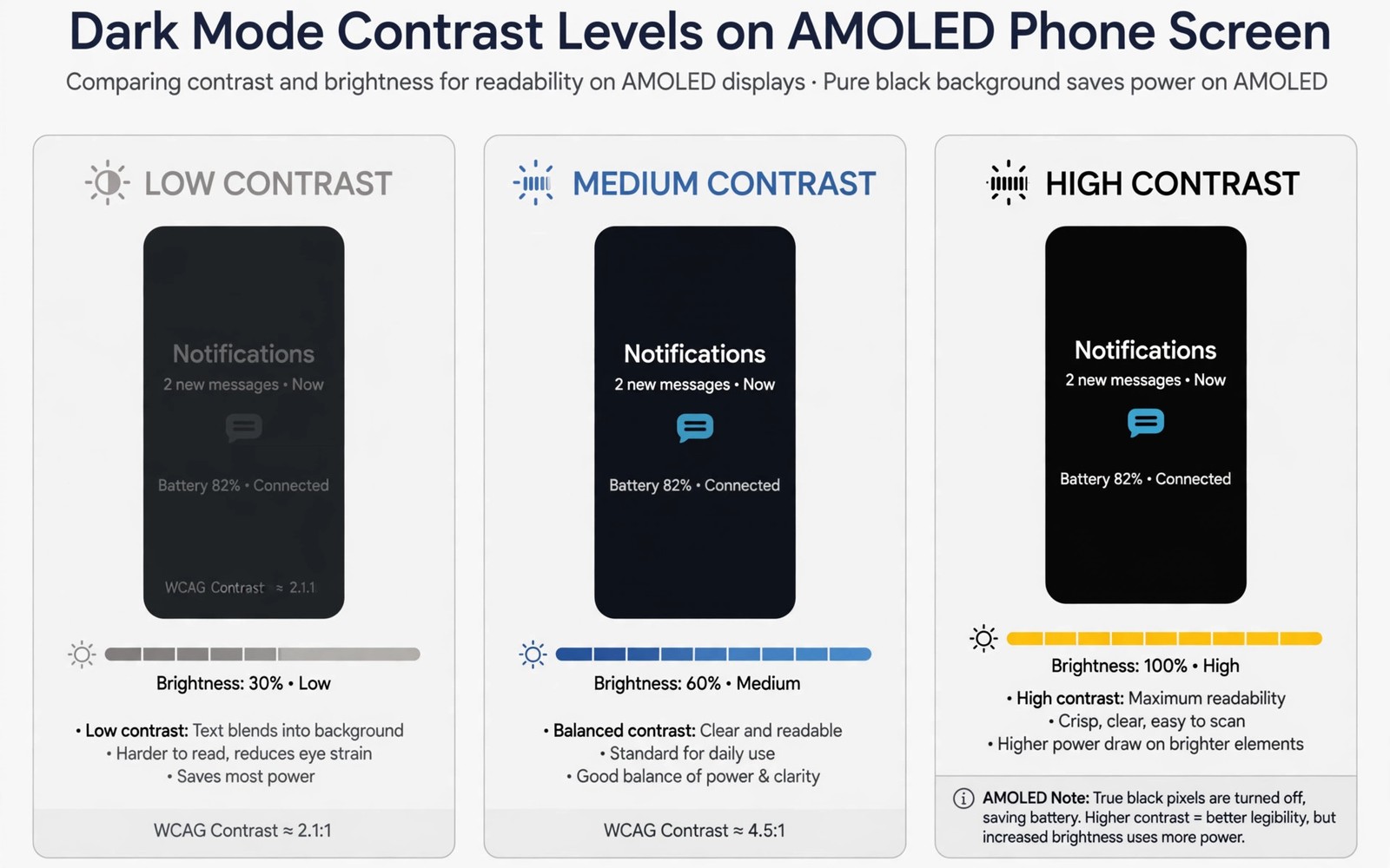
Low contrast uses light grey text on a dark grey background. It feels gentle at night and reduces glare in a dark room. It can hurt readability for small text because letters blend into the background. Use low contrast only for large headings or for night use when your eyes are tired.
Medium contrast uses brighter grey or off-white text on a near-black background. It suits most daily reading because letters stay clear without harsh glare. High contrast uses pure white text on pure black. It suits bright rooms and users who need maximum clarity. Test all three levels with the same paragraph so the comparison stays fair.
Accessibility standards back this up. The WCAG guidelines recommend a contrast ratio of at least 4.5 to 1 for normal text and 3 to 1 for large text. On AMOLED, pure white on pure black reaches roughly 21 to 1, which is far above the standard and can feel harsh. Medium grey text on black often lands near 7 to 1, which is clear without glare. That middle zone is where most people settle.
Why AMOLED Makes Contrast Choices More Sensitive
On an LCD screen, black is really dark grey, because the backlight always leaks a little light. On AMOLED, a black pixel is fully off. The jump from off to white is the largest possible brightness step on any phone display. That is why a setting that looks fine on LCD can feel glaring on AMOLED, and why grey text that reads well on LCD can vanish on AMOLED.
AMOLED also changes how colours behave. Saturated colours glow against black, which is beautiful for photos and harsh for long reading. Muted accent colours read better at night than neon ones. Keep that in mind when you pick a theme colour to go with your contrast level.
Contrast and Brightness Are Different Settings
Contrast is the gap between text and background. Brightness is the overall light level of the screen. Raising brightness does not fix poor contrast; it only makes a poor contrast brighter. Fix contrast first, then set brightness for the room. That order saves battery and saves your eyes.
Set Dark Mode and Contrast in Display Settings
Open Settings, go to Display, and turn on dark mode if it is off. Look for a dark mode style or theme option on your phone. Some phones offer a standard dark mode and an enhanced contrast mode. Enhanced contrast usually darkens backgrounds further and brightens text. Turn it on and read a message thread for a few minutes.
On Pixel phones, dark mode lives in Settings, then Display, then Dark theme, with a schedule option for sunset to sunrise. Samsung phones put it under Settings, then Display, then Dark mode, with a separate Extra Dim option in Accessibility that lowers brightness below the normal minimum. OnePlus and Xiaomi offer similar controls under Display, sometimes with a dedicated dark mode style menu.
Check the setting in a bright room as well as indoors. A setting that looks perfect at home can look washed out outside. Material colour tweaks interact with dark mode because accent colours change how buttons look. Pick an accent that stays visible on a dark background.
Turn On High Contrast Text and Bold Text
Android includes a high contrast text option in accessibility settings. On most phones it lives in Settings, then Accessibility, then Display, then High contrast text. It adds outlines or stronger colours to text across the system. Try it if medium contrast still feels faint.
Bold text is the quiet hero of dark mode tuning. It lives in the same accessibility area. Bold text thickens letters and makes medium contrast feel like high contrast, without making the screen harsh. That trick helps many users who find pure white text glaring but grey text too faint. Test bold text with your chosen contrast level for a full day before you judge it.
Extra Dim for Night Reading
Extra Dim, available on Pixel and Samsung phones, drops screen brightness below the normal minimum. It pairs well with low contrast at night. A dim screen with soft grey text is the gentlest combination for reading in a dark room. Turn it off in the morning, because the same setting looks muddy in daylight.
Tune Text Size and Bold Text Together With Contrast
Contrast and text size work together. Larger text needs less contrast to stay readable. Smaller text needs more contrast to stay clear. If you read small text often, raise contrast rather than shrinking text further. If you use large text, you can keep contrast softer for comfort.
Font size lives in Settings, then Display, then Font size, and display size sits beside it. Raising display size enlarges everything, including buttons, while font size only enlarges text. For reading comfort, font size is usually the better lever. Set it one step larger than default, then soften contrast by one step and see whether reading still feels clear.
SystemUI colour control can help when a specific bar or panel stays too faint. A single faint panel can ruin an otherwise good setup. The guide to SystemUI colour control explains how to adjust those elements when the standard settings do not reach them.
Fix Apps That Ignore System Contrast
Some apps use their own dark theme and ignore the system contrast setting. An app may show grey text on a dark grey card even when the system uses high contrast. Check the app theme settings first and set the app to follow the system theme. Most well-made apps offer a “follow system” option in their appearance menu.
If the app lacks that option, raise its internal text size or switch its theme to light for reading. A web browser may also ignore system contrast on some pages. A reader mode can fix a difficult page by showing black text on white, or white text on black, in a clean layout. Use reader mode for long articles when the original page contrast is poor. Do not fight a bad page design when a clean reader view exists.
Force Dark Mode for Stubborn Apps
Developer options include an “Override force-dark” toggle that forces a dark theme on apps that do not offer one. It works well for many apps, though some look wrong because their colours were never designed for dark backgrounds. Try it for one stubborn app at a time, and turn it off for any app it breaks. To reach Developer options, tap the build number in Settings, then About phone, seven times.
Per-App Theme Shortcuts
Some phones let you set dark mode per app from the app info screen. Long-press the app icon, tap App info, and look for a theme or appearance option. This is the cleanest fix when only one or two apps misbehave, because the rest of the system keeps your chosen setting.
Test Contrast in Real Light Conditions
Test your setup in three lights before you settle. Test indoors with normal room light. Test outdoors in sunlight. Test at night in a dark room. Each light changes how contrast feels. A level that passes all three tests is a good daily setting. A level that passes only one test needs adjustment.
Keep a note of the setting that passes all three tests. System updates can reset display settings, and a note restores them fast. Ambient display settings deserve the same test, because a dim always-on display can hide low contrast text. A setup that works on the full screen and on the dim screen is complete.
The Three-Light Test, Step by Step
Read the same paragraph in each light for two minutes. Indoors, note whether small text feels faint. Outdoors, note whether the screen washes out and whether raising brightness fixes it or only makes glare worse. At night, note whether your eyes tire or the screen feels like a lamp. Adjust one step at a time and repeat the failing test. Changing one thing at a time tells you which change actually helped.
Dark Contrast for Reading Long Articles
Long articles demand a contrast level that stays comfortable for twenty minutes or more. A high contrast setting that feels sharp for a message can feel harsh for a long read. Test your chosen level with a full article rather than with a short message. Read for ten minutes and notice whether your eyes tire. If they tire, soften the contrast by one step and test again.
Reader mode in a browser can help when an article site uses poor contrast. Reader mode strips the site design and shows clean text on a controlled background. Use it for articles longer than a few minutes. Keep the browser text size slightly larger for long reads so contrast does not have to work as hard.
Contrast for Different Screen Sizes and Colour Vision
A small phone screen needs higher contrast than a large tablet screen because letters are smaller. A contrast level that works on a tablet may feel faint on a phone. Test the same level on each device you use for reading. Foldable phones add another case, because the inner screen is larger and brighter than the outer one. Check both screens after setting contrast.
Contrast is not only about brightness. Text that relies only on colour to convey meaning can fail for users with colour vision differences. Use brightness contrast as the main signal and colour as a secondary signal. A button that is both brighter and a different colour than its background works for more people than a button that differs only in colour. Test your dark mode palette by viewing it in greyscale. If text still stands out in greyscale, brightness contrast is doing its job.
Avoid red and green as the only difference between two states in dark mode. A toggle that is red when off and green when on can confuse users who cannot distinguish those colours. Add a shape or a position change to the toggle as well. System accessibility settings can simulate colour vision differences for testing. Turn on a simulation mode and view your dark mode setup through it. If text remains readable under simulation, your contrast choices are robust.
Frequently Asked Questions About Dark Mode Contrast
What contrast level is best for AMOLED?
Medium contrast suits most users for daily reading. High contrast suits bright rooms and users who need maximum clarity. Low contrast suits night use and large text only. Test all three in real light before choosing, because the right answer depends on your eyes and your rooms, not on a single recommendation.
Does high contrast drain more battery on AMOLED?
High contrast with white text lights more pixels than grey text, but the difference is small for text screens. A full white screen costs far more than a dark screen with bright text. Keep backgrounds dark and the battery impact stays low. The biggest battery factor is screen brightness, not contrast level.
Why does dark mode look different in each app?
Apps can define their own dark colours and ignore system contrast. Set each app to follow the system theme where possible. For apps without that option, adjust text size inside the app or use the force-dark toggle in Developer options for that app alone.
Can dark mode cause eye strain by itself?
Dark mode does not cause eye strain by itself, but the wrong contrast level can. Pure white on pure black can glare at night, and faint grey on black can force your eyes to work harder. The fix is the same either way: test medium contrast, add bold text if small letters stay faint, and check your setup in the three lights where you actually read.
The Bottom Line: Test in Three Lights, Then Write It Down
Open Display settings today and test low, medium, and high contrast with the same paragraph. Check the winner outdoors and at night before you keep it. Turn on bold text if small text still feels faint. That three-light test gives you a dark mode that stays readable all day.
Write the winning setting down so an update cannot silently undo it. Revisit your contrast choice after changing your phone or your glasses. A new screen with different brightness can change how the same level feels. Adjust by one step at a time and test for a full day. A contrast setting is personal to eyes and hardware together, and keeping it tuned to both ensures reading stays comfortable as either changes.

