

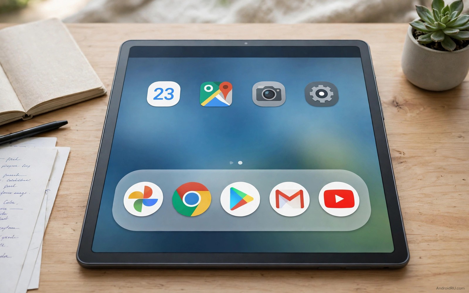
A macOS style dock sits centred at the bottom of the screen as a floating bar. App icons rest on a translucent shelf with a subtle reflection. The dock magnifies icons as your finger or cursor passes over them. Recent apps appear at one end separated by a divider. This design feels like a desktop because it separates running apps from pinned favourites while keeping both in one place. On an Android tablet it turns a phone like home screen into a workstation.
Tablets benefit most from a dock because they have width to spare. A phone dock holds four apps in a cramped row. A tablet dock can hold ten or more apps with room for magnification. The dock becomes a taskbar for multitasking. You can switch apps without returning home. You can drag an app from the dock into split screen. That desktop behaviour is what tablet users want when they use a tablet for work.
Getting the look requires a launcher or a dock tool that supports floating centred docks. Stock tablet launchers often use a full width bar that stretches edge to edge. A macOS style dock is narrower and it floats above the wallpaper with rounded corners. The visual difference is immediate. A floating dock looks intentional and modern. A full width bar looks like a leftover phone layout stretched to tablet size.
Set up a centred floating dock on your tablet
Open your launcher settings and find dock settings. Look for dock style and position options. Choose a floating dock if available. Set alignment to centre. Set width to fit content rather than full width. The dock should shrink to the number of icons it holds. Add five favourite apps first and watch the dock size adjust. A dock that grows and shrinks with its contents feels alive and desktop like.
Background style matters for the macOS look. Use a translucent blurred background with a subtle border. A solid dark background looks like a phone dock. A translucent background lets wallpaper show through softly. Test the dock over a bright wallpaper and over a dark wallpaper. Translucency should adapt or stay readable in both cases. If the dock vanishes over a bright wallpaper then increase its opacity slightly. Readability must survive translucency.
Icon size and spacing define the dock feel. Use medium to large icons so magnification has room to work. Space icons evenly with a small gap between them. A cramped dock looks like a phone dock. A spacious dock looks like a desktop dock. Test icon size in landscape because tablets are used in landscape most often. Icons that look right in portrait may look small in landscape where the screen is wider.
Position the dock with a bottom margin so it floats above the screen edge. A margin of a small amount creates the floating effect. A dock glued to the edge looks like a system bar. A dock floating slightly above the edge looks like a desktop shelf. Test the margin with a keyboard open. The dock should hide or move when the keyboard appears so it does not overlap typing. Keyboard behaviour is part of a good dock setup.
Add magnification and recent apps like a desktop
Magnification is the signature macOS dock effect. Icons grow as the pointer passes over them and shrink as it moves away. On a tablet with touch this effect works best with a mouse or a stylus. With a finger the effect is less precise because the finger covers the icon. Enable magnification if you use a mouse or a stylus often. Disable it if you use touch only and find it distracting. A touch only tablet benefits more from large static icons than from magnification.
Recent apps section adds desktop functionality. It shows apps you opened recently after a divider. This section helps multitasking because you can return to a recent app without opening the app drawer. Enable recent apps in dock settings if available. Limit recent apps to three or four so the dock does not grow too wide. A dock with too many recent apps becomes a second app drawer and loses its focused feel.
Running indicators show which dock apps are currently open. A small dot under an icon indicates a running app. This indicator helps you switch to an open app rather than launching a new instance. Check whether your dock tool supports running indicators. If it does then enable them. A dot is a small detail but it transforms the dock from a shortcut bar into a task manager. Desktop users rely on that dot unconsciously.
Drag and drop from the dock enables split screen on many tablets. Drag an icon from the dock to the left or right edge to open it in split view. Test this with a browser and a notes app. The drag should feel smooth and the split should activate without a menu. If drag fails then check split screen settings in your launcher. A dock that cannot drag into split screen is only a visual copy of a desktop dock. Real desktop behaviour requires drag support.
Organise dock apps by task and frequency
Dock apps should be your most used tools. Place browser and email and notes and files in the main section. Place media and social apps in the recent section rather than pinning them. This separation keeps work tools always visible while leisure apps appear only when recently used. A dock organised by task supports focus. A dock organised by habit alone can fill with distractions.
Order matters for muscle memory. Place the most used app near the centre where your hand rests. Place less used apps toward the edges. This centre weighted order reduces travel distance for frequent switches. Test the order for a week. If you repeatedly reach for an app at the edge then move it inward. Dock order should evolve with your usage rather than staying fixed from setup day.
Folders in a dock are usually a mistake. A folder inside a dock adds a tap and hides apps. The dock should show apps directly. If you need more than twelve pinned apps then your dock is trying to be an app drawer. Move less used apps to the home screen or to folders there. Keep the dock to ten apps at most. A focused dock is faster than a crowded one.
Seasonal apps can rotate in and out of the dock. A travel app can join the dock during a trip and leave afterwards. A study app can join during a course. Rotate apps monthly based on current projects. This rotation keeps the dock relevant without growing it. A dock that reflects current work feels alive. A dock frozen with old projects feels like a museum. You can coordinate dock apps with launcher alternatives worth trying that support floating docks well.
Fix dock conflicts with gestures and keyboards
Gesture navigation can conflict with a floating dock because both use the bottom edge. A swipe up from the dock area may trigger home instead of opening a dock app. Test gestures with the dock in place. If conflicts occur then increase the dock bottom margin or reduce gesture sensitivity. A clear separation between dock tap zone and gesture zone prevents misfires. Tap should open apps. Swipe should navigate.
Keyboard overlap is another common conflict. A floating dock that stays visible over the keyboard can block the space bar area. Set the dock to hide when the keyboard opens. Test typing in a notes app with the dock setting on. The keyboard should have full height. If the dock still overlaps then choose a launcher with better keyboard handling. Typing comfort outranks dock visibility.
Full screen apps need a dock rule too. Games and video players should hide the dock automatically. A dock over a game control can cause wrong taps. Set full screen apps to hide the dock or to show it only on swipe from the bottom. Test in a game you play often. The dock should not appear during gameplay unless you deliberately swipe for it. Accidental dock appearance during a game is disruptive.
Performance on older tablets can suffer with translucent blurred docks. Blur over a live wallpaper costs graphics power. If the dock lags when opening then switch to a semi opaque background without blur. The dock will still look floating but it will render faster. A fast opaque dock beats a laggy blurred dock for daily work. Performance is part of the desktop feeling.
tablet_dock = {"style": "floating centred", "max_pinned": 10, "recent_apps": 3, "magnification": True}
print(tablet_dock["style"])
The code above is an original example created for this article to show how a tablet dock plan could be written down as a simple set of choices. It is a planning aid and not a file you must run on your tablet.
Dock apps also benefit from fast system access and custom quick settings tiles can handle toggles while the dock handles app switching.
Common mistakes
The biggest mistake is pinning too many apps to the dock. A dock with twenty icons is not a dock. It is an app drawer at the bottom of the screen. Keep pinned apps to ten at most. Let recent apps handle the rest. A focused dock switches faster because your eyes find the right icon instantly.
Another mistake is enabling magnification for touch only use. Magnification shines with a mouse or stylus. With a finger it can feel jittery because the finger covers the growing icon. Disable magnification if you use touch only. Large static icons serve touch users better. Match the effect to your input method.
People also forget keyboard and full screen behaviour. A dock that overlaps the keyboard or a game ruins the desktop illusion. Set hide rules on day one. Test typing and gaming with the dock in place. A dock that respects other interfaces feels professional. A dock that fights them feels like a theme pack.
Frequently asked questions
Can I get a macOS dock without root on a tablet?
Yes launchers and dock tools offer floating centred docks without root. Root allows deeper system dock changes but it is not needed for the look and for basic drag functionality. Start with a launcher that supports floating docks. Judge the result before considering deeper methods.
Will a floating dock work in portrait mode?
Yes a floating dock works in portrait but it holds fewer apps comfortably. In portrait the dock width is limited. Keep pinned apps to six or seven in portrait. The dock will still centre and float. Test both orientations and let the dock shrink to content in each. A dock that adapts to orientation feels native.
Does a dock help multitasking on Android tablets?
Yes a dock with recent apps and drag to split screen helps multitasking significantly. It reduces trips to the home screen and to the app drawer. Combined with running indicators it becomes a taskbar. You can refine multitasking alongside live status bar controls for fast system access during split screen work.
Conclusion
A macOS style dock on a tablet works when it floats centred with ten pinned apps and recent apps separated by a divider. Set translucency and magnification to match your input method. Your concrete next step is to enable a floating centred dock tonight with five favourite apps. Use it for split screen work tomorrow. If drag to split feels natural then add recent apps and running indicators next.

