

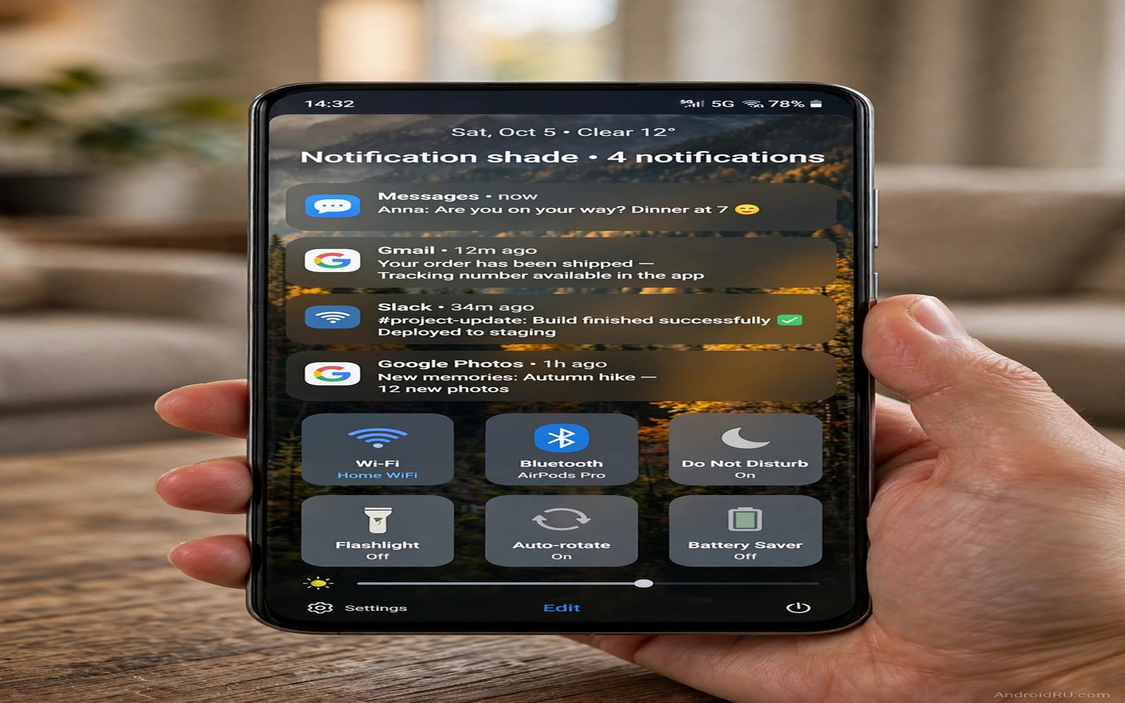
The notification shade is a panel you pull down dozens of times a day. By default it shows a plain colour or a blurred version of your wallpaper. Replacing that background with a personal image turns a functional panel into a personal space. A family photo or a travel memory or a favourite artwork can sit behind your notifications. The trick is to keep notifications readable while the image shows through. A beautiful shade that hides messages is a failed design.
Personal images work best when they are calm and simple. A photo with a large sky area or a soft out of focus background lets text stand out. A photo with many faces and sharp details competes with notification text. Choose an image where the main subject sits at the bottom or at the edges. Leave the centre relatively quiet for notifications to occupy. That composition gives both the photo and the messages room to breathe.
Opacity and dimming are the controls that make personal images practical. A full strength photo behind white text can wash out words. A dimmed photo with a dark overlay keeps the image visible while restoring contrast. Most shade customisation tools let you set background opacity and overlay darkness separately. Start with a moderate dim and adjust until every notification reads clearly in daylight and at night.
Choose and prepare the right personal image
Pick an image with emotional value and visual simplicity. A landscape from a trip often works better than a group photo because landscapes have large quiet areas. A pet photo with a plain background also works well. Avoid screenshots and documents as shade backgrounds because their text clashes with notification text. The shade already contains text. Adding more text from the background creates confusion.
Crop the image for the shade ratio. The shade is tall and narrow when fully expanded. A landscape photo cropped to portrait may lose its subject. Choose a portrait original when possible. If you only have a landscape image then crop a section that still tells the story. A mountain peak or a beach horizon can survive cropping better than a group of people. Test the crop in the shade before you settle.
Reduce contrast in busy areas before you apply the image. Use a simple editor to blur the background slightly or to darken the top area where notifications appear. A gentle blur on the photo itself helps text stand out without needing a heavy overlay. This preparation step is worth ten minutes because it improves every pull down for months. A prepared image beats a raw photo for shade use.
Keep a small collection of three shade images and rotate them monthly. A single image can become invisible through familiarity. Rotation keeps the shade feeling personal without rebuilding settings each time. Save the three images in a dedicated folder so you can switch quickly. Note which image works best in daylight. That daylight winner should be your default for outdoor use.
Apply the image with opacity and overlay controls
Open your shade customisation tool and find the background image setting. Select your prepared photo. Set background opacity to a middle value first. A value around seventy percent lets the photo show while keeping panel structure visible. Pull down the shade and read three notifications. If any word blends into the photo then increase the dark overlay by a small step. Repeat until all three read clearly.
Quick settings tiles need their own contrast check. Tiles sit at the top of the shade over the same image. Filled tile backgrounds help because they create small contrast islands. If tiles use transparent backgrounds then they may vanish over a bright photo area. Switch tiles to filled style when using a personal image. Filled tiles look deliberate and they keep controls findable.
Brightness slider visibility matters too. The slider track must stand out against the photo. Use a slider style with a thick track and a large thumb. Test the slider while walking. If you cannot find the thumb quickly then increase its contrast or its size. A shade that looks great but hides its brightness control fails a basic usability test. Controls must remain obvious even over a personal photo.
Test the shade over different app backgrounds because the shade image replaces the app behind it. The image should look consistent whether you pull down over a game or over a browser. If the image shifts or scales differently in different apps then your tool may be using a live blur layer. Disable live blur for the shade when using a static personal image. A static image should stay static.
Keep notifications readable in all lighting
Daylight is the hardest test for a photo shade. Sunlight washes out screens and reduces contrast. A photo shade that reads indoors may fail outdoors. Take the phone outside and pull down the shade in direct light. Read a message preview and a calendar notification. If either is hard to read then increase overlay darkness for daytime use. Some tools support separate day and night shade profiles. Use them if available.
Night use has the opposite problem. A bright photo shade in a dark room can glare. Set a night profile with a darker overlay and lower brightness. The photo will still show but it will not dominate the room. A night shade should feel calm. If the photo glows at night then dim it further. Comfort at night matters more than photo vividness.
Text colour choice interacts with the photo. White text works over dark photos. Dark text works over light photos. Adaptive text that switches based on background brightness is ideal if your tool supports it. If adaptive text is unavailable then choose a photo with a consistent tone. A consistently dark photo with white text is safer than a mixed photo that needs both text colours. Consistency simplifies readability.
Notification icons also need contrast. Small app icons over a photo can blend into similar colours. Use a notification style with icon backgrounds or badges that outline icons. A subtle icon container helps icons stand out without hiding the photo. Test with icons from your most used apps. If a familiar icon becomes hard to spot then adjust overlay or icon style. Icons are the fastest way to identify a notification and they must stay clear.
Protect privacy while showing personal images
A personal photo in the shade is visible to anyone who glances at your phone when you pull it down. A family photo may reveal people you prefer to keep private. A travel photo may reveal a location. Consider this visibility before you choose an image. A landscape or an artwork reveals less than a photo of people. Choose a photo you are comfortable showing to a colleague who glances over.
Lock screen shade behaviour deserves separate attention. The shade on the lock screen may show notification previews over your personal image. If previews reveal message content then hide sensitive previews on the lock screen. Keep the personal image but limit preview detail. This combination gives you a personal lock shade without leaking private messages. Privacy settings and shade style should be set together.
Sharing screenshots of the shade can also reveal the personal image. If you share a screenshot for support then the shade photo will be visible in it. Crop screenshots to the relevant notification when sharing. A cropped screenshot protects the personal image and it focuses the recipient on the issue. This habit is especially important for family photos.
Finally keep the original photo backed up separately. Shade tools may compress the background image. If you later want the full quality original then you need the backup copy. Store originals in your photo backup and use a copy for the shade. That separation protects quality and it lets you reuse the image for other purposes later. You can coordinate shade style with icon only home screen ideas for a coherent personal interface.
shade_image = "family_trip_landscape.jpg"
shade_opacity = 0.70
shade_overlay_dark = 0.35
print(shade_image, shade_opacity)
The code above is an original example created for this article to show how shade image settings could be written down as a simple preset. It is a planning aid and not a file you must apply on your phone.
A tidy home screen makes the shade feel more personal and icon only home screen ideas can keep icons quiet while the photo shade carries the style.
Shade readability also improves with well placed toggles and custom quick settings tiles can put brightness and Wi-Fi where your thumb expects them.
Common mistakes
The biggest mistake is using a busy group photo as a shade background. Faces and details compete with notification text and the shade becomes hard to read. Choose a simple landscape or a single subject photo. Simplicity is what makes a personal image work in a functional panel. A busy photo belongs in the gallery and not behind notifications.
Another mistake is setting opacity to maximum for vividness. Maximum opacity removes the panel structure that helps text stand out. A moderate opacity with a dark overlay looks more professional and reads better. Vividness should serve readability and not fight it. Dial opacity back until text wins.
People also forget to test in daylight and at night. A shade that looks perfect indoors can fail in both extremes. Test outside in sunlight and in a dark room before you settle. Adjust day and night profiles separately if possible. Real lighting is the final judge for a shade background.
Frequently asked questions
Will a personal shade image drain battery?
A static personal image uses almost no extra battery because it is a single picture. Live or animated shade backgrounds use more because they redraw constantly. Choose a static image for daily use. Battery impact should be negligible with a static photo and moderate overlay settings.
Can I use different images for shade and wallpaper?
Yes shade background and home wallpaper are separate settings in most customisation tools. You can keep a calm wallpaper for the home screen and a personal photo for the shade. This separation lets each surface serve its purpose. The home screen can stay minimal while the shade carries personal meaning.
Does a shade image affect notification privacy?
The image itself does not change notification privacy settings. Preview visibility is controlled separately in notification settings. Set sensitive previews to hidden on the lock screen if you share your phone screen often. The shade image is visible to onlookers so choose a photo you are comfortable sharing at a glance. You can refine privacy alongside custom lock screen ideas that control what appears before unlock.
Conclusion
A personal shade image works when a simple photo and a dark overlay keep notifications readable in daylight and at night. Choose a calm image and tune opacity until every message reads clearly. Your concrete next step is to prepare one landscape photo with a darkened top area tonight. Apply it as your shade background tomorrow morning. If five notifications read clearly outdoors then keep it and add a night profile next.

