

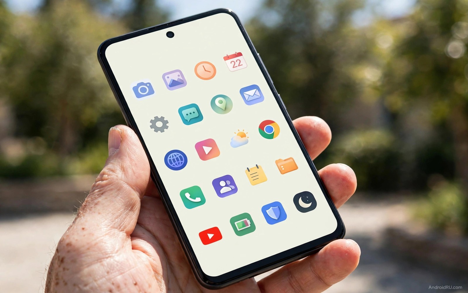
A home screen without app names looks calm at first glance. Icons float on the wallpaper without a wall of small text below them. The screen feels larger because your eyes are not reading twenty labels every time you unlock the phone. This style works best when you already know your apps by icon and colour. It turns the home screen into a visual map rather than a text list.
The risk is confusion during the first week. Similar icons blend together when their names disappear. A blue chat icon and a blue mail icon can look alike at a glance. A banking icon and a shopping icon can share the same colour family. The solution is not to hide every label at once. Hide labels on the main screen first and keep labels on the second screen. Learn the icon map in stages and let muscle memory build before you hide the rest.
Most custom launchers offer a simple toggle for icon labels. Open launcher settings and look for home screen settings or icon appearance. Turn off labels for the home screen only if that option exists. Keep labels in the app drawer so you can still search by name when you forget an icon. This split setup gives you a clean main screen and a readable backup. It also helps guests who borrow your phone because the drawer still explains itself. A clean icon grid also works well beside live wallpapers that stay light on battery because the wallpaper becomes part of the design instead of fighting with text.
Build an icon map you can read without text
Start by choosing icons that are distinct in shape and colour. A circle icon and a square icon are easier to tell apart than two rounded squares in the same blue shade. Use an icon pack that gives each major app a unique silhouette. Avoid packs that force every icon into the same shape and the same muted palette. Uniform packs look tidy in screenshots but they destroy recognition when labels are gone.
Place apps by position and not by alphabet. Put communication apps on the left side where your thumb starts. Put work apps in the centre where your eyes land first. Put media apps on the right side where they are easy to reach with a stretch. Position becomes the label. After a few days you will reach for the top left icon for messages without thinking about its name. That spatial memory is the real engine behind an icon only screen.
Limit the main screen to twelve icons at most. A grid of twenty icons without labels is a puzzle and not a tool. Twelve icons fit in three rows of four and each icon gets enough breathing room to stand out. Move the rest to folders or to a second screen. If you need more than twelve daily apps then your main screen is trying to do too much. Split by context instead of cramming every app onto one page.
Use folders with clear visual cues when you must group apps. A folder icon that shows a preview of its contents is better than a plain folder shape. Put at most six apps in a label free folder. Open the folder and check that you can identify each app by icon alone. If you hesitate for more than two seconds on any icon then that app needs a distinct icon or a different folder. Hesitation is data and it tells you where the map is weak.
Hide labels the safe way in your launcher
Open your launcher settings and find the label toggle. Some launchers hide labels globally with one switch. Others let you hide labels per screen or per folder. Choose the narrowest option first. Hide labels on the home screen and keep them in folders and in the drawer. Test the result for one day. If you feel lost then restore labels for folders only. A partial hide still looks clean because the main screen is what you see most.
Check the dock separately because many launchers treat the dock as its own area. A dock without labels looks sleek and it is easy to learn because it holds only four or five apps. A dock with labels can look cluttered because the text sits close to the screen edge. Hide dock labels first if you want a quick win. Keep home screen labels for a few more days while your thumb learns the dock positions.
Font size tricks do not replace a real toggle. Setting label text to the smallest size still leaves faint text that clutters the wallpaper. Setting label colour to match the wallpaper creates invisible text that reappears on a new wallpaper. Use the official toggle when it exists. If your launcher has no toggle then switch to a launcher that does. A hack that breaks on the next wallpaper change is not a clean setup.
After hiding labels take a screenshot and review it like a stranger would. Can you name every icon in under ten seconds. Can you find your bank app without tapping the wrong icon. Can you find your camera app in bright sunlight. If any answer is no then change that icon or move that app. A clean screen must also be a fast screen. Beauty that slows you down is not minimalism and it is just decoration.
Keep labels where they still earn their place
Some apps should keep their labels even in a mostly icon only setup. Banking and health and work apps deserve labels because a wrong tap can open sensitive data or send a message to the wrong person. Keep labels for any app you open less than once a week because you will not build spatial memory for it. Keep labels for new apps for the first month until their icons become familiar. These exceptions do not ruin the clean look because they affect only a few icons.
Widgets are another place where text helps. A calendar widget without text is useless. A task widget without text shows coloured blocks with no meaning. Let widgets keep their text while icons stay silent. The contrast actually helps because your eyes learn that text means information and icons mean actions. A screen that mixes both roles clearly is easier to scan than a screen that hides all text everywhere.
Folders for rarely used tools should keep labels too. A folder named travel is more useful than a folder icon with four tiny previews. You open that folder only on trips and you will not remember its contents by position. A short folder name at a glance saves a tap and a guess. Treat folder names as signs on a road and not as clutter. Signs exist to prevent wrong turns.
Accessibility is the final reason to keep some labels. Voice control and screen readers rely on app names even when visual labels are hidden. Test your setup with voice commands after hiding labels. Say the app name and confirm that it still opens. If voice control fails then restore labels or adjust the launcher accessibility settings. A clean screen should never lock out a legitimate way of using the phone. You can explore related visual controls through live status bar controls that add information without adding text clutter to icons.
Match icons wallpaper and grid for a calm result
A clean icon screen needs a calm wallpaper. A busy photo with many colours competes with icons and makes them hard to find. Choose a wallpaper with a large quiet area in the centre or at the top. Place icons over the quiet area and let the interesting part of the photo sit at the edges. A gradient or a soft abstract image works better than a detailed landscape for an icon only layout.
Grid size affects recognition as much as icon choice. A dense grid with small icons makes similar shapes harder to tell apart. A spacious grid with larger icons gives each shape room to breathe. Start with a four column grid and medium icons. Increase icon size slightly if you use the phone outdoors often. Larger icons are easier to hit and easier to recognise in sunlight. Small icons may look elegant indoors but they fail in real light.
Colour harmony matters when labels are gone. Icons with wildly different styles clash and slow recognition. Choose one icon pack for all apps and let the launcher fill gaps with a consistent shape. Avoid mixing a realistic icon pack with a flat icon pack on the same screen. Consistency helps your brain treat the screen as one system rather than a collection of random pictures. That system feeling is what makes a label free screen feel intentional.
Review the setup at night and in daylight. A wallpaper that looks calm in a dark room may look washed out outside. An icon that is clear on a dark background may vanish on a light wallpaper. Test both conditions before you settle. Save your favourite wallpaper and icon pack combination as a preset if your launcher supports it. A preset lets you restore the clean look after an update without rebuilding it from memory.
home_grid_columns = 4
home_grid_rows = 3
show_icon_labels_home = False
show_icon_labels_drawer = True
max_icons_main_screen = 12
The code above is an original example created for this article to show how a label free layout could be written down as a simple set of choices. It is a planning note and not a command you must run on your phone.
Common mistakes
The top mistake is hiding all labels on day one across every screen. The result is a beautiful screen that you cannot use for a week. Hide labels in stages and keep the drawer labelled. Let each stage settle before you hide the next area. Patience turns a gimmick into a habit.
Another mistake is using a uniform icon pack that makes every app look alike. A pack that forces one shape and one colour removes the visual differences that replace labels. Choose a pack with varied shapes and clear brand colours. Test the pack with labels off before you commit to it. If you cannot tell apps apart then the pack is wrong for this style.
People also forget guests and family members who use the phone. A label free screen can confuse a partner who needs to make a call in an emergency. Keep a second profile or a labelled emergency folder with phone and messages and contacts. A clean personal screen should not block urgent use by someone else. Safety is more important than a screenshot.
Frequently asked questions
Will hiding app names affect search?
No search still works by app name because the name exists in the system even when the visual label is hidden. Open the drawer or use launcher search and type the app name as normal. The hidden label only changes what you see on the home screen. It does not rename or remove the app.
Can I hide labels without a custom launcher?
Some stock launchers offer a label toggle but many do not. Check home screen settings first for an icon label option. If no option exists then a custom launcher is the reliable path. Avoid apps that promise to hide labels by overlaying wallpaper patches because those patches break when the wallpaper changes.
How long does it take to learn an icon only screen?
Most people learn a twelve icon screen in three to five days. A larger screen with folders takes one to two weeks. Keep the layout stable during that learning period. Moving icons daily resets spatial memory and extends the confusion. Stability is the fastest teacher for this style and you can pair it with custom quick settings tiles so frequent controls stay reachable while icons stay silent.
Conclusion
An icon only home screen works when position and shape replace text. Keep the main screen small and keep labels in the drawer and for sensitive apps. Your concrete next step is to hide dock labels tonight and leave home screen labels on for three days. If the dock feels natural after three days then hide home screen labels next. That staged move gives you the clean look without the lost week.

