

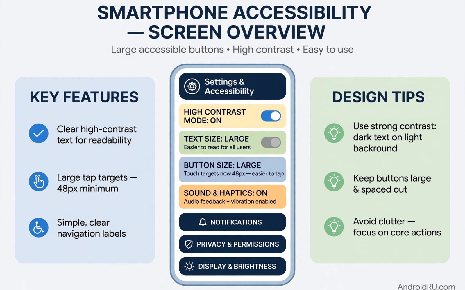
Stop Failing Accessibility Audits: Essential UI Accessibility Rules
Accessibility audits fail for reasons that are often simple to fix. A button is too small. A text colour blends into the background. A screen reader cannot describe an icon. These issues block users who rely on assistive technology, and they also block users with temporary injuries and users in bright sunlight. This guide explains the essential UI accessibility rules that help an Android app pass an audit and serve more people well.
Accessibility is not a separate feature that can be added at the end of a project. It is a property of every screen and every control. A design that ignores contrast will fail no matter how good the code is. Code that ignores content descriptions will fail no matter how good the design looks. The team must check both design and code together, because early checks save rework: a contrast fix late in a project can force a full colour redesign.
An audit usually checks a set of rules against each screen. The auditor uses a screen reader and a magnification tool and a contrast checker. The auditor also checks touch target sizes and focus order. A failure in any area can block release for an organisation that must meet accessibility standards. Passing is not about perfection on day one. It is about meeting the core rules consistently across the app, and this guide covers exactly those rules.
Contrast and Readable Text: The 4.5 to 1 Rule
Contrast measures the difference between text colour and background colour. Small text needs a higher contrast ratio than large text, because small glyphs are harder to read. The WCAG 2.1 AA target is a ratio of at least 4.5 to 1 for normal text, and at least 3 to 1 for large text, which WCAG defines as 18 point or 14 point bold and larger. A contrast checker tool gives an exact ratio for any colour pair, so use it for every text style in the app theme rather than guessing by eye.
Contrast ratios you must hit on every screen
Normal body text needs 4.5 to 1. Large headings need 3 to 1. Icons and controls that carry meaning, such as a checkbox border or a focus indicator, need 3 to 1 against their surroundings. These numbers are minimums, not goals: text at 4.6 to 1 passes the audit but still strains some readers, so aiming for 7 to 1 on body text is a sensible habit. Check contrast in both light and dark themes, because a colour pair that passes in one theme often fails in the other.
How to check contrast in thirty seconds
Open a contrast checker, paste the text colour and the background colour, and read the ratio. Do it for every text style in your theme file, not just the ones on the home screen. A settings screen with low-contrast text will fail even when the home screen passes, and auditors check every screen including dialogs, empty states, and error screens.
Colour alone must never carry meaning
A form error shown only in red will be invisible to a user who cannot distinguish red from green. Add an icon and a text message to every error state. A success state should also use text or an icon in addition to colour. That extra signal helps every user, it helps automated tests that check for error text, and it helps users who view the screen in bright light where colours wash out. The same rule applies to charts: label each line or bar with text, never with colour alone.
Text size must respect the system font setting
Some users increase font size for readability. An app that uses fixed pixel sizes will clip text or overlap controls when the user increases the size. Use scalable text units, sp in Android layouts, and test layouts at the largest system font size. A layout that scrolls cleanly at large text size is a sign of good design. A layout that breaks at large text size will fail an audit and frustrate users. Test with the system font scaled to the maximum in Settings, then fix every clipped label before you move on.
Touch Targets and Focus Order
Touch targets must be large enough to tap reliably. The Android minimum is 48 density-independent pixels in both dimensions. Small icons in a toolbar often fail this rule: a designer may draw a 24-pixel icon and forget the tap area around it. The tap area can be larger than the visible icon, and padding around an icon can bring the target up to the minimum without changing the visual design. That trick solves many audit failures quickly, and it costs nothing visually.
Focus order matters for keyboard users and for screen reader users. Focus should move in a logical order across a screen, starting at the top and moving through headings and controls in reading order. A focus order that jumps randomly confuses users who cannot see the screen layout. Test focus order with a keyboard or with a screen reader in linear navigation mode, and fix any jump by setting focus order explicitly or by restructuring the layout hierarchy.
Interactive elements must show a visible focus indicator. A user who navigates with a keyboard needs to see which element is focused. A faint outline or no outline at all makes navigation guesswork. Use a clear focus colour that contrasts with the background, and test focus visibility on every screen including dialogs and bottom sheets. A dialog that traps focus correctly but hides the indicator will still feel broken.
Screen Reader Support and Content Descriptions
A screen reader reads the content description of an image or an icon. An icon button without a description will be read as unlabeled or as a generic button, and that label gives the user no clue about the action. Give every meaningful icon a short, clear description such as Search, Share, or Back. Decorative images should be marked as not important for accessibility, so the screen reader skips them. That distinction keeps the spoken output concise and useful.
Write descriptions that say the action, not the picture
A button labelled Share does not need a description that says Share button share. A short description that says Share is enough. Overly long descriptions slow screen reader users and hide the important action. Keep descriptions to a few words and focus on the action or the meaning. Readers who explore open-source Android repositories every developer should study will find accessibility samples that show concise descriptions in real projects.
Headings help screen reader users scan a screen
Mark section titles as headings in the layout. A screen reader can then jump from heading to heading instead of reading every element in order. That navigation pattern mirrors how sighted users scan a page visually. Use headings consistently, and do not use a heading style for text that is not a true section title. Misleading headings slow navigation and confuse the user. In Jetpack Compose, use the heading semantics property; in XML layouts, set android:accessibilityHeading to true.
Custom views need extra attention
A custom chart or a custom slider may not expose its value to a screen reader by default. The developer must provide accessibility actions and state information for custom controls. A slider should report its current value and its range. A chart should offer a text summary of the key data. Without that information, a custom control is invisible to assistive technology even when it looks polished on screen. Test every custom view with TalkBack on, and listen to what it actually says.
Code That Sets Content Descriptions and Touch Size
The code below shows a simple pattern for an icon button with a clear description and a minimum touch size. It uses a standard button style and sets padding to reach the target size. Adapt the description text to the action that the button performs, and keep descriptions short and action-oriented so a screen reader can speak them quickly.
val searchButton = ImageButton(context).apply {
    contentDescription = "Search"
    setImageResource(R.drawable.ic_search)
    minimumWidth = 48.dpToPx()
    minimumHeight = 48.dpToPx()
    setPadding(12.dpToPx(), 12.dpToPx(), 12.dpToPx(), 12.dpToPx())
}
Adapt the snippet by using your own icon and your own description. Test the result with a screen reader turned on. Listen to the spoken output for the button and confirm that it matches the action. Also test the tap area with a finger rather than only with a mouse pointer. A tap area that looks large on a big screen may feel small on a compact phone, and real device testing catches those differences.
Jetpack Compose equivalent for the same button
In Compose, the same idea takes fewer lines. Give the IconButton a Modifier.size(48.dp) for the touch target, and pass a contentDescription to the Icon. The semantics system then exposes both the size and the description to TalkBack automatically. Compose also offers a semantics block where you can set heading, state descriptions, and custom actions for more complex controls.
Common Mistakes That Fail Audits
One common mistake is to fix contrast only on the main screen. An audit checks every screen, including settings, error dialogs, and empty states. Apply theme colours consistently across all screens, and check dialogs and sheets with the same contrast tool used for main screens. Consistency is the fastest path to a clean audit.
A third mistake is to disable accessibility services during testing because they feel slow. That habit hides the very issues an audit will find. Test with the screen reader on for a full user journey, from launch to task completion. Note every point where the spoken output is unclear or where focus jumps, and fix those points before release. That journey test is more valuable than a checklist ticked from memory. It also mirrors the care needed when handling lifecycle state changes without crashes, because both require testing a complete flow rather than a single screen.
A further mistake is to treat accessibility as a design-only task. Developers must implement descriptions, focus order, and touch sizes in code. Designers must provide contrast values and heading structure in the design file. Both roles need to review the final app together. A joint review catches mismatches between design intent and code reality, so schedule that review before the audit rather than after a failure. Document the rules your team follows in a short internal guide. A shared guide helps new team members apply the same contrast and touch target rules from their first task, and it makes code review faster because reviewers can point to the guide rather than debating each case from scratch.
Accessibility Audit Rules: Your Questions Answered
What is the minimum touch target size for Android?
The common minimum is 48 density-independent pixels in width and height. That size gives most users a reliable tap area, and smaller targets increase mis-taps and frustration. Use padding to reach the minimum when the visible icon is smaller, and always test tap areas on a real phone with a finger rather than with a mouse pointer in an emulator.
Do decorative images need content descriptions?
No. Decorative images should be marked as not important for accessibility, which tells the screen reader to skip the image. Giving a decorative image a description adds noise to the spoken output. Reserve descriptions for images that carry meaning or that act as controls, and keep those descriptions short.
How can I test accessibility without a specialist auditor?
Use the built-in screen reader and the Accessibility Scanner tool on a test device. Walk through a full task with the screen reader on. Check contrast with a checker tool for every text style. Check touch targets by measuring the tap area in the layout inspector. Those steps catch most common failures before a formal audit, and they cost nothing but an afternoon of testing.
What contrast ratio does WCAG 2.1 AA require?
Normal text needs a contrast ratio of at least 4.5 to 1 against its background, and large text needs at least 3 to 1. Non-text elements that carry meaning, such as focus indicators and control borders, need 3 to 1. These are minimums, and aiming higher, around 7 to 1 for body text, gives a more comfortable reading experience for everyone.
Your Pre-Audit Checklist: Start Today
Start today by running a contrast check on your main screens and by turning on the screen reader for one complete user journey. List every failure you find, and fix touch targets and descriptions first, because those fixes are often quick. Then retest the same journey and confirm that the spoken output is clear and that focus moves logically. That single pass will move your app much closer to a passing audit. It will also give you a stronger base for studying how Camera2 API manages multi-lens hardware switching, because both topics demand careful testing of a complete user experience rather than a single isolated feature. The teams that pass audits are not the teams with the biggest budgets. They are the teams that test the whole journey, fix the small things first, and check every screen.

