

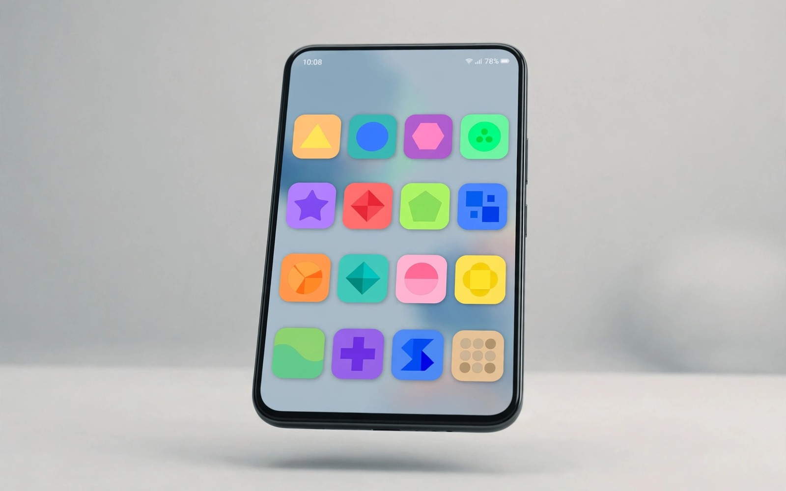
Icons carry the visual identity of a phone more than any other element. You see them every time you unlock and every time you search for an app. A mismatched icon set makes even a powerful phone look unfinished.
Seven icon packs in this guide push Android toward a next generation look. Each pack uses one shape family and one color logic across hundreds of apps. The differences lie in shape and color temperature and detail level.
Judge packs by coverage first and style second. A beautiful pack that covers only half your apps leaves the other half clashing. A complete pack with a quiet style wins over a loud pack with gaps.
Packs one and two: line icons and glass icons
The first pack draws every icon as a thin outline on a transparent background. Outline icons feel futuristic because they reduce each app to its essential gesture. They suit dark wallpapers where thin lines glow softly.
The second pack uses frosted glass shapes with soft color gradients inside. Glass icons feel premium because depth replaces flat color. They suit light wallpapers where the frosted edge stays visible.
Outline and glass styles both appear in the flagship makeover in a flagship look for a budget phone where icon unity sells the premium illusion. Pick the style that matches your wallpaper brightness.
Packs three and four: neon gradients and pastel solids
The third pack fills rounded squares with neon gradients that shift from violet to cyan. Neon packs suit users who want the next generation look to announce itself. They demand a dark wallpaper to avoid visual shouting.
The fourth pack uses soft pastel solids with simple white glyphs. Pastel packs suit users who want modernity without noise. They work on light and dark wallpapers because pastels stay gentle in both.
Pastel logic follows the palette discipline in Material You color tweaks where one calm family beats five loud colors. Let the pack color family match your theme palette.
Packs five to seven: minimal glyphs and retro future and monochrome
The fifth pack reduces each icon to a single minimal glyph on a plain circle. The sixth pack mixes retro shapes with futuristic colors for a playful next generation feel. The seventh pack uses pure monochrome icons that adapt to any wallpaper automatically.
Monochrome deserves special attention for busy users. It never clashes because it adds no color of its own. If you change wallpapers weekly then monochrome saves you from rethinking icons every time.
Monochrome and minimal styles pair with the clean layout in a minimalist aesthetic setup where icons must stay quiet. Loud packs fight minimal layouts and quiet packs complete them.
Test coverage before you commit
Apply a pack and count how many of your daily apps keep default icons. If more than three daily apps stay uncovered then the pack fails your library even if it looks great in previews. Check for pack updates because coverage grows monthly.
Live with the winner for a week and watch for readability problems. An icon that looks clever in a preview but reads poorly at a glance costs you time every day. Readability is the final judge after coverage.
Keep the runner up pack installed during the trial week. Switching packs takes seconds and a fair trial needs an easy fallback. Commit to the winner only after the week proves its readability.
Icon pack scorecard
Score each pack on this card after a week of use. Coverage counts double because gaps break the look instantly. Style counts once because taste adapts faster than coverage grows.
coverage_daily_apps = _ / 5
readability_at_glance = _ / 5
wallpaper_match = _ / 5
total = coverage x 2 + readability + wallpaper_match
The scorecard above was written for this guide as a paper tool for comparing icon packs. Fill it in after a week with each candidate. It runs nowhere and it collects no data.
Design icons for aging eyes and small screens
Icon packs designed for large screens often fail on small phones. Thin lines vanish at small sizes and detailed glyphs blur into blobs. Small screens need bolder shapes and higher contrast.
Test a pack on the smallest screen you own before committing. An icon that reads clearly on a tablet may fail on a compact phone. The smallest device sets the readability standard for the whole set.
Aging eyes need icons with strong silhouettes and clear color differences. Pastel on pastel fails older eyes even when it looks elegant to younger designers. Contrast beats subtlety for daily recognition.
Pair icon testing with font size testing because both affect recognition speed. A larger font beside a small icon creates imbalance. Scale icons and labels together for a harmonious result.
Keep one high contrast pack as a fallback for bright outdoor use. Sunlight washes out subtle packs quickly. A bold fallback pack saves you from squinting through summer afternoons.
Icon pack maintenance across Android updates
Android updates sometimes change icon shapes at the system level and pack makers must adapt. A pack designed for round icons may look odd when a new version favors squircle shapes. Pack updates usually follow system updates within weeks. Check for pack updates after every major system upgrade before judging the new look harshly.
Adaptive icons complicate pack maintenance because apps provide foreground and background layers separately. A pack that replaces only the foreground may leave a mismatched background behind. Good packs replace both layers or mask backgrounds consistently. Test packs after updates by viewing the drawer where adaptive effects show most clearly.
Some manufacturers add their own icon masking on top of packs. That double masking can crop pack icons unexpectedly or add unwanted backgrounds. If icons look cropped after an update then check manufacturer theme settings for a masking option to disable. Disabling double masking usually restores the pack design immediately.
Pack makers retire packs occasionally and retired packs stop gaining coverage for new apps. A retired pack slowly accumulates uncovered apps as you install new software. Check the pack store page for recent update dates before committing long term. A pack updated within the last three months is actively maintained.
Archive your favorite pack choices with version numbers in your setup notes. When a pack update changes a beloved icon for the worse you can report it precisely with the version number. Precise reports help makers fix regressions faster than vague complaints about a recent change.
Icon packs and cultural design differences
Icon design carries cultural meanings that vary across regions and a pack designed in one culture may misread in another. Color symbolism differs sharply by culture. White signifies purity in some cultures and mourning in others. Red signifies luck in some cultures and danger in others. A pack using culturally loaded colors for neutral apps can confuse users from different backgrounds. Neutral palettes travel better across cultures than symbolic ones.
Glyph meanings also vary culturally. Hand gestures depicted in icons mean different things in different countries. An icon showing a thumbs up gesture is positive in many places but offensive in a few. Animal symbols carry different associations across cultures as well. Pack designers aiming for global audiences should favor abstract shapes over culturally specific gestures and animals.
Text in icons creates localization problems because a letterform meaningful in one language may mean nothing in another. Packs using English initials for apps fail users who do not read English. Abstract glyphs without letters travel better globally. When letters are unavoidable choose the most universally recognized initial for each app category rather than brand specific letters.
Reading direction affects icon layout expectations. Right to left languages reverse visual flow and icons designed for left to right scanning may feel backward. Packs with strong directional arrows or progress indicators need mirrored variants for right to left locales. Ignoring reading direction makes icons feel subtly wrong even when users cannot articulate why.
Religious symbolism in icons requires sensitivity because some symbols carry sacred meanings. Using a sacred symbol as a generic decoration for an unrelated app can offend users who revere it. Pack designers should avoid religious symbols entirely unless the app itself is religious. That avoidance respects diverse users without limiting creative expression meaningfully.
Finally remember that global pack success requires testing with users from multiple cultures before release. A pack tested only in its home culture may carry blind spots that global users notice immediately. Diverse testing groups catch cultural misreads early when fixes are cheap. Cultural sensitivity in icon design is both respectful and commercially wise for packs seeking worldwide audiences.
Common mistakes
Icon pack choices fail in familiar ways. Avoid these.
- Choosing a pack for preview beauty while it covers half your daily apps.
- Mixing two packs on one screen so the shape family breaks instantly.
- Picking neon gradients for a light wallpaper where they shout too loudly.
- Judging readability from a large preview instead of a small home icon.
- Forgetting to check for pack updates that add missing app coverage.
Frequently asked questions
Do icon packs need a special launcher?
Most icon packs need a launcher that supports pack application. Stock launchers on some phones support packs directly. Check your launcher settings before buying a pack.
Will a pack change icons inside apps?
No because a pack only changes the launcher surface. Icons inside an app stay as the app designer made them. The home screen and drawer are where packs work.
Can I request missing icons from the pack maker?
Many pack makers accept requests through the store listing. Send the app name and package name if you know it. Popular apps usually gain coverage in the next update.
Conclusion
Seven icon packs now offer you outline and glass and neon and pastel and minimal and retro future and monochrome paths to a next generation look. Coverage plus readability picks the winner for your library.
Your concrete next step is to apply the monochrome pack tonight if you change wallpapers often or the pastel pack if you keep one wallpaper. Count uncovered daily apps tomorrow and switch if more than three remain.

