

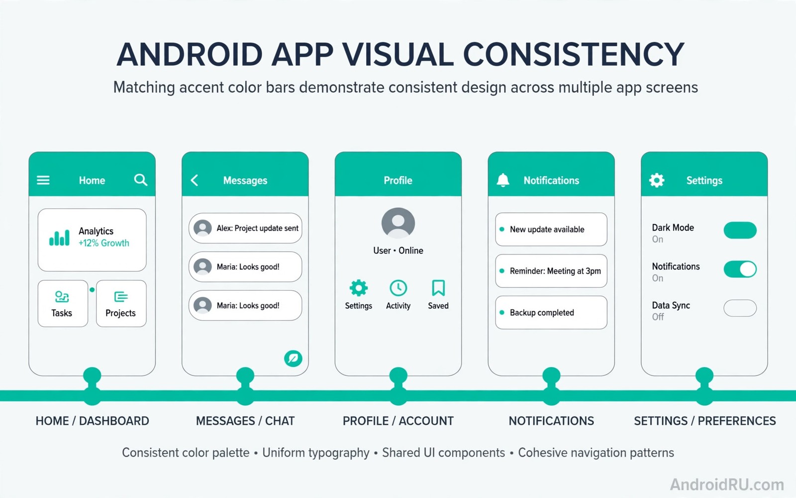
System visual consistency is the feeling that every app on your phone belongs to one family. Buttons share shapes and cards share corners and accents share hues. Material You improves that feeling by giving all apps one color language drawn from your wallpaper. The phone stops feeling like a bag of separate products.
This guide explains how shared roles and shapes and motion create that family feeling. You will learn why some apps feel native and others feel foreign. You will also learn what users and developers can do to close the gap. If you want the color engine behind the roles then read about dynamic color engine basics first and then return to the consistency picture here.
Consistency is not about making every app identical. A messaging app and a banking app should keep distinct jobs and distinct layouts. Consistency means shared atoms like color and shape and type so distinct apps still feel related. That distinction keeps the system calm without making it boring.
Shared atoms build the family feeling
Color roles are the strongest consistency atom because they travel across apps without code sharing. A primary button in one app and a primary button in another app both read the same system role. A theme change then updates both buttons at once. Users learn one color meaning and they apply it everywhere without thinking.
Shape roles are the second atom and they shape cards and sheets and buttons. A medium corner radius on cards across apps creates a rhythm the eye trusts. An app with sharp corners everywhere breaks that rhythm even when its colors match. Shape consistency is subtle and users notice its absence more than its presence.
Typography and motion form the third layer and they carry tone across the system. A shared type scale keeps headings proportional from app to app. Shared motion curves make transitions feel like one system instead of many stitched products. Together these atoms let apps differ in content while they agree in character.
Audit consistency on your phone
Open the same task in three apps and compare the atoms rather than the features.
- Pick three apps you use daily such as messages and mail and calendar.
- Open a primary action screen in each app and compare button colors.
- Compare card corners and sheet corners across the same three apps.
- Compare heading sizes and body text sizes on similar content screens.
- Note which apps follow the system palette and which keep fixed brand colors.
- Check dark mode in each app to see if consistency survives the switch.
- Rank the apps from most native to most foreign by atom agreement.
- Replace or theme the worst offender first if a better alternative exists.
Practical tips for a consistent system
Favor apps that adopt system roles when you choose between similar tools. A notes app with dynamic color will age better with your themes than a notes app with fixed brand colors. Feature parity matters but a small feature gap is worth closing for system harmony. Over years the consistent app feels calmer every single day. You can also explore Monet engine capabilities to understand how role adoption drives the consistency you see.
Keep system apps as the consistency anchor and judge third party apps against them. Settings and Messages show the intended color and shape language clearly. An app that matches those anchors will blend into the system. An app that fights those anchors will always feel imported no matter how good its features are.
Developers should treat roles as a contract with users and not as a suggestion. Hardcoded colors break user themes and they break dark mode trust. Role based layouts cost little extra effort and they reward the app with native feel on every phone. That native feel is a competitive edge that marketing cannot buy.
<!-- Shared shape and color roles -->
<style name="Widget.App.Card" parent="Widget.Material3.CardView.Elevated">
    <item name="shapeAppearance">@style/ShapeAppearance.MediumComponent</item>
    <item name="cardBackgroundColor">?attr/colorSurfaceVariant</item>
</style>
The snippet above follows the pattern shown in the official Android developer documentation for Material Design components and in the Material Design guidelines for shape and color roles. It shows how shared roles keep cards consistent and you should reuse the same roles across screens rather than inventing local values.
Common mistakes
Consistency breaks most often from small local choices that compound across screens.
- Hardcoding brand colors for controls. Brand colors belong in logos and art. Controls should use roles so themes and dark mode keep working.
- Inventing corner radii per screen. Random radii make one app feel like several apps. Reuse the shared shape scale everywhere.
- Ignoring dark mode atoms. An app consistent by day and chaotic by night is half consistent. Test every atom after dark.
- Judging consistency from icons only. Icons are one atom among many. Check buttons and cards and type before you declare an app consistent.
- Blaming users for app choices. Users cannot force an app to adopt roles. Developers own adoption and users own app choice in response.
FAQ
Why do some Google apps look more consistent than others?
Update timing and team adoption differ across apps. Newer updates adopt roles more fully while older screens may lag behind.
Can a user force consistency on a stubborn app?
Users can theme launchers and icons but they cannot rewrite an app’s internal roles. Choosing a role based alternative is the strongest user lever.
Does consistency limit creativity?
No shared atoms free designers to focus on content and flow. Creativity moves from reinventing buttons to solving user problems better.
A seven day routine
Consistency auditing becomes a habit when you compare the same screens across apps each week.
- Day one: compare button colors across messages and mail and calendar.
- Day two: compare card corners and sheet corners in the same apps.
- Day three: compare heading and body type sizes on similar screens.
- Day four: check dark mode consistency for all three apps.
- Day five: rank the apps by atom agreement from most to least native.
- Day six: try a role based alternative for the worst ranked app.
- Day seven: keep the alternative only if daily use feels calmer.
Troubleshooting quick answers
Consistency gaps usually come from one hardcoded choice repeated across screens.
- App ignores palette. The app may hardcode brand colors for controls. Choose a role based alternative when possible.
- Cards look foreign. Custom corner radii break shape rhythm. Developers should reuse the shared shape scale.
- Dark mode diverges. Night values may be hardcoded separately. Test every atom after dark during development.
- Icons match but buttons do not. Icons are only one atom. Audit buttons and cards and type before judging consistency.
Putting it all together
Consistency compounds across a system because each agreeing atom reduces cognitive load slightly. Buttons and cards and type each contribute a small saving. Across dozens of daily screens the savings become a noticeably calmer phone. Small atoms deserve serious attention.
Developers hold the key because users cannot rewrite internal roles. A developer who adopts roles gives every user a native feeling app. A developer who hardcodes colors gives every user a foreign feeling app. The choice scales across the whole user base instantly.
Users hold a lever too because app choice rewards role adoption over time. Choosing consistent alternatives signals the market toward system harmony. Individual choices feel small and aggregate choices reshape ecosystems. Choose consistently and the ecosystem follows slowly.
Real world scenarios
A user opens messages then mail then calendar and feels one family across all three. Shared buttons and cards and type create that feeling silently. The user cannot name the atoms but feels the calm. Consistency works best when it goes unnoticed.
A developer ships a notes app with hardcoded brand buttons and users complain it feels foreign. Replacing buttons with roles fixes the complaint in one release. The app suddenly belongs on every themed phone. Role adoption becomes the highest value change of the release.
A reviewer ranks phones by app consistency and finds ecosystem gaps quickly. System apps score high while older third party apps lag. The ranking guides readers toward role based alternatives. Consistency becomes a buying criterion alongside cameras and battery.
Checklist before you finish
System consistency is healthy when these observations hold.
- Three daily apps were compared on buttons and cards and type.
- Primary buttons share color roles across compared apps.
- Card and sheet corners follow a shared shape scale.
- Heading and body type sizes stay proportional across apps.
- Dark mode consistency was checked for each compared app.
- Worst offender app was identified by atom agreement ranking.
- A role based alternative was tried for the worst offender.
- System apps were used as the consistency anchor for judgment.
What changes after a month
After a month of consistency awareness the user spots foreign apps instantly. Hardcoded colors and random corners stand out against system apps. The eye becomes a consistency detector through practice. Detection skill guides future app choices reliably.
Developers who adopt roles gain loyal users who value native feel. A consistent app feels trustworthy because it respects user themes. Trust accumulates across updates when consistency persists. Consistency becomes a retention feature rather than a cosmetic one.
Ecosystem consistency improves slowly as older apps update to modern design systems. Each updated app raises the average harmony of the phone. Users benefit without any action of their own. Progress arrives through developer updates over years.
Reviewers increasingly treat consistency as a quality signal alongside speed and features. An app that fights system themes loses points fairly. An app that embraces roles gains praise deservedly. The market slowly rewards good system citizenship.
Looking further ahead
Consistency research in human computer interaction shows that familiar patterns reduce learning time for every new screen. Users transfer knowledge from one app to another when patterns match. Transfer saves minutes daily across dozens of apps. Inconsistent patterns force fresh learning for each app and waste that time repeatedly. Platform consistency is therefore a productivity feature with measurable value rather than a cosmetic luxury.
Brand differentiation and system consistency can coexist when brands express identity inside content rather than in controls. A banking app can use brand colors in illustrations and headers while using system roles for buttons. Users recognize the brand through content while enjoying consistent controls. That division preserves both goals without compromise. Designers who master the division produce apps that feel both branded and native.
Conclusion
Visual consistency is a quiet system quality that users feel as calm. Shared color roles and shape roles and type scales let distinct apps feel related. Material You supplies the color language and developers supply the discipline to use it. You may also enjoy theme performance effects when you want another angle on the same theme.
Your next step is to audit your three daily apps with the steps in this guide. Note the worst atom offender and try a role based alternative for one week. Keep the alternative only if daily use feels calmer.

