

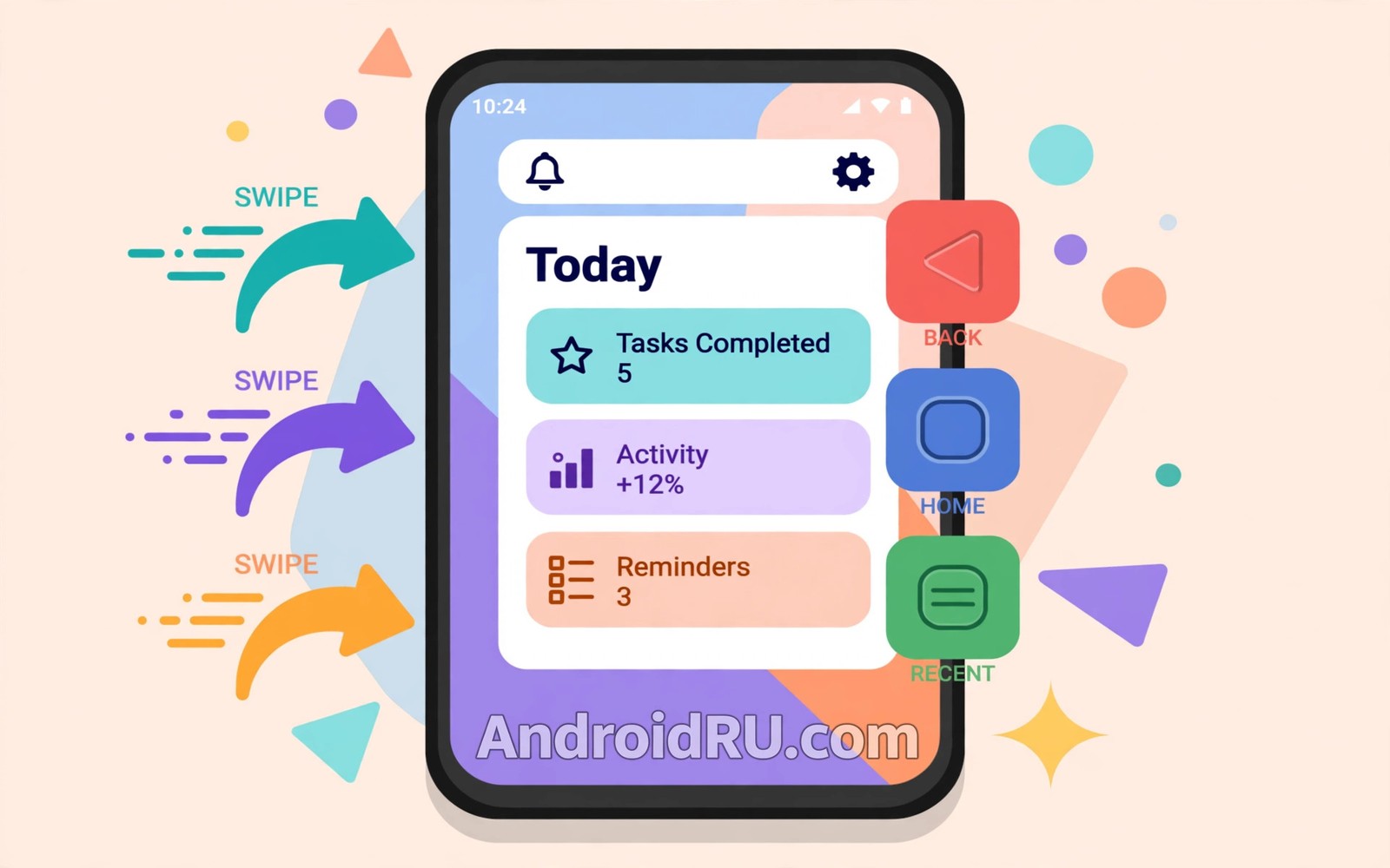
Customizing Navigation Gestures vs Traditional 3-Button Navigation
Navigation is the one setting you touch a hundred times a day without thinking about it. A swipe from the edge goes back. A swipe from the bottom goes home. Three buttons do the same jobs with visible targets that never move. Both systems get you through apps, and both reward different habits, different hands and different app mixes.
I switched between the two systems for a month, timing the same daily tasks on each, and the result was not the clean victory I expected. Gestures won on speed once my thumb learned them. Buttons won on accuracy in games and in apps that use screen edges for their own controls. The honest answer is that the right system depends on your hands, your apps and your patience during the learning week.
This guide compares gestures and buttons on speed, accuracy, comfort, screen space and accessibility, with a side-by-side table, a verdict for each use case, and a fair seven-day test you can run yourself. It also covers the wider picture: navigation and quick controls together define how fast a phone feels, so pair this choice with Quick Settings efficiency tips once you have settled the navigation question.
How gesture navigation actually works on Android
Gesture navigation replaces the button bar with swipes. Swipe in from the left or right edge to go back. Swipe up from the bottom edge to go home. Swipe up and hold to open recents. Swipe left or right along the bottom edge to jump to the previous app. The gestures form one family, so once the thumb learns the pattern, home, back and recents flow without looking.
The screen gains space because no button bar consumes pixels. That extra space matters most on small phones and in reading apps, where a few millimetres of height change how much text fits on screen. The trade-off is discoverability: nothing on screen tells a new user that the edge swipe exists, so the first days feel like guessing.
Gesture hints help during that learning week. A thin line at the bottom of the screen shows where to swipe, and most phones let you turn hints off once the motions feel automatic. Keep hints on until gestures feel automatic, because turning them off early is one of the most common reasons people give up on gestures before muscle memory forms.
Sensitivity is the setting most gesture users miss. A lower sensitivity reduces accidental back swipes when scrolling feeds near the edge. A higher sensitivity suits users with thick cases, because the case edge changes how far the thumb must travel to register a swipe. Test sensitivity with your daily case installed, because cases change edge feel a lot.
What the back gesture really does in apps that use edges
Edge conflicts decide many real-world verdicts, because apps use screen edges for their own controls. A drawing app may use edge strokes for tools, a game may use edge swipes for camera moves, and a photo editor may use edge drags for sliders. Gesture navigation can steal those strokes, and the app has no way to tell the system that its edge matters more.
Android gives apps a way to mark edge zones as exclusive, but not every app uses it well. Before you commit to gestures, open your top three apps and try their edge controls. If a game camera jumps every time you swipe back, that app will fight gestures every day, and no amount of practice will fix a conflict that lives in the app itself.
Recents, app switching and the flick most users never learn
Learn the recents gesture deeply, because it holds the biggest speed gain in gesture navigation. A short swipe up and hold opens recents, and a quick flick along the bottom bar jumps straight to the last app. Many gesture users never learn the flick, and they miss the fastest app switch on the phone. Practise the flick with two apps you alternate between all day, such as mail and chat, until it feels like one motion instead of two.
How to practise the recents flick in five minutes
Open your two most-used apps, then flick along the bottom edge to jump between them ten times. Slow down if the flick opens recents instead of switching: a shorter, faster motion is what the system wants. After five minutes of this, the flick should feel like a single thumb movement, and that is the moment gestures start to pay for their learning cost.
How traditional 3-button navigation actually works on Android
Three-button navigation keeps three visible targets at the bottom of the screen: back on one side, home in the middle, and recents on the other side. Each action has a fixed place that never moves, so new users learn the system in minutes and users with motor limits often prefer that certainty. There is nothing to remember and nothing hidden.
The button bar costs screen space, and it can clash with full-screen media, but it also gives a stable anchor when gestures feel slippery or ambiguous. A guest who picks up your phone can navigate instantly, which matters on shared devices. A phone used by family members may serve everyone better with visible buttons, because personal speed matters less than shared usability on a shared device.
Buttons also leave app edges untouched. Games, drawing apps and photo editors keep their full edge controls, because the system never claims a swipe from the side. That is the single strongest argument for buttons, and it is the reason many gamers keep them even after trying gestures for a week.
On many phones you can change the order of the buttons, swapping back and recents to suit your thumb. That small option matters more than it sounds: the back button is the one you press most, so put it on the side your thumb reaches most easily, and leave it there for a month so the position becomes automatic.
Why buttons still win for shared phones and new users
Teaching navigation reveals the strengths of each system honestly. Buttons teach in seconds through visible targets. Gestures teach through guided practice over days. If you hand your phone to a parent, a child or a colleague even once a week, the teaching cost of gestures adds up, and buttons quietly earn their screen space back.
Button order and size: two settings worth checking
Check whether your phone lets you swap button order and adjust the bar height. A swapped back button on the thumb side reduces reach strain on large phones, and a slimmer bar returns a little screen space without giving up visible targets. These are small wins, but they are free, and they make buttons feel less like a compromise.
Gesture vs 3-button navigation: side-by-side comparison table
Read the table first, then read the verdicts below it. No single row decides the choice: the pattern across rows is what matters, and your own app mix will weight some rows far more heavily than others.
| Criterion | Gesture navigation | 3-button navigation |
|---|---|---|
| Learning time | Three to seven days before it feels automatic | Minutes, because targets are visible |
| Speed after practice | Faster for practiced users, thumb travels less | Steady and predictable, rarely the fastest |
| Accuracy and errors | Accidental back swipes are common in week one | Few accidental taps, targets never move |
| Screen space | Full screen, no button bar | Button bar uses a strip at the bottom |
| Games and drawing apps | Edge swipes can steal game and tool controls | App edges stay free for gameplay and tools |
| One-handed use | Good on large phones, thumb stays near the edge | Good on small phones, harder reach on large ones |
| Accessibility | Needs precise swipes, harder with tremor | Large stable targets suit limited dexterity |
| Shared or guest use | Guests need a tutorial before they can navigate | Guests navigate instantly with no help |
| App switching | Bottom flick jumps to the last app very fast | Recents button, then tap, two steps |
| Customisation | Sensitivity and hints can be tuned where offered | Button order and bar size can be changed |
The table hides one truth worth stating plainly: gestures have a higher ceiling and a lower floor. At their best they are the fastest way to move around a phone. At their worst, in the first three days, they are the most frustrating. Buttons have a lower ceiling and a higher floor. They never feel brilliant, and they rarely feel broken.
Verdict by use case: who should pick gestures, who should pick buttons
A verdict that names one winner for everyone would be dishonest here, so this section gives a verdict per use case instead. Find the use case that matches your week, and that verdict is yours.
Daily reader, messenger and browser: pick gestures
If your day is reading, messaging and browsing, gestures win after the learning week. The thumb rarely leaves the screen edge, page turns and back swipes flow from one gesture family, and the extra screen space helps long reading sessions. Fluency after a week beats button familiarity, and the recents flick makes switching between chat and browser genuinely faster.
Thumb travel is the reason: on a tall phone, the distance from the bottom bar to the content is the tax you pay on every action, and gestures cut that tax to almost nothing. Once the flick is automatic, you will feel the difference every time you switch apps.
When a reader should still pick buttons
If you read mostly in an app that uses edge swipes for its own controls, such as a comic reader with edge page turns, test that app first. An edge conflict in your main reading app can erase the whole gesture advantage, and buttons will serve you better there.
Gamer and digital artist: pick 3-button navigation
If you play games with edge camera controls or draw in apps that use edge strokes, pick buttons. Game edges stay free for gameplay controls, the button bar costs little screen space during play, and performance in games outweighs gesture elegance elsewhere. A gamer who switches to buttons because edge gestures steal camera moves is not giving up: they are choosing the tool that fits the job.
Small hands, large phone, or limited dexterity: pick buttons first
Small hands may favour buttons for reach, because a visible target at the bottom is easier to hit reliably than a swipe from the far edge. Users with tremor or limited dexterity should also start with buttons, because large stable targets accommodate imprecise motion in a way a swipe cannot. Gesture sensitivity settings help, but they cannot fully replace explicit targets for every user. Platforms should preserve button navigation as an accessibility commitment, because choice here is not a preference but a necessity for many users.
Shared family phone or tablet: pick 3-button navigation
A shared family tablet keeps buttons so grandparents and children learn instantly. Guests navigate without a tutorial on every visit, and shared usability beats personal speed on a communal device. If you are the only user, gestures are a live option. If the device belongs to the household, buttons are the kind choice.
Power user who switches apps all day: pick gestures
If you alternate between two or three apps all day, gestures win on the recents flick alone. The flick jumps to the last app in one motion, and after a week it becomes the fastest move on the phone. Pair the choice with broader tuning: you can also explore customization without unlocking for more stock settings that improve daily flow without risky changes, and check font and display size settings when you want text and touch targets to match your hands as well.
How to set up and test both systems fairly in seven days
Give each system a fair trial with the same tasks, so the comparison reflects habit and not novelty. Judging gestures after ten minutes measures novelty, not skill, and switching systems daily prevents either system from becoming automatic. Commit to one system for at least three days before you judge it.
- Open Settings, then System, then Gestures or System navigation, depending on your phone. The exact menu name varies by maker, so use Settings search for navigation if the path looks different.
- Switch to gesture navigation and turn gesture hints on if you are new to it.
- Practise home, back and recents for ten minutes with your daily apps, including the recents flick.
- Run a timed task set: open mail, return home, switch to chat, go back, and open recents. Time it with a stopwatch.
- Note accidental back swipes and missed gestures during that practice period, and write the count down.
- Switch to three-button navigation and repeat the same timed task set, with the same apps.
- Compare task times and error counts rather than first impressions alone.
- Keep the system with fewer errors after three days, even if it felt slower on day one.
That test is the core of this guide. A fair test beats every review, including this one, because hands differ and app mixes differ, so the community winner may lose on your phone. A drawing app user faces edge costs that a reader never meets. A small hand faces reach costs that a large hand never meets. Personal testing beats aggregate opinion for this choice.
A seven-day routine that builds real fluency
Navigation skill builds through repeated real tasks, not through settings tours alone. Day one: practise home and back gestures with your five daily apps. Day two: practise the recents flick between your two most alternated apps. Day three: test edge swipes inside a game or drawing app you use. Day four: switch to buttons and repeat the same task set for comparison. Day five: time both systems on identical tasks and record error counts. Day six: adjust gesture sensitivity if accidental back swipes appeared. Day seven: commit to the lower-error system for a full month.
After a month, navigation fluency feels automatic for the committed system. Gestures flow without conscious planning for practised users. Buttons respond instantly for users who chose explicit targets. Fluency is the reward that only commitment delivers, and it is why the seven-day test ends with a month-long commitment, not with a shrug.
Common mistakes that ruin the test
Navigation regret usually comes from a rushed trial or a missed sensitivity setting. Judging gestures after ten minutes is the first mistake, because gestures need days for muscle memory to form. Ignoring case effects is the second: a thick case changes edge swipes and can fake a gesture problem, so test with your daily case installed. Forgetting app edge conflicts is the third, because games and drawing apps suffer most from gesture theft. Disabling hints too early is the fourth, and switching systems daily is the fifth, because daily switching keeps both systems awkward forever.
Edge cases that decide the winner on your phone
Most navigation advice stops at speed, but edge cases are where the choice is actually made. Check these three before you commit, because each one can overturn the table above.
Games, keyboards and full-screen apps
Edge gestures can steal game camera moves, and some keyboards need a settings tweak for smooth dismissal when the back gesture is in play. With the keyboard open, the system back gesture still works, and the keyboard adds its own dismiss gesture, but the combination can feel awkward until you learn it. Full-screen video is the opposite case: gestures shine there, because no button bar competes with the picture.
Edge conflict is the term to remember when a game or drawing app misbehaves after a switch. If the conflict appears in only one app, look for that app’s own setting first, such as a full-screen or immersive mode, before blaming the navigation system. If the conflict appears in three apps you use daily, the navigation system is the problem, and buttons are the fix.
What to do when only one game conflicts
Keep gestures for everything else and use the game’s own full-screen mode, or accept one awkward swipe in that single title. A single-app conflict is a poor reason to give up a system that works everywhere else, but a three-app conflict is a clear verdict.
Phone size, hand size and one-handed reach
Phone size changes reopen navigation choices, because reach changes with dimensions. A larger phone may favour gestures for thumb travel, since the thumb already lives near the edge. A smaller phone may favour buttons for precision, since the bar is always within easy reach. Hold your phone the way you actually hold it, not the way a review photo holds it, and test both systems in that grip.
One-handed mode, where offered, changes the maths again, because it shrinks the screen toward your thumb. If you use one-handed mode often, test navigation inside it, not outside it. The system that wins on a full screen does not always win on a shrunken one.
Accessibility, motor limits and teaching others
Motor accessibility deserves attention in navigation debates, because gestures demand precise motions that some users cannot perform reliably. Buttons offer large stable targets that accommodate tremor and limited dexterity, and that difference is not a matter of taste. If you share a phone with someone who has motor limits, their needs decide the setting, and gestures can wait for a personal device.
Teaching a new user also reveals the truth about a system. Watch someone try your phone for the first time: if they find back and home without help, the system is discoverable. If they stare at the screen and ask how to go back, the system is not, whatever its speed advantage may be for you.
Frequently asked questions about Android navigation gestures and buttons
Are gestures faster than buttons?
Gestures are faster for practised users, because the thumb travels less and the recents flick jumps straight to the last app. Buttons are faster for new users, because targets are visible and explicit, and there is no learning week to pay for. After a month of practice, most users find gestures faster on daily tasks, but the gap is small, and accuracy matters more than raw speed.
Can I keep buttons on one app and gestures elsewhere?
No, the navigation mode is system-wide, so you cannot mix modes per app. You can use in-app controls to work around edge conflicts in specific apps, such as a game’s own back button or a drawing app’s toolbar, but the system gesture stays the same everywhere until you change it in Settings.
Do gestures work with a keyboard open?
Yes, the keyboard adds its own dismiss gesture and the system back gesture still works. Some keyboards need a settings tweak for smooth dismissal, so if the back swipe feels sticky with the keyboard open, check the keyboard’s own settings and the gesture sensitivity setting before you blame the system.
Will switching to gestures break my games?
It will not break them, but it can interfere with edge controls in some titles, especially camera moves and edge menus. Test your top three games before you commit, and keep buttons if two or more of them conflict. A single conflicting game is usually manageable with that game’s full-screen setting.
How long should I try gestures before deciding?
Give gestures at least three days of real use, and a full week if you can. The first day measures novelty, the third day measures learning, and the seventh day measures habit. If accidental back swipes are still frequent after a week with tuned sensitivity and your daily case on, buttons are the honest choice for your hands.
Pick one system, commit for a month, then judge it
Gestures reward practice with fluid speed, and buttons reward clarity with instant learnability. Your hands and your apps should decide, not a trend or a default. A fair three-day test reveals the honest winner for you, and the table and verdicts above give you the language to explain why.
Revisit the choice only after a major change, such as a new phone size or a new daily app. Stability between those changes lets fluency compound, while constant revisiting taxes the thumb without improving the result. Settle, enjoy the fluency, and remember that the best navigation system is the one you stop noticing.
Your next step is concrete: run the timed task test from this guide for both systems this week, keep the system with fewer errors after three days, and commit to it for a month before you revisit the choice. If you want another angle on the same theme, font and display size settings are a good next read, because text size and touch targets shape comfort just as much as navigation does.

