

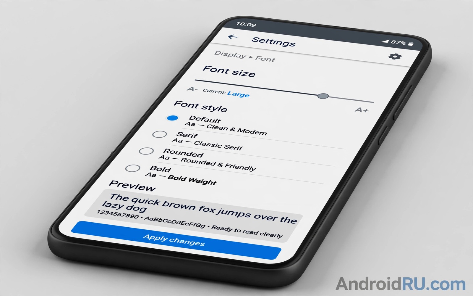
Font styles and display sizes decide whether your phone feels comfortable or tiring. Small text strains the eyes during long reads. Oversized text truncates buttons and breaks layouts. The right setting balances reading comfort with screen real estate for your eyes and your hands.
This guide shows how to modify font style and size and display size in Android settings. You will learn the difference between font size and display size. You will also learn how to test a setting across apps before you commit. If you want the wider theme context then read about theme customization steps so type choices match your palette and icon choices.
Type settings are personal in a way color settings are not. Age and vision and reading distance all shift the ideal size. There is no universal best size and the best size is the one that lets you read for an hour without fatigue. Trust your eyes over any default.
Font size versus display size
Font size changes text only and it leaves icons and layouts mostly untouched. A larger font size makes messages and articles easier to read. It can also push long labels into truncation in apps with fixed layouts. Font size is the gentler first lever when reading feels hard.
Display size changes everything including icons and buttons and spacing. A larger display size makes the whole interface easier to hit and read. It also reduces how much content fits on one screen. Display size suits users who want larger touch targets as well as larger text.
Bold text is a third lever that helps many users without changing sizes at all. Bold labels gain contrast against backgrounds and they survive bright light better. Bold text can crowd tight layouts so test it with your most used apps. The trio of font size plus display size plus bold text covers most comfort needs without extra apps.
Tune type settings step by step
Change one lever at a time so you can tell which change helped and which change hurt.
- Open Settings and then Display and find the font size option.
- Move font size one step larger and read a long message thread.
- Check a home screen with long app labels for truncation problems.
- Return to Display settings and find the display size option.
- Move display size one step larger only if touch targets still feel small.
- Open a banking or transit app and check that buttons still show full labels.
- Turn on bold text if labels still feel faint in bright light.
- Live with the new trio for two days before you adjust again.
Practical tips for comfortable type
Test type settings in your real reading apps and not only in Settings previews. A preview sentence hides truncation that a real inbox reveals. Open mail and messages and a news article after each change. Real content is the only honest test for a type setting. You can also explore visual consistency across apps because type scale agreement across apps makes any size feel more natural.
Pair larger type with a simpler home screen so the interface does not feel crowded. Larger display size reduces grid capacity and widgets may need resizing. Remove one widget row when you increase display size. The calmer grid will repay the lost widget with faster scanning.
Revisit type settings after vision changes or after a new phone with a different screen size. A size that suited a small phone may feel cramped on a large phone and vice versa. Screen density changes the effective size of every step. A fresh two day test after each phone change keeps type matched to the hardware.
<!-- Text size in sp scales with user font settings -->
<TextView
    android:layout_width="wrap_content"
    android:layout_height="wrap_content"
    android:textSize="16sp"
    android:text="Readable body text scales with your choice." />
The snippet above follows the pattern shown in the official Android developer documentation for text sizing and in the Material Design guidelines for type scales. It shows why body text uses scalable units and you should never fix body text in unscaled units in a real app.
Common mistakes
Type tuning fails when users change everything at once or test only in previews.
- Maxing every slider at once. Maximum font plus maximum display breaks layouts everywhere. Move one step at a time and test real apps.
- Testing only in Settings. Settings previews use short sentences. Real inboxes and articles reveal truncation that previews hide.
- Ignoring button labels. Large text can clip action buttons in fixed layouts. Check banking and transit apps after each change.
- Forgetting bold text. Bold text can fix faint labels without size changes. Try it before you push sizes to extremes.
- Never revisiting after a new phone. Density differences shift every size step. Retest type after each device change.
FAQ
Will larger fonts break my apps?
Well built apps adapt to larger fonts gracefully. Older apps with fixed layouts may truncate labels and those apps need a smaller step.
What is the difference between font and display size?
Font size changes text alone while display size scales text plus icons plus spacing. Use font size for reading comfort and display size for touch comfort.
Can I set a custom font on stock Android?
Some makers offer font choices in display settings and others limit you to size and weight. Font apps and launchers can add choices with varying reliability.
A seven day routine
Type comfort stabilizes when changes arrive one step at a time with real reading tests between them.
- Day one: increase font size one step and read a long message thread.
- Day two: check home screen labels for truncation after the change.
- Day three: increase display size one step only if targets feel small.
- Day four: open banking and transit apps and check button labels.
- Day five: enable bold text if labels still feel faint outdoors.
- Day six: read a news article for twenty minutes and note eye fatigue.
- Day seven: keep the trio that allowed comfortable reading all week.
Troubleshooting quick answers
Type problems usually come from changing everything at once or from preview-only testing.
- Labels truncate. A size step may exceed a fixed layout. Step back one size or choose an app with adaptive layouts.
- Buttons clip text. Fixed layouts clip action labels at large sizes. Test banking apps after every size change.
- Screen feels crowded. Larger display size reduces grid capacity. Remove one widget row to restore breathing room.
- Bold text crowds layout. Bold labels need slightly more room. Reduce size one step when bold text is enabled.
Putting it all together
Type settings are health settings because reading strain accumulates silently across months. A slightly small font feels fine for minutes and tiring for hours. A comfortable font feels unremarkable and that unremarkable feeling is success. Invest the test week because eyes repay it daily.
Real content testing beats preview testing because previews hide the hard cases. Long names and dense threads and fixed buttons reveal true limits. A setting that survives real inboxes and real articles is proven. A setting that survives only previews is a guess.
Revisit type after every major life or device change because eyes and screens both evolve. A new phone density shifts every step size. Aging vision shifts comfort thresholds gradually. A fresh test week after each change keeps type matched to reality.
Real world scenarios
An older reader increases font size one step and long articles become comfortable. Button labels survive because the step was modest. Evening reading stretches longer without eye strain. One small step transforms daily reading.
A commuter increases display size for larger touch targets on a moving train. Buttons become hittable despite train motion. Content per screen drops slightly but accuracy rises sharply. The tradeoff favors accuracy for mobile use.
A student enables bold text for outdoor campus reading between classes. Labels gain contrast against bright backgrounds. Bold text avoids a larger size step that would crowd layouts. The lightest effective change wins.
Checklist before you finish
Type settings are settled when real content passes these tests.
- Font size was changed one step at a time with real app tests.
- Long message thread was read comfortably after the change.
- Home screen labels show no truncation after the change.
- Banking and transit apps show full button labels.
- Display size was increased only if touch targets felt small.
- Bold text was tried before pushing sizes to extremes.
- News article was read for twenty minutes without fatigue.
- Settings were lived with for two days before further adjustment.
What changes after a month
After a month comfortable type settings feel like the phone was built for your eyes. Reading stretches longer without fatigue or headaches. The setting disappears into daily use completely. Comfort that goes unnoticed is comfort achieved.
Vision changes gradually and type settings should track those changes honestly. Annual eye checks may suggest a new size step. Adjusting promptly prevents strain from becoming habit. Type settings are health settings and deserve health attention.
New apps test type adaptability because fixed layouts still exist. A comfortable global size may clip labels in one stubborn app. That app deserves a report to its developer or a smaller size compromise. One app should not dictate global comfort.
Family members with different vision needs benefit from per device type tuning. A shared tablet cannot serve all eyes with one size. Individual phones allow personal type settings for each user. Personal devices justify personal type choices fully.
Looking further ahead
Reading science supports larger type for sustained reading because eye strain grows with small text over time. Studies consistently show that comfortable sizes improve comprehension and retention for long texts. Phone reading involves articles and books and messages across hours daily. Type settings therefore affect learning outcomes not just comfort. Investing in type tuning pays dividends in understanding as well as in eye health over years of use.
Display size interacts with touch accuracy research because larger targets reduce error rates measurably. Older users and users in motion benefit most from larger targets. A display size increase that feels slightly wasteful on a desk can prove essential on a moving bus. Context determines the ideal size more than static preference. Users should test sizes in motion rather than only at a desk.
Conclusion
Comfortable type is a personal setting that deserves a real test. Font size and display size and bold text together cover most needs. One step at a time plus real app testing beats maxing sliders in hope. You may also enjoy customization without unlocking when you want another angle on the same theme.
Your next step is to move font size one step larger today and read a long thread tonight. Adjust display size only if touch targets still feel small tomorrow. Keep the setting that lets you read without fatigue.

