

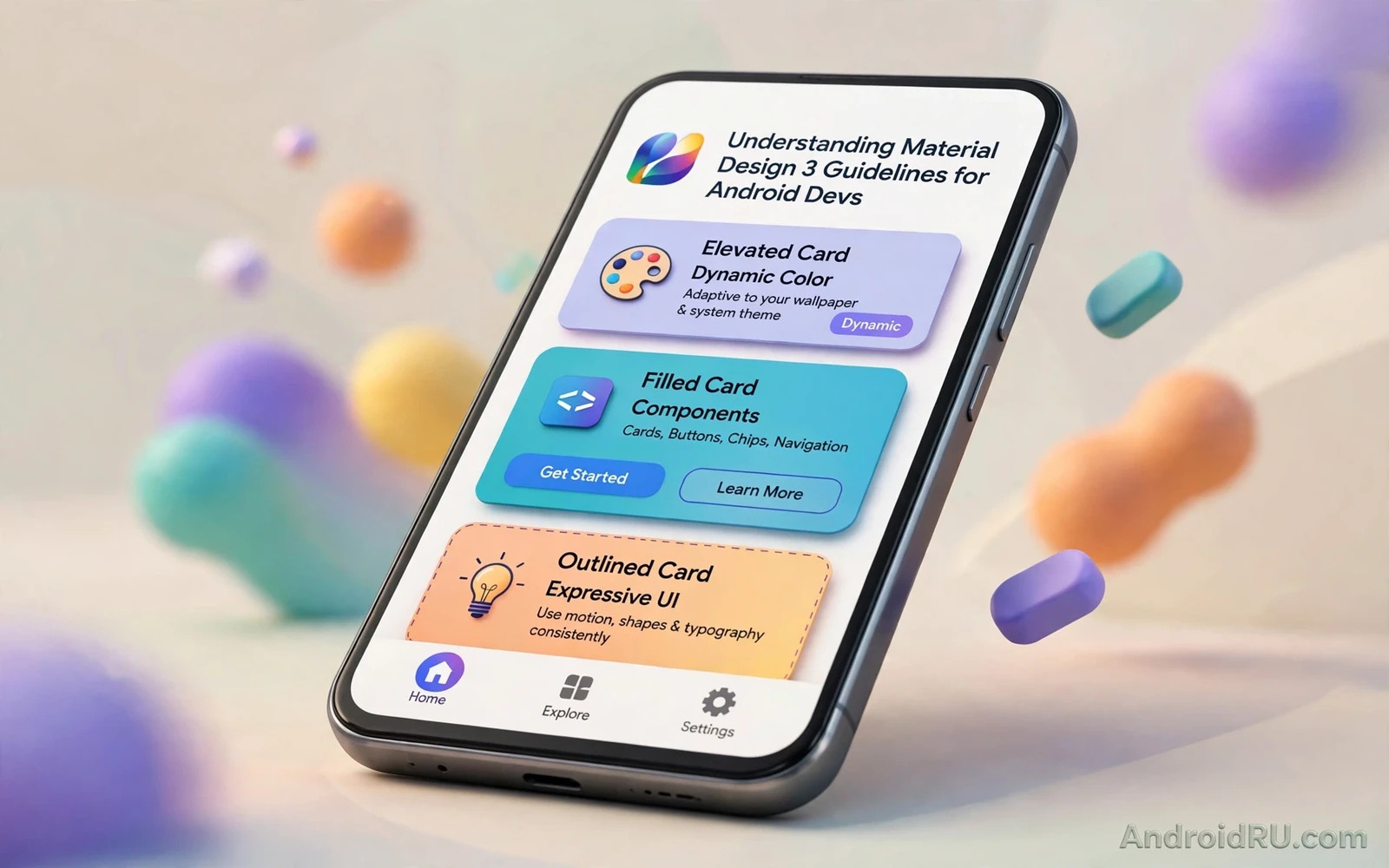
Material Design 3 is the current design language for Android interfaces. It builds on earlier Material ideas with dynamic colour and refined shapes and clearer typography. An app that follows it feels native because its components match system patterns users already know. Buttons and cards and dialogs behave in familiar ways. This guide explains the core rules in practical terms for developers who build real screens.
Dynamic colour is the most visible change. The system derives a colour scheme from the user wallpaper and offers it to apps. An app that adopts dynamic colour feels personal without custom theming work. An app that ignores it can still look good with a fixed scheme. Choose dynamic colour when personalisation matters and choose a fixed scheme when brand colour must stay exact. Either choice should apply consistently across every screen.
Material Design 3 is a system rather than a set of decorations. Colour roles and type scales and shape scales work together. A primary colour has a container variant and an on colour for text on it. A type scale defines sizes for display and headline and title and body and label text. A shape scale defines corner styles for small and medium and large components. Using the system roles keeps contrast and hierarchy consistent without manual tuning on every screen.
<!-- Material 3 button -->
<Button
    android:layout_width="wrap_content"
    android:layout_height="wrap_content"
    android:text="Continue"
    style="@style/Widget.Material3.Button" />
Colour roles and contrast
Colour roles give each colour a job. Primary marks key actions and key elements. Secondary marks less prominent actions. Tertiary adds accent variety. Surface colours form backgrounds and containers. Error colours mark problems. Each role has an on colour for text and icons placed on it. Use roles rather than raw colour values in layouts. Roles adapt to light and dark themes automatically when the theme defines both schemes.
Contrast decides readability. Text on a coloured container must pass a clear contrast ratio for its size. Small text needs stronger contrast than large display text. Test every role pairing in light theme and in dark theme. A pairing that passes in light theme may fail in dark theme when the container lightens. Fix contrast at the theme level rather than patching individual screens with custom colours.
Tonal palettes generate the roles from a few seed colours. The system produces light and dark tones for each seed. Developers can supply a seed and let the system derive the full scheme. That derivation keeps harmony across roles. Manual colour picking for every role risks clashes that derivation avoids. Start from a seed and adjust only when a specific role fails a contrast test.
Typography and shape
The type scale gives each text role a size and a weight and a line height. Display text suits hero headings. Headline text suits section headings. Title text suits card headings and dialog titles. Body text suits paragraphs. Label text suits buttons and small controls. Use the scale consistently so users learn the hierarchy fast. A screen that uses random sizes for similar elements feels messy even when each element looks fine alone.
Shape scale controls corner rounding for components. Small components such as chips use small rounding. Medium components such as cards use medium rounding. Large components such as dialogs and sheets use large rounding. Consistent shapes create a calm visual rhythm. Mixing extreme rounding with sharp corners on the same screen breaks that rhythm. Pick a shape family and apply it everywhere.
Spacing and elevation support the hierarchy. Consistent spacing tokens keep layouts aligned across screens. Elevation lifts interactive surfaces above backgrounds. Use elevation sparingly because too many lifted surfaces flatten the hierarchy. A card that needs attention can use elevation. A static text block does not need it. Restraint keeps the interface calm.
Components in practice
Buttons follow a clear hierarchy. A filled button marks the primary action on a screen. An outlined button marks a secondary action. A text button marks a low emphasis action. One screen should have one primary action in most cases. Two filled buttons competing for attention confuse the user about the next step. Place the primary action where the reading flow ends.
Cards group related content with a container and optional actions. Keep card content focused on one topic. A card that mixes unrelated actions becomes a mini screen that is hard to scan. Navigation bars and navigation rails follow platform patterns for phones and tablets. Use the bar on phones and the rail on larger screens when the app supports both. Familiar navigation reduces learning time for new users.
Dialogs and bottom sheets handle focused tasks and extra options. A dialog suits a short confirmation or a choice that blocks the flow. A bottom sheet suits a longer option list that the user can dismiss by swiping. Avoid dialogs for long forms because a cramped dialog frustrates input. Move long tasks to a full screen where input has room to breathe.
Dark theme and personalisation
Material Design 3 themes include light and dark schemes by default. A dark scheme is not a simple inversion of light colours. Surface tones and primary tones shift to keep contrast comfortable in low light. Readers who implement theme switching can continue with the piece on implementing dark theme support in apps and apply the same token approach to their own screens. Tokens keep both themes consistent without duplicate layouts.
Personalisation through widgets extends the design language to the home screen. Widgets use the same colour roles and shape ideas at a smaller scale. Readers who build widgets can continue with the piece on building custom widgets for home screens and carry the app theme into widget layouts. A widget that matches the app theme feels like part of the same product.
Launchers present the app icon and widgets in their own style. A launcher may apply its own shape mask to icons. Readers who build launchers can continue with the piece on building a custom launcher application and see how host choices affect app presentation. Design icons with safe padding so launcher masks never clip important details.
Accessibility inside the system
Material components include accessibility support when used correctly. Buttons expose labels and states to assistive tools. Text scales with system font size when layouts use flexible sizes. Touch targets meet a minimum size that fingers can hit reliably. Test with large font sizes and with a screen reader on real devices. A layout that breaks at large font size fails users who need that size most.
Colour alone must never carry meaning. An error state needs an icon or text in addition to a red colour. A success state needs a label in addition to a green colour. Users with colour vision differences rely on those extra cues. Design states with shape and text and icon together. The combination stays clear in every theme and for every user.
Motion should support understanding rather than decorate. Small transitions show where a screen came from and where it returns. Large distracting motion harms users who prefer reduced motion. Respect the system reduced motion setting when the platform exposes it. Keep transitions short and purposeful so navigation feels responsive rather than theatrical.
Adopt the system gradually
Adopting Material Design 3 does not require a full rewrite at once. Start with the theme tokens and the type scale. Apply them to new screens first and migrate old screens during normal updates. A mixed app during migration is acceptable when new screens follow the system and old screens stay consistent internally. Plan migration by screen priority rather than by component fashion.
Review designs against the guidelines during design review rather than after implementation. A design review that checks colour roles and type scale and touch targets catches issues cheaply. An implementation review that finds the same issues costs rework. Keep a short checklist for reviewers that covers roles and contrast and hierarchy and touch size.
A design system earns trust through consistency. Users learn where actions live and how hierarchy works. Developers move faster because tokens answer most visual questions. Material Design 3 provides that system for Android. Use its roles and scales with discipline and the app will feel native and clear across phones and tablets and foldables.
Design tokens in code
Design tokens become real when code references them consistently. Define colour tokens and type tokens and shape tokens in one theme file. Reference tokens from layouts and from code rather than from hardcoded values. A new developer who follows the token file produces consistent screens without learning every guideline by heart. Tokens turn design guidance into a default path.
Token naming should describe role rather than appearance. A token named primary suits both themes. A token named blue button breaks when the brand colour changes. Role names survive rebrands and theme changes. Appearance names force a rename hunt across the codebase whenever a colour changes. Choose role names from the start and rebrands become theme edits.
Spacing tokens deserve the same discipline as colour tokens. Define a small set of spacing values and use them for margins and padding. Consistent spacing makes screens feel aligned even when content differs. Random spacing values create visual noise that users feel without naming it. A spacing scale keeps layouts calm across a growing app.
Review token use during design review. Flag hardcoded colours and sizes in new layouts. Suggest the matching token in the review comment. Consistent review feedback teaches token habits faster than a guideline document alone. Over time the codebase converges on tokens and visual consistency becomes automatic.
Evolving with the system
Material guidance evolves with each Android release. New components appear and old components gain new states. Review the guidance once per year and note which components changed. Update the app theme tokens first and then update individual screens during normal feature work. A yearly review keeps the app current without a disruptive redesign. An app that never reviews guidance slowly drifts from system patterns until it feels dated. Small yearly updates prevent that drift with modest effort.

