

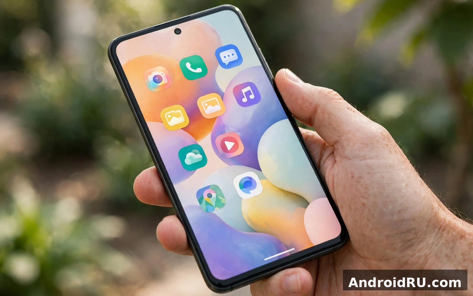
Material You customization for Android turns a standard phone into a personal phone. Material You is a design system that adapts color and shape to your choices. It uses your wallpaper as a starting point. It builds a color palette from that wallpaper. It applies that palette across menus and widgets and buttons. This guide explains how to use it well. It explains how to keep the result readable. It explains how to keep the result useful and not just pretty.
Good personalization starts with purpose. A theme should help you find tools faster. A theme should help you read text without strain. A theme should help you notice important alerts. A theme should not hide important buttons. A theme should not make text hard to read. A theme should not distract you during work. Start with readability first. Add flair after readability is solid.
How Material You Color Works
Dynamic color is the core idea of Material You. You choose a wallpaper that you like. The system reads the main colors in that wallpaper. The system builds a set of tones from those colors. The system uses light tones for backgrounds. The system uses dark tones for text in light mode. The system reverses that balance in dark mode. The result is a palette that feels connected to your wallpaper.
Wallpaper choice changes the whole feel of the phone. A photo with soft colors gives a calm palette. A photo with bold colors gives a vivid palette. A photo with many colors can give a mixed palette. A simple illustration can give a clean palette. Try several wallpapers before you settle on one. Live with each wallpaper for a day if you can. A palette that looks good for five minutes may feel tiring after a full day.
You can also choose a basic color set instead of wallpaper colors. A basic color set gives you a fixed palette. A basic color set is useful when wallpaper colors clash. A basic color set is useful when you want a consistent look across wallpapers. Try a basic color set if dynamic color feels unpredictable. You can switch back to dynamic color at any time. Personalization should be easy to change and easy to undo.
Contrast matters more than beauty. Text must stand out from its background. Buttons must stand out from the background. Icons must be easy to tell apart. If a palette makes text fade into the background then change the wallpaper. If a palette makes buttons hard to find then change the color set. If a palette causes eye strain then choose softer tones. A beautiful theme that you cannot read is a failed theme.
Setting Up Wallpaper And Theme
Start with a wallpaper that you enjoy looking at each day. Open the wallpaper picker on your phone. Choose a photo or an illustration. Preview the wallpaper on the home screen. Preview the wallpaper on the lock screen. Check how widgets look on top of the wallpaper. Check how app icons look on top of the wallpaper. A busy wallpaper can hide widgets. A busy wallpaper can hide icon labels. Choose a calmer wallpaper if widgets disappear into the image.
After you set the wallpaper open theme settings. Look for wallpaper and style options. Look for color options. Choose dynamic color if you want wallpaper based tones. Choose a basic color if you want a fixed palette. Apply the choice and check the home screen. Check the settings app. Check the notification shade. Check a messaging app. A theme should look coherent across all of these places. If one place looks off then try another palette.
Dark mode and light mode change the palette balance. Light mode uses light backgrounds and dark text. Dark mode uses dark backgrounds and light text. Dark mode can reduce glare at night. Dark mode can save power on some display types. Light mode can feel clearer in bright sunlight. Try both modes with your chosen palette. Choose the mode that feels comfortable for your eyes in your usual light. You can also schedule dark mode for night hours.
Icon style is part of the theme too. Themed icons can match the palette. Themed icons can make the home screen feel unified. Themed icons may not cover every app. Unthemed icons can break the unified look. Decide if that mix bothers you. If it bothers you then use standard icons instead of themed icons. A mixed icon set can still look good if colors are calm. A mixed icon set can look messy if colors are loud.
Home Screen Layout That Works
Home screen layout should follow your daily routine. Place your most used apps on the first screen. Place your most used widgets on the first screen. Place less used apps on a second screen. Place rarely used apps in the app drawer. A first screen with too many icons slows you down. A first screen with too few icons wastes space. Aim for a balance that you can scan in one glance.
Folders can organize apps by task. A folder for communication can hold messaging and email apps. A folder for media can hold music and video apps. A folder for work can hold documents and calendar apps. A folder for travel can hold maps and booking apps. Name folders by task not by app brand. Task names help you find the folder faster. Keep folders to a small number. Too many folders hide apps and slow you down.
Widget size affects layout a lot. A large calendar widget shows more events. A large calendar widget also pushes other tools off screen. A small calendar widget shows only the next event. A small calendar widget leaves room for other tools. Choose widget size by how often you check that widget. A widget that you check hourly deserves more space. A widget that you check weekly deserves less space.
Grid size also affects layout. A dense grid fits more icons on screen. A dense grid can make icons feel cramped. A sparse grid gives icons breathing room. A sparse grid can push tools to a second screen. Try a medium grid first. Adjust the grid only if icons feel too small or too spread out. A layout change should solve a real problem. A layout change should not be change for its own sake.
Widgets That Save Time
Widgets bring information to the home screen without opening an app. A weather widget shows temperature and forecast. A calendar widget shows upcoming events. A music widget shows playback controls. A notes widget shows a short list. A clock widget shows time and date. A search widget gives fast access to search. Choose widgets that answer a question you ask often. Remove widgets that only decorate the screen.
Material You themes and colors can make widgets feel unified. Widgets can use palette tones for backgrounds. Widgets can use palette tones for text. Widgets can use palette tones for accents. A unified widget set looks calm. A widget set with clashing colors looks noisy. Check widget colors after you change the theme. If a widget clashes then resize it or replace it or remove it. A widget that clashes every day is not worth keeping.
Stacked widgets can save space. A stack lets you swipe between widgets in one spot. A stack is useful for weather and calendar in one spot. A stack is useful for notes and tasks in one spot. A stack can hide information if you forget to swipe. Use stacks only for widgets that you check in turn. Do not stack a widget that needs constant visibility. An alarm widget should stay visible. A calendar widget for today should stay visible.
Widget transparency and shape also matter. A solid widget stands out on a busy wallpaper. A transparent widget blends into a calm wallpaper. A rounded widget feels soft. A square widget feels formal. Match widget style to your wallpaper and theme. Test widget readability in bright light. Test widget readability at night. A widget that is hard to read in sunlight fails its job.
Lock Screen Customization
Lock screen customization is about fast access and privacy together. You can change the clock style. You can change the clock size. You can change the lock screen shortcuts. You can change the wallpaper for the lock screen. You can show or hide notification content. Each choice affects speed and privacy in a different way.
Material You lock screen customization starts with the clock. A large clock is easy to read at a glance. A large clock can also push notifications down. A small clock leaves more room for notifications. A bold clock style feels modern. A simple clock style feels calm. Choose a clock that you can read without glasses if you wear glasses. Choose a clock that does not hide urgent alerts.
Shortcuts on the lock screen save time in urgent moments. A camera shortcut lets you capture a moment fast. A flashlight shortcut helps in a dark room. A wallet shortcut helps at a checkout. A device control shortcut helps with smart home tools. Choose only shortcuts that you truly use in a hurry. Remove shortcuts that you never tap. A shortcut that opens a sensitive app should still require a lock check. Speed should not remove security.
Notification privacy on the lock screen needs a clear rule. Hide sensitive content for banking apps. Hide sensitive content for messaging apps. Hide sensitive content for email apps. Show full content only for low risk apps such as news apps. Show full content only for apps that never carry private data. Review lock screen notification rules after you install a new sensitive app. A new app may default to full content on the lock screen.
Lock screen wallpaper can differ from home screen wallpaper. A lock screen photo can be personal and bold. A home screen wallpaper should stay calm for widgets. A bold lock screen photo does not hurt widget readability. A bold home screen photo can hurt widget readability. Use that difference to your advantage. Keep the home screen calm. Let the lock screen show personality.
Color And Readability In Practice
Test your theme in real light. Check the theme indoors under normal light. Check the theme outdoors in sunlight. Check the theme at night in a dark room. Check the theme in your most used app. Check the theme in settings. Check the theme in the notification shade. A theme that passes only in settings is not a good theme. A theme must pass in daily apps.
Watch for specific readability problems. Light text on a light background is a problem. Dark text on a dark background is a problem. Low contrast icons are a problem. Small text in a pale color is a problem. If you spot any of these problems then change the palette at once. Do not wait for eye strain to force a change. Eye comfort is a daily need not a minor detail.
Color blindness and vision differences deserve attention too. Do not rely on color alone to show a state. Use icons and labels alongside color. Use text labels for important toggles. Use distinct shapes for on and off states when the system allows it. A theme that uses only red and green to show state can confuse some users. Labels and icons make the state clear for everyone.
Customize Android UI with Material You in small steps. Change the wallpaper first. Change the color set second. Change widgets third. Change lock screen shortcuts fourth. Test each step for a day. A step by step approach makes it easy to find the change that caused a problem. A big bang change makes it hard to know what to undo.
Advanced Personalization Without Risk
Advanced personalization can go beyond themes and widgets. You can change the launcher for more layout control. You can change the icon pack for a different icon style. You can change the font size for better readability. You can change animation scale for a snappier feel. Each change should solve a real need. Each change should be easy to undo.
A third party launcher can offer more grid options. A third party launcher can offer more gesture options. A third party launcher can offer more folder options. A third party launcher can also change default behaviors that you rely on. Test a new launcher for a few days before you commit. Keep the stock launcher as a fallback. A launcher that feels powerful but confusing is not an upgrade.
Icon packs can refresh the home screen fast. An icon pack can unify app icons. An icon pack can make old apps feel new. An icon pack may miss icons for new apps. Missing icons can break the unified look. Check icon pack coverage for your most used apps before you buy or install one. A pack that covers only half your apps will look inconsistent.
Animation scale affects perceived speed. Faster animations make the phone feel snappier. Faster animations can also feel abrupt. Slower animations feel smooth but can feel slow. Default animation settings suit most users. Change animation scale only if you understand developer options. Developer options can affect system behavior in unexpected ways. Use developer options with care and change one setting at a time.
Keeping A Theme Fresh Over Time
Themes can feel stale after months of use. Change the wallpaper with the season. Change the color set when you want a fresh feel. Move widgets to match a new routine. Remove widgets for a project that ended. Add widgets for a project that started. Small seasonal changes keep the phone feeling new without a full reset.
Review your home screen once a month. Remove apps that you no longer use. Remove widgets that you no longer tap. Move a new daily tool to the first screen. Move an old tool to the second screen. A monthly review takes only a few minutes. A monthly review prevents clutter from building up unnoticed. Clutter builds slowly and then feels overwhelming all at once.
Back up your layout if your launcher allows it. A layout backup saves widget positions. A layout backup saves folder names. A layout backup saves grid settings. A layout backup helps after a phone reset. A layout backup helps after a launcher change. Check backup options before you need them. A backup that you discover after a reset is too late.
New system versions can bring new personalization options. New Android 15 features for your phone covers new color sets and lock screen styles in plain language. Those options help you spot settings that you may have missed after an update.
Color is the fastest way to change how a phone feels. Dynamic color palette on any Android device shows how wallpaper colors become theme colors across apps. A matching palette looks calm. A clashing palette makes text hard to read.
Home screen layout decides how fast you reach daily tools. Best custom launchers for Android customization compares layout options and widget placement for different habits. A tidy layout reduces taps. A crowded layout hides the tools you use most.
Personalization Checklist
- Choose a wallpaper that is calm and easy to look at daily
- Pick a color set with strong text contrast
- Place daily tools and widgets on the first screen
- Set lock screen shortcuts for urgent tasks only
- Hide sensitive notification content on the lock screen
- Test the theme in sunlight and at night
- Review the home screen once a month and remove clutter
Customize Android UI with Material You is not about collecting every option. It is about choosing a small set of options that serve your routine. A calm wallpaper and a readable palette and a tidy home screen beat a loud theme with dozens of widgets. Start simple. Test in real light. Keep what helps. Remove what distracts. Your phone will feel personal and calm at the same time.

