

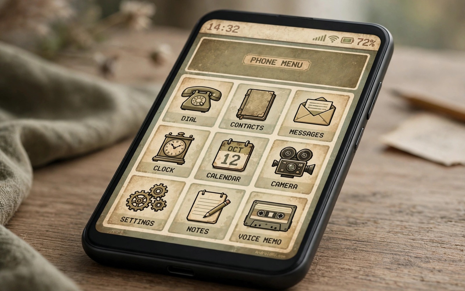
Early Android had a different personality from the polished screens of today. Icons were chunky and colours were bold. Buttons looked like real buttons with shadows and edges. Menus were simple and text was direct. Many people miss that honest look even though modern phones are faster and sharper. A retro style brings that feeling back without giving up modern apps or modern security.
Retro does not mean outdated in a bad way. It means choosing a visual language from an earlier era and applying it with care. A classic icon pack can change the whole home screen in minutes. A classic wallpaper can set the mood at once. A launcher with a simple grid can complete the look. The key is restraint because a few strong retro choices beat a messy mix of old and new.
This guide builds a retro setup that still works for daily life. Modern apps keep working and notifications keep arriving. Only the surface changes. You can switch back to a modern look in minutes if nostalgia wears off. Start with icons and wallpaper and add deeper changes only if the first step feels right.
Start With A Classic Icon Pack
A classic icon pack is the fastest way to feel retro. Look for packs that copy the shapes and colours of early Android icons. Early icons often used simple symbols and strong outlines. They avoided the soft gradients that dominate today. Apply the pack through your launcher and check the most used apps first. If the main apps look right then the whole screen will feel right.
Some apps will lack a themed icon because the pack maker did not draw one. Turn on icon masking so unthemed icons still fit the shape. Check masked icons after updates because a new app symbol can break the mask. Icon packs for a new look show how much a single pack can change a screen. A retro pack works the same way in reverse. Pick a pack with wide coverage so fewer icons need masking.
Choose A Launcher With A Simple Grid
Early Android launchers used a plain grid and a simple app drawer. A modern custom launcher can copy that layout while keeping modern speed. Set the grid to a modest size so icons stay large and easy to tap. Turn off fancy folders and effects for the first test. A plain layout lets the retro icons do the work.
Set the app drawer to a simple vertical list if your launcher offers it. A list feels closer to early Android than a paged grid. Keep the drawer background dark or light in a flat colour. Avoid blur and transparency for the retro test because those effects belong to a later era. Small choices like this keep the illusion consistent.
Retro UI setup
1. Apply a classic icon pack in your launcher
2. Set a simple grid and a list app drawer
3. Pick a flat wallpaper with few colours
4. Match the accent colour to the wallpaper
5. Build one simple clock widget
6. Test the setup for a full day
The example above was written for this guide as a plain summary of the steps in the sections before it. It uses only the menus and options described above and it needs no extra tool to understand. Follow the steps in order so you can see which change helps most. If one step makes things worse then undo that step alone and keep the rest.
Add Retro Wallpaper And Colours
Wallpaper sets the mood faster than any other choice. A flat colour or a simple geometric pattern feels more retro than a photo. Early wallpapers often used bold shapes and limited colours. Pick a wallpaper with two or three colours and a simple pattern. Avoid a busy photo that fights with chunky icons.
Match the system accent colour to the wallpaper palette. A teal accent with a dark wallpaper feels close to early Android. A bright orange accent with a light wallpaper feels playful in a different way. Keep the accent consistent across widgets and quick settings. Changing system fonts can support the look if you pick a simple sans font rather than a decorative one. A clean font keeps retro readable.
Bring Back Chunky Buttons And Simple Widgets
Widgets in early Android were simple boxes with clear text. A modern widget builder can copy that style with a flat background and a bold clock. Build one clock widget with large numbers and no shadow. Build one weather widget with a simple icon and a short text line. Two simple widgets beat a crowded screen full of effects.
Buttons inside apps will stay modern because apps control their own design. That limit is fine because the home screen carries most of the retro feeling. Focus your effort on the launcher and the lock screen and the widgets. Those surfaces are the ones you see most often. A consistent home screen matters more than changing every app.
Keep Modern Functions Under The Retro Surface
Retro style should not block modern functions. Keep fingerprint unlock and notifications and gesture navigation if you rely on them. A retro look that slows you down will not last. Test the setup for a full day of normal use before you judge it. Check that you can still find apps fast and read notifications clearly.
If a retro choice hurts usability then soften it rather than abandoning the whole style. A slightly larger icon grid can fix a cramped screen. A slightly brighter accent can fix a dark widget. Modern features on Android remind us that a phone can borrow a look from another era while keeping current tools. Retro is a surface choice and daily function must stay first.
Retro Lock Screen And App Drawer
A retro home screen feels incomplete if the lock screen stays modern and glossy. Set a simple lock screen wallpaper with a flat colour and a bold clock. Turn off fancy lock screen widgets for the retro test. A plain lock screen with a chunky clock matches the retro home screen far better than a modern blurred panel. The lock screen is the first surface you see each time you pick up the phone.
The app drawer deserves the same retro treatment. Set it to a simple list with plain icons and a flat background. Avoid a modern grid with blur behind it because that effect belongs to a later era. A list drawer with classic icons feels like an early Android phone while keeping modern search speed. Test the drawer for a day and check that you can still find apps fast. Retro style must not slow app discovery.
Avoid Retro Overload
Retro charm fades when every surface uses a different old style. Pick one retro era and stay close to it. Early Android icons with a later Android widget style can clash. A single icon pack and a single wallpaper palette keep the look coherent. If a new retro element fights the existing set then remove it rather than forcing it to fit.
Leave some modern comforts untouched even in a full retro setup. Modern notifications and modern gesture navigation can stay because they affect daily speed. A retro look that forces old navigation will frustrate you within days. Keep the surfaces you touch most in a retro style and keep the mechanics modern. That balance is what makes a retro phone enjoyable for months rather than for an afternoon.
Retro Sounds And Haptics To Complete The Look
Retro visuals feel stronger when sounds match them. A classic notification tone with a simple beep can complete a retro setup. Avoid modern melodic tones that clash with chunky icons and flat colours. Pick a short tone that feels like an early phone alert. Keep the tone volume moderate so it does not annoy people nearby. A retro tone should be a subtle nod to the past rather than a loud gimmick. Test the tone in a quiet room and in a busy street. A tone that works in both places is a good daily choice.
Haptics can also support a retro feel when kept simple. Early phones vibrated in simple patterns rather than in refined haptic rhythms. A short single buzz for notifications feels closer to that era than a complex pattern. Set notification vibration to a simple pattern for the retro test. If the simple pattern feels too plain then return to a modern pattern because usability matters more than era accuracy. Retro is a style choice and daily comfort must stay first. A retro phone that annoys you with every notification will not last a week.
Wallpaper sound pairings can change with the season as well. A summer retro setup might use a bright tone while a winter setup might use a softer tone. Change sounds only when you change the wallpaper theme so the set stays coherent. Keep a note of your favourite retro tone names so you can restore them after an update. System updates can reset sound settings just as they reset launcher settings. A short note restores the full retro atmosphere in minutes rather than hours.
Common mistakes
One common mistake is mixing retro icons with modern blur and transparency everywhere. The mix looks confused rather than nostalgic. Pick one era and stay close to it on the home screen. Another mistake is using a decorative font that hurts readability. A retro font should stay simple and clear. A third mistake is chasing every old detail at the cost of usability. If a retro choice slows daily tasks then soften it. Nostalgia should make the phone more fun rather than harder to use.
FAQ
Can I get a retro look without root?
Yes for launcher and icon and wallpaper and widget changes. Those surface changes need no root. Root only matters for deep system themes that change app interiors. Most people get a strong retro feel without root.
Will retro icons work for all my apps?
Most popular apps get themed icons in a good pack. Less common apps may need masking. Check coverage before you buy a paid pack and test the free version first if one exists.
How do I switch back to a modern look?
Change the launcher theme and icon pack back to your previous set. Keep a backup of your modern layout in the launcher so the switch takes minutes. Your apps and data stay untouched.
Conclusion
Apply a classic icon pack today and set a flat wallpaper with a matching accent. Live with that simple change for a day and see whether nostalgia still feels good in daily use. Add a simple widget and a plain grid only if the first step feels right. That gradual method gives you a retro phone that still works like a modern one. Keep the backup of your modern layout so you can switch back any time.
Keep the retro setup enjoyable by revisiting it after a month of daily use. A setup that still feels fun after a month is a keeper. A setup that feels tiring after a month needs softening rather than abandoning. Change one element at a time such as the wallpaper or the accent colour. Small refreshes keep nostalgia alive without a full rebuild. That long term view turns a fun experiment into a lasting personal style.

