

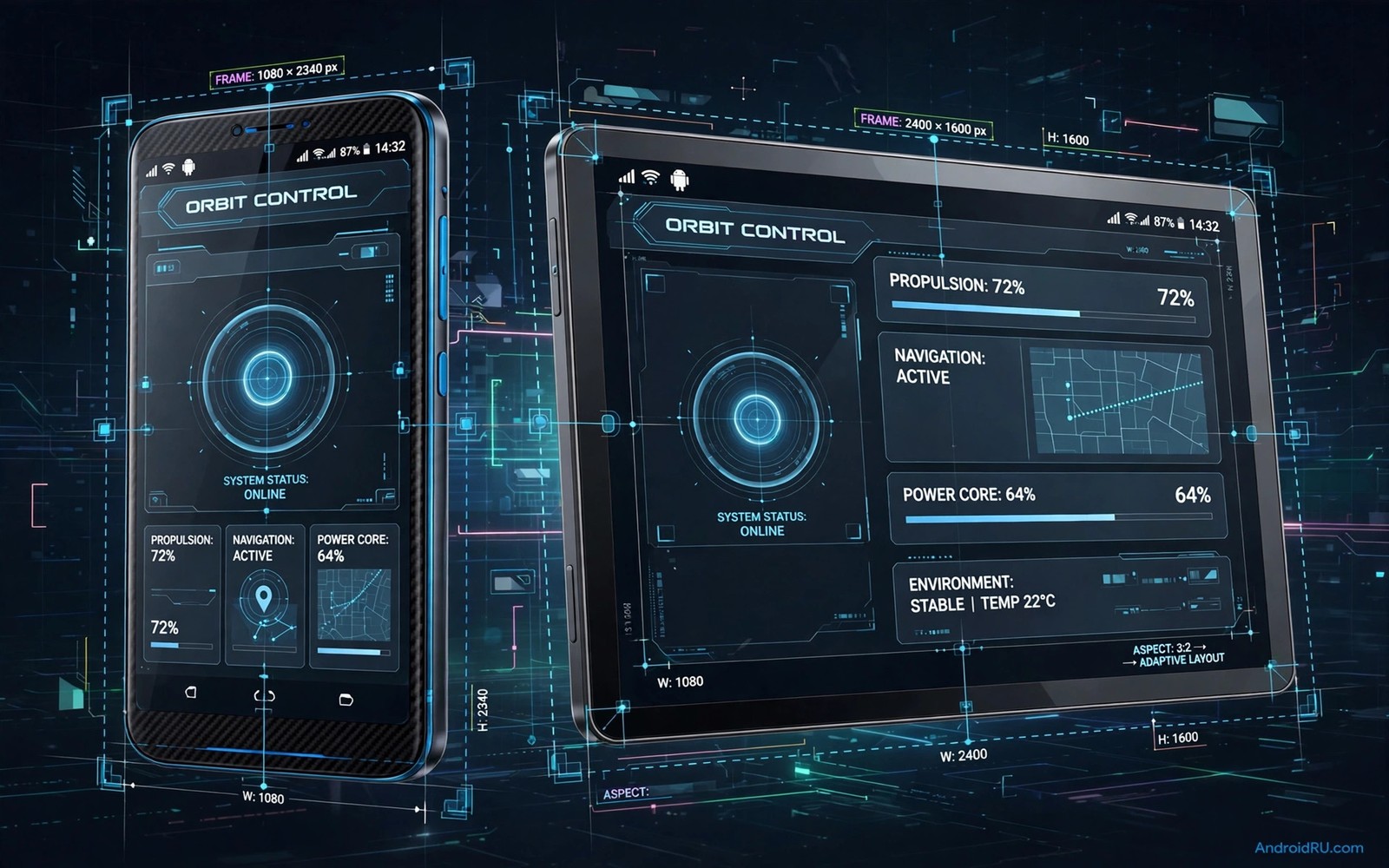
Aspect ratio decides how much of the screen an app actually uses. A tall phone with a narrow ratio can leave black bars on the sides of an older game. A tablet with a wide ratio can stretch a phone app until characters look short and wide. A foldable can switch ratios when you unfold it and some apps fail to follow. Forcing a custom aspect ratio lets you choose between full screen immersion and correct proportions.
Heavy apps are the hardest case because they render graphics and video at high load. A game that renders at the wrong ratio may stretch its world and misplace touch buttons. A video app that forces the wrong ratio may crop subtitles or stretch faces. A design app may distort its canvas and make precise work impossible. The goal is not simply to fill the screen. The goal is to fill the screen while keeping shapes and touch zones honest.
Android offers several routes to control ratio. Developer settings include options for forcing apps to resize. Per app settings on some phones let you set full screen behaviour for each app. Third party tools can force a specific ratio for apps that refuse to resize. Each route has limits and each route can break an app that assumes a fixed screen. Test one app at a time and keep a note of what works. A ratio fix that helps a game may hurt a banking app that expects a portrait layout.
Why apps resist the ratio you want
Apps declare supported screen sizes in their manifest. An app built for phones may declare that it does not support large screens. An app built for tablets may declare a minimum width that a phone cannot meet. When the system respects those declarations it letterboxes the app with black bars. That letterboxing protects the layout but it wastes screen space. Forcing a ratio overrides the declaration and asks the app to draw in a space it did not plan for.
Games are special because they often lock orientation and ratio for performance. A game engine may render at a fixed resolution and then scale the result to the screen. If the scale uses the wrong ratio then the image stretches. If the scale uses the right ratio then black bars appear. Some engines support dynamic resizing and they handle forced ratios well. Others cache the screen size at launch and ignore changes until restart. Restart the app after changing its ratio to give the engine a clean start.
Video apps face a different problem. Video content has its own ratio that may differ from the screen ratio. A wide movie on a tall phone will always have bars somewhere unless it crops. Forcing the app ratio does not change the video ratio. It changes how much of the screen the app window uses. Understand this distinction before you blame the app. A stretched face in video usually means the video player is set to stretch rather than the app window being wrong.
Touch zones are the hidden risk of forced ratios. Buttons drawn at stretched positions may still accept touches at their original positions. This mismatch makes a game feel broken even when graphics look fine. Test every button after a ratio change. Tap the corners and the centre and the menu icons. If taps land in the wrong place then revert the ratio for that app. A beautiful full screen with broken touch is worse than black bars with working controls.
Use per app full screen settings first
Open settings and look for display and full screen apps. Many phones list apps that can use the full screen including the camera cutout area. Turn on full screen for a game or a video app and test it. This official route is safest because the system handles the change. It may add a small prompt the first time the app opens. Accept the prompt and check whether graphics stretch or crop.
Some phones offer a per app aspect ratio choice with options like full screen and app default. Choose full screen for immersive games and video players. Choose app default for banking and messaging and work apps where layout correctness matters more than immersion. This split approach gives you the best of both worlds. You do not need one global rule for every app on the phone.
Camera cutout handling is part of the ratio decision. An app that extends into the cutout area gains a little more space but it may hide a button behind the hole. Choose to hide the cutout area for apps with important top controls. Choose to show it for video and games where the extra space matters and no button sits in that corner. Test both choices in the same app because the right answer depends on where its controls live.
Foldables need a separate profile for folded and unfolded states. An app that looks right folded may stretch unfolded. Set the unfolded behaviour in the foldable display settings if your phone offers it. Test the transition by opening the app folded and then unfolding it. The app should resize smoothly or restart cleanly. If it freezes then force stop it and set a fixed ratio for the unfolded state. A predictable restart beats a frozen half resized screen.
Force a custom ratio with developer tools
Developer options include a setting to force activities to be resizable. This setting tells the system to allow resizing even for apps that did not declare support. Turn it on and restart the app you want to test. The app may now fill the screen or it may still show bars if its engine locks size internally. This setting is a request and not a guarantee. Engines that lock size will ignore it.
Another developer setting controls the smallest width used for layout. Changing this value makes the system treat the screen as a different size class. It can turn a phone layout into a tablet layout for apps that support both. This change affects all apps so use it with care. Record the original value before you change it. Restore it immediately if text becomes tiny or if layouts break across many apps. A global change is powerful and therefore risky.
Third party ratio tools work by launching an app inside a container with a chosen size. They can force a square ratio for a portrait app or a wide ratio for a game. These tools are useful for testing but they add overhead. Heavy games may lose frames inside a container. Test frame rate with and without the tool. If the game stutters inside the container then the ratio gain is not worth the performance loss. Native per app settings remain the better path when they exist.
Always test with a real task and not just a screenshot. Play a game level for five minutes at the new ratio. Watch a full video scene. Complete a form in a work app. Real tasks reveal touch mismatches and cropping that screenshots hide. A ratio that survives five minutes of real use is a keeper. A ratio that fails in the first minute should be reverted without debate.
Fix stretching cropping and touch mismatch
Stretching is the easiest problem to spot. Circles become ovals and faces look wide. Fix it by choosing a ratio that matches the content ratio. For a game that was built for a wide screen use a wide ratio even on a tall phone. Black bars on the top and bottom are better than a stretched world. For a portrait app use a tall ratio that matches the phone. Do not force a wide ratio onto a portrait app just to fill a tablet screen.
Cropping happens when the app fills the screen by cutting off edges. Subtitles may vanish at the bottom. Health bars may vanish at the top. Menu buttons may vanish at the sides. Fix cropping by reducing the forced ratio slightly or by enabling a safe area margin. A small margin that keeps controls visible is worth more than a few millimetres of extra image. Check all four edges after any change.
Touch mismatch needs a restart and sometimes a cache clear. Force stop the app after a ratio change and open it fresh. Test taps in a menu and in gameplay. If taps still land offset then the app engine does not support the new ratio. Revert to the app default for that app and accept black bars. No visual gain justifies broken controls in a game or a work tool. You can still improve the look around the app with Material You colour tweaks that make the surrounding interface feel deliberate even with bars present.
Performance drops can follow a forced ratio because the app renders more pixels than before. A game forced to a wider ratio renders a larger scene. Monitor frame rate and temperature for ten minutes. If the phone heats up fast or frames drop then reduce graphics quality in the game settings. Ratio and graphics quality trade against each other on heavy apps. Balance them so the game stays smooth at the new size.
adb shell settings put global force_resizable_activities 1
adb shell wm size 1080x2400
adb shell wm size reset
The code above is an original example created for this article to show how a developer might record ratio related commands for reference. It is an optional advanced note and normal per app settings are enough for most readers.
Once the ratio looks right you can keep other controls close by setting up custom quick settings tiles for display and rotation toggles.
Common mistakes
The most common mistake is forcing one ratio for every app. A global ratio helps one app and breaks ten others. Use per app settings whenever possible. Keep work and banking apps at their default ratio. Force custom ratios only for games and video apps where immersion matters. Selective forcing is the professional approach.
Another mistake is judging a ratio by a screenshot alone. Screenshots hide touch mismatch and performance drops. Always play or work in the app for several minutes. Tap every control and watch for heat. A ratio that looks perfect in a still image can fail in motion. Real use is the only valid test.
People also forget to restart apps after a ratio change. An app that cached its old size will keep drawing wrong until it restarts. Force stop and reopen after every change. If you skip this step then you may blame the ratio when the real problem is a stale cache. Restart first and judge second.
Frequently asked questions
Will forcing a ratio damage my phone or void support?
Forcing a ratio through official settings does not damage hardware. It can make an app unstable but a revert restores normal behaviour. Third party container tools add risk on heavy games because they add overhead. Use official settings first. Keep a note of original values so you can undo any change quickly.
Why do black bars remain after I force full screen?
Black bars remain when the app engine locks its internal size or when video content has a different ratio. The system can resize the window but it cannot force the engine to redraw at a new size. In that case the bars are protecting the image from stretching. Accept them for that app and focus ratio forcing on apps that actually resize.
Does a custom ratio help on tablets and foldables?
Yes tablets and foldables benefit most because their ratios differ greatly from phone apps. A phone app on a tablet can look tiny or stretched without a ratio fix. Use per app settings to give each app a sensible window size. Test folded and unfolded states separately on a foldable. A good tablet setup often uses different ratios for games and for reading apps and you can refine it alongside independent SystemUI colours for a coherent large screen look.
Conclusion
A custom aspect ratio is worth forcing when it fills the screen without stretching graphics or breaking touch. Use per app settings first and test with real tasks. Your concrete next step is to pick one heavy game tonight and set it to full screen in display settings. Play one level and tap every control. If graphics stay honest and taps land correctly then keep the setting and move to the next app.