

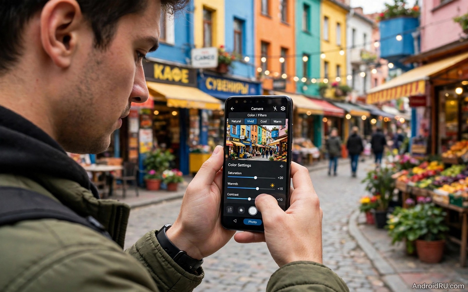
Many phones from Chinese brands produce vivid photos that pop on a small screen. Greens look electric and reds look intense and skies turn a deep artificial blue. That vivid style pleases at first glance but it can ruin skin tones and print quality. A family photo with orange skin and neon grass feels less like a memory and more like a cartoon. The good news is that most of the excess comes from software processing rather than from the sensor itself.
Manufacturers tune cameras for showroom appeal. A bright saturated photo stands out beside a muted competitor on a shop display. That tuning assumes most photos will be viewed briefly on a phone screen. It does not assume the photo will be printed large or edited later. Understanding that tradeoff helps you tame colour without losing the punch that makes the phone enjoyable.
This guide shows practical fixes inside the camera app and inside editing. You will learn how to use pro mode and scene settings and white balance to calm colour at capture time. You will also learn how to rescue already saturated photos with gentle edits. The goal is natural colour that still feels lively rather than flat colour that feels dull.
Find where saturation comes from
Saturation can come from three layers. The scene mode may add a vivid filter automatically. The AI scene detection may boost colours when it recognises food or foliage or sky. The default processing may raise saturation for all photos regardless of scene. Disable AI scene enhancement first and test again. Many phones hide this toggle under camera settings or under an AI icon in the viewfinder.
Check for a vivid or AI colour mode in the camera settings. Some phones offer natural and vivid picture styles similar to a film profile. Choose natural when available. A natural profile gives you a flatter starting file that edits cleanly. A vivid profile bakes excess colour into the file and makes later correction harder.
Test with a controlled subject such as a fruit bowl in daylight. Photograph it with AI on and AI off and with vivid and natural styles if available. Compare skin tones if a person is nearby because skin reveals saturation errors faster than fruit. A controlled test isolates which setting causes the excess rather than guessing across random photos.
Use pro mode to take control
Pro mode gives direct control over white balance and ISO and shutter speed. White balance matters because a wrong colour temperature can push a photo toward orange or blue and make saturation feel worse. Set white balance to daylight outdoors and to the matching indoor preset under lamps. Avoid automatic white balance when the light is mixed because it may shift between shots.
Pro mode also lets you shoot in RAW on many phones. A RAW file stores sensor data with minimal processing. It gives you full control over saturation and white balance in editing. RAW files are larger and need editing before sharing but they are the cleanest starting point for colour critical photos. Use RAW for portraits and prints and keep JPEG for casual snaps.
Keep ISO as low as light allows in pro mode. High ISO adds noise and noise reduction can smear colour and create blotchy saturation. A steady hand or a support lets you use a lower ISO in dim light. A clean low ISO file responds better to gentle saturation reduction than a noisy high ISO file.
Calm colour in editing without killing life
Start editing by reducing saturation in small steps rather than dragging the slider to zero. A reduction of ten to twenty points often tames neon grass while keeping the photo lively. Check skin after each step because skin should stay warm but not orange. A photo that looks slightly flat on screen may print beautifully because prints add their own contrast.
Use vibrance when your editor offers it because vibrance protects skin tones better than global saturation. Vibrance raises muted colours more than already strong colours. That behaviour calms the loudest colours first. If only saturation is available then reduce it gently and then lift shadows slightly to restore depth.
Adjust individual colours when possible. Reduce green saturation for foliage and reduce red saturation for skin warmth. Shift green hue slightly toward yellow if foliage looks electric teal. Keep changes small and compare with the original at each step. A guide to editing raw photos like a professional explains how colour channels behave during these adjustments in more detail.
Handle tricky scenes with a plan
Food photos tempt cameras to oversaturate reds and yellows. A plate that looks appetising in real life can look artificial when reds are pushed too far. Use natural light near a window and turn off AI food detection. A neutral starting photo lets you add a touch of warmth manually without turning sauce into neon orange.
Landscapes tempt cameras to push sky blue and grass green together. The result looks like a postcard from another planet. Expose for the sky slightly and keep saturation moderate. A polarising effect from angle and light already deepens skies without software help. Let real light do the work and let software support it gently.
Portraits need the most restraint. Skin covers a large area and small saturation errors become obvious. Use a natural profile and soft daylight and keep red and orange saturation in check. A portrait with calm skin and a slightly vivid background feels balanced. A portrait with orange skin and a dull background feels wrong even if the background looks correct.
A small script to preview gentler colour
The script below reduces colour saturation of a copy by a chosen factor. It helps you preview a calmer version before rebuilding the edit in a mobile editor. Run it on a local copy and compare the preview with the original.
from PIL import Image, ImageEnhance
image = Image.open("vivid.jpg").convert("RGB")
calmer = ImageEnhance.Color(image).enhance(0.82)
calmer.save("calmer_preview.jpg", quality=92)
The code above was written for this guide as an original colour preview helper. It reduces colour strength to eighty two percent of the original and saves a new file. It does not change the original photo and it does not upload any file. Try values between zero point eight and zero point nine and pick the preview that keeps life without neon edges.
Check colour on a second screen
A second screen check prevents a vivid phone display from misleading your edits. Transfer a test photo to a computer or a tablet and view it at normal brightness. A photo that looks neon on a vivid phone screen may look balanced on a neutral display. A photo that looks balanced on both screens is truly balanced.
Ask a friend to view the same photo on their phone without telling them your concern. A fresh viewer notices orange skin or electric grass without your editing bias. A quick second opinion takes a minute and it often confirms whether a colour problem is real or only a display effect. Trust a consensus over a single screen.
Colour problems often appear first in reds and greens because those channels saturate fastest. A red shirt that loses texture and a green lawn that looks flat both signal excess saturation. Reducing red and green slightly restores texture without dulling the whole photo. Texture is a better guide than brightness when judging colour.
Common mistakes
The biggest mistake is judging colour only on the phone screen at full brightness. A vivid screen makes saturation look stronger than it will on a print or on another device. Check photos on a second screen or at moderate brightness before deciding they are oversaturated. A photo that looks loud on a vivid display may look balanced elsewhere.
Another mistake is reducing saturation to zero in frustration. A fully desaturated photo loses warmth and life and looks grey rather than natural. Calm colour means reducing excess by a modest amount. Keep some warmth in skin and some depth in skies so the photo still feels alive.
People also forget to turn off AI scene detection after testing it once. AI modes re-enable after updates or after switching camera modes. Recheck the AI toggle after a system update or after using a special mode such as night or portrait. A silent re-enable can undo weeks of careful colour work.
Finally avoid stacking a vivid capture profile with a vivid filter in editing. Two layers of saturation multiply the excess. Start from a natural capture and add one gentle colour adjustment in editing. One controlled layer beats two aggressive layers every time.
Frequently asked questions
Why do photos look more saturated on my phone than on my computer?
Phone screens often use a vivid display mode that boosts colour for all content. The photo file itself may be less saturated than the screen suggests. View the same file on a calibrated computer screen or share it to another device for a second opinion. Change the phone display mode to natural when judging colour accuracy.
Will a third party camera app fix oversaturation?
A third party app can help when it offers a natural profile or RAW capture. It cannot change the sensor but it can change processing. Test a reputable camera app with a natural profile on the same scene. Compare skin and foliage before adopting it as your main camera. A new app that still uses vivid processing will not solve the problem.
Should I shoot RAW for every photo?
RAW helps for important photos but it adds editing time and storage use. Use RAW for portraits and prints and tricky light. Use JPEG with a natural profile for casual everyday shots. A mixed approach gives you colour control where it matters without slowing down every snapshot.
Conclusion
Oversaturation on many Chinese brand phones comes from vivid processing tuned for showroom impact. Turning off AI enhancement and choosing a natural profile and using pro white balance calms colour at capture. Gentle editing with vibrance and selective colour controls rescues photos that are already too vivid. The goal is lively natural colour rather than flat grey or neon excess.
Your concrete next step is to photograph a fruit bowl and a portrait in daylight today with AI enhancement off and a natural profile on. Compare those shots with your previous vivid shots on the same screen. Keep the setting that gives calm skin and believable grass. Readers who want more camera control will also like smartphone pro mode explained for ISO and shutter and white balance and camera settings to change before a trip as follow-ups.

