

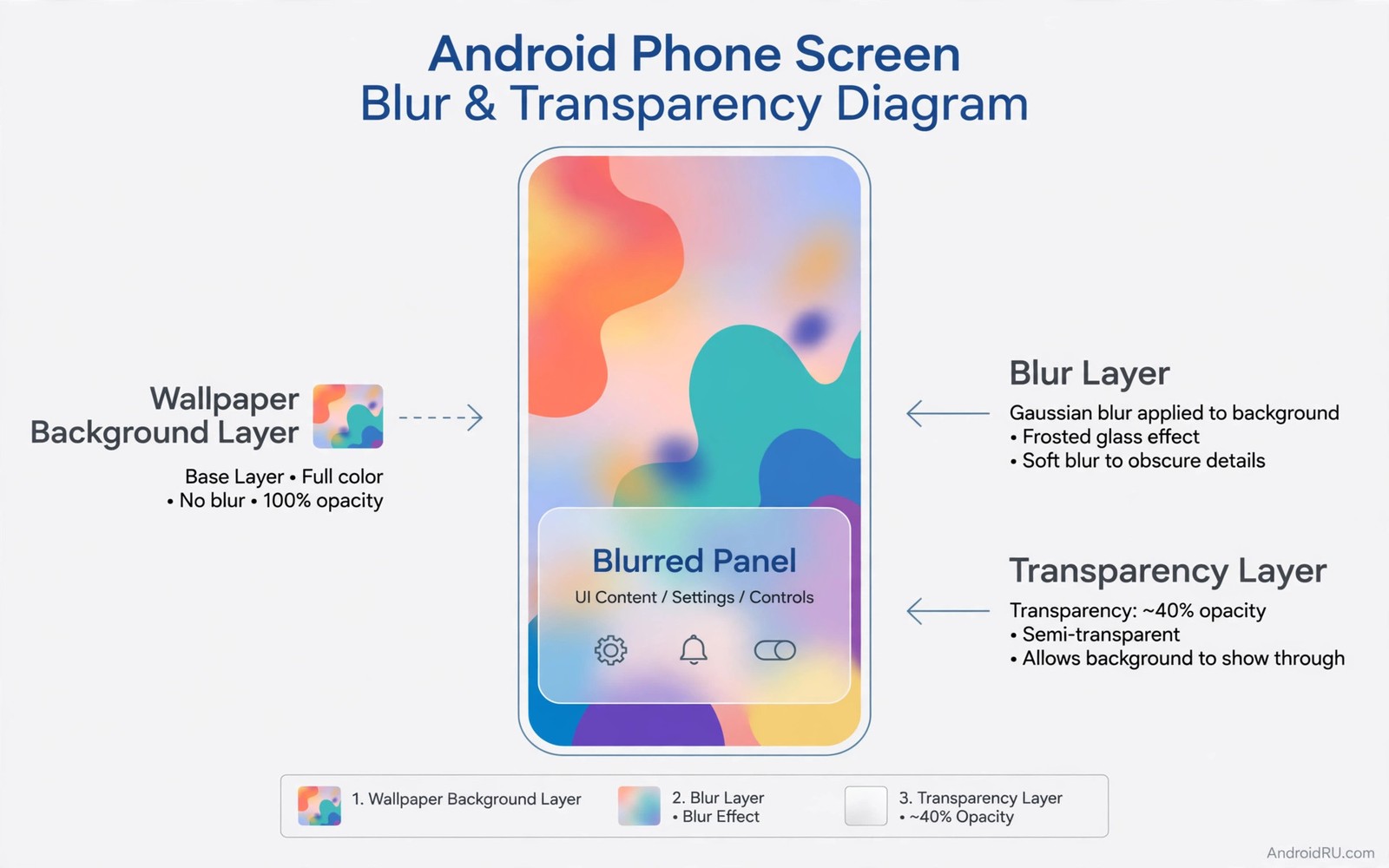
Blur turns a flat panel into frosted glass. A notification shade over a photo becomes readable because the photo softens behind it. A quick settings panel over a video becomes calm because motion blurs into colour. A widget over a busy wallpaper becomes usable because the background loses its sharp edges. Systemwide blur applies this effect across panels and not just inside one app. The result is a phone that feels layered and modern.
Blur is not just decoration. It helps readability by reducing contrast between panel text and background detail. A sharp photo behind white text can make words hard to read. A blurred photo behind the same text keeps colour mood while removing competing edges. Blur also signals depth. A blurred background tells your brain that the panel is in front and the app is behind. That depth cue makes navigation feel more physical.
Getting blur everywhere is harder than getting it in one place. Some phones support blur in system panels natively. Others support it only in certain themes. Third party tools can add blur to panels that lack it but they cannot blur every surface. This guide maps what is possible and how to tune it for readability. It also covers performance because blur is one of the most expensive visual effects on a phone. You can pair blur with dynamic blur backgrounds for quick settings ideas once the base effect works well.
Check native blur support on your phone
Open settings and search for blur or transparency or frosted effects. Some phones place blur under display or wallpaper or theme settings. Others enable it automatically when you choose a theme that uses it. Take a screenshot of your notification shade over a colourful wallpaper. If the wallpaper looks soft and out of focus behind the shade then native blur is already on. If the wallpaper looks sharp then native blur is off or unsupported.
Theme choice often controls blur more than a single toggle. A theme with frosted panels will blur shades and dialogs. A theme with solid panels will not blur even if the phone hardware supports it. Try two or three built in themes and compare the same notification shade each time. Record which theme gives the softest background while keeping text sharp. That theme is your base for systemwide work.
Wallpaper type affects how blur looks. A photo with strong colours blurs into a pleasant wash. A plain gradient blurs into a smooth tone that may look identical to a solid panel. A busy pattern blurs into noise that still competes with text. Choose a wallpaper with large colour areas and few sharp details for the best blur result. A landscape photo with sky and water usually blurs better than a city photo with many windows.
Check blur in different panels separately. Notification shade and quick settings and volume panel and app folders may each behave differently. One panel may blur while another stays solid. Note which panels blur natively. Third party tools should focus only on the panels that stay solid. Trying to blur everything with one tool often creates conflicts with panels that already blur well.
Enable blur in notification shade and quick settings
Start with the notification shade because you see it many times a day. Open the shade over a photo and read a notification. If text is hard to read then increase panel opacity or blur strength in theme settings. Opacity and blur work together. Higher opacity makes text clearer but hides more wallpaper. Stronger blur keeps wallpaper colour while softening detail. Find the combination where text is crisp and wallpaper mood remains visible.
Quick settings tiles sit inside the same shade on most phones. Their icons need contrast against the blurred background. If tile icons vanish against a bright blurred area then switch tile style to filled circles with dark icons. Filled tiles create their own contrast zone inside the blur. Test tiles over a bright wallpaper and over a dark wallpaper. A tile style that works in both conditions is ready for daily use.
Brightness sliders and toggles inside quick settings need special attention. A slider track over a blurred background can lose its ends. Use a slider style with a clear track and a large thumb. The thumb should contrast strongly with the blur behind it. Test the slider with one thumb while walking. If you cannot find the thumb quickly then increase its size or its opacity. A beautiful slider that is hard to grab fails its job.
Some phones let you adjust blur radius in developer or theme settings. A small radius softens edges slightly. A large radius turns the background into pure colour. Start with a medium radius and increase it only if text still competes with background detail. A very large radius can make the shade look like a solid colour panel and lose the glass feeling. Medium blur usually gives the best balance between glass and readability.
Add blur to widgets folders and dialogs
Widgets can use frosted backgrounds through widget tools that support blur. Choose a widget with a translucent blurred background rather than a solid colour. Place it over a colourful wallpaper and check text readability. A calendar widget with blurred background and dark text works well over a light photo. A music widget with blurred background and white text works well over a dark photo. Match text colour to the blurred tone and not to the original wallpaper.
Folders can also benefit from blur when they open over the home screen. A folder popup with a blurred background keeps the home screen visible in soft form. This depth cue helps you remember where you came from. If folder backgrounds stay solid then try a launcher theme that supports frosted folders. Test folder opening speed because blur on folder open can add a slight delay on older phones. If delay is noticeable then keep folders solid and blur only the shade.
Dialogs are smaller and blur matters less there. A confirmation dialog over an app benefits from a dimmed and slightly blurred background because it focuses attention on the choice. Most system dialogs already dim the background. Adding blur to dialogs is a refinement and not a necessity. Focus your effort on large panels first. Small dialogs can stay solid without hurting the overall glass feeling.
Lock screen blur is a separate case because it affects security perception. A blurred lock screen wallpaper can look elegant but it may hide notification details you need. Test lock screen notifications with blur on. If message previews become hard to read then reduce blur on the lock screen only. Keep strong blur for unlocked panels where you control the content. Lock screen clarity should win over glass style.
Balance blur strength with performance and battery
Blur is computed by the graphics processor every time the background changes. A static wallpaper costs little because the blur result can be cached. A live wallpaper or a video behind a panel costs more because blur must update constantly. Avoid live wallpapers if you want strong systemwide blur on an older phone. A static photo gives you the glass look without constant recomputation.
Frame drops are the warning sign of too much blur. Open the notification shade while a video plays behind it. If the video stutters or the shade animation jerks then blur is too heavy for that combination. Reduce blur radius or increase panel opacity so less background shows. Test again with the same video. Smooth animation matters more than a perfect frosted look. A jerky shade feels broken even if it looks premium in a still image.
Battery impact follows the same pattern. Static blur has a small impact. Constant blur over moving content has a larger impact. Check battery usage after a day with heavy blur. If the system interface share grows noticeably then simplify. Blur the shade only and leave folders and widgets solid. That compromise keeps the most visible glass effect while cutting the cost elsewhere.
Low end phones need a lighter strategy. Use blur only in the notification shade and use solid panels elsewhere. Choose a medium radius and a static wallpaper. This light strategy still delivers the modern feeling without taxing the graphics processor. A phone that stays smooth with light blur feels more premium than a phone that stutters with heavy blur everywhere. Performance is part of the aesthetic.
blur_radius = 24
panel_opacity = 0.72
blur_panels = ["notification_shade", "quick_settings"]
print(blur_panels[0], blur_radius)
The code above is an original example created for this article to show how blur settings could be written down as a simple preset. It is a planning aid and not a setting you must apply on your phone.
Tile clarity over blur also improves when you arrange custom quick settings tiles so the toggles you use most sit at the top of the panel.
Blurred panels also pair well with a clear top area and live status bar controls can keep signal and time readable over soft backgrounds.
Common mistakes
The top mistake is maximising blur everywhere on day one. Heavy blur on every panel slows older phones and makes text harder to read in some conditions. Start with the notification shade only. Add quick settings blur after a week if performance stays smooth. Expand gradually and measure each step. Gradual expansion protects both speed and readability.
Another mistake is choosing a busy wallpaper for a glass setup. Busy wallpapers blur into noisy colour that still competes with text. Choose a wallpaper with large soft areas. Test blur over that wallpaper before you commit to a theme. A good wallpaper makes blur look effortless. A bad wallpaper makes even strong blur look messy.
People also forget to test text contrast after enabling blur. White text over a bright blurred area can vanish. Dark text over a dark blurred area can vanish too. Check both bright and dark wallpapers. Adjust text colour or panel opacity until text stays clear in both cases. Contrast is not optional for a daily interface.
Frequently asked questions
Does blur work without root?
Yes native blur and theme blur work without root on phones that support them. Third party blur tools for panels also work without root in many cases. Root opens deeper control over system surfaces but it is not required for a good glass effect in the shade and quick settings. Start with native options and judge the result before considering deeper methods.
Why does blur disappear in some apps?
Blur disappears when an app draws its own panels or when a full screen app takes over the display. Games and video players often disable system blur for performance. Some apps use solid dialogs by design. This is normal and not a failure of your setup. System blur applies to system panels and not to every app surface.
Can blur improve readability or only style?
Blur can improve readability when it softens a busy background behind text. It hurts readability when it is too weak to soften detail or when panel opacity is too low. The key is pairing blur with enough opacity and strong text contrast. Test readability with real notifications and not just with a clean demo screen. You can also refine panel style through custom quick settings tiles that keep tile icons clear over blurred backgrounds.
Conclusion
Systemwide blur works when large panels gain a frosted depth without losing text clarity or smooth animation. Start with the notification shade and a soft wallpaper. Your concrete next step is to enable a frosted theme tonight and read five notifications over a colourful photo. If all five read clearly and the shade animates smoothly then keep the theme and extend blur to quick settings next.

