

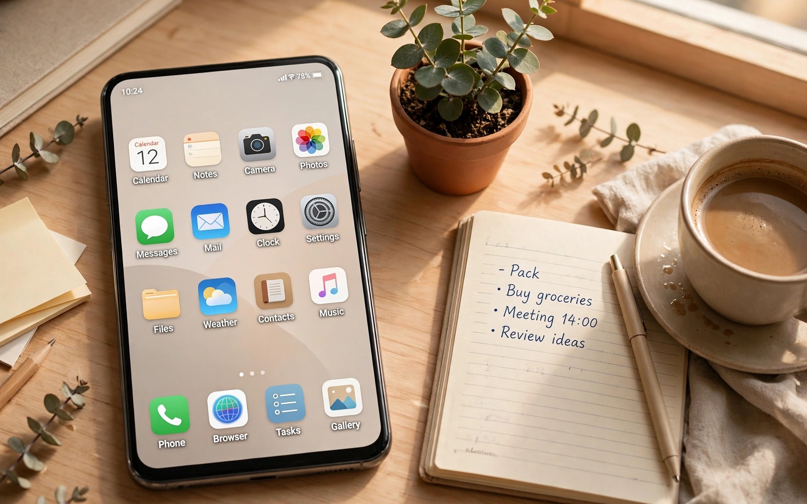
An aesthetic phone desktop is more than a pretty wallpaper. It is a system where wallpaper and icons and widgets and colours work together. When those pieces agree the phone feels calm every time you unlock it. When they fight each other the phone feels noisy even if each piece looks good alone. The seven ideas in this guide cover different moods so you can pick one that fits your life rather than copying a screenshot that fits someone else.
Start with a mood word before you pick any app. Calm and warm and bold and minimal are different goals. A calm setup uses soft colours and large empty space. A bold setup uses strong contrast and large icons. A warm setup uses earth tones and nature photos. A minimal setup uses one colour family and almost no widgets. Naming the mood first prevents a random mix of styles that looks busy. Every later choice should serve that one word.
Speed must stay part of the aesthetic. A setup that needs ten widgets and three live feeds will drain battery and slow unlocks. A beautiful setup that lags is not beautiful in daily use. Keep widgets to two at most on the main screen. Keep icon packs light. Keep animations modest. The ideas below are chosen to look strong without heavy tools. You can refine any of them with custom floating widgets once the base mood is settled.
Minimal monochrome and soft pastel grids
A minimal monochrome setup uses black and white and one grey tone across the whole screen. Icons come from a single monochrome pack. The wallpaper is a soft gradient or a simple shape. Widgets use white text on a dark background or dark text on a light background. The result is a screen that reads instantly because nothing competes for attention. It suits work phones and people who check the phone dozens of times a day.
Build it by choosing the wallpaper first. A light grey gradient works for daytime use. A dark charcoal gradient works for night use. Set icons to a monochrome pack with consistent line weight. Place twelve icons in a four by three grid. Leave the bottom row partly empty so the screen breathes. Add one small clock widget in a clean font. Stop there. Adding more widgets breaks the monochrome calm and turns minimal into empty in a bad way.
A soft pastel grid is the warmer cousin of monochrome. It uses pale pink and mint and cream and sky tones in low saturation. Icons use pastel fills with rounded shapes. The wallpaper is a pastel gradient or a soft abstract wash. Widgets use the same pastel family with dark text for readability. This setup feels friendly without being loud. It suits personal phones and people who want warmth without clutter.
Pastel setups fail when colours become too pale to read outdoors. Test the screen in sunlight before you settle. Increase icon contrast slightly if pastel icons vanish against a light wallpaper. Use a slightly darker pastel for icon fills and keep the wallpaper lighter. That contrast gap keeps icons visible while preserving the soft mood. A pastel screen that cannot be read outside is decoration and not a tool.
Nature earth tones and dark neon accents
A nature setup uses a landscape photo as the hero and earth tones for everything else. Choose a photo with a large sky or a quiet field area where icons can sit. Use brown and green and stone tones for icons and widgets. Keep the icon count low so the photo stays visible. This setup feels grounded because the phone reminds you of a real place rather than a digital pattern. It suits people who spend long days indoors and want a visual break.
Build a nature screen by cropping the photo for the phone ratio. Place the horizon low so the sky occupies the top half where icons sit. Use translucent widgets that let the photo show through. Avoid bright widget backgrounds that cover the photo. A calendar widget with a translucent background and white text works well. A weather widget with a simple icon and temperature fits the theme without shouting.
An earth tone setup is similar but more structured. It uses terracotta and sand and olive as a palette across icons and widgets. The wallpaper can be a texture like stone or wood or linen in a muted tone. Icons use flat earth fills. Widgets use the same palette with clear dark text. This setup feels crafted and warm. It suits people who like a consistent design language across the whole phone.
A dark neon setup is the opposite mood and it suits night owls and gamers. It uses a near black wallpaper with one neon accent colour like cyan or magenta. Icons are dark with neon outlines. Widgets use dark backgrounds with neon text for time and battery. Keep neon to one accent colour. Two neon colours compete and the screen becomes a light show. One accent gives focus and makes the clock and the favourite icons pop at night.
Retro pixel and modern glassmorphism looks
A retro pixel setup uses chunky pixel icons and a limited colour palette from older games. The wallpaper can be a pixel landscape or a simple pattern. Widgets use blocky fonts and hard edges. This setup feels playful and nostalgic. It suits people who want personality over polish. Keep the palette to four colours at most so the pixel style stays coherent. Too many colours turn retro into random.
Build retro carefully because pixel icons can be hard to read at small sizes. Use medium or large icons so pixel shapes stay clear. Place fewer icons on the main screen because pixel art needs space to breathe. Use a simple clock widget in a pixel font but keep the date in a readable size. Test the setup with a friend. If they cannot name the main apps then the pixel style is too abstract for daily use.
A glassmorphism setup uses translucent frosted panels over a colourful wallpaper. Widgets look like glass cards with soft blur. Icons sit on a vibrant gradient or a photo with strong colours. The frosted effect makes widgets feel layered and modern. This setup needs a wallpaper with rich colour because glass needs something to blur. A plain wallpaper makes glass panels look grey and dull.
Glass setups can hurt readability if the blur is too weak. Text on a frosted panel over a busy photo can vanish. Increase panel opacity slightly until text is clear. Use white text on dark glass and dark text on light glass based on the wallpaper. Test in different lighting because a glass panel that works indoors may fail outdoors. Readability is the price of admission for any aesthetic and glass is no exception.
One colour family and a photo hero layout
A one colour family setup picks a single hue and uses its shades across the whole screen. A blue family setup uses navy and sky and ice tones. A green family setup uses forest and sage and mint tones. Icons and widgets and wallpaper all stay inside that family. The result looks professionally designed because colour harmony does the heavy lifting. It suits people who want a strong look without complex tools.
Start with the wallpaper shade and build outward. If the wallpaper is deep blue then icons should be light blue or white on transparent backgrounds. Widgets should use deep blue panels with light text. The dock should match the widget panels. This chain of matching shades creates depth. Avoid introducing a second hue for accent buttons unless you do it deliberately and sparingly. One accent icon in a contrasting colour can highlight a favourite app but more than one breaks the family.
A photo hero layout makes one image the star and pushes everything else to the edges. Choose a portrait photo or an artwork with a clear subject. Place icons along the bottom and widgets along the top. Leave the centre free so the subject stays visible. This layout feels like a poster and it suits people with a favourite photo. It works best with a small icon count and a transparent dock. A crowded hero layout hides the photo and defeats its own purpose.
Rotate hero photos seasonally to keep the setup fresh without rebuilding it. Save three hero layouts as presets if your launcher supports it. Switch presets when the season changes or when your mood changes. A preset switch takes a minute and it feels like a new phone. Rebuilding from scratch every time wastes effort and often loses a layout you liked. Presets protect good work.
aesthetic_preset = {
  "mood": "calm pastel",
  "wallpaper": "soft gradient",
  "icon_pack": "pastel rounded",
  "max_widgets": 2
}
print(aesthetic_preset["mood"])
The code above is an original example created for this article to show how an aesthetic setup could be written down as a simple preset note. It is a planning aid and not a file you must run on your phone.
Colour harmony across the whole phone also matters and Material You colour tweaks can align accents with the wallpaper you chose.
If your chosen wallpaper moves then live wallpapers that stay light on battery offer motion that stays gentle on battery while keeping the theme intact.
Common mistakes
The biggest mistake is mixing three moods on one screen. A neon widget on a nature wallpaper with retro icons looks confused. Pick one mood word and enforce it for a week. Remove any element that does not serve that mood. A coherent screen with fewer elements beats a rich screen with clashing styles.
Another mistake is covering a beautiful wallpaper with widgets. A hero photo needs empty space to shine. If you love widgets then choose a quiet wallpaper that can sit behind them. If you love a photo then keep widgets minimal. You cannot maximise both at once. Choose which element is the star and let the other support it.
People also forget to test outdoors and at night. A pastel screen may vanish in sunlight. A dark neon screen may glare at night. Test both conditions before you declare a setup finished. Adjust contrast and opacity until the screen works in real light. A setup that only works in a dim room is not finished.
Frequently asked questions
How many widgets should an aesthetic setup have?
Two widgets on the main screen is a good limit for most moods. A clock and a calendar cover daily needs without clutter. Add a third widget only on a second screen for briefings. More widgets on the main screen compete with icons and wallpaper. Restraint is what makes a setup look intentional.
Do aesthetic setups slow down older phones?
Light icon packs and static wallpapers add almost no load. Live wallpapers and many widgets can slow older phones. Choose static wallpapers and limit live widgets if your phone is older. Test unlock speed after building the setup. If unlock feels slower then remove the heaviest widget first.
How often should I change my aesthetic setup?
Change presets seasonally or when your routine changes. A stable setup builds muscle memory for icon positions. Frequent redesigns reset that memory and slow you down. Keep the layout stable and change only wallpaper and accent colour for freshness. You can explore new widget ideas through custom floating widgets without rebuilding the whole screen.
Conclusion
A great aesthetic setup starts with one mood word and stays loyal to it across wallpaper and icons and widgets. Pick the mood that fits your day and build it in under an hour. Your concrete next step is to choose one mood tonight and set its wallpaper and icon pack before bed. Live with that base for three days before you add any widget. If the base still pleases you on day three then add one widget and stop.

