

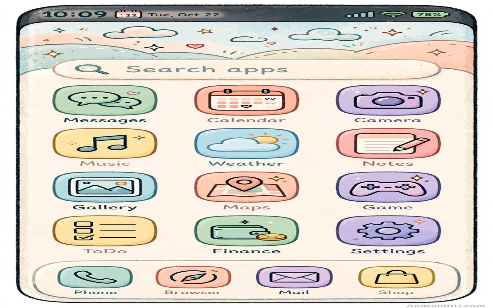
Changed icons often arrive with an ugly surprise. A small launcher badge or a white frame or a drop shadow marks the icon as customized. That mark breaks the clean look you wanted and tells everyone that a shortcut stands in for the real app.
The watermark problem has a real cause. Shortcut icons created by some tools carry a badge to show they are shortcuts. Icon packs applied through a full launcher avoid the badge because the launcher draws the icon directly. This guide uses the clean paths first.
You will learn three watermark free methods in order. A full launcher icon pack is the cleanest. A shortcut tool with proper icon masking comes second. A manual icon edit for single apps comes last for stubborn cases.
Method one: apply a full icon pack
Install a launcher that supports icon packs and apply one pack across the whole system. The launcher replaces icons at draw time so no shortcut badge appears. This is the only method that changes drawer icons and home icons together.
Choose a pack with high coverage for your installed apps. Check the pack details for the number of icons included. A pack that covers ninety percent of your apps looks finished. A pack that covers half looks like a work in progress.
Pack choice guidance lives in secret icon packs for a next generation look where coverage and style are judged together. Pick coverage first and style second for a watermark free result.
Method two: mask shortcut icons properly
If you must use shortcuts then use a shortcut tool that lets you pick a full bleed icon image. Choose an image that fills the entire icon square with no transparent border. A full bleed image leaves no room for a badge to show beside it.
Set the shortcut name to match the original app name exactly. A mismatched name reveals the shortcut faster than any badge. Test the shortcut on the home screen at normal viewing distance before you duplicate it for more apps.
Shortcut masking works best inside a calm layout like a flagship style layout where uniform icons carry the premium feel. One masked shortcut among default icons still looks odd so commit to the full set.
Method three: fix single stubborn apps
Some apps resist pack coverage because their icons use unusual shapes. For those apps create a single custom icon from a simple shape and the app initial letter. Keep the color inside your pack palette so the custom icon blends rather than shouts.
Place the stubborn app in a folder if a custom icon still looks wrong. A folder icon hides the mismatch until the pack updates with proper coverage. Check for pack updates monthly because popular apps gain coverage quickly.
Single app fixes pair with font tuning in changing system fonts without root since label style affects how a custom icon reads. Short labels help custom icons blend in faster.
Verify the result at a glance
Step back and view the home screen as a whole. Every icon should share the same shape family and the same shadow style. Any icon with a frame or badge or mismatched shadow needs another pass.
Ask a friend to spot the customized icons. If they cannot tell which icons changed then you have succeeded. If they spot one instantly then that icon needs a different method from this guide.
Keep a note of which method worked for each stubborn app. When you switch phones you can repeat the winning method without rediscovering the watermark traps.
Icon change method picker
Pick your method with this simple decision list. Start at the top and stop at the first method that fits your phone. Do not mix methods on the same screen.
if launcher supports icon packs:
    apply one full pack everywhere
elif shortcut tool supports full bleed icons:
    create masked shortcuts with exact names
else:
    fix single apps with custom shapes
verify = no badge, no frame, same shadow family
The picker above was written for this guide as a decision aid. It is not software to run. Follow it by hand and verify the result visually on your home screen.
Keep icons consistent after app updates
App updates sometimes replace a pack covered icon with a new default shape. The update changes the app logo and the pack has not caught up yet. Your home screen gains one mismatched icon overnight.
Check the home screen after major app updates for new mismatches. Fix them by requesting pack coverage or by creating a temporary custom icon. A single mismatch draws the eye more than a whole old set did.
Delay major icon pack changes until after a round of app updates. Changing packs during update week creates confusion about which change caused each mismatch. Stable timing isolates causes clearly.
Back up your icon pack choice in your setup notes alongside the launcher name. A new phone rebuild needs the pack name and the launcher name together. One without the other wastes an evening of trial.
Teach yourself to spot shape family breaks quickly. Scan the home screen for any icon with a different corner radius or shadow depth. That scan takes five seconds and keeps the set uniform for months.
Icon packs and brand recognition tradeoffs
Icon packs improve visual unity but they cost brand recognition. A redesigned bank icon may look beautiful yet fail to signal banking at a glance. Users who scan for a familiar logo will hesitate when the logo becomes a generic glyph. That hesitation costs seconds dozens of times a day and the cost adds up quietly.
The tradeoff matters most for apps you open under stress. Banking and health and emergency apps should remain instantly recognizable even in a themed set. Consider leaving those apps with default icons while theming everything else. A mixed approach sacrifices perfect unity for reliable recognition where it matters most.
Social apps present a subtler tradeoff because their logos carry social meaning beyond function. A messaging app icon signals who you are to people glancing at your screen. A heavily redesigned icon may hide that signal or replace it with a different one. Decide deliberately whether hiding brand signals is a benefit or a loss for your social life.
Work apps add a professional dimension. A client glancing at your phone during a meeting reads your app icons as part of your professional image. Uniform minimal icons can look polished and intentional. Obscure artistic icons can look playful in a context that demands seriousness. Match icon style to the rooms where your phone is visible.
The balanced solution is to theme entertainment and utility apps fully while keeping sensitive and professional apps recognizable. That balance gives you most of the visual benefit with little recognition cost. Review the balance quarterly because app importance shifts as jobs and hobbies change over time.
Icon design history and why packs feel modern
Icon design has moved through distinct eras and each era leaves traces in modern packs. Early smartphone icons used realistic textures that mimicked physical objects. Later flat design removed textures in favor of simple colors and shapes. Current design blends flat shapes with subtle depth and gradients. Packs that feel next generation usually follow the current blend rather than pure flat or pure realism.
Shape language signals modernity as strongly as color does. Rounded squares feel friendly and current. Sharp squares feel technical and dated to many users. Circles feel playful but waste corner space for glyphs. Squircles balance friendliness and efficiency and dominate current design for that reason. A pack shape choice communicates era before any color is noticed.
Glyph simplicity also marks modern packs. Early icons packed multiple objects into one small square. Modern icons reduce each app to one bold gesture or letterform. That reduction improves recognition at small sizes where detail turns to noise. A pack that simplifies aggressively often reads as more modern than a pack that preserves every brand detail.
Color temperature trends shift every few years and packs follow them. Warm gradients dominated one era while cool pastels dominate another. Neon accents cycle in and out of fashion regularly. Choosing a pack slightly behind the trend often ages better than chasing the newest gradient fad. Timeless packs use muted colors that survive trend cycles gracefully.
Brand evolution forces pack makers to update constantly because apps rebrand their logos periodically. A pack that covered an app perfectly last year may mismatch after a rebrand. Active pack maintenance matters more than initial beauty for long term satisfaction. Check update frequency as a quality signal equal to visual style.
Finally remember that icon fashion is cyclical and today’s modern pack becomes tomorrow retro pack. That cycle is harmless if you enjoy changing packs periodically. Embrace pack switching as a low cost refresh rather than a permanent identity choice. A fresh pack every season keeps the phone feeling new without hardware spending.
Common mistakes
Icon changing creates watermark traps. Avoid these.
- Using shortcut tools that add a small badge to every custom icon.
- Mixing a full icon pack with unmasked shortcuts on one screen.
- Choosing icon images with transparent borders that expose the badge.
- Renaming shortcuts differently from the original app names.
- Applying two icon packs at once through different tools.
Frequently asked questions
Why do my changed icons show a tiny badge?
The badge marks a shortcut created by a tool rather than a launcher drawn icon. Switch to a full launcher icon pack to remove badges completely. Masked full bleed shortcuts reduce the badge visibility as a fallback.
Can I change icons without a new launcher?
Yes through shortcut tools but badges may appear depending on the tool. A launcher gives the cleanest result. Try shortcuts for one app first before committing to them for the whole screen.
Will icon packs slow my phone?
A normal icon pack uses very little memory because it only replaces images. Heavy packs with animated icons cost more. Choose a static pack for the lightest result.
Conclusion
Your icons now share one shape family with no badges and no frames. The home screen reads as designed rather than patched together. That uniformity is the secret the title promised.
Your concrete next step is to screenshot the home screen and circle any icon that still shows a badge. Fix that one icon tonight with the full pack method before you change anything else.

