

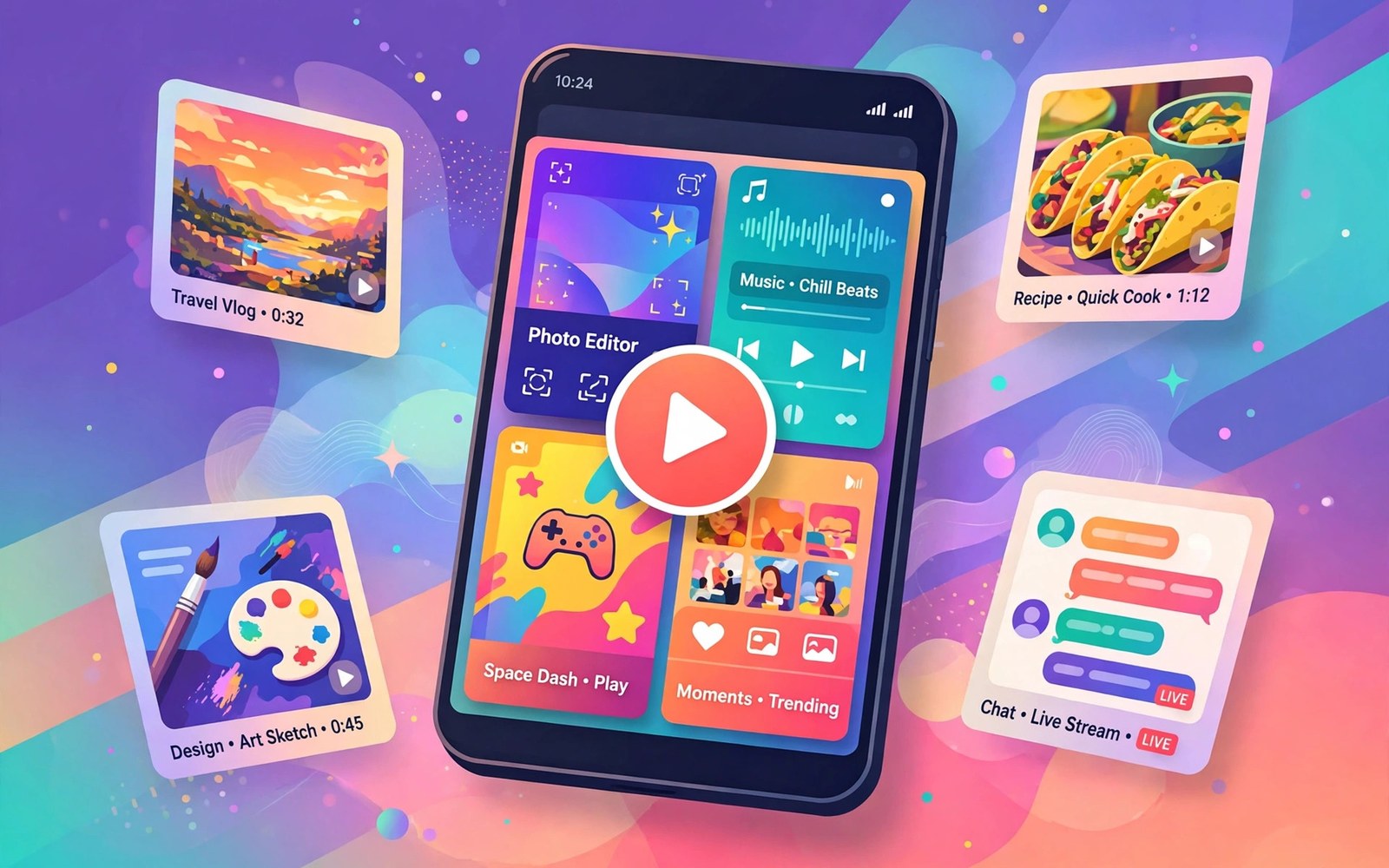
Screenshots and preview videos decide many installs within seconds. A visitor scans visuals before reading a description. A clear first image can win an install. A confusing first image can lose a visitor who never reads further. Visuals are the storefront of your app.
Conversion depends on understanding rather than on beauty alone. A beautiful image that does not explain the app will not convert. A plain image that shows the core task clearly will convert better. Design visuals to answer one question fast. What does this app do for me.
Test visuals with strangers who have never seen the app. Ask them to describe the app after five seconds of viewing. Their answers reveal whether the visuals communicate. A test with five strangers can reveal faults that a team familiar with the app will never notice.
Lead With The Core Task
Put the core task in the first screenshot. Show the screen where users spend most of their time. Avoid starting with a welcome screen or a settings screen. A visitor who sees the core task immediately understands the value proposition.
Keep the first image simple with one main element and a short caption. A crowded first image forces the visitor to search for meaning. A simple image delivers meaning at a glance. Simplicity in the first image is a conversion advantage that costs nothing.
Tell A Visual Story
Order screenshots as a short story from problem to solution. Start with the task and then show the result. Show a before state and an after state when that story fits the app. A story order helps visitors imagine themselves using the app.
Keep the story to the strongest screens rather than showing every screen. Eight strong images beat twelve mixed images. Remove any image that repeats a previous point. Each image should add a new reason to install. A tight story holds attention to the end.
Write Captions That Help
Captions should explain the benefit shown in the image in a few words. A caption that repeats the visible text adds nothing. A caption that names the outcome helps the visitor understand why the screen matters. Short benefit captions work best on small phone screens.
Test caption readability on a phone rather than only on a desktop. Text that looks fine at large size can become unreadable at phone size. Use large type and high contrast for captions. A caption that cannot be read is worse than no caption at all.
Show Real Screens Honestly
Use real app screens rather than idealized mockups that the app never shows. Visitors feel deceived when the installed app looks different from the listing. Honest screens build trust that survives the first open. Trust after install matters more than a slightly prettier listing.
Clean up test data in screenshots before publishing. Replace placeholder names with realistic examples. Remove debug overlays and test banners. A clean real screen looks professional without misleading anyone about the actual product.
Design For Phone And Tablet
Screenshots appear in different sizes on phones and on tablets. Design images that read well at the smallest size where they appear. Check the listing on a phone and on a tablet after upload. A layout that works on one device can fail on another.
Provide tablet screenshots when your app supports tablets. Tablet visitors judge the app by tablet visuals. Phone screenshots stretched to tablet size look unprofessional. Dedicated tablet images show that you care about the tablet experience.
Create A Strong Preview Video
A preview video should show the core task within the first ten seconds. Visitors decide quickly whether to keep watching. Start with action rather than with a logo animation. A logo intro wastes the most valuable seconds of the video.
Keep the video short and focused on one or two tasks. A video of thirty seconds often converts better than a video of two minutes. Show real interaction with taps and swipes that visitors can follow. Real interaction teaches faster than narration alone.
Add Sound And Captions To Video
Many visitors watch preview videos without sound. Add captions for any spoken explanation in the video. Captions also help visitors in noisy places and visitors with hearing needs. A video that works silently will reach more visitors than a video that needs sound.
Use music carefully when you add a soundtrack. Music should support the video without distracting from the task. Choose licensed music and keep the volume low under narration. A loud soundtrack can drive visitors away within seconds.
Test Video Thumbnails
The video thumbnail is the image that visitors see before pressing play. Choose a thumbnail that shows the core task clearly. A thumbnail with a face or with a clear action draws more attention than a blank screen. Test several thumbnails when the platform allows it.
Avoid thumbnails that promise a feature that the video never shows. A misleading thumbnail creates a click that ends in disappointment. A honest thumbnail creates a click that ends in understanding. Understanding is the path to an install.
Localize Visuals With Care
Localize screenshots for markets where you translate the listing. A translated listing with English screenshots feels unfinished. Translate captions and interface text in screenshots together. A fully localized visual set shows respect for the local audience.
Check cultural details in localized visuals. Colors and gestures and examples can carry different meanings across cultures. Ask a local reviewer to check the images before publishing. A local review catches details that a translation tool will miss.
Measure Visual Performance
Track store visits and installs before and after a visual update. A visual change that raises installs without changing ranking has improved conversion. A visual change that lowers installs needs a quick rollback. Measurement turns visual design into a testable practice.
Compare visual performance across markets when you localize. A set that works in one market may underperform in another. Local preferences for color and for layout can differ. Market data helps you tailor visuals rather than assuming one set fits all.
Avoid Visual Mistakes
Avoid screenshots with tiny text that no phone visitor can read. Avoid videos that start with a long brand animation. Avoid images that show features that are not yet live. Each mistake costs installs in a different way but all of them are avoidable with a phone check.
Avoid using another app screenshots or brand assets in your visuals. Copied visuals create legal risk and user confusion. Create original visuals from your own app screens. Original visuals are safer and they represent your product more accurately.
Update Visuals With The App
Update screenshots whenever the interface changes materially. Old screenshots that show a retired interface mislead new visitors. A visual update should accompany every major redesign. Users who install based on old visuals may feel tricked by the new interface.
Review visuals during each major release cycle. Check that every image still matches the current app. Remove images for retired features promptly. A visual set that matches the app builds trust from the first listing view to the first app open.
Use Visuals To Support Reviews
Strong visuals can reduce negative reviews that come from misunderstanding. A visitor who understands the app before install will not complain that it lacks a feature it never promised. Clear visuals set accurate expectations. Accurate expectations lead to fairer reviews.
When reviews mention confusion about the app purpose then check the visuals first. A confusing first image may be the root cause. Fixing the image can reduce confusion reviews faster than changing the app. Visual clarity is a product quality issue as well as a marketing issue.
Build A Visual Test Routine
Test new visuals with a small group before a wide listing update. Show the images to users who do not know the app. Ask what the app does and what they would tap first. Their answers guide revisions before the visuals reach the whole store.
Keep a record of visual tests with dates and results. Note which first image performed best and why. A record prevents repeating a failed visual approach. Over time the record becomes a guide for what your audience understands quickly.
Keep Visuals Fresh Without Churn
Refresh visuals periodically to reflect the current app and current seasons. A stale visual set can make a maintained app look abandoned. Refresh only when the app or the audience has changed enough to justify it. Frequent churn without reason confuses returning visitors.
Plan visual refreshes alongside major releases rather than as isolated tasks. A release that changes the interface naturally needs new visuals. A refresh tied to a release stays honest and stays efficient. Fresh visuals that match the app convert best over the long term.
- Put the core task in the first screenshot
- Order screenshots as a short story from task to result
- Use real screens with realistic test data
- Show the core task in the first ten seconds of video
- Add captions so video works without sound
- Check visuals on a phone before publishing
Choosing Screenshot Order For Different Audiences
Different audiences may value different features first. A productivity audience may care about speed first. A creative audience may care about output quality first. Consider audience order when you choose the first screenshot. A first image that matches audience priority converts better than a generic first image.
Test audience specific orders when the platform supports localized listings. A market with a different primary use may need a different first image. Local data should guide local order choices. A single global order may serve the largest market while underserving smaller markets.
Refreshing Video After Redesign
A redesign requires a new preview video because old video shows an interface that no longer exists. Plan video production as part of the redesign schedule rather than as an afterthought. A video that lags behind the redesign misleads new visitors. A video that ships with the redesign shows the current product accurately.
Reuse the video structure from the previous version when it worked well. Keep the same task order and the same timing targets. Update only the screens and captions that changed. Reusing a proven structure saves production time while keeping the video honest.
Reviewing Visuals Before Every Launch
Review visuals as a final step before every launch even when the interface did not change. Check that captions still match the current wording in the app. Check that the video still shows the current navigation flow. A final visual review catches drift that accumulates silently across small updates.
Ask a colleague who did not work on the release to review the visuals fresh. A fresh reviewer notices a stale screenshot faster than the team that lived with it. Record any visual fix in the release notes for the team. A fresh review habit keeps the listing honest across many releases.
For reference the snippet below shows the simple timing targets that a preview video should meet.
// Video length guide example
val maxPreviewSeconds = 30
val hookSeconds = 10
println("Show core task within $hookSeconds seconds")
println("Keep preview under $maxPreviewSeconds seconds")
For more context read access permissions policies for accessibility storage and SMS and appealing unjust app suspensions or account bans. You may also find Android Vitals tracking for crashes and ANR rates helpful for your next release.
The steps above follow the approach described in the official developer documentation for this platform. That guidance explains the same sequence in general terms. This article adapts those ideas into a practical workflow for independent developers and small teams.

