

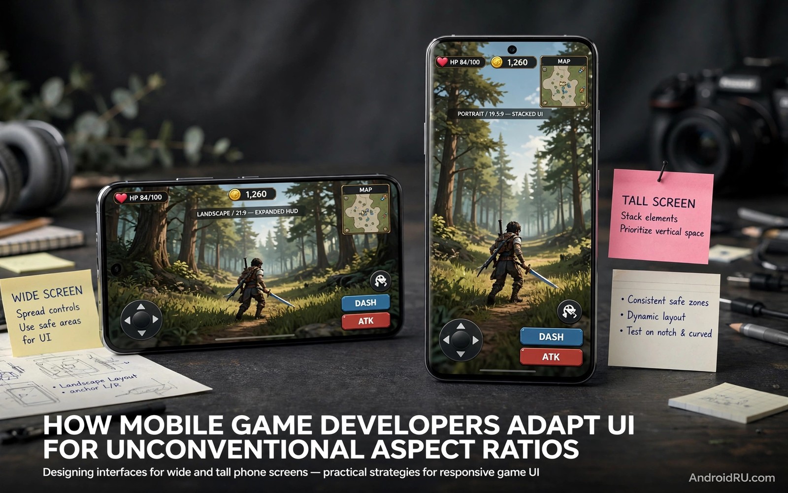
How Mobile Game Developers Adapt UIs for Unconventional Aspect Ratios
Most mobile games were drawn for one shape: a tall, narrow phone held in two hands. Then foldables arrived with inner screens that are nearly square when open, tablets kept their wide 4:3 and 16:10 panels, and some phones stretched to 21:9. A layout that felt natural on a 19.5:9 screen suddenly has buttons a thumb cannot reach, a camera that shows too much, and menus that waste half the display. I have felt that stretch first-hand, opening a shooter on a foldable inner screen and finding the fire button stranded near the far edge.
This guide explains how developers reshape game interfaces for those odd shapes without breaking fair play or comfort. It covers thumb zones, camera limits, HUD scaling, menu redesign, and the settings players can change today in real games. It is written for players who own a foldable or a wide tablet, and for curious developers who want to see the decisions behind a layout that adapts cleanly.
Why Tall Game Layouts Break on Square and Wide Screens
Tall layouts stack controls along narrow edges because the edges are close together. On a nearly square foldable inner screen, those edges move far apart, and a thumb that used to reach the fire button now has to stretch or lift off the grip. Menus stretch wide and waste vertical space, text lines grow long and hard to scan during play, and inventory grids that showed four items per row suddenly show eight in a cramped strip. The layout is not broken in the sense of crashing; it is broken in the sense of asking the hand to do work the screen shape no longer supports.
Camera views change with aspect ratio too. A wider view shows more of the game world sideways, which can reveal an enemy a tall-screen player cannot see. That extra vision is a fairness problem in competitive play, not just a visual quirk. Some games cap the horizontal view so every player sees the same width regardless of screen shape. Others accept the wider view in single-player modes where fairness does not apply. The choice between those two approaches shapes almost every other layout decision a developer makes.
How aspect ratio changes the visible game world
Aspect ratio is the width of the screen divided by its height, and it decides how much of the world fits sideways. A 16:9 phone shows a moderate slice, a 21:9 phone shows a wider slice, and a foldable inner screen near 4:3 or close to square shows a tall slice with a wide middle. Developers test their camera at each of those ratios and decide where to draw the line. In practice, many competitive games fix the vertical field of view and cap the horizontal field of view, so a wider screen shows the same world with more empty space at the edges rather than more enemies.
Field of view caps in competitive games
A field of view cap is a hard limit on how wide the camera can see, set in the game code rather than in a player setting. PUBG Mobile and Fortnite both manage camera width carefully in competitive modes, and players who move to a wider screen often notice black bars or a narrower effective view rather than a wider one. That is the cap doing its job: the screen is bigger, but the fair view stays the same.
Thumb Zones and Control Placement on Wide Foldable Screens
Good controls sit inside the arc a thumb can sweep without shifting grip. On a wide screen that arc covers the bottom corners, not the far edges or the top corners. Developers who adapt well cluster the movement stick near the bottom left, the fire and action buttons near the bottom right, and secondary buttons in floating panels that the player can drag. Custom layouts matter more on foldables than on slab phones, because the default layout was drawn for a shape the player no longer holds.
Testing with the phone half-folded matters as much as testing it flat. Tabletop mode changes the grip completely: the bottom half becomes a stand, the top half becomes the display, and buttons near the fold feel awkward under the thumbs. Critical actions belong away from the crease zone, where taps land unevenly and the screen flexes slightly under pressure. Comfort during a long session beats visual symmetry every time, and a layout that looks balanced in a screenshot can feel terrible after twenty minutes of play.
In Genshin Impact, for example, the attack, dodge and skill buttons sit in the lower right on a phone, and on a wide screen the player can move them closer to the thumb or spread them slightly without losing reach. In a shooter, the scope, reload and crouch buttons benefit from the same treatment. The principle is identical across genres: put the buttons the player presses most often where the thumb already rests, and move everything else to a second layer the player opens on purpose.
Custom button layouts players should set first
Open the control customisation screen in your game, drag the fire or attack button to the lower right corner where your thumb rests naturally, then place the movement control in the lower left. Move the jump, reload and skill buttons just inside those corners, and push map, chat and settings buttons to the top edge where a deliberate reach is fine. Save the layout as a named preset if the game offers one, and test it in a practice match before a ranked match. That ten-minute setup is the single biggest comfort gain on a wide screen.
Where to place buttons on a Galaxy Z Fold inner screen
On a Galaxy Z Fold inner screen, keep primary buttons inside the lower third and at least a finger width away from the centre crease. Place the minimap in the upper corner opposite your dominant hand, and keep the health bar along the top edge where it never sits under a thumb. If the game lets you scale button size, raise the size slightly on the inner screen, because the same button covers less of the display relative to the wider panel.
Camera Fairness: Capping Horizontal View on Unconventional Ratios
Wider cameras show more enemies and terrain at once, so competitive games often cap horizontal view to protect fairness. Single-player games can embrace wider views freely, and many do: an open-world game on a wide screen feels more cinematic when the camera opens up, and a strategy game benefits from seeing more of the map. The developer decision is not whether wider is better, but whether wider is fair in that mode. Ranked matches get the cap. Story modes and casual matches get the view.
Letterboxing is the blunt version of the same idea. Some games show black bars on the sides of a square screen, preserving the original layout and the original fair view at the cost of wasted display. Others stretch the view, which distorts speed perception and makes distances hard to judge. A third group redesigns the layout so the extra width holds menus, maps and inventory rather than extra world. That third option is the hardest to build and the best to play, because the screen earns its size without changing what any player can see.
| Approach | How it works | Fairness | Player experience |
|---|---|---|---|
| Camera cap | Horizontal view fixed, extra width holds UI | High, same view for all | Clean, uses the screen well |
| Letterboxing | Black bars keep the original ratio | High, no extra vision | Wastes screen, layout unchanged |
| Full wide view | Camera opens with the screen | Low in ranked play | Cinematic, but uneven in matches |
| Stretch | Image pulled to fill the panel | Poor, distorts distance | Uncomfortable, hard to judge speed |
How developers test camera fairness across ratios
Developers test many ratios before release, running the same match on a tall phone, a square foldable and a wide tablet and comparing what each player could see at the same moment. They look for sightlines that appear on one ratio and not another, and they adjust the cap until those sightlines match. Players can do a rough version of the same test: record a match on the inner screen and on the cover screen, and compare how much of the map edge is visible in each. If the inner screen shows a whole extra doorway, the game is not capping the view.
HUD Scaling and Menu Redesign for Foldable Aspect Ratios
HUD elements need anchor points that survive resizing. Health bars, minimaps and timers should attach to a corner or an edge with a fixed offset, not to a position measured from the centre of the screen, because the centre moves when the ratio changes. Menus can use two columns on square screens, inventory grids can show more items per row when wide, and chat and quest text should scale independently of the rest of the HUD so it stays readable at arm length. Font scaling matters because wide screens invite tiny text, and tiny text during a fast match causes mistakes.
A good redesign keeps tap targets large during play. A button that was comfortable at 48 pixels on a tall phone can feel small on a wide tablet if the game scales the layout by width alone. Developers who adapt well scale by the smaller dimension, or they set a minimum tap target size in the layout code and let the rest of the interface breathe around it. Accessibility settings should scale HUD text independently, so a player who needs larger text does not have to accept a larger everything else.
Anchor every HUD element to a corner or edge, and keep critical buttons clear of the fold line, and the layout will survive almost any screen shape.
Two-column menus and wider inventory grids
On a nearly square screen, a single-column menu wastes half the width and forces long scrolling. A two-column menu puts the item list on one side and the detail pane on the other, so the player sees the item and its stats together. Inventory grids gain columns as the screen widens, and a good grid keeps each cell large enough to tap reliably rather than shrinking cells to fit more of them. The test is simple: can you tap the right item first time, in the middle of a match, without looking down for a second?
Keeping chat and quest text readable at arm length
Chat and quest text should sit at a size you can read with the phone on a stand a short distance away, not pressed to your face. If the game offers a separate HUD text size setting, raise it one step on the inner screen and check it in a real match. If it does not, use the system font size setting and watch whether the game respects it; some games scale HUD text with the system setting, and some ignore it entirely.
Adaptive Layout Code: Window Size Classes in Android Games
Android gives developers a standard way to read the screen shape before placing controls. The window size class API reports whether the width is compact, medium or expanded, and the game picks a layout for that class. The snippet below shows the core step behind ratio-aware design: check the width class, then choose a margin that keeps buttons inside thumb reach on a wide screen and closer to the edge on a narrow one.
val isWide = windowSize.widthSizeClass == WindowWidthSizeClass.EXPANDED

val controlMargin = if (isWide) 96 else 48

placeButtons(margin = controlMargin)
That check is the beginning, not the whole solution. A serious adaptation also listens for configuration changes, because a foldable can change size class mid-match when the player opens or closes it. The game should move controls to the new layout without pausing the match, and it should remember the player custom layout for each size class separately, so the inner-screen layout does not overwrite the cover-screen layout. Players who unfold mid-match and find their buttons in a new place are meeting a game that read the size change but forgot to preserve their preferences.
Handling fold and unfold during a live match
When a foldable opens or closes, Android sends a configuration change and the game activity may restart. A well-adapted game saves the match state, restores the layout for the new size class, and resumes without dropping the player from the match. A poorly adapted game restarts the activity and loses the match, or pauses and waits for the player to tap resume. Before a ranked session, test your main game by folding and unfolding once in a practice match, and learn what it does before it happens in a match that counts.
Testing Games on Your Foldable: A Practical Routine
Test each main game unfolded for thirty minutes before you trust it in a ranked match. Note control reach, camera fairness, heat and battery drain, and whether the game pauses when focus shifts to another app. Some games pause when you open a split-screen guide beside them, which matters if you like to keep a map or a walkthrough open. Update games often, because foldable support improves steadily and developers add ratio fixes in patches without fanfare; patch notes may mention large-screen support in a single line, and a game that letterboxed last year may adapt well now.
Hardware shapes this routine too. If a case changes how the phone folds or how heat escapes, it changes the gaming experience, and the guide on cases made for hinge designs explains how protection works on a two-piece hinge and what to check before you buy. A case that blocks hinge motion or traps heat during charging will hurt gaming long before it hurts the hinge itself, so test every new case through a full slow fold cycle and a thirty-minute gaming session before you keep it.
A thirty-minute test checklist for each game
- Play unfolded for thirty minutes and note whether your thumbs reach the fire and movement controls without shifting grip.
- Compare the camera view with the cover screen and note whether the wider screen reveals extra map edges.
- Open the inventory and settings menus and check that text stays readable and tap targets stay large.
- Fold and unfold once mid-match and note whether the game resumes cleanly or drops you.
- Check heat on the hinge side after the session, and lower graphics settings one step if the phone throttles.
Settings worth reviewing before a gaming session
Start with display brightness and refresh rate: adaptive brightness saves power and reduces screen ageing, a lower refresh cap suits reading days, and maximum smoothness belongs to gaming sessions. Then check notification privacy on the cover screen, because sensitive previews can appear where strangers might glance, and hide message content while keeping sender names visible. Those two checks shape battery life and privacy more than most in-game settings.
Cold Weather, Heat and Flexible Screens During Gaming
Flexible screens react to temperature more than rigid glass does. Cold mornings can stiffen the panel and the hinge, and folding a cold phone sharply is a habit worth breaking; warming the phone in a pocket for a few minutes before unfolding is a small step that protects the display over years. Heat has the opposite effect: long gaming warms thin foldables faster than slab phones, the processor throttles sooner, and frame rates dip during extended sessions. Short breaks and lower graphics settings help, and a cool room extends comfortable play time more than any setting change.
The guide on cold weather effects on flexible screens covers the temperature behaviour in detail, including what happens to the panel material in the cold and how to warm the device safely. For gaming, the practical takeaway is simple: do not start a long session on a cold phone, and do not charge a hot phone under bedding or inside a closed bag, where heat cannot escape. Charge on a hard surface, use a certified charger, and avoid damaged cables entirely.
Balancing graphics settings against heat on thin foldables
On a thin foldable, the graphics setting that looks best in a screenshot is rarely the setting that plays best for an hour. Drop the frame rate cap one step, turn shadows down, and keep resolution at the middle setting for long sessions. The game will look slightly less sharp and will hold its frame rate far longer, which matters more in a match than a higher resolution that throttles after ten minutes.
Real Games, Real Layouts: Genshin Impact, PUBG Mobile and Fortnite
Named examples make the adaptation concrete. Genshin Impact on a wide screen spreads its skill buttons and map across the extra width, and its touch controls benefit from moving the attack cluster closer to the thumb; the game also offers a controller mode that many foldable players prefer on the inner screen, where a small controller removes the reach problem entirely. PUBG Mobile caps camera width in competitive modes, offers a detailed custom layout editor with separate presets, and lets players save one layout for the cover screen and another for the inner screen. Fortnite on mobile manages its building and shooting buttons through a similar custom HUD editor, and its wide-screen layout puts the build menu along the edge where a thumb can reach it without covering the centre of the screen.
The lesson across all three is the same: the games that adapt best give the player a custom layout editor, a camera cap in ranked play, and a layout that survives folding. The games that adapt worst offer a single fixed layout drawn for a tall phone and a letterbox as the only concession to a square screen. When you choose a main game for a foldable, check the layout editor first, before you check the graphics settings, because the editor decides whether the game fits your hands.
Choose games with a real custom layout editor and a camera cap in ranked play, and a foldable becomes a genuine advantage instead of a compromise.
What to check in a game before you invest time in it
- Does the game offer a custom button layout editor with named presets you can save per screen size?
- Does ranked play cap the camera, or does a wider screen show extra map edges?
- Does the HUD scale cleanly when you unfold, or does it stretch and shrink tap targets?
- Does folding mid-match resume cleanly, or does it drop you from the game?
Frequently Asked Questions About Game UIs on Unconventional Aspect Ratios
Do all games work on foldable inner screens?
Most games run, but not all adapt layouts well. Some stretch or letterbox on square screens, competitive games may cap camera width for fairness, and a few older titles ignore the inner screen size entirely and render at the cover-screen ratio in the middle of the panel. Test your main titles before long sessions, and check the game forums for ratio reports from other foldable owners before you invest in a battle pass.
Is gaming better folded or unfolded on a foldable phone?
Unfolded play suits strategy, simulation and open-world games, where the larger map and wider inventory pay off. Fast action games and shooters often feel better on the outer screen, because thumb reach matters more than screen size and the narrower panel keeps every button inside the thumb arc. Try both modes for each genre you play, and save a separate control preset for each mode if the game allows it.
How can I fix buttons that sit too far away on a wide screen?
Open the game control customisation screen, drag the primary buttons into the lower corners inside your thumb arc, move secondary buttons to a floating panel, and save the layout as a preset. If the game has no custom layout editor, try the system full-screen or aspect-ratio setting for that app, which sometimes offers a letterbox mode that pulls the layout back to a tall ratio. If neither option exists, a controller removes the reach problem entirely on the inner screen.
Does gaming overheat foldables faster than slab phones?
Long gaming warms thin foldables faster than slab phones, because the same processor sits in a thinner body with a hinge that limits heat spreading. Heat can throttle performance during extended sessions, so take short breaks, lower graphics settings one step, and play in a cool room. If the phone throttles within ten minutes at maximum settings, that is a sign to lower the frame rate cap rather than a fault in the phone.
Conclusion: Pick Games That Respect the Screen You Hold
Foldable gaming improves when developers respect square screens: they anchor the HUD to corners, cap the camera where fairness matters, give players a custom layout editor, and handle folding mid-match without dropping the player. As a player, you can get most of that benefit today by setting a custom layout, testing each game for thirty minutes unfolded, and checking the temperature habits that protect a flexible screen.
Do three things today: open your main game, move its primary buttons into your thumb arc and save the preset, then play one practice match unfolded and note what still feels out of reach. If the game adapts well, keep it as a main title; if it letterboxes or stretches, look for a better-adapted alternative before you invest more time. When you later think about changing phones, the guide on resale value and market adoption helps you judge whether foldables are holding their value and how widely the format is being adopted, so the next upgrade is a decision based on evidence rather than a guess.