

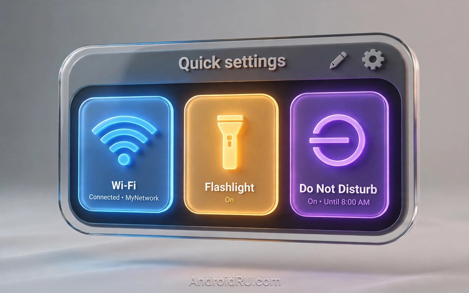
Quick Settings tiles are the fastest controls on your phone and most users never arrange them on purpose. The default order reflects a generic user and not your day. A flashlight you use nightly may sit on page two while a control you never touch sits on page one. A ten minute reorder can save hundreds of swipes over a year.
This guide shows how to build a Quick Settings layout around real tasks. You will learn which tiles deserve page one and how long press shortcuts extend each tile. You will also learn how to keep the panel readable when you add custom tiles. If you theme the panel too then read about light and dark theme behavior so your tile colors stay comfortable in both modes.
Design the panel around tasks
Start by listing the controls you touch in a normal week and rank them by frequency. Most users find that Wi-Fi and Bluetooth and flashlight and Do Not Disturb dominate the list. Screen rotation and hotspot and screen record follow for many people. Everything else is occasional and it belongs on page two or in the edit tray.
Page one should hold six to eight tiles at most because a crowded first page slows scanning. The eye must find the target tile without reading every label. Put the daily four in the top row where the thumb lands first. Put the weekly controls in the second row and leave the rest for the second page. A panel that fits one screen of attention beats a panel that holds everything.
Long press behavior is the hidden power of the panel and many users never try it. A long press on Wi-Fi opens network settings while a long press on Bluetooth opens paired devices. A long press on Do Not Disturb opens schedule rules. Learning three long presses can replace three trips through Settings and it makes the panel feel like a true control room.
Reorder your tiles in minutes
These steps work on most modern Android phones and the exact labels may vary slightly by maker.
- Swipe down twice to open the full Quick Settings panel on your phone.
- Tap the edit icon shaped like a pencil to open the tile editor.
- Drag your four most used tiles into the first row of the active area.
- Drag weekly tiles into the second row and leave rare tiles in the holding area.
- Remove tiles you have never used so the panel stays scannable at a glance.
- Tap a tile and then long press it to learn what shortcut each tile offers.
- Test the new layout for one day and note any tile you still hunt for.
- Reopen the editor and promote any hunted tile to page one the next morning.
Practical tips for an efficient panel
Pair tile order with your routines rather than with app categories. A night routine wants Do Not Disturb and flashlight and Bedtime mode in one row. A travel routine wants hotspot and location and screen rotation together. Routines cut decision time because the hand learns one pattern per context. You can also explore lock screen clock options because lock shortcuts and quick tiles together cover most one tap needs without unlocking fully.
Keep custom tiles honest by checking what they actually do before you trust them. Some custom tiles look useful and they only open an app instead of toggling a setting. A tile that opens an app is still useful when the app is your control hub. A tile that promises a toggle and only opens a web page is clutter and it should leave the panel.
Review the panel after you change jobs or travel habits because tile needs shift with life. A tile you needed daily during a commute may gather dust after a move. A quarterly review takes two minutes and it keeps the panel matched to the present. Treat the review like clearing a desk and enjoy the faster panel that follows.
// TileService example: a custom Quick Settings tile
public class MyTileService extends TileService {
    @Override
    public void onClick() {
        super.onClick();
        Tile tile = getQsTile();
        tile.setState(Tile.STATE_ACTIVE);
        tile.updateTile();
    }
}
The snippet above follows the pattern shown in the official Android developer documentation for custom Quick Settings tiles and in the Material Design guidelines for tile states. It shows the minimal click handling for a tile and you should add real action logic and proper state sync before you use it in an app.
Common mistakes
Panel clutter grows slowly and these habits keep it in check.
- Adding every available tile. A panel with thirty tiles is a second settings app. Keep page one tight and let search handle the rest.
- Ignoring long press shortcuts. Tapping through Settings for a network change wastes the panel’s best feature. Learn the long press for each daily tile.
- Placing rare tiles on page one. A rare tile on page one pushes a daily tile to page two. Rank by weekly frequency and not by novelty.
- Forgetting screen record safety. A screen record tile in a careless spot can start recording by accident. Place it where a stray tap is unlikely.
- Never revisiting the layout. Habits change and panels go stale. Revisit the order whenever a tile feels hard to find.
FAQ
How many tiles should page one hold?
Six to eight tiles work best for most hands and most screen sizes. More tiles force a second page and they slow the scan for the tile you need.
Why did a tile disappear after an update?
Updates can retire a tile or move it to the holding area when an app changes its permissions. Reopen the editor and drag it back if it still exists.
Can I add tiles from third-party apps?
Yes apps can offer custom tiles through the tile service and they appear in the editor after install. Remove any custom tile that only opens an ad screen.
A seven day routine
Quick Settings order improves fastest when you track real taps for a week instead of guessing from memory.
- Day one: note every quick tile you tap and tally the counts in a note.
- Day two: move the top four tallied tiles into the first row.
- Day three: learn the long press shortcut for each of those four tiles.
- Day four: remove two tiles with zero tallies from the active area.
- Day five: test the panel one handed to check thumb reach for top tiles.
- Day six: add a Do Not Disturb tile if evening focus needs fast control.
- Day seven: review tallies again and promote any tile that climbed fast.
Troubleshooting quick answers
Panel annoyance usually means the order reflects old habits rather than current ones.
- Tile missing after update. Updates can retire tiles or move them to the holding area. Reopen the editor and drag it back.
- Tile opens an app instead of toggling. Some custom tiles only launch their app. Keep it only when the app itself is the control hub.
- Panel feels crowded. Too many active tiles slow scanning badly. Cut page one to eight tiles and move the rest out.
- Long press does nothing. Not every tile offers a long press shortcut. Check the tile behavior and use Settings for those controls.
Putting it all together
The panel is a habit mirror and habits change with seasons and jobs and travel. A panel tuned for a commute may fail for remote work. A panel tuned for summer travel may fail for winter routines. Quarterly reviews keep the mirror accurate with only minutes of effort.
Muscle memory is the real payoff because a stable panel lets the hand act without the eye. The hand learns that flashlight sits top right and Do Not Disturb sits top left. That learning vanishes when the order changes weekly. Stability after the initial tuning is a feature and not laziness.
Teach the panel to one other person and you will discover its remaining flaws fast. A guest hunting for Wi-Fi reveals ordering problems that familiarity hides. Fix the flaws a guest finds and the panel improves for everyone including you.
Real world scenarios
A night nurse needs flashlight and Do Not Disturb within one swipe at 2am. The first row holds exactly those controls plus Wi-Fi for hospital networks. The nurse never hunts through pages during a dark ward round. The panel becomes a trusted tool rather than a menu.
A traveler juggles hotspot and location and screen rotation across airports. A travel row groups those three tiles together for trip days. The traveler promotes the row before departure and demotes it after returning home. Seasonal panel tuning mirrors seasonal life.
A student records lectures with the screen record tile placed safely away from daily taps. Accidental recording never happens because placement respects thumb habits. The tile stays available for genuine lecture days. Thoughtful placement prevents embarrassing accidents.
Checklist before you finish
Verify the panel against this list and it will stay fast for months.
- First row holds the four most used tiles from a real tally week.
- Page one holds eight tiles at most for fast scanning.
- Long press shortcuts are learned for each daily tile.
- Rare tiles live in the holding area rather than on page one.
- Screen record tile sits where stray taps are unlikely.
- Panel was tested one handed for thumb reach on daily tiles.
- Layout was revisited after the last job or travel habit change.
- Custom tiles were checked to confirm they toggle rather than merely open apps.
What changes after a month
After a month the panel order feels like an extension of the hand. Flashlight and Do Not Disturb arrive without conscious searching. The panel serves routines that the user no longer articulates. That fluency is the return on ten minutes of ordering.
Habit changes eventually outgrow the panel order and a quarterly review catches the drift. A new job or a new commute shifts tile frequency silently. The review promotes rising tiles and demotes fading ones. The panel stays a mirror of present life rather than past life.
Guests benefit from a well ordered panel because common controls sit where anyone expects them. Wi-Fi and flashlight in the first row need no explanation. A guest can help themselves without a tutorial. Good defaults serve strangers as well as owners.
Custom tiles age unevenly because some apps abandon tile support over time. Dead tiles should leave the panel promptly when they stop toggling. A dead tile wastes a prime slot and confuses scanning. Prune custom tiles during each quarterly review.
Looking further ahead
Panel design mirrors the broader principle that frequently used controls deserve the shortest path and rare controls deserve a longer path. That principle applies to kitchens and workshops as well as phones. Tools used daily sit within reach while tools used yearly sit in storage. The Quick Settings panel is a small workshop and its layout should follow workshop logic rather than alphabetical order or install order. Users who apply workshop logic never hunt for flashlights again.
Automation can extend the panel by changing which tiles matter across contexts such as work and home and travel. A routine that enables hotspot during travel hours effectively promotes that tile without manual reordering. Context aware panels represent the next step beyond static ordering. Static ordering remains the foundation because automation works best on top of a sensible default. Build the default first and let automation refine it later.
Conclusion
An efficient Quick Settings panel is a personal tool and not a default grid. It should mirror your week and it should reward muscle memory with one swipe control. The reorder takes minutes and the payoff repeats every day. You may also enjoy themed icons across the drawer when you want another angle on the same theme.
Your next step is to open the tile editor right now and promote your four daily tiles to the first row. Remove two tiles you never use in the same session. Test the new panel tomorrow and adjust once more.

