

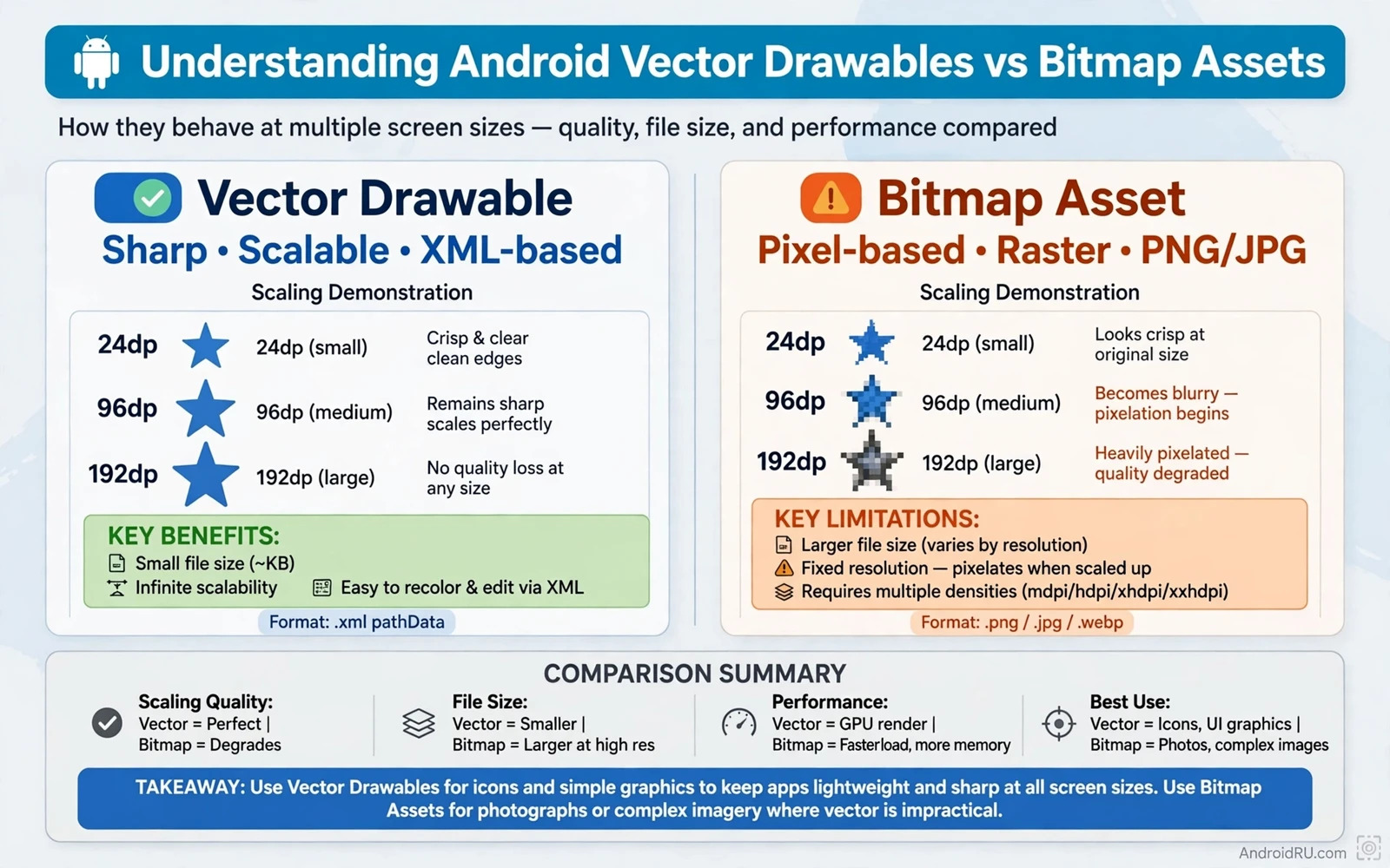
What a Vector Drawable Really Is
A vector drawable describes a picture with paths and fills rather than with a grid of coloured dots. The system reads the path data and draws the shape at the size that the screen needs at that moment. That single description can serve a small icon and a large header graphic without a second file. The result stays sharp because the shape is redrawn for each size instead of being stretched from a fixed grid. Designers can change a colour or a stroke width by editing a value in the file. Developers can reuse the same file across screens and themes with very little extra work.
A bitmap asset works in the opposite way. It stores a fixed grid of pixels that was rendered at one size. A small bitmap looks soft when it is enlarged because the system must invent pixels that were never stored. A large bitmap looks fine when it is reduced but it still carries the full weight of the original file. Android projects often store several copies of one bitmap for several screen densities. Each copy adds size to the final package and adds work for the team that must keep every copy in step.
The choice between these two formats shapes the look and the size of an app from the first build onward. Icons and simple illustrations lean toward vectors because they need clean edges at many sizes. Photographs and rich textures lean toward bitmaps because they need detail that a path cannot describe well. A team that understands this split can keep an app light without giving up visual quality. A team that ignores the split often ends up with blurry icons or with a package that grows with every new screen density.
How Scaling Changes the Result
Scaling is the clearest test of the two formats. A vector shape keeps its edges clean at any scale because the renderer draws the path again for the new size. A curve stays smooth and a straight line stays straight. That behaviour matters on modern phones because one app must serve compact phones and large tablets and foldable screens. A single vector file can adapt to all of those surfaces without extra assets. The trade off is rendering work at run time because the system must draw the path on demand.
A bitmap has no such flexibility. It has a fixed number of pixels in each direction. When the display asks for more pixels than the file holds then the system must interpolate between neighbours. The interpolation softens edges and can turn a crisp logo into a hazy shape. When the display asks for fewer pixels than the file holds then detail is discarded and the extra data is wasted. Density buckets exist to reduce this problem by giving the system a closer match. The cost is duplication because the same image must be prepared at several resolutions.
Density buckets also create a maintenance burden. A change to a bitmap icon must be exported again for each bucket. A missed export leaves one device with an old icon and another device with a new icon. A vector file removes that risk because one file is the source of truth for every density. The project stays smaller and the review process stays simpler. For teams that ship often that simplicity is worth more than the small rendering cost of vectors.
File Size and Package Impact
Vector files are usually tiny when the artwork is simple. A path description for an icon may take only a few hundred bytes. The same icon as a bitmap at several densities can take many times more space. That difference grows across a full icon set. An app with dozens of icons can save a meaningful amount of package size by moving simple icons to vectors. Smaller packages download faster and install faster and leave more room on the device for user content.
Bitmap files grow quickly when the image is detailed or large. A full screen photograph at high resolution can be larger than an entire vector icon set. Compression helps but it cannot change the basic fact that every pixel must be stored. Teams should reserve bitmaps for content that truly needs photographic detail. Background art and product photos and user generated images all belong in bitmap form. Simple shapes and glyphs and flat illustrations do not need that weight.
Package size also affects update behaviour. Users on slow connections may delay a large update. Users on limited storage may remove a large app first when space runs low. A lean asset strategy therefore protects retention as well as download speed. Vectors help that strategy because they remove duplicate density copies for simple art. Bitmaps remain essential but they should be used with intent and with the smallest resolution that still looks sharp on the target devices.
Colour and Theme Behaviour
Vector drawables support tinting in a direct way. A single black icon can appear in a light theme and in a dark theme through a tint colour applied at run time. That feature reduces the need for separate light and dark copies of the same icon. It also helps Material You style personalisation because an icon can follow a colour scheme chosen by the user or by the system. The icon keeps its shape while its colour adapts to the surrounding surface.
Bitmap tinting is possible but it is less clean. A coloured bitmap cannot be recoloured as freely because the colour is baked into the pixels. A mask approach can work for simple single colour art but it adds complexity. Teams often end up with separate bitmap files for light and dark themes. That duplication returns the maintenance problem that vectors solve. For themed interfaces the vector route is usually the safer and simpler path.
State based colour changes also favour vectors. A button icon that changes colour when pressed or disabled can use one vector with a colour state list. The same effect with bitmaps needs a separate file for each state. The vector approach keeps the drawable folder tidy and keeps state behaviour in one place. It also makes design review easier because a reviewer can see the shape and the colour rules together.
When Bitmaps Are the Right Answer
Photographs are the strongest case for bitmaps. A path description cannot capture skin texture or fabric detail or a landscape with the same fidelity as pixels. A vector version of a photograph would need an enormous number of paths and it would still look flat. Bitmap formats exist for this kind of rich visual data. They store colour variation per pixel and they compress that variation well for photographic content.
Complex illustrations with gradients and shadows and texture also favour bitmaps in many cases. A vector file can describe gradients but a very detailed illustration can become a large and slow vector file. At some point the rendering cost and the file complexity outweigh the scaling benefit. A bitmap at a well chosen resolution gives a predictable result and a predictable rendering cost. The team should test the artwork at the largest target size and pick a resolution that stays sharp there.
User content is another bitmap domain. Photos taken with a camera arrive as bitmaps. Images downloaded from a server arrive as bitmaps. Avatars and product shots and screenshots all arrive as bitmaps. The app must handle them with caching and downsampling and memory care. No vector conversion can replace that pipeline. The skill lies in handling bitmaps well rather than in avoiding them entirely.
Performance and Memory Thinking
Vector rendering costs processor time at draw time. A simple icon costs almost nothing. A complex vector with many paths and gradients can cost more and can slow a scrolling list if it is redrawn often. Developers should keep vector paths simple for items that appear many times on screen. They should also avoid very large vector art for full screen backgrounds when a bitmap would render faster. Profiling on a real device reveals the true cost better than theory alone.
Bitmap memory cost depends on the decoded size rather than the file size on disk. A compressed file can expand to a large bitmap in memory once it is decoded. A large image shown in a small view still costs the full decoded memory unless the app downsamples it first. That rule makes bitmap handling a memory discipline. Load at the size that the view needs and release images that are no longer visible. Vectors avoid this decoded memory problem for simple art because they store paths rather than pixels.
Both formats can hurt performance when misused. A huge vector in a list item hurts frame rate. A huge bitmap in a small thumbnail hurts memory. The fix in both cases is the same discipline of matching the asset to the job. Use the simplest asset that meets the visual goal. Measure on a low end device as well as on a flagship device. A smooth result on a flagship does not prove a smooth result for every user.
Practical Workflow for a Team
A practical workflow starts with a rule for new art. Simple icons and glyphs and flat shapes go to vectors by default. Photographs and rich illustrations go to bitmaps by default. Anything in between gets a test at the largest size and at the smallest size. The test decides the format based on sharpness and file size and rendering speed. Writing the rule down prevents a slow drift toward mixed formats for the same kind of art.
Export settings matter for both formats. Vector exports should use clean paths and a sensible viewport size. Bitmap exports should target the densities that the app actually supports. Unused densities should be removed rather than carried forever. Asset names should describe the content and the purpose so that a future developer can find the right file without guessing. A tidy drawable folder saves more time than any single optimisation.
Learning how other interface topics connect to asset choices helps a team keep its design coherent. The way a screen adapts to different widths and heights changes which assets stay sharp and which assets need a second version and a careful look at responsive layouts in Jetpack Compose shows how layout decisions and asset decisions support each other on phones and tablets. State handling also interacts with assets because an icon may change with the screen state and a clear explanation of app state and lifecycle events helps a team decide when an asset should change and when it should stay stable. Storage choices matter too because an app may cache bitmaps on disk and the comparison in shared preferences versus Room database gives a useful frame for deciding where cached asset data belongs.
Migration Without Breaking the Interface
Migration from bitmap icons to vectors should proceed one set at a time. Start with the most reused icons because they give the largest package saving. Compare the vector rendering with the old bitmap on several screen sizes before removing the old files. Look for thin strokes that may disappear at small sizes and for details that may merge when scaled down. Fix the path rather than forcing a larger size. A careful migration keeps the interface familiar while the package gets smaller.
Testing should cover light and dark themes and large text settings and different densities. A vector that looks perfect at one size may look crowded at a very small size. A bitmap that looks perfect on one device may look soft on a higher density device. Screenshot tests help but they do not replace a look on a real device. The team should check the migrated icons in the real app rather than only in a design tool.
Rollback stays simple when migration is staged. Keep the old bitmap files in version control even after the vector version ships. If a vector renders badly on a specific device then the team can restore the bitmap for that case while the path is fixed. Staged migration also spreads review work across releases instead of creating one huge change. Small changes are easier to review and easier to revert.
Common Mistakes to Avoid
One common mistake is converting a photograph to a vector and expecting a better result. The vector file becomes large and the image still looks wrong. Another mistake is using a single low resolution bitmap for every device and expecting it to stay sharp. The image will soften on high density screens and users will notice. A third mistake is storing every density copy for a simple icon that could be a vector. The package grows for no visual gain.
Another mistake is ignoring the viewport size of a vector. A viewport that is too small makes strokes look thick. A viewport that is too large makes details vanish. The viewport should match the design grid that the designer used. A consistent grid across the icon set keeps stroke weights coherent. Inconsistent grids create icons that look like they came from different apps.
A final mistake is forgetting accessibility. An icon that relies only on colour may fail for users who cannot distinguish that colour. A decorative vector should be marked as decorative so that screen readers do not announce it as content. A meaningful icon needs a content description that explains its purpose. Asset format does not remove the need for accessible design.
// Vector drawable example in XML
// <vector android:width="24dp" android:height="24dp"
//     android:viewportWidth="24" android:viewportHeight="24">
//     <path android:fillColor="#000000" android:pathData="M12,2 L22,22 L2,22 Z" />
// </vector>
// </vector>
// Bitmap loading should downsample to the view size before display.

