

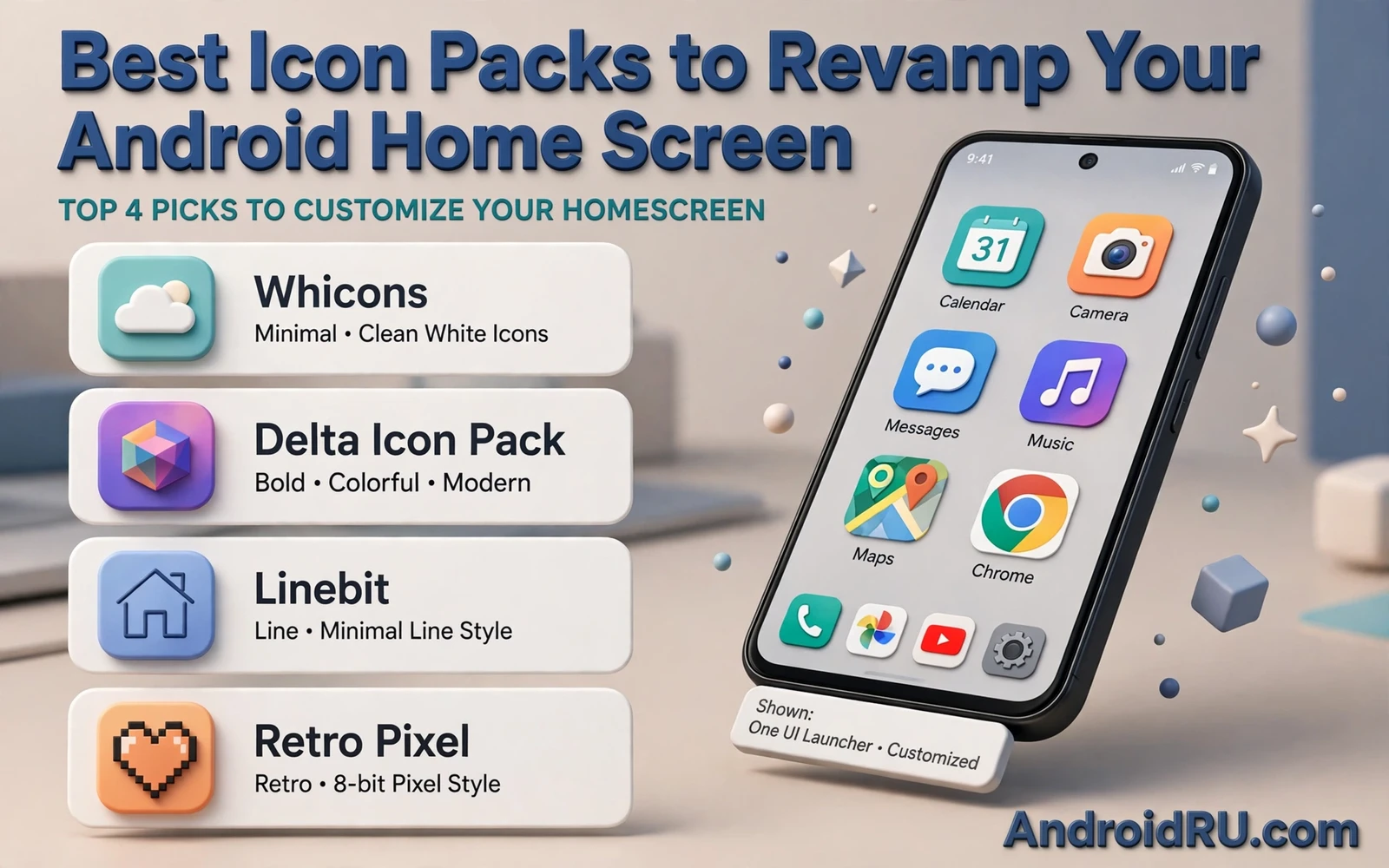
Icons shape the first impression of a phone. You see them every time you unlock the screen. A mismatched set can make a clean wallpaper look messy. A coherent icon pack can make an old phone feel new. One pack can change dozens of app icons at once. That single change refreshes the whole home screen.
An icon pack is a set of replacement icons for your apps. A launcher applies the pack. The launcher swaps the default icon for the pack version. System apps and popular apps usually get a designed icon. Less common apps may keep a fallback style. A good pack covers many apps. A great pack keeps the fallback style close to the main style.
Style choice is personal. Some packs use flat shapes. Some use outlines. Some use soft gradients. Some use bold colors. Some use minimal monochrome shapes. Pick a style that matches your wallpaper. Pick a style that stays readable at a small size. A beautiful icon that hides the app identity will slow you down.
Matching Icons With Launchers And Wallpapers
A launcher is the tool that applies an icon pack. Most custom launchers support packs directly. Stock launchers may support packs in a limited way. Check launcher support before you buy a pack. A pack without launcher support cannot change icons on that phone. A launcher change can unlock a whole world of packs.
Wallpaper and icons work as a pair. A busy wallpaper needs calm icons. A calm wallpaper can carry bold icons. A dark wallpaper pairs well with light icons. A light wallpaper pairs well with icons that have a clear edge. Test the pair at normal brightness. A pair that looks good in a store preview can clash in daily light.
Widgets complete the look. A clock widget and a weather widget should share the color mood of the icons. A search widget should not fight the icon grid. Keep widget count low on a themed screen. One or two widgets give breathing room. A crowded screen hides the icon design that you chose.
Launcher choice sets the grid and the gesture feel as well as the icon style. A launcher that lets you hide labels can make a minimal pack shine. A launcher that lets you resize icons can fix a pack that feels too large. Readers who want that control can explore custom launchers for Android customization enthusiasts and test how different grids change the same icon pack.
Icon Pack Types Worth Trying
Flat packs suit a clean modern screen. Shapes stay simple. Colors stay solid. Shadows stay subtle. Flat packs age well because they avoid trendy effects. They also stay readable in a small grid. A flat pack is a safe first choice for a new theme.
Outline packs suit a light airy screen. Lines define each shape. Backgrounds stay clear. Outline packs can feel elegant. They can also feel faint on a bright wallpaper. Test an outline pack outdoors. Bright light can wash out thin lines fast.
Gradient packs suit a bold expressive screen. Color flows across each icon. Gradients can unify apps that have clashing brand colors. Gradients can also overwhelm a busy wallpaper. Pair a gradient pack with a simple background. Let the icons carry the color story.
Monochrome packs suit a focused calm screen. One color family covers every icon. Labels may matter more here because color cues disappear. A monochrome pack can reduce visual noise. It can also make similar apps harder to tell apart. Use distinct shapes within a monochrome pack to keep apps easy to find.
Retro packs suit a playful nostalgic screen. Shapes echo older design eras. Colors feel warm. Retro packs can clash with modern widgets. Pair them with a simple clock widget. Keep the rest of the screen quiet so the retro icons can shine.
Applying A Pack Without Breaking Your Setup
Back up your home screen layout before you apply a new pack. A launcher backup saves grid and folders and widgets. A backup lets you return fast if the new pack disappoints. Export the backup to a safe place. Name it clearly with the date and the pack name in plain words.
Apply the pack through the launcher theme menu. Check the app drawer after applying. Check folders after applying. Check the dock after applying. Some launchers apply a pack only to the home screen at first. Others apply it everywhere at once. A full check avoids a half themed phone.
Fix missing icons with the pack request tool when available. Many packs let you request icons for uncovered apps. The designer may add them in a later update. You can also assign a single icon by hand for a key app. A hand assigned icon for a banking app or a messaging app keeps daily use smooth while you wait for full coverage.
Changing the default launcher is a small step that many new themers skip. The system settings let you pick which launcher handles the home screen. A clear walkthrough of that step helps avoid a confusing first attempt. You can follow how to change the default launcher on Android step by step before you apply a pack that needs a custom launcher.
Keeping Icons Readable And Fast
Readability beats novelty every day. An icon should tell you the app at a glance. A clever abstract shape can fail that test. A shape that echoes the original app logo helps recognition. Test a new pack for a day of real use. Notice which apps you pause to find. Those pauses tell you where the pack fails.
Icon size affects readability too. A larger icon shows more detail. A larger icon also takes grid space. A smaller icon fits more apps per screen. A smaller icon can hide fine lines. Find a size that keeps labels readable without crowding the grid. A size change can rescue a pack that felt too faint.
Labels matter when icons share a style. Keep labels on for a new pack. Turn labels off only after you know every icon by sight. Folder labels matter even more. A folder icon hides many apps behind one shape. A clear folder name prevents a hunt through folders.
Performance stays light for most icon packs. A pack is a set of images. It does not run in the background like a live widget. A heavy launcher with many effects can slow a phone more than a pack can. Keep animations modest. Keep widget count low. Your themed phone should feel as fast as it looks.
Building A Coherent Theme
A coherent theme uses one color mood across icons and wallpaper and widgets. Pick two main colors and one accent color. Let icons carry the main colors. Let the wallpaper carry a soft version of the same mood. Let one widget carry the accent color. Restraint creates a premium feel. Excess creates clutter.
Live wallpaper can add motion to a themed screen. Motion should stay subtle behind icons. A busy moving background can fight icon readability. A slow gentle motion can add life without distraction. The balance between motion and readability is a theme decision in its own right. You can explore that balance through live wallpaper apps that will not drain your battery and test which motion styles keep icons clear.
Seasonal refreshes keep a theme fun. Change the pack with the season. Change the wallpaper with the pack. Keep the layout stable while colors change. A stable layout means your muscle memory survives each refresh. You get a new look without relearning where apps live.
Share your theme only after a day of use. A screenshot can hide readability problems. A day of use reveals them. Fix the weak icons. Fix the clashing widget. Then enjoy a home screen that feels designed rather than decorated. A revamped home screen should make daily use calmer and faster and more personal.
Seasonal And Occasion Themes
Change icon packs with seasons to keep the phone fresh. A bright pack suits summer. A warm pack suits autumn. A cool pack suits winter. A fresh pack suits spring. Seasonal change costs little effort once the launcher backup habit exists. It gives the phone a renewed feel four times a year.
Occasion themes work for holidays and events. A festive pack can mark a celebration. A calm pack can mark a focused work period. Switch back after the occasion ends. A temporary theme feels special precisely because it ends. A permanent festive theme can feel tiring after a month.
Keep a short list of favorite packs. Note which pack pairs with which wallpaper. Note which grid size suits each pack. A short list prevents a long hunt through the store each time you want change. A short list also helps you return to a proven combination fast.
Test a pack on the lock screen and the app drawer as well as the home screen. Some launchers theme only parts of the system. A pack that looks great on the home screen may leave the drawer mismatched. A full check across screens gives a coherent result.
Consider icon shape consistency. Round icons feel soft. Square icons feel structured. Squircle icons feel modern. Mixed shapes can feel chaotic even when colors match. A consistent shape family unifies apps with clashing brand colors. Shape consistency is a quiet design strength.
Finally respect readability for older eyes and for small screens. A detailed icon can vanish at a small size. A bold simple icon survives shrinking. Test a pack at the smallest size that you might use. A pack that survives small sizes will serve every phone in the family.
Icon Packs And Accessibility
Accessibility matters in icon design. High contrast icons help in bright light. Large distinct shapes help at a glance. Clear labels help when shapes look similar. A pack that scores well on beauty but poorly on clarity will slow daily use. Choose clarity first and beauty second.
Color blindness affects icon recognition. A pack that relies only on color to distinguish apps will fail for some users. A pack that uses distinct shapes as well as color works for more people. Test a pack in grayscale mode on your phone. Shapes that survive grayscale are strong shapes.
Folder icons deserve special attention. A folder hides many apps behind one image. A folder icon should hint at its contents. A generic folder shape for every folder forces label reading every time. Custom folder icons or clear folder names reduce that friction.
Keep icon packs updated for new apps. A new app installed after a pack update may lack a themed icon. A pack update often adds coverage for popular new apps. Check for updates monthly. Request missing icons through the pack tool when available.

