

Why fonts change the feel of a phone
A system font shapes every menu and every message and every label on a phone. A small change in letter shape can make text easier to read at a glance. A narrow font can fit more words on a small screen. A rounded font can feel softer during long reading sessions. A sharp font can feel more formal for work use. That is why font choice feels personal even though it looks minor. The right font reduces eye strain during long days. The wrong font makes a familiar phone feel strange within minutes.
Many readers assume that a system font change needs root access. That assumption was true on older systems for many models. Newer systems offer safer paths that do not touch the system partition. Theme stores and font apps and launcher settings now cover many devices. Those paths change the look without opening the boot chain. This tutorial focuses on those no root paths first. It explains their limits honestly. It also explains when a font change truly needs deeper access.
Read the risk note even though this tutorial avoids root. A font that is hard to read can hide warnings and buttons and settings labels. A broken font package can leave menus unreadable until it is removed. A font app that asks for broad permissions can read more than it needs. Back up the phone before any visual change that touches system text. Do not test an unknown font on your only phone before a work day. Keep the stock font option ready so you can revert in seconds. A visual change should never risk data or warranty or a bootloop or a brick.
Paths that need no root at all
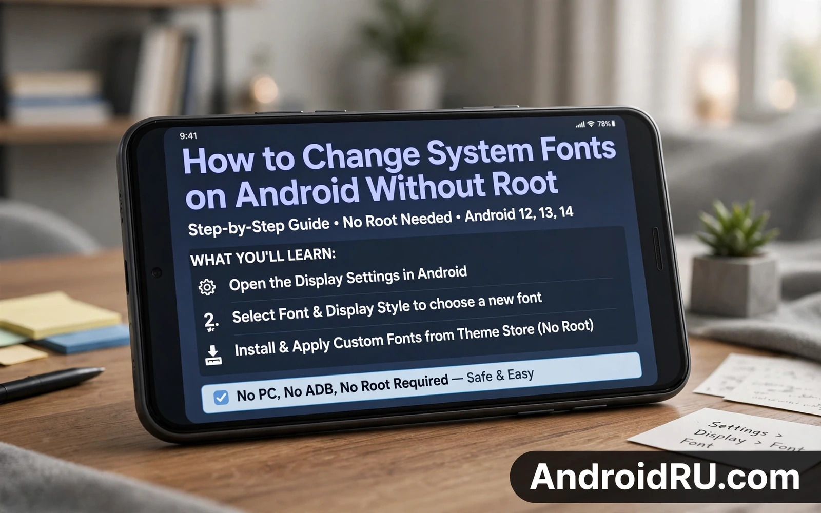
Start with the display settings built into the phone. Many makers include a font size control and a font style control in display settings. Some makers add a theme store with free font packs. Open display settings and look for font size and font style entries. Change one setting at a time and read a message thread after each change. A thread with long words shows spacing problems faster than a settings menu. If the built in list has a font you like then stop there. The built in path is the safest path and it reverts cleanly.
Launcher apps offer a second no root path. A launcher can change icon labels and app drawer text and home screen text without touching system menus. That scope suits readers who mainly want a fresh home screen. It does not change the font inside every app. Some launchers include font packs or let you import a font file. Test a launcher font on the home screen first. Check widget text and folder labels after the change. A launcher change can be removed by switching back to the stock launcher. That easy revert makes launchers a good test bed.
Font apps in app stores form a third path with more variety. A good font app previews text in several sizes before it applies a change. A weak font app pushes paid packs and asks for device admin rights for no clear reason. Read the permission list before you install any font app. A font app does not need contacts or messages or call logs. If an app asks for those permissions then skip it. Choose apps with clear previews and a clear revert button. Keep only one font app installed at a time so conflicts stay easy to trace.
A careful method for testing a new font
Pick a shortlist of three fonts before you apply anything. Preview each font with a long paragraph and with numbers and with punctuation. Numbers matter because some display fonts render digits poorly. Punctuation matters because a cramped comma or period can blur word boundaries. Read the preview at the smallest size you actually use. A font that looks elegant at a large size can turn muddy at a small size. A font that looks plain at a large size can stay crisp at a small size. Judge fonts at real reading size.
Apply one font and live with it for a full day before you judge it. Morning reading differs from evening reading under low light. Outdoor reading under bright light exposes thin strokes. Indoor reading under warm light hides some contrast problems. Check messaging and email and maps during that day. Maps expose label legibility at a glance. Email exposes long paragraph comfort. Messaging exposes short line rhythm. A font that passes all three contexts is a keeper. A font that fails one context may still suit a different reader.
Revert quickly when text turns hard to read. Return to the stock font through the same menu that applied the change. Remove a font app that leaves stray settings behind. Restart the phone after a revert when labels look mixed. A restart clears cached text rendering in many apps. If a menu stays unreadable then use voice control or a large text accessibility setting to reach the font menu. Accessibility settings can rescue a bad visual experiment. Practice the revert path before you need it under stress.
Font files and formats in plain language
Font files carry letter shapes and spacing rules and weight variants. A single font family may include a light weight and a regular weight and a bold weight. A phone uses those weights for headings and body text and buttons. A font pack with only one weight can look flat across an interface. A pack with matched weights keeps headings distinct from body text. Check whether a pack includes bold text before you buy or install it. A missing bold weight can make headings blend into paragraphs.
Some font files support many languages and some support only a narrow set. A font that lacks a script you use will fall back to a different font for those letters. That fallback can look jarring inside a single sentence. Test the font with every language you read daily. Type a test message in each language and read it back. Look for missing glyphs that appear as boxes or blanks. A box in place of a letter is a clear rejection signal. Choose a font that covers your daily scripts fully.
Font test checklist
- Read a long paragraph at small size
- Read numbers and punctuation clearly
- Test every language used daily
- Check maps labels at a glance
- Confirm the stock font revert path
Licensing matters for fonts even when a file is free to download. A free personal license may not allow use in a commercial project. A font taken from a random file host may carry altered glyphs or hidden payloads. Prefer fonts from a maker store or from a known open font library. Keep a note of where each font came from. That note helps when a font later behaves oddly. It also helps when you move to a new phone and want the same look legally.
When no root still means limits
A no root font change may not reach every corner of the system. Some system dialogs keep the stock font by design. Some apps set their own font and ignore the system choice. Banking apps and secure apps often ignore custom fonts for safety. That limit is not a failure of your method. It is a boundary set by the app or by the system. Accept partial coverage when the safe path gives you most of the look you want. Full coverage through deeper access carries warranty and security costs that a font alone rarely justifies.
Readers who want deeper system changes should understand the gate that protects the system before they open it. The bootloader unlocking tutorial explains that gate and its data wipe warning in detail. That background helps a font fan judge whether deeper access is worth the trade. Most font fans will find that the no root path already meets their goal. The tutorial is still useful as a cautionary read. It shows why a cosmetic change should not trigger a boot level change lightly.
A terminal can help with font file handling on some setups without changing system fonts directly. The Termux terminal walkthrough shows how a Linux terminal engine works on Android. That knowledge helps when you need to inspect a font file or move it between folders. It does not turn a no root phone into a rooted phone. It simply gives you a stronger tool for file work. Use that tool for inspection and organisation rather than for forcing system changes.
If a font experiment ever leaves the interface unreadable then a clean recovery mindset matters more than a new font. The unroot and stock restore walkthrough explains how a device returns toward a clean stock state. That guide is written for rooted devices yet its backup lesson applies to every reader. A verified backup before a visual change is the cheapest insurance available. Read the restore logic once so a bad font day never becomes a data loss day.
Keeping a readable phone for the long term
Pair font choice with font size and display size settings. A good font at a tiny size still strains eyes. A plain font at a comfortable size often beats a fancy font at a cramped size. Increase display size slightly when a new font feels narrow. Decrease it slightly when a new font feels wide. Small paired adjustments keep the layout balanced. Check home screen widgets after each paired change. Widgets break layout faster than app screens when text grows.
Review font apps every few months and remove packs you no longer use. Old packs can conflict with a system update. Old apps can gain new permission requests through updates. A lean font setup survives updates better than a crowded one. Keep one favourite font and the stock font as your working set. That discipline keeps the phone readable and keeps troubleshooting short. A phone that looks good and reads clearly is the real goal of any font change.
Font size and contrast as partners
Font choice works best alongside size and contrast settings. A beautiful font at low contrast can still strain eyes in bright light. A plain font at high contrast can stay readable in harsh conditions. Test a new font under the lighting you actually face daily. Test it outdoors and indoors and at night. A font that passes only one lighting test is not ready for daily use. Pairing font and contrast gives a more complete result than font alone.
Accessibility settings can rescue a font experiment that went too far. A large text setting can make a cramped font readable enough to reach the revert menu. A high contrast setting can separate letters that blur together. A bold text setting can rescue a thin font that looked elegant in preview. Learn where those accessibility toggles live before you need them. That knowledge turns a scary unreadable screen into a short recovery task. Practice the path once on a calm day.
Share font findings with other users of the same model when you can. A font that renders well on one maker skin may render poorly on another. A note about language coverage helps readers who share your scripts. A note about bold weight helps readers who care about headings. Community notes save strangers from repeating the same trial and error. Keep those notes factual and short. State the model and the font name and the result in plain words.

