

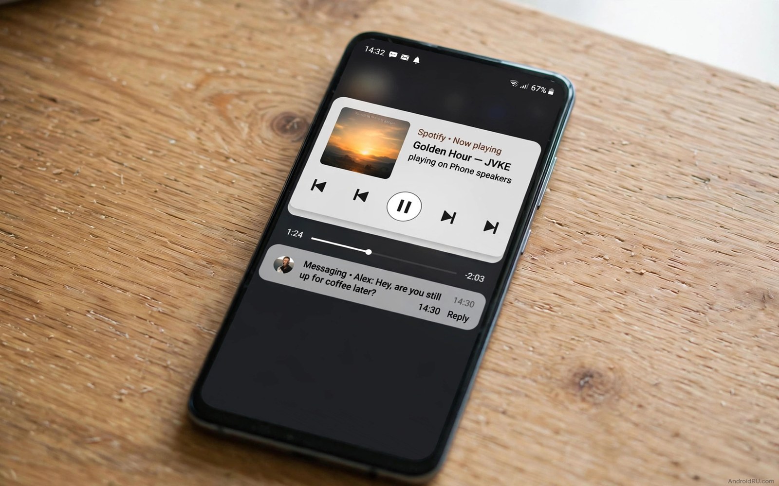
The status bar is tiny and always visible. It shows time and signal and battery in a strip most people ignore. That constant visibility makes it perfect for live controls if you set it up with restraint.
A live control center status bar does three jobs. It shows music controls without opening the player. It shows a live timer or navigation cue at a glance. It offers one tap actions for the tools you use hourly.
This guide builds that bar without clutter. You will choose two live elements and one action row. Everything else stays hidden until you swipe down. A status bar that shows everything shows nothing useful.
Start with music and media controls
Enable a status bar music control that shows play and skip buttons beside the track name. Test it while walking so you can skip tracks without looking down for long. The control must work from the lock screen and from any app.
Keep the music display to one line. A scrolling track title distracts from navigation and messages. If the title scrolls then shorten the display to artist only or to controls only.
Media controls pair with sound tuning in custom system audio tweaks where per app tones help you know what is playing before you look. Combine sound cues with the visual control for the fastest triage.
Add one live indicator that matters
Pick one live indicator for your current context. A navigation arrival time during driving or a recording dot during meetings or a timer during cooking all qualify. Pick the indicator that matches your present week and change it when life changes.
Do not stack three live indicators at once. A status bar with timer plus navigation plus download progress becomes unreadable. One indicator plus the clock plus battery is the readable limit for most screens.
Indicator restraint matches the panel discipline in customizing quick settings tiles where fewer controls mean faster use. Apply the same math to the tiny bar.
Place quick actions within thumb reach
Add quick actions for flashlight and Do Not Disturb just below the status bar in the first swipe panel. Those actions feel like status bar controls because they sit one swipe away. They stay out of the bar itself so the bar stays readable.
Order the actions so flashlight sits nearest your dominant thumb. Test the order in the dark where you actually need a flashlight. A control that works in daylight but fails in darkness has failed its main job.
Quick action placement also benefits from gesture ideas in custom navigation gestures where a single swipe replaces several taps. Keep the gesture count low so each one stays reliable.
Test readability in real conditions
Check the bar outdoors in sunlight and indoors at night and while a video plays full screen. The bar must stay readable in all three conditions or it needs a contrast fix. Increase icon weight or choose a darker bar background if text washes out.
Ask yourself one question after a week. Did the live bar save you from opening an app at least once a day. If the answer is no then remove the live element and try a different one. A live bar must earn its pixels daily.
Keep a note of the winning combination for your next phone. Status bar setups rarely transfer automatically and rebuilding from notes takes minutes instead of hours.
Live status bar target layout
Build toward this target layout. The bar itself stays minimal while the first swipe panel carries the actions. That split keeps the bar readable and the controls reachable.
status_bar = clock, battery, one_live_indicator
live_indicator = music OR timer OR navigation
swipe_panel_row_1 = flashlight, dnd
swipe_panel_row_2 = music_controls
max_live_elements = 1
The layout above was written for this guide as a target for the bar and the first swipe panel. It is not code to run. Adjust the live indicator slot to your current week.
Protect the bar from notification overload
A live status bar degrades when notifications flood it. Ten app icons in the bar leave no room for the live indicator. The bar becomes a stamp collection instead of a control surface.
Limit status bar notification icons to three recent apps in system settings. Older notifications wait in the shade where they belong. The bar keeps room for time and battery and your one live element.
Turn off notification icons entirely for games and shopping apps. Those apps generate volume without urgency. Their icons add noise to the most visible strip on the phone.
Test the bar after a busy morning of messages and mail. If icons crowd out the live indicator then tighten the limit further. A bar that survives busy mornings survives every day.
Revisit the limit after installing any chatty new app. New apps often enable icons by default. A monthly check keeps the bar clean without daily policing.
Status bar design for drivers and commuters
Drivers need status bar information that reads in a single glance at highway speed. Music controls and navigation time are the two elements that matter most behind the wheel. Everything else becomes a distraction at speed. A driver focused status bar shows those two elements large and hides the rest until the car stops.
Commuters on trains face the opposite problem because they have time but limited attention. A commuter status bar can show download progress and podcast position and next stop information. Those elements help a commuter manage a journey without opening several apps in a crowded carriage.
Glanceability depends on position as much as content. The left side of the bar suits time and notifications because eyes start there naturally. The right side suits battery and signal because those are status checks rather than actions. Placing a music control in the center breaks both reading patterns and slows recognition.
Color choices matter enormously in vehicles because sunlight through windows creates glare. White icons on a dark bar survive glare better than colored icons on a light bar. Test any status bar design in a parked car under noon sun before trusting it on the road. A design that fails parked will fail dangerously while driving.
Safety rules should override customization enthusiasm for drivers. Any status bar element that demands more than a glance should stay hidden while driving. Use driving mode to simplify the bar automatically when the car moves. Manual customization cannot beat an automatic safety mode that activates without thinking.
Status bar customization for low vision users
Low vision users need status bar elements that remain legible without magnification. Large system font settings increase status bar text size on many phones. Icon size settings may also scale status icons slightly. Enable both settings together for the best low vision result. Test the bar without glasses to confirm it works for your worst vision day rather than your best.
Contrast settings help low vision users more than color choices. High contrast mode thickens icon outlines and darkens backgrounds. That thickening makes small icons distinguishable at a glance. Enable high contrast text in accessibility settings if your phone offers it. The setting affects system surfaces including the status bar immediately.
Notification icon limits matter enormously for low vision because crowded icons blur together. Limit the bar to two notification icons so each icon gets visual separation. Two clear icons beat six blurred icons for every low vision user. That limit also helps fully sighted users during busy mornings when notifications flood in.
TalkBack users interact with the status bar differently because the screen reader announces bar elements on exploration. A bar with one live indicator announces cleanly. A bar with five live elements announces a confusing list. Keep live elements minimal for screen reader compatibility even if visual users could handle more.
Caregivers setting up a phone for a low vision relative should test the bar in the relative actual lighting conditions. Kitchen lighting and bedroom lighting differ greatly from store lighting. A bar that passes store tests may fail at home. Home testing with the actual user present is the only reliable validation for accessibility setups.
Finally remember that accessibility settings interact with each other in complex ways. Magnification gestures may conflict with status bar swipe gestures. Bold text may change icon spacing unexpectedly. Test the full combination of accessibility settings together rather than each setting alone. Combined testing reveals conflicts that isolated testing hides.
Status bar icons for travelers abroad
Travelers abroad rely on status bar icons to understand connectivity without reading local language menus. A roaming indicator and a signal strength icon tell the whole connectivity story at a glance. A Wi-Fi icon confirms hotel network access without opening settings. Travelers should learn those three icons before departure because they matter more abroad than at home. Data roaming charges make the roaming indicator financially important as well as technically useful. A traveler who ignores the roaming icon may return home to a shocking bill. Check the roaming icon every time you cross a border and disable data roaming immediately if you did not intend to use it.
Common mistakes
Live status bars fail through clutter. Avoid these.
- Stacking timer and navigation and download indicators at once.
- Allowing a scrolling track title to distract from messages.
- Adding quick actions into the bar itself until it becomes unreadable.
- Choosing a low contrast bar style that vanishes in sunlight.
- Keeping a live indicator for a context that ended weeks ago.
Frequently asked questions
Will a live status bar drain battery?
One live indicator uses very little power because it updates only when its state changes. Constantly animating indicators cost more. Choose a state based indicator over an animated one.
Can the status bar show two music players at once?
Most setups show only the active player to avoid confusion. Switch players from the swipe panel when needed. The bar follows the player that most recently played audio.
What if my phone hides the status bar in apps?
Full screen apps may hide the bar by design. Swipe down once to reveal it temporarily. Games and video apps keep this behavior for immersion and it cannot be fully overridden safely.
Conclusion
Your status bar now carries one live indicator and a fast swipe panel for music and flashlight and quiet mode. It works in sunlight and at night without demanding attention.
Your concrete next step is to set your live indicator to the one task you do most this week and test it during that task tomorrow. Replace it if it does not save you an app open.

