

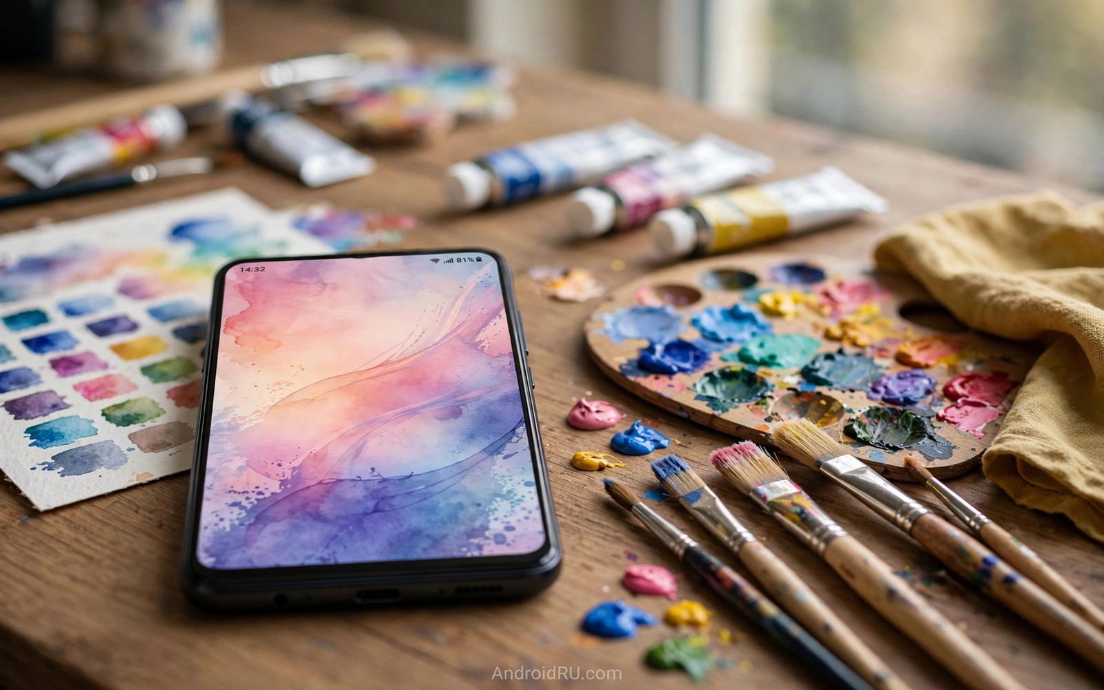
Personalized wallpapers for Material You are the raw material for every theme you love. A wallpaper with a clear hero color gives the engine a confident seed. A wallpaper with clean zones gives the clock and icons room to breathe. Tools that build such wallpapers are worth more than tools that only add filters.
This guide reviews the tool types that matter and it shows how to build a wallpaper that themes well. You will learn gradient tools and photo tools and pattern tools and their different strengths. You will also learn how to test a wallpaper before you commit to it. If you want to read the resulting colors precisely then read about wallpaper color extraction after you build your first image.
The best wallpaper tool is the one that respects color discipline. A tool with endless stickers tempts you toward clutter. A tool with strong gradient and crop controls guides you toward clean hero colors. Choose discipline over novelty when the goal is a theme that lasts.
Tool types and their strengths
Gradient tools are the simplest path to a great theme because two tones give a clean seed. A diagonal gradient from a deep tone to a soft tone themes predictably. A gradient with five competing tones confuses the sampler and it yields muddy palettes. Keep gradients to two or three tones and let one tone dominate.
Photo editors suit users who want personal images to drive the theme. A travel photo or a pet photo carries emotional value that no gradient can match. The editor job is to crop around the hero color and to calm busy areas. A strong crop can rescue a busy photo and turn it into a theme friendly wallpaper.
Pattern tools suit users who want texture without photo noise. Geometric patterns and soft shapes give consistent color areas. A pattern with a calm background zone also gives the clock a readable home. Avoid patterns with high contrast noise across the whole frame because they fight both the clock and the icons.
Build a theme friendly wallpaper
Follow this build order so color discipline survives creative enthusiasm.
- Pick one hero color that you want the whole phone to echo.
- Choose a gradient tool or a photo editor based on your source material.
- Build the image with the hero color covering at least half the frame.
- Leave a calm zone at the top where the clock and date will sit.
- Leave a calm zone at the bottom where the dock icons will sit.
- Export the image at full resolution to avoid compression color shifts.
- Set it as wallpaper and cycle through the palette options it generates.
- Keep the wallpaper for a full day before you judge the theme it creates.
Practical tips for wallpaper creation
Design for the clock zone first because a beautiful image with a busy clock zone fails daily. The clock is the most viewed element on the phone. A calm sky or a soft gradient behind the clock pays off every glance. You can also explore lock screen clock options to pair clock style with the calm zone you design.
Save source files and palette notes together so a theme can be rebuilt after a reset. A wallpaper without its palette notes forces a fresh guessing round. A folder with the image and three hex values rebuilds the theme in minutes. Future resets become routine instead of creative crises.
Test wallpapers in both themes because a light mode beauty can fail at night. Dark mode shifts surfaces and it can expose harsh edges in a bright image. A wallpaper that survives both modes is a keeper. A wallpaper that survives only one mode belongs on a seasonal rotation at best.
<!-- Gradient wallpaper drawable -->
<gradient
    android:startColor="#6750A4"
    android:endColor="#FFB4AB"
    android:angle="45"
    android:type="linear" />
<!-- A two tone gradient gives the engine a clean seed. -->
The snippet above follows the pattern shown in the official Android developer documentation for drawable resources and in the Material Design guidelines for color gradients. It shows a simple two tone gradient and you should test any gradient on both light and dark themes before you adopt it.
Common mistakes
Wallpaper mistakes hide in the zones users forget to check.
- Ignoring the clock zone. A busy clock zone ruins glanceability. Design a calm area where the clock lives.
- Using five hero colors. Too many heroes create a muddy seed. Let one color dominate the frame.
- Exporting low resolution. Low resolution exports blur colors and shift seeds. Export at full resolution always.
- Forgetting the dock zone. A busy dock zone hides icon labels. Keep the bottom area calm as well.
- Judging from the editor only. Editor previews differ from phone screens. Set the wallpaper and live with it for a day.
FAQ
What makes a wallpaper theme well?
One dominant hero color plus calm zones for clock and dock plus clean color areas. Those three traits give the engine a confident seed.
Do live wallpapers theme the same way?
Live wallpapers can theme well when their dominant color stays stable. Rapidly changing live scenes produce shifting palettes that feel restless.
Can I use a photo of a person as wallpaper?
Yes but crop so the face does not sit under the clock or the dock. A face behind icons loses both the photo and the readability.
A seven day routine
Wallpaper craft improves when each creation faces the same phone test before it earns keeper status.
- Day one: build a two tone gradient with one dominant hero color.
- Day two: set it and cycle all palette options it generates.
- Day three: test the clock zone readability in bright sunlight.
- Day four: test the dock zone with icon labels visible.
- Day five: crop a personal photo around its hero color area.
- Day six: set the cropped photo and compare its palette to the gradient.
- Day seven: keep the wallpaper that passed every zone and mode test.
Troubleshooting quick answers
Wallpaper failures hide in zones that editor previews never show honestly.
- Clock unreadable. The clock zone is too busy for text. Redesign with a calm top area or pick a calmer image.
- Palette looks muddy. Too many competing hues confuse the sampler. Reduce the image to one dominant hero color.
- Dock icons vanish. The bottom zone lacks contrast for labels. Calm the bottom area with a soft gradient band.
- Dark mode breaks image. Bright images can glare after dark. Test every keeper wallpaper in both modes before adopting it.
Putting it all together
Wallpaper creation is design work and design work needs constraints to succeed. Hero color plus calm zones plus full resolution form a simple brief. Any tool can serve that brief and no tool can rescue a brief ignored. Constraints liberate creativity by removing aimless options.
Personal photos carry emotional value that gradients cannot match and crops unlock that value for theming. A crop is an editorial choice that says which color story matters. That choice turns a memory into a theme without losing the memory. Cropping skill is theme skill.
Keep a small gallery of keeper wallpapers with palette notes so seasonal changes stay easy. A gallery of five proven images beats a library of five hundred untested ones. Rotation among keepers keeps the phone fresh without fresh risk. Build the gallery slowly and guard it well.
Real world scenarios
A photographer crops a mountain photo to its amber sunset band. The crop yields a warm palette that themes the whole phone. The full photo remains in the gallery while the crop serves as wallpaper. Editing for theme does not destroy the original art.
A gradient fan builds a diagonal two tone wallpaper in minutes. Deep violet to soft pink gives a confident seed every time. The wallpaper themes predictably across light and dark modes. Simplicity beats elaborate art for daily theme reliability.
A pattern lover designs soft geometric shapes with a calm top zone. The clock sits cleanly over the calm area every morning. The pattern adds personality without fighting icons or labels. Texture plus discipline produces a keeper wallpaper.
Checklist before you finish
A wallpaper earns keeper status only after these checks.
- Hero color covers at least half the frame for a confident seed.
- Clock zone is calm enough for text at arm’s length.
- Dock zone is calm enough for icon labels.
- Image was exported at full resolution without compression shifts.
- Palette options generated from the image were cycled and compared.
- Wallpaper was tested in both light mode and dark mode.
- Wallpaper survived a full day of real use before adoption.
- Source file and palette notes are saved together for rebuilds.
What changes after a month
After a month a keeper wallpaper gallery becomes a treasured personal collection. Five proven images cover seasons and moods reliably. Rotation among keepers refreshes the phone without fresh risk. The gallery represents taste refined through testing.
Photography skills improve alongside wallpaper craft because hero color awareness grows. Photographers start seeing color stories while shooting. A sunset becomes both a memory and a future theme. Art and system design merge in daily practice.
Gradient tools remain the reliable fallback when photos disappoint. A two tone gradient always themes predictably. Fallbacks matter because not every week produces a great photo. Reliable tools rescue weeks when inspiration runs low.
Sharing keeper wallpapers with friends spreads theme joy efficiently. A shared image plus palette notes transfers the full design. Friends gain a proven theme without trial and error. Generosity in wallpaper sharing builds small design communities.
Looking further ahead
Wallpaper art has a long history from cave paintings to desktop backgrounds and phone screens continue that tradition. Humans decorate personal spaces to reflect identity and mood. A phone wallpaper is the most viewed personal decoration in modern life. Treating it as design rather than as an afterthought honors that history. A thoughtful wallpaper is a small daily artwork that also powers an entire theme system.
AI wallpaper tools will expand creation options while raising questions about originality and taste. Generated images can produce perfect hero colors on demand. Human photos carry memories that generated images cannot replicate. The best wallpapers may combine generated backgrounds with personal photos as focal points. Tools change but the design brief of hero color plus calm zones remains constant across technologies.
Conclusion
A personalized wallpaper is a design decision and not just a picture. Hero color and calm zones and resolution decide whether the theme sings or stumbles. Tools matter less than discipline in those three areas. You may also enjoy sound scheme customization when you want another angle on the same theme.
Your next step is to build one gradient wallpaper today with a single hero color and calm clock and dock zones. Set it and cycle the palettes and keep the best one for a week.

