

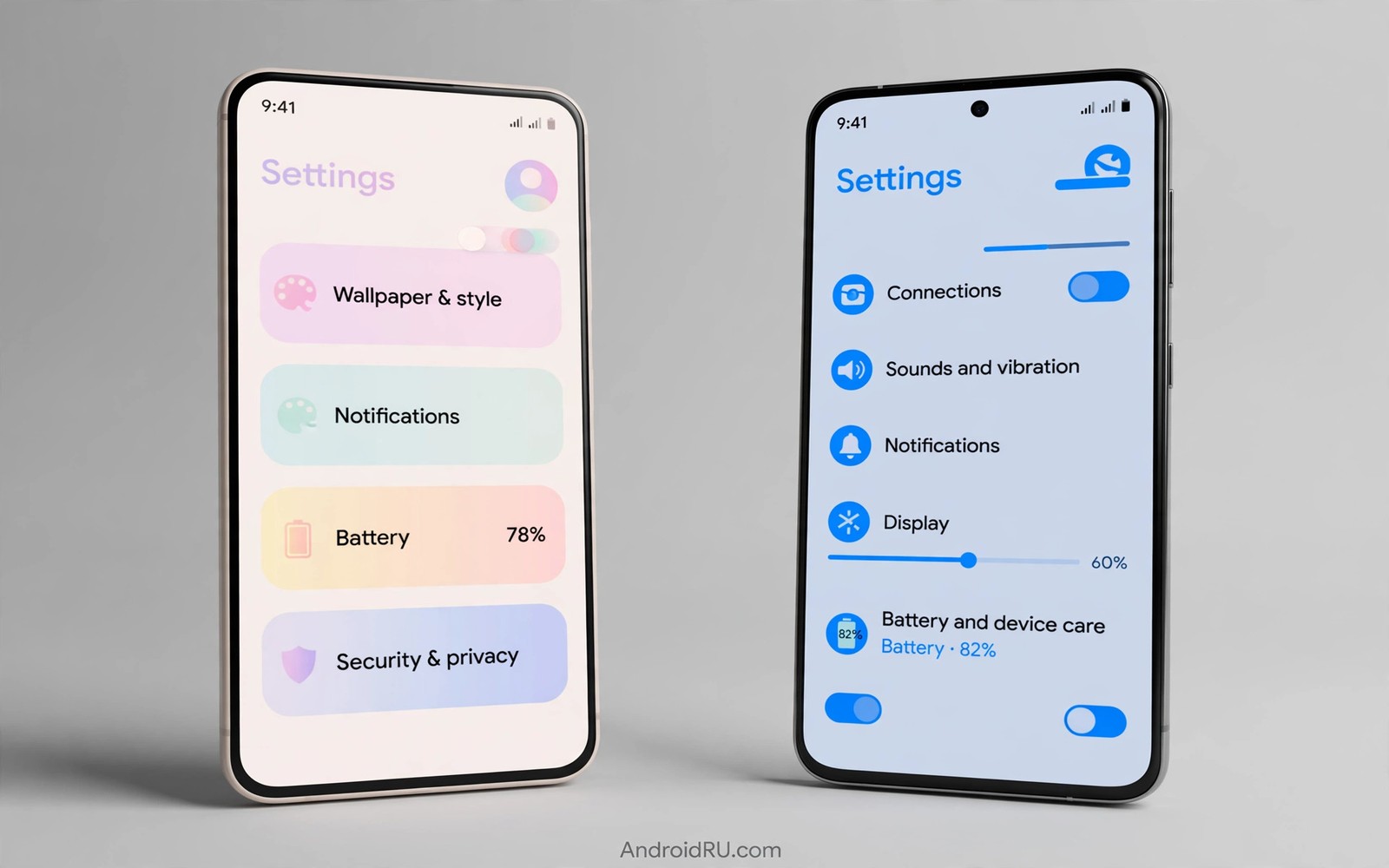
One UI color palettes take a different path from Material You to the same goal of a personal phone. Material You grows color from your wallpaper. One UI leans on curated brand palettes and manual theme controls. Both can look beautiful and both can frustrate users who expect the other philosophy.
This guide compares the two approaches on control and consistency and comfort. You will learn where dynamic color wins and where curated palettes win. You will also learn how to get the best of both on a Samsung phone. If you want the dynamic side in depth then read about dynamic color engine basics before you judge the comparison.
A fair comparison needs a clear lens. This article judges palettes by daily comfort and not by screenshot drama. A palette that photographs well but strains the eye at night loses to a quieter palette that stays comfortable for weeks. Keep that lens in mind as you read the tradeoffs.
Dynamic growth versus curated choice
Material You wins on surprise and personal connection because the palette comes from your own image. A travel photo can tint the whole phone with the colors of a remembered place. That emotional link is hard for a curated palette to match. The cost is unpredictability because a new wallpaper can produce a palette you dislike.
One UI wins on predictability and manual control because curated palettes stay stable across wallpapers. A user who loves one blue accent can keep it through ten wallpaper changes. Theme tools add manual color picks for users who want exact control. The cost is extra work because the phone does not adapt on its own and the user must curate every change.
Consistency splits by ecosystem because each approach themes different surfaces. Material You themes system apps deeply when apps adopt dynamic roles. One UI themes Samsung apps deeply and it themes third party apps less. A Samsung user lives mostly in Samsung apps and feels strong consistency. A Pixel user lives across Google apps and feels dynamic consistency instead.
Test both philosophies fairly
Judge each palette after a full day of real use and not after a minute of preview.
- Set a bold wallpaper and let Material You build a dynamic palette from it.
- Use that palette for a full day and note comfort in daylight and at night.
- Switch to a curated One UI palette or theme with a fixed accent you like.
- Use the curated palette for a full day with the same wallpaper.
- Compare app consistency by opening the same five apps under each palette.
- Compare glance speed by finding settings and messages under each palette.
- Note which palette you stopped noticing because comfort often feels like invisibility.
- Keep the palette you forgot about because that is usually the better daily choice.
Practical tips for Samsung users
Combine approaches by using dynamic wallpaper color for inspiration and manual theme control for stability. Pick a wallpaper whose hero color matches a curated accent you love. The phone then feels personal and stable at once. You can also explore light and dark theme behavior because both philosophies must still pass the night comfort test.
Test curated palettes in Samsung apps first because that is where One UI consistency shines. Messages and Settings and Calendar will show the strongest theme. Third party apps may stay fixed and that gap is normal. Judge One UI by its home ecosystem and judge Material You by its system wide reach.
Avoid theme store overload because too many paid themes create decision fatigue. Pick two curated themes that suit your taste and rotate only between them. A small rotation keeps the phone fresh without turning theme choice into a hobby.
/* One UI style palette concept */
:root {
    --oneui-accent: #0B57D0;
    --oneui-surface: #F8F9FF;
    --oneui-on-surface: #1B1B1F;
}
/* Fixed brand accents contrast with dynamic seed palettes. */
The snippet above follows the pattern shown in the official Android developer documentation for color resources and in the Material Design guidelines for accent roles. It illustrates a fixed accent approach for comparison and you should not treat the values as an official Samsung palette.
Common mistakes
Palette debates go wrong when users compare a preview against a lived experience.
- Judging from screenshots. Screenshots hide night glare and glance speed. Live with each palette for a full day before you declare a winner.
- Expecting one winner for everyone. Dynamic fans value surprise while curated fans value control. Different users can rationally prefer different systems.
- Mixing both systems blindly. Dynamic plus manual overrides can clash badly. Pick one lead system and use the other only for accents.
- Ignoring third party apps. A palette that themes only system apps leaves half the phone untouched. Check your real app mix before you judge.
- Chasing novelty weekly. Constant palette changes prevent familiarity. Settle for a season and let the phone fade into the background.
FAQ
Which look is better overall?
Neither system wins for every user. Dynamic color suits users who change wallpapers often and curated palettes suit users who want one stable accent.
Can Samsung phones use full Material You?
Samsung phones support dynamic color ideas with One UI tuning and theme tools. The output differs from Pixel phones but the core idea remains.
Do curated themes cost battery?
Theme choice has almost no battery effect on its own. Dark versus light surfaces matter far more than accent hue for battery use.
A seven day routine
Palette philosophy becomes clear only when each system gets a full day of identical tasks.
- Day one: use the dynamic palette for mail and messages and calendar tasks.
- Day two: use a curated palette for the same tasks and compare comfort.
- Day three: compare glance speed for settings under each palette.
- Day four: test both palettes outdoors for glare and readability.
- Day five: test both palettes at night for eye comfort differences.
- Day six: note which palette you stopped noticing during routine use.
- Day seven: keep the forgotten palette because comfort feels like invisibility.
Troubleshooting quick answers
Palette comparisons fail when previews replace lived experience or when systems mix.
- Curated theme clashes with dynamic icons. Mixed systems can fight over accents. Pick one lead system and use the other sparingly.
- Dynamic palette changes with wallpaper. That change is the system working as designed. Use a stable wallpaper when you want stability.
- Third party apps ignore both. Many apps keep fixed brand colors regardless of system. Judge palettes by system apps and themed apps.
- Theme store overwhelms choice. Too many options create fatigue. Shortlist two themes and rotate only between them.
Putting it all together
Philosophy matters less than daily comfort because both systems can produce calm phones. Dynamic color delights wallpaper changers and curated palettes satisfy stability seekers. The user base splits honestly along that line. No review can settle the split for someone else.
Samsung users gain an advantage by combining systems thoughtfully rather than picking a tribe. A wallpaper matched to a curated accent gives personal plus stable color. That hybrid respects both philosophies without forcing a false winner. Hybrids often beat purism in daily use.
The final test is always invisibility because a great palette disappears into use. A palette you admire constantly is still demanding attention. A palette you forget is serving you silently. Choose the silent servant over the loud artwork for a daily driver.
Real world scenarios
A Samsung owner loves one blue accent and keeps it across ten wallpapers. Curated stability beats dynamic surprise for this user. Theme tools provide the exact blue without wallpaper dependence. The phone feels like home every single day.
A Pixel owner changes wallpapers weekly and loves dynamic surprises. Each new photo recolors the phone with memories of recent trips. The dynamic system turns wallpaper hobby into theme hobby. Curated palettes would feel static to this user.
A reviewer tests both systems for a guide and refuses to crown a universal winner. Dynamic wins for wallpaper changers and curated wins for stability seekers. The guide teaches readers to match system to habit. Honest comparison beats tribal verdicts.
Checklist before you finish
A palette philosophy choice is sound when it reflects real habits.
- Both philosophies were lived with for a full day each on identical tasks.
- Glance speed was compared under each palette with real tasks.
- Night comfort was compared for both palettes before deciding.
- Third party app behavior was checked under each palette.
- One lead system was chosen rather than mixing both blindly.
- Chosen palette was forgotten during routine use which signals comfort.
- Wallpaper change frequency matches the chosen philosophy.
- Theme store rotation is limited to two themes to avoid fatigue.
What changes after a month
After a month the palette philosophy debate fades because the chosen system simply works. Dynamic users enjoy fresh wallpapers without theme labor. Curated users enjoy stable accents without wallpaper dependence. Both groups forget the debate and use their phones.
Samsung theme store habits settle into a small rotation of trusted themes. Two or three themes cover seasons and moods adequately. Endless browsing stops once the rotation satisfies daily use. Theme shopping becomes a rare event rather than a hobby.
Pixel dynamic users develop wallpaper collections that theme reliably. Hero crops with strong colors become a personal library. The library guarantees pleasant palettes for months ahead. Curation of seeds replaces curation of themes.
Cross device households learn that palettes differ by maker and accept the difference. A Samsung tablet and a Pixel phone need not match exactly. Each device serves its ecosystem strengths best. Harmony across devices matters less than comfort on each device.
Looking further ahead
Design philosophy debates often hide personal habit differences behind aesthetic arguments. A user who changes wallpapers weekly genuinely needs dynamic systems. A user who keeps one wallpaper for years genuinely needs stable systems. Neither habit is superior and each system serves its habit best. Recognizing habit differences dissolves tribal arguments into practical matching. The right question is always which system matches your habits rather than which system wins abstractly.
Samsung and Google both borrow ideas from each other over successive releases. Dynamic color appeared on Pixel first and Samsung adapted it with One UI tuning. Samsung theme tools influenced Google customization options in return. Cross pollination benefits all users regardless of brand loyalty. The ecosystem improves when makers learn from each other rather than guarding ideas.
Conclusion
The better look is the one you stop noticing during real use. Dynamic color delights when wallpapers change often. Curated palettes satisfy when one accent feels like home. Both philosophies can produce a calm phone when applied with restraint. You may also enjoy visual consistency across apps when you want another angle on the same theme.
Your next step is to run the two day comparison from this guide with one wallpaper. Keep the palette you forgot about by day two. That quiet winner is your answer.

