

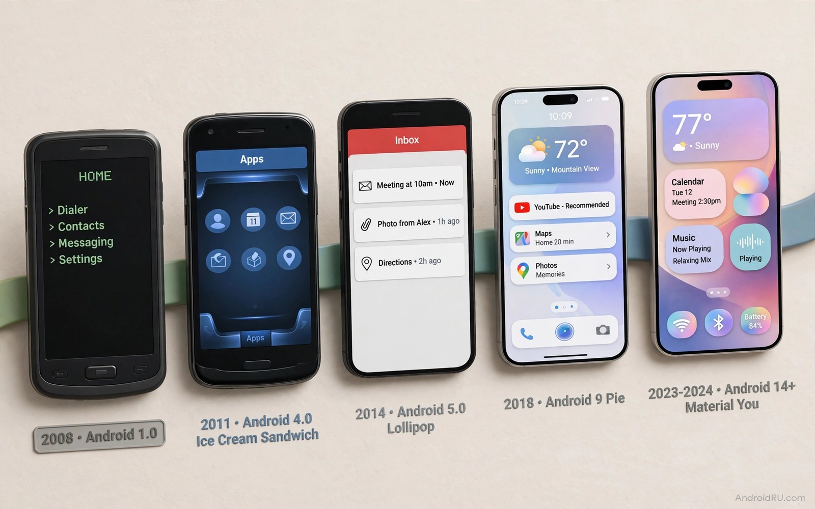
Android began with a simple interface that focused on apps and widgets and a notification shade. Early screens used small icons and plain menus and a physical keyboard on some models. The system felt functional rather than polished. Users tolerated rough edges because a phone that ran many apps and offered open customisation was new and exciting.
Cupcake added a virtual keyboard and video recording and a more usable home screen. Those additions seem basic today but they changed how people typed and shared moments. A phone without a virtual keyboard forced a hardware keyboard that added bulk. A phone with video recording turned a communication device into a media device. Each early step expanded what a phone could do in daily life.
Early years and dessert names
Early Android versions carried dessert names that made updates feel friendly and memorable. Donut added better search and camera controls. Eclair added live wallpapers and better maps. Froyo added speed and tethering. Gingerbread refined the keyboard and added better copy and paste. Each version added small improvements that together made Android feel faster and more capable.
Ice Cream Sandwich unified phone and tablet design with a cleaner look and a new typeface. Jelly Bean added smooth animations and Google Now cards that predicted useful information. KitKat slimmed the system so that it ran better on low memory phones. Those versions moved Android from a hacker friendly system to a polished system that ordinary users could enjoy without tweaking.
Material design changes everything
Material design arrived with Lollipop and gave Android a consistent visual language based on paper and shadows and bold colour. Buttons and cards and menus followed clear rules. Animations showed how screens connected rather than jumping abruptly. That consistency helped users learn new apps faster because common actions looked and behaved the same way.
Material design also pushed developers toward cleaner layouts and larger touch targets. Apps that followed the guidelines felt modern. Apps that ignored them felt dated quickly. The design language evolved over time but its core idea remains. A good interface should guide attention and explain hierarchy without requiring a manual.
Notifications and quick settings mature
Notifications started as a simple list in a shade that a user pulled down from the top. Over time notifications gained actions and replies and grouping and priority controls. A user could reply to a message without opening the app. A user could silence a noisy group while keeping important alerts loud. That evolution turned notifications from interruptions into a control centre.
Quick settings evolved in parallel with tiles for Wi-Fi and Bluetooth and flashlight and do not disturb. A user could change common settings in seconds without opening a full settings app. Custom tiles let makers and apps add their own controls. The shade became the most used interface on many phones because it offered speed without complexity.
Gestures and full screen design
Gesture navigation replaced buttons and gave apps more screen space. A swipe up returned home and a swipe from the edge went back. That change required developers to handle safe areas and edge gestures. It also required users to learn new muscle memory. Early confusion gave way to speed once users adapted to the new system.
Full screen design also changed media and games because apps could use the entire display without a permanent bar. Edge to edge layouts made photos and videos feel larger. Developers had to ensure that important buttons did not hide behind notches or camera holes. That challenge pushed better responsive design across Android.
Widgets and personalisation return
Widgets were an early Android strength that faded when home screens became simpler. Modern Android revived widgets with better sizing and dynamic colour and interactive controls. A widget can show calendar events and music controls and smart home switches without opening an app. That glanceable power suits busy users who want information at a glance.
Personalisation also expanded with dynamic themes that adapt to wallpaper colours. A phone can feel individual without a custom launcher. Icon shapes and font sizes and display scaling let users adapt the interface to vision and taste. Personalisation works best when it stays simple because too many options can overwhelm a new user.
Foldables and large screens
Foldables and tablets forced Android to adapt interfaces for larger and flexible screens. An app that looked good on a phone could look stretched on a tablet. Android added responsive layouts and multi window support and taskbars for large screens. Those changes helped productivity because a user could run two apps side by side and drag content between them.
Foldables also introduced new states such as folded and unfolded and half folded for video calls. Developers must handle those states without losing user data. The interface must adapt smoothly when a device changes shape. That flexibility points to a future where one device serves as both phone and tablet.
What modern Android gets right
Modern Android balances power and simplicity better than early versions. A new user can make calls and send messages and take photos without learning complex menus. A power user can customise launchers and automate tasks and manage permissions in detail. That dual audience is hard to serve but modern Android handles it through layered settings and sensible defaults.
Accessibility also improved with larger text and voice control and hearing support and switch access. Those features help users with different needs and they also help everyone in hands free situations. An interface that works for more people is simply a better interface. Modern Android reflects that lesson in many small details.
Lessons for future interface design
Future interfaces should learn from Android history by keeping simple tasks simple even as features grow. A new gesture or AI feature should not hide a basic action that users perform every day. Designers should test new ideas with new users and older users and users with accessibility needs before release. That testing reveals friction that a designer who knows the system well may miss.
Future design should also preserve user choice where possible. A user who prefers buttons should keep a button option. A user who prefers gestures should keep gesture options. Choice costs development effort but it respects different habits and abilities. An interface that forces one path on everyone will frustrate a large minority even if the majority adapts quickly.
Common mistakes
People often remember early Android as either perfect or terrible without acknowledging its gradual evolution. Early Android was powerful but rough. Modern Android is polished but more complex. A fair history recognises both strengths and tradeoffs at each stage.
- Assuming that a dessert name era feature was better without checking its security and performance limits.
- Judging modern design only by screenshots without testing gestures and notifications in daily use.
- Ignoring accessibility features when evaluating whether an interface truly works for everyone.
- Expecting a foldable app to work perfectly without responsive layout support from developers.
- Forgetting to back up home screen layouts before trying a new launcher or theme.
A balanced view looks at daily tasks rather than nostalgia or novelty. An interface succeeds when it helps a user finish a task quickly and comfortably.
Frequently asked questions
Which Android version introduced Material design?
Material design arrived with Android Lollipop and gave apps a consistent visual language. Later versions refined colours and animations and typography. The core idea of clear hierarchy and meaningful motion remains in modern Android.
Developers who follow Material guidelines create apps that feel familiar across devices. Users benefit because common actions look and behave predictably.
Why did Android switch from buttons to gestures?
Android switched to gestures to free screen space and to support larger displays. Buttons occupied a permanent bar that reduced usable area. Gestures let apps use the full screen while keeping navigation fast once learned.
Some users still prefer buttons and many phones offer a button option in settings. Choice helps users with different habits and needs.
Are widgets still useful on modern Android?
Widgets remain useful for glanceable information such as calendar events and music and smart home controls. Modern widgets offer better sizing and interactivity than early widgets. A user who places only a few useful widgets avoids clutter while gaining speed.
Too many widgets can slow a home screen and drain battery. Choose widgets that save at least one tap every day and remove the rest.
Conclusion
Android interfaces evolved from simple Cupcake screens to a modern system that balances gestures and widgets and notifications and large screen support. Each era solved a problem of its time and created new challenges for the next era. The constant thread is a focus on making powerful tools usable for ordinary people. That focus will guide the next era of foldables and wearables and AI driven interfaces. Readers can trace related change in software features introduced in betas and European Union smartphone regulations and custom silicon processing chips.
Take one concrete next step today. Open your home screen and remove one widget that you have not used in a week. Replace it with a widget for a task you do every day and notice how much faster that task becomes.
A final check helps a user appreciate modern design without ignoring its costs. Ask whether a new interface change saves time in a real task or merely looks fresh in a screenshot. That question separates genuine progress from fashion.
# Check Android version and interface density on a device
adb shell getprop ro.build.version.release
adb shell wm density
The commands above were written for this guide to show a simple way to check Android version and screen density on a connected device. They are general diagnostic examples and they do not modify the phone.

