

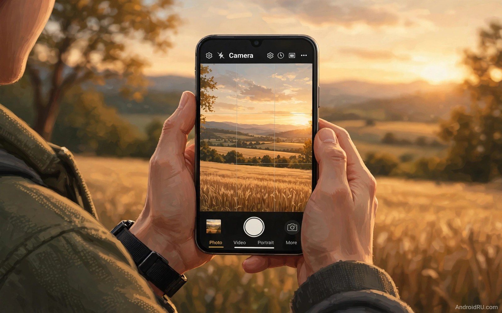
Grid lines turn a blank viewfinder into a composition tool. Two vertical lines and two horizontal lines divide the frame into nine equal parts. The four points where those lines cross are power points. Placing a subject near a power point feels more dynamic than centring it every time. This guide shows you how to use that simple grid on a phone. You will learn placements for people and horizons and streets and landscapes.
Turn the grid on before your next walk with the phone. Open the camera app and look in its settings menu. Find a toggle called grid or grid lines or composition guide. The name varies by phone maker. Turn it on once and leave it on. The grid does not appear in the final photo. It only guides your eye while you frame the shot. After a few weeks you will sense the thirds even with the grid off.
Start with one rule and ignore perfection. Place the main subject on a vertical third line. Let the rest of the frame breathe around it. A portrait with space in the look direction feels calm and intentional. A landscape with the horizon on a third line feels balanced. Small shifts matter more than big moves. Step left or crouch low and watch the grid relationship change in real time.
Place Horizons On A Third Line
A horizon in the middle of the frame splits a photo into two equal halves. That split can feel static and indecisive. Place the horizon on the upper third line when the foreground matters most. Place it on the lower third line when the sky matters most. A sunset with dramatic clouds deserves more sky. A beach with interesting rocks deserves more foreground. Let the story decide the split.
Check the horizon level as well as its height. A tilted horizon distracts even when the thirds are right. Use the horizontal grid line as a level guide. Line it up with the sea edge or a distant roof line. Take a second to straighten the phone before you tap the shutter. A straight horizon makes the whole image feel steady. It also saves you from a heavy crop later.
Try the same scene with both horizon placements. Shoot one frame with the horizon high and one with it low. Compare them on a larger screen at home. Notice which version leads your eye where you want it to go. That comparison teaches faster than any diagram. Composition tricks for stunning landscape photos extends this idea to leading lines and foreground layers.
Put Subjects On Power Points
Power points sit where grid lines cross. Place an eye on a power point in a portrait. Place a lone tree on a power point in a field. Place a boat on a power point in a harbour scene. The subject gains weight without needing to fill the frame. The empty space around it starts to work for the image. That space can show context or mood or direction of travel.
Leave look room in portraits. If a person looks to the right then place them on the left third line. The empty space on the right becomes the space they look into. The same rule works for a moving car or a walking dog. Leave space ahead of the motion. A subject pressed against the edge in its direction of travel feels trapped. A subject with room ahead feels free and alive.
Watch the background behind a power point subject. A pole or a branch growing from a head ruins an otherwise strong placement. Shift a step sideways until the background clears. Check the corners of the frame before you shoot. A stray bin or a bright sign in a corner pulls the eye away. A clean background lets the power point placement do its job.
Use The Grid For Streets And Architecture
Streets reward grid thinking because lines are everywhere. Place a building edge on a vertical third line. Let a road run from a bottom corner toward a power point. Let a row of windows repeat across the thirds. These alignments create order without making the image stiff. Walk slowly and let the grid reveal patterns you would miss at speed.
Architecture shots benefit from vertical alignment. Hold the phone level to avoid leaning walls. Place a doorway or a tower on a third line. Keep the main vertical edge parallel to the nearest grid line. Step back when a building leans too much in the frame. A wider view with straight lines beats a close view with tilted walls. Crop later for a tighter frame if you need it.
Try a low angle for a street scene with a strong sky. Crouch and tilt the phone up slightly. Place the building top near the upper third line. Let the pavement fill the lower part of the frame. This low view makes ordinary streets feel grand. It also separates the subject from busy crowds at eye level. Locking exposure for sunset photos helps when a bright sky tricks the camera meter in these scenes.
Break The Rule On Purpose
Rules serve the photo rather than the other way round. Centre a subject for symmetry when the scene is truly symmetrical. Centre a face for a bold direct portrait. Centre a reflection when both halves mirror each other. These centred shots work because the symmetry is the point. A centred shot without symmetry just looks accidental.
grid_step = turn grid on
grid_step = place horizon on third
grid_step = place subject on crossing
grid_step = check corners and level
The snippet above is an original framing checklist written for this guide. It lists only built in camera steps for your own phone. It does not copy instructions from any outside source.
Learn to break the rule after you can use it well. Shoot a scene both ways when you have time. Take one frame on the thirds and one frame centred. Compare the two frames side by side at home. Ask which frame feels calmer and which feels bolder. That habit builds judgement faster than memorising rules. Soon you will place subjects well without thinking about lines at all.
Practice With Five Everyday Scenes
Practice with a coffee cup on a table first. Place the cup on the right third line and leave the left side empty. Move the phone until the table edge runs along the lower third line. Take the shot and study the balance. The empty left side should feel like breathing room rather than a mistake. Repeat the same setup with the cup on the left third line. Notice how the image mood shifts with a simple left to right swap.
Practice with a street corner next. Stand across the road and place the corner building on a vertical third line. Let the pavement lead from a bottom corner into the frame. Wait for a single walker to enter the empty third. A lone walker adds scale and life without stealing the scene. Take several frames as the walker moves through the grid. Pick the frame where the walker sits near a power point. That frame will feel timed rather than random.
Practice with a pet at home. Get low to pet eye level and place one eye near a power point. Leave space in the direction the pet faces. Pets move fast so use burst mode if your camera offers it. Review the burst and keep the frame with the sharpest eye and the best grid placement. A sharp eye on a power point beats a centred but soft portrait every time. This drill trains speed as well as composition.
Practice with a sunset over water last. Place the horizon on the lower third line to feature the sky. Place a boat or a rock on a power point for an anchor. Check that the reflection does not pull the horizon off level. Take a second frame with the horizon high to feature the water instead. Compare the two frames and note which story feels stronger. That comparison turns a rule into a choice you control.
Practice with a portrait session in a park to lock in the habit. Place your subject on the left third line and let trees fill the right side. Ask the subject to look toward the empty space. Take a frame and check the eye position against the nearest power point. Move one step closer and repeat the placement. The closer frame should keep the eye near the same power point while the background simplifies. That repeat drill shows how thirds survive a change in distance. It also shows why a small step matters more than a new lens.
Review your week of grid practice on a larger screen every Sunday. Open the keepers and check horizon height and subject placement in each one. Delete frames where a subject sits dead centre without a symmetry reason. Keep frames where empty space supports the subject rather than competing with it. This weekly review turns scattered practice into a visible trend. You will see which placements you repeat well and which placements you still force. A trend you can see is a habit you can improve.
Common Mistakes
One common mistake is to place every subject exactly on a crossing point. Rigid placement can feel forced and repetitive. Vary your placements across a shoot. Another mistake is to ignore the horizon while chasing a subject placement. A tilted horizon can undo a good composition in one glance. Check level first and placement second when time is short.
A third mistake is to fill every third with a competing subject. A busy frame with three strong elements fights itself. Choose one hero subject per frame. Let the other thirds support it with texture or empty space. A fourth mistake is to crop away the grid balance in editing. Crop with the thirds in mind. Keep the subject near a third line after the crop. Camera hacks that upgrade mobile photos shows quick framing checks you can add to this routine.
Frequently Asked Questions
Where is the grid setting on Android cameras?
Open the camera app and open its settings menu. Look for a toggle named grid or grid lines or composition guide. Some phones put it under a general or advanced section. Turn it on once. The grid stays on until you turn it off again.
Does the grid appear in my saved photos?
No. Grid lines are only a viewfinder guide. They never appear in the saved image file. You can leave the grid on for every shoot. It costs nothing and it helps every frame.
Should I always use the rule of thirds?
Use it as a strong starting point rather than a strict law. Symmetry and centred subjects work well in the right scenes. Learn the rule first so your exceptions feel deliberate. A deliberate break looks confident. An accidental break looks careless.
Conclusion
Turn the grid on today and shoot twenty frames using third line placements. Review them tonight and keep the five strongest compositions. Note where you placed the horizon and the subject in each keeper. Repeat that review for one week. That short practice will change how you see a frame before you even raise the phone.

