

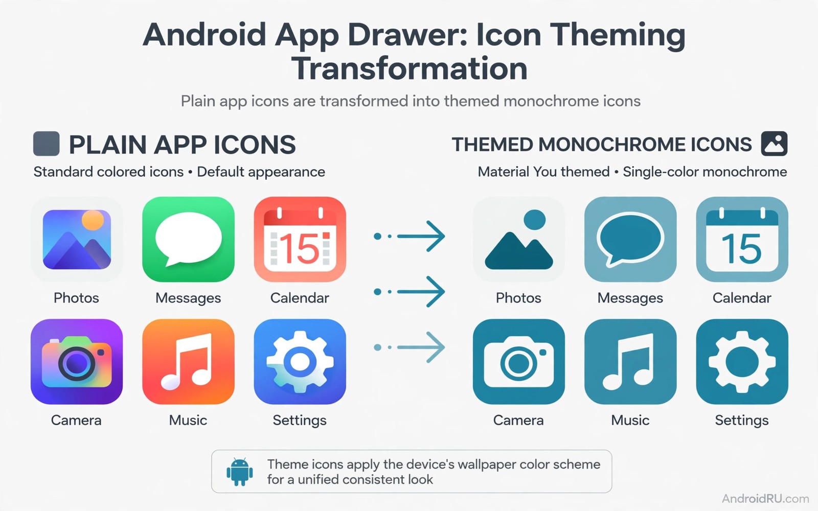
Material You icons for unsupported apps are the missing piece in many themed drawers. The system themes most apps cleanly and then a handful of holdouts keep loud brand colors. Those holdouts draw the eye and they break the calm palette you built. Forcing them into theme restores the drawer without waiting for developers.
This guide shows safe ways to force themed icons for stubborn apps. You will learn icon pack overrides and shortcut tricks and launcher tint options. You will also learn which methods are safe and which ones risk breakage. If you need the normal themed flow first then read about themed icons across the drawer so you can tell a true holdout from a settings miss.
Why some apps stay unthemed
An app stays unthemed when it lacks a monochrome icon layer for the system to tint. The developer must ship that layer and no user setting can create it from nothing. Some developers delay the layer because brand teams resist monochrome treatment. Some older apps simply never update their icon resources at all.
Launcher tinting offers a partial workaround by recoloring the icon at display time. Some launchers apply a tint filter to unsupported icons and the result looks themed at a glance. The filter can distort multi color artwork and it can muddy fine details. It works best for simple glyph icons and it works worst for photographic icons with many colors.
Shortcut replacement offers a cleaner workaround for a few key apps. A shortcut can carry a custom themed drawable while it still opens the target app. The shortcut lives on the home screen and it behaves like the app for daily taps. It does not replace the drawer icon and it does not change deep links or share targets. Use shortcuts for home screen holdouts and accept drawer holdouts that matter less.
Force themed icons safely
Work from the safest method to the strongest method and stop as soon as the result looks good.
- Update the stubborn app first because a new version may finally ship a monochrome layer.
- Turn themed icons off and on again to force the launcher to repaint the drawer.
- Check your launcher settings for a force tint or adaptive icon option.
- Apply an icon pack with a mapping for the stubborn app from its settings.
- Use per app icon override in the launcher for single holdouts that matter.
- Create a themed shortcut on the home screen for a holdout you open daily.
- Test the forced icon in dark mode to confirm contrast stays readable.
- Leave rare holdouts alone when forcing them would cost more time than the calm is worth.
Practical tips for forced icons
Force icons only for apps you see daily because each override adds maintenance. An overridden icon can revert after an app update or a launcher restore. Ten overrides create ten future chores while two overrides stay manageable. Rank holdouts by daily visibility and force only the top few. You can also explore Material You icon packs for packs with deep mappings that reduce the need for manual overrides.
Keep forced icon shapes simple and consistent with the themed set. A detailed custom icon next to clean monochrome icons looks worse than the original brand icon. Simple glyphs in the palette tone blend best. If you cannot draw a simple glyph then use a pack mapping instead of a hand made icon.
Document your overrides in a short note so a future restore does not become a puzzle. Note the app name and the method used and the pack name when relevant. A restore after a phone swap will then take minutes instead of an evening of trial and error.
<!-- Shortcut icon override concept -->
<shortcut
    android:shortcutId="custom_mail"
    android:icon="@drawable/ic_mail_themed"
    android:shortcutLabel="Mail" />
<!-- A shortcut can carry a themed icon even when the app lacks one. -->
The snippet above follows the pattern shown in the official Android developer documentation for app shortcuts and in the Material Design guidelines for icon layers. It illustrates how a shortcut can carry its own icon and you should test shortcut behavior on your launcher before relying on it widely.
Common mistakes
Forcing icons can backfire when the method is stronger than the problem.
- Using overlay hacks for every app. Aggressive overlays can break after updates and they can distort icons badly. Reserve strong methods for daily apps only.
- Forgetting that shortcuts differ. A shortcut is not the app icon and it may lack long press menus. Test taps and long presses before you rely on it.
- Forcing photographic icons. Photo based icons tint into muddy blobs. Leave those apps branded and enjoy the rest of the themed set.
- Skipping the update check. An update may add native support and remove the need for forcing. Check for updates before building workarounds.
- Overriding icons you rarely see. Rare apps do not justify override maintenance. Spend forcing effort only where daily eyes land.
FAQ
Can I force themed icons without a third-party launcher?
Stock themed mode cannot force apps that lack a monochrome layer. Icon packs and shortcuts in a supporting launcher are the usual workarounds.
Will forced icons survive app updates?
Pack mappings usually survive while manual overrides may revert. Recheck forced icons after major app updates.
Do forced icons break app functionality?
Icon overrides and shortcuts only change the launch surface. They do not change app code or data or account behavior.
A seven day routine
Forced icons need a maintenance rhythm or updates will quietly undo the work.
- Day one: update all stubborn apps and recheck native themed support.
- Day two: force only the top three daily holdouts with the safest method.
- Day three: test forced icons in dark mode for contrast problems.
- Day four: test long press menus on shortcut replacements for missing actions.
- Day five: note each override method in a short maintenance note.
- Day six: check the drawer after any app update for reverted icons.
- Day seven: decide which overrides earned their maintenance cost.
Troubleshooting quick answers
Forced icon failures usually appear after updates and they look like theme bugs.
- Override reverted after update. App updates can reset icon mappings. Reapply the override and note the pattern for that app.
- Shortcut lacks long press menu. Shortcuts differ from app icons in menus. Keep the app icon in the drawer for full menus.
- Forced icon looks muddy. Tinted photographic icons blur badly. Leave photographic icons branded and theme the rest.
- Launcher tint breaks shapes. Aggressive tint filters distort details. Use pack mappings for those apps instead of tint filters.
Putting it all together
Forcing icons is maintenance work and maintenance budgets should stay small. Three overrides are a hobby and thirty overrides are a chore. The drawer does not need perfection to feel calm. A few honest holdouts read as character while many hacks read as clutter.
Native support grows over time as developers add monochrome layers. An app forced today may theme natively after its next major update. Rechecking native support quarterly retires overrides gracefully. The goal is a drawer that needs fewer hacks each year.
Document overrides because memory fades faster than launchers change. A note with app names and methods turns a phone swap into a short task. Without a note the same detective work repeats on every device. Documentation is the difference between a system and a pile of tricks.
Real world scenarios
A banker forces a themed icon for a banking app that refuses native theming. A pack mapping covers the app cleanly on the home screen. The drawer holdout remains but the home screen looks calm. Daily visibility matters more than drawer perfection.
A traveler forces icons for transit apps used in foreign cities. Recognition speed matters when navigating unfamiliar stations. Themed glyphs plus labels guide faster than brand colors under stress. The forced set proves its worth on the first trip.
A minimalist forces only two daily holdouts and leaves the rest branded. The drawer keeps two honest exceptions among a calm themed set. Maintenance stays trivial because only two overrides exist. Restraint beats perfection for long term sanity.
Checklist before you finish
Forced icons are done right when these checks pass.
- Stubborn apps were updated first to check for new native support.
- Only daily holdouts were forced rather than the whole drawer.
- Safest method was tried before stronger overlay methods.
- Forced icons were tested in dark mode for contrast.
- Shortcut replacements were tested for taps and long press menus.
- Override methods are documented in a short maintenance note.
- Photographic icons were left branded rather than tinted into mud.
- Forced icons were rechecked after the latest app updates.
What changes after a month
After a month forced icons either survive updates or reveal themselves as fragile. Survivors use pack mappings that update with the pack. Fragile manual overrides revert repeatedly and waste maintenance time. The month test separates durable methods from fragile ones.
Native support arrives gradually for popular apps as developers add monochrome layers. Quarterly rechecks retire overrides that are no longer needed. The drawer grows more native each year without user effort. Patience converts forced themes into native themes over time.
Maintenance notes prove their worth during phone swaps when overrides must rebuild quickly. A note with three apps and methods rebuilds in minutes. Without notes the detective work repeats from scratch. Documentation is the unglamorous hero of themed drawers.
Restraint remains the guiding rule because a few exceptions read as character. A drawer with two branded holdouts still feels themed overall. Chasing absolute uniformity costs more sanity than it returns in calm. Accept the exceptions and enjoy the calm majority.
Looking further ahead
Themed icon forcing illustrates a broader tension between platform consistency and developer brand identity. Platforms want calm unified systems while brands want distinctive colorful marks. Users sit between those interests and choose per app through overrides. The tension resolves slowly as brands accept monochrome variants for system contexts. Brand identity survives in app content while system contexts gain calm through monochrome treatment.
Shortcut workarounds reveal how much of an app icon is merely a launch surface rather than the app itself. A shortcut opens the same app with the same data and account through a different image. The image is replaceable while the destination stays identical. That separation empowers users to customize launch surfaces without touching app internals. Understanding the separation prevents fear that icon changes might break app functionality.
Conclusion
Forcing themed icons is a finishing touch and not a foundation. Build the palette first and theme the supported set and then fix only the daily holdouts. A drawer with two honest holdouts beats a drawer with ten fragile hacks. You may also enjoy personalized wallpaper tools when you want another angle on the same theme.
Your next step is to list your daily holdouts tonight and force only the top three with the safest method from this guide. Test them for a week and keep the ones that survive updates.

