

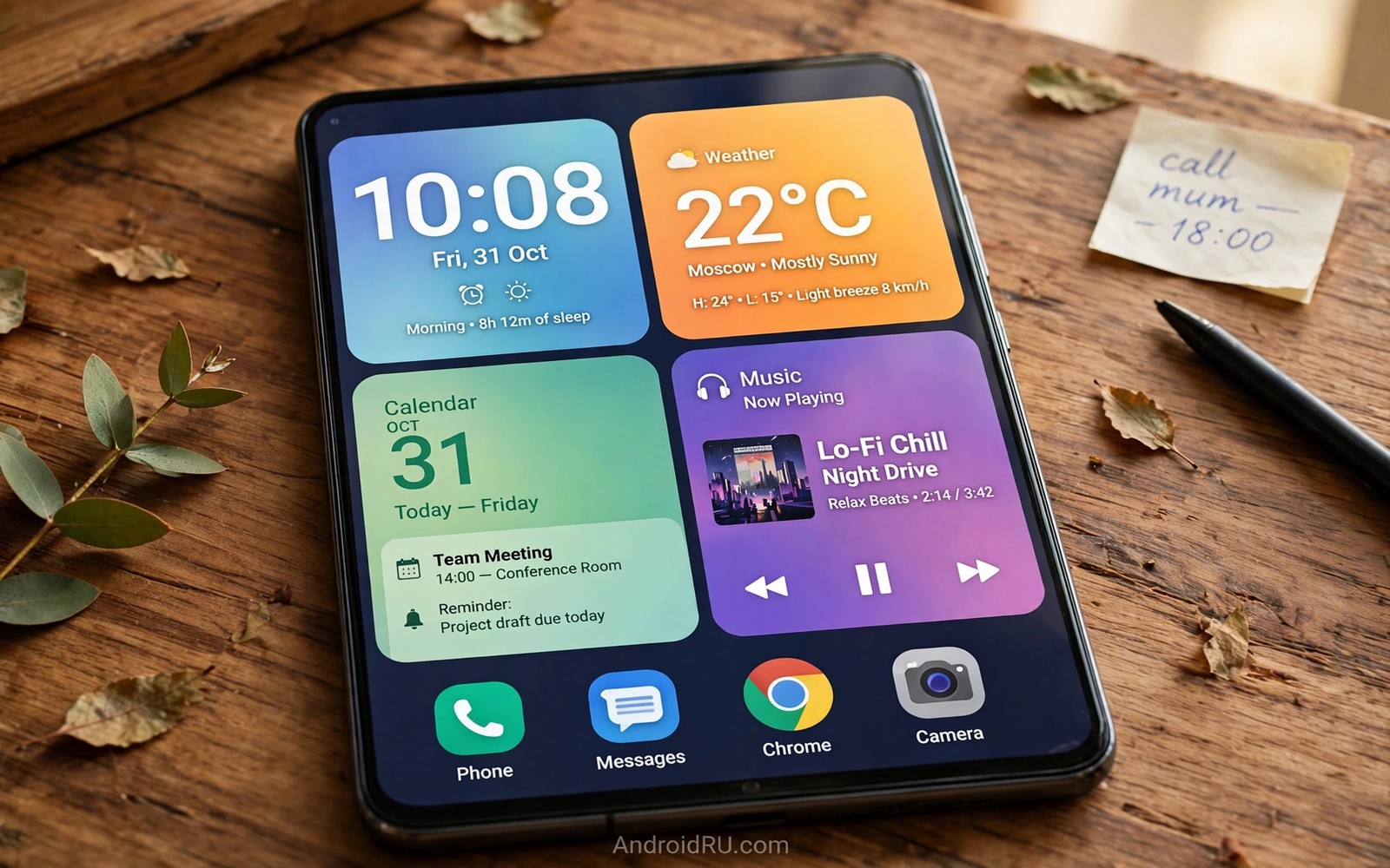
Custom Material You widgets turn a home screen from an app grid into a personal dashboard. A clock widget can carry your palette and a calendar widget can surface the next meeting without opening an app. A music widget can put playback where your thumb already rests. Widgets earn their space only when they answer a real daily question at a glance.
This guide shows how to choose and size and color widgets for a coherent interface. You will learn which widget types repay their space and which ones become decoration. You will also learn how to avoid the cluttered board that ruins many widget experiments. If you are still setting the base theme then read about theme customization steps so widget colors inherit a palette you trust.
Choose widgets that answer questions
A widget must answer one question faster than opening its app. A clock answers the time question and a calendar answers the next event question. A weather widget answers the clothing question for the morning. A widget that merely repeats an app icon answers nothing and it wastes grid space that a better widget could use.
Size discipline keeps the board readable because a widget that is too large crowds neighbors and a widget that is too small hides its answer. A clock needs width for legibility while a calendar needs height for event rows. Test each widget at two sizes and keep the size where the answer reads without squinting. Remove any widget that needs a tap to reveal its core answer.
Color matching ties widgets to the theme and it separates a designed board from a random board. Widgets that reference surface roles will follow palette changes at once. Widgets with fixed brand colors will clash after every wallpaper change. Favor themed widgets and treat fixed color widgets as exceptions that must earn their clash with unique value.
Build a widget board step by step
Build slowly and test each addition for a day before you add the next one.
- Clear one home screen page so the widget board starts from a clean grid.
- Add a clock widget in a size that reads clearly from arm’s length.
- Add a calendar widget below it and check that the next event shows fully.
- Add a weather widget only if you check weather before leaving home daily.
- Add a music widget if you control playback several times per day.
- Resize each widget so text never truncates and no widget overlaps another.
- Check the board in dark mode to confirm themed widgets adapt correctly.
- Remove any widget you did not glance at during a full test day.
Practical tips for a calm widget board
Limit the board to four widgets at most because each extra widget divides attention. A board with eight widgets becomes a second app drawer and it loses glance value. Four strong widgets beat eight weak ones in every daily test. If a widget survives a week of glances then it earned its place and the rest can leave. You can also explore launcher styling options because grid size and widget padding controls shape how calm the board can feel.
Group widgets by morning routine so the eye follows one path. Clock plus calendar plus weather forms a natural morning trio. Music plus notes forms an evening pair for wind down time. Grouping by routine reduces scanning because the hand and the eye learn one order. Random placement forces a fresh search on every glance.
Stack widgets where the launcher supports it to save space without losing answers. A smart stack can rotate weather and calendar in one slot. Stacking suits secondary widgets that you check occasionally. Keep primary widgets unstacked so their answers stay visible without swipes.
<!-- Widget layout with themed colors -->
<LinearLayout
    android:layout_width="match_parent"
    android:layout_height="wrap_content"
    android:background="?attr/colorSurfaceVariant"
    android:padding="16dp">
    <TextView android:text="Today"
        android:textColor="?attr/colorOnSurfaceVariant" />
</LinearLayout>
The snippet above follows the pattern shown in the official Android developer documentation for widget layouts and in the Material Design guidelines for surface roles. It shows how a widget references theme attributes instead of fixed colors so it follows palette changes automatically.
Common mistakes
Widget boards fail from overload far more often than from poor taste.
- Adding widgets for every app. Every app wants a widget and few deserve one. Keep only widgets that answer a daily question at a glance.
- Using fixed color widgets everywhere. Fixed colors clash after palette changes. Favor widgets that follow theme roles for core slots.
- Sizing by decoration. A widget sized for symmetry may hide its answer. Size by legibility and let symmetry follow function.
- Stacking primary widgets. A stacked clock hides the time behind a swipe. Keep primary answers visible without extra gestures.
- Never pruning the board. Needs change and boards go stale. Remove any widget that earns no glances for a full week.
FAQ
Do widgets drain battery?
Static widgets cost almost nothing while widgets with frequent refresh or location checks cost more. Check refresh settings for weather and news widgets first.
Why does a widget ignore my theme?
That widget likely uses fixed colors instead of theme roles. Replace it with a themed widget or accept its fixed look as a deliberate accent.
Can I resize any widget?
Most widgets offer a few fixed sizes and some launchers allow free resize. Check the long press menu for resize handles on each widget.
A seven day routine
Widget boards settle best when additions arrive one at a time with a day of testing between them.
- Day one: place only the clock widget and test glance speed all day.
- Day two: add the calendar widget and check event text truncation.
- Day three: add weather only if the morning routine truly needs it.
- Day four: resize every widget so no text clips at the edges.
- Day five: check the board in dark mode for themed widget behavior.
- Day six: stack secondary widgets if the launcher supports stacking.
- Day seven: remove any widget that earned no glance during the week.
Troubleshooting quick answers
Widget disappointment usually means the widget answers a question nobody asks daily.
- Widget shows stale data. Refresh settings may be too slow or background limits may block updates. Check refresh and battery settings.
- Widget ignores theme. Fixed color widgets cannot follow palettes. Replace core widgets with themed alternatives.
- Widget truncates text. The size may be too small for its content. Enlarge the widget or shorten the displayed content.
- Board feels crowded. Too many widgets divide attention fast. Cut the board to four widgets and retest glance speed.
Putting it all together
A widget board is a dashboard and dashboards serve decisions rather than decoration. Each widget should shorten a decision by at least one tap. A widget that only looks beautiful without shortening a decision is wall art. Wall art belongs in wallpaper and not in widget slots.
Sizing is a usability choice and not a cosmetic one because clipped text destroys glance value. A widget that hides its answer behind a tap is a failed widget. Size by the answer and let the grid adapt around the answer. That rule keeps boards honest across launchers.
Pruning is the ongoing discipline because needs shift and boards accumulate widgets like drawers accumulate cables. A weekly glance audit takes a minute and it keeps the board sharp. Remove without guilt because a removed widget can return in seconds when needed again.
Real world scenarios
A morning person builds a trio of clock plus calendar plus weather widgets. The trio answers time and schedule and clothing questions before breakfast. No app opens during the morning rush. The board earns its space before 8am daily.
A music lover places a large playback widget where the thumb rests naturally. Playback control never requires opening the music app fully. Album art colors clash slightly but playback value outweighs the clash. The widget survives every pruning round.
A freelancer stacks calendar and tasks in one slot to save grid space. Morning glances show calendar while afternoon glances show tasks. Stacking suits secondary widgets that rotate by time of day. Primary clock stays unstacked for instant reading.
Checklist before you finish
A widget board is ready when each statement below is true.
- Board holds four widgets at most for glance speed.
- Each widget answers one daily question faster than its app.
- No widget text truncates at its chosen size.
- Widgets follow theme roles rather than fixed brand colors.
- Board was tested in dark mode for adaptation problems.
- Primary widgets are unstacked so answers stay visible.
- Each widget earned at least one glance during a test week.
- Board was resized after any display size change.
What changes after a month
After a month the widget board either proves itself daily or reveals itself as decoration. Survivors answer questions every morning without fail. Removed widgets leave no gap because they never served a question. The board reaches a stable honest state.
Seasonal needs shift widget value because weather matters more in some months. A weather widget peaks during travel seasons and fades during stable seasons. Rotating widgets seasonally keeps the board relevant. Static boards eventually serve past needs rather than present ones.
Widget developers update themed support over time and stale widgets improve. A fixed color widget may gain theme roles in a later release. Rechecking old favorites quarterly can restore them to the board. The widget ecosystem rewards patient revisiting.
Home screen grids evolve as display size or launcher changes alter available space. A board built for one grid may need resizing after a launcher switch. Rebuilding the board after grid changes takes minutes when the widget list is short. Short boards adapt faster than crowded ones.
Looking further ahead
Widget philosophy mirrors dashboard design in cars and control rooms where glance value rules every element. A car dashboard shows speed and fuel because drivers need those answers constantly. It hides engine diagnostics until a warning demands attention. Phone widget boards should follow the same hierarchy with daily answers visible and diagnostics hidden. Boards that show everything at once serve nobody well because attention splits across too many answers.
Widget refresh economics matter because each update costs battery and data and attention in small amounts. A weather widget updating every minute wastes resources for information that changes hourly. A news widget updating constantly creates anxiety without improving decisions. Sensible refresh intervals respect both battery and mental health. Users should audit refresh settings as carefully as they audit widget placement.
Conclusion
A great widget board answers daily questions before you ask them. Clock and calendar and weather form a strong core for most users. Everything beyond the core must prove its glance value quickly. You may also enjoy gesture navigation choices when you want another angle on the same theme.
Your next step is to build a four widget board today using the steps in this guide. Test it for three days and remove any widget you never glanced at. Keep the survivors and enjoy the calmer home screen.

