

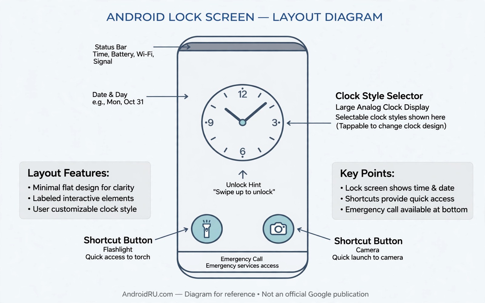
Lock screen clock styles shape the first thing you see every time you lift your phone. A large bold clock suits quick glances across a room. A small refined clock suits a calm minimal lock screen. Shortcuts below the clock decide whether you open the camera in one tap or fumble through menus. Small choices here pay off dozens of times a day.
This guide shows how to customize clock styles and shortcuts without losing readability. You will learn which layouts suit different wallpapers and which shortcuts deserve the two slots. You will also learn how to test a lock screen in real light before you commit. If you want the wider theme first then read about theme customization steps so the clock colors match the palette you already chose.
Clock layouts and readability
Clock layout is a balance between presence and restraint. A stacked two line clock dominates the screen and it suits bold wallpapers with empty sky areas. A single line clock stays quiet and it suits detailed photos that need room to breathe. Neither layout is better in abstract and the wallpaper decides which one wins.
Typeface weight matters as much as size because a thin font can vanish on a bright photo. A light font looks elegant on a dark image and it disappears on a pale image. A medium weight font survives more backgrounds and it still looks modern. Test the clock against your actual wallpaper and not against a plain preview background.
Color contrast on the lock screen follows the same rule as everywhere else. Light text needs a dark area behind it and dark text needs a light area. Some phones add a subtle scrim behind the clock to guarantee contrast. If your phone lacks that scrim then choose a wallpaper with a calm zone where the clock sits.
Set clock style and shortcuts
Menu names vary by maker but the flow below covers most modern Android phones.
- Open Settings and then Wallpaper and style or Lock screen depending on your phone.
- Tap the lock screen preview to enter the clock style editor.
- Cycle through the clock layouts and pick one that suits your wallpaper zones.
- Adjust clock color if the editor offers a color choice and test it in bright light.
- Return to lock screen settings and open the shortcuts section.
- Assign the left shortcut to the tool you open most without unlocking.
- Assign the right shortcut to a second daily tool such as a wallet or a torch.
- Lock the phone and test both shortcuts and the clock glance from arm’s length.
Practical tips for a useful lock screen
Pick shortcuts by urgency and not by novelty because the lock screen rewards speed. Camera and torch and wallet cover most urgent needs. A music app shortcut is useful only when you control playback daily from a locked phone. A shortcut you tap twice a month wastes a slot that an urgent tool could use. You can also explore Quick Settings efficiency tips because tiles and lock shortcuts together should cover urgent controls without overlap.
Keep notifications readable by limiting lock screen notification detail to what you need. Full message previews are convenient and they expose private content to anyone near the phone. Sensitive content hidden mode shows the app name without the text. Choose the level that matches your daily surroundings and not the level that looks most open.
Change the clock style when you change wallpaper families because a layout tuned for dark photos may fail on bright photos. A quick style review after each wallpaper change takes under a minute. Treat it as part of the wallpaper routine and the lock screen will always feel intentional.
<!-- Lock screen clock layout concept -->
<TextView
    android:id="@+id/lock_clock"
    android:layout_width="wrap_content"
    android:layout_height="wrap_content"
    android:textSize="64sp"
    android:fontFamily="sans-serif-light" />
The snippet above follows the pattern shown in the official Android developer documentation for text views and in the Material Design guidelines for large display type. It shows how a clock view declares size and typeface and you should test any clock style at arm’s length before you adopt it.
Common mistakes
Lock screen mistakes are small and they annoy you every single day until fixed.
- Choosing style over glanceability. An artistic clock that needs a close read defeats the lock screen purpose. Pick the style you can read at arm’s length.
- Wasting shortcuts on rare apps. Rare apps belong in the drawer and not on the lock screen. Reserve slots for urgent daily tools only.
- Ignoring wallpaper zones. A clock over a busy photo area turns unreadable. Place the clock over a calm zone or pick a calmer wallpaper.
- Showing full notifications everywhere. Full previews leak private messages in public places. Hide sensitive content when you are often around others.
- Never testing in sunlight. A lock screen tuned indoors can vanish outdoors. Step outside and glance at the clock before you finalize it.
FAQ
Can I use a custom font for the lock clock?
Some makers offer font choices in the clock editor and others limit you to preset styles. Third-party lock tools can add fonts but they may cost battery and reliability.
Why do shortcuts differ on my phone?
Makers expose different shortcut sets and some carriers restrict wallet or payment shortcuts. The available set depends on your phone model and region.
Does a big clock drain battery?
A static clock style adds almost no battery cost. Always on display settings matter far more than clock size or style.
A seven day routine
Lock screen quality reveals itself in glances across varied light so test it in more places than your desk.
- Day one: set the clock style and test a glance from across the room.
- Day two: test the clock outdoors in bright sunlight at noon.
- Day three: test the clock in a dark room with night mode on.
- Day four: test both shortcuts with cold hands and one hand only.
- Day five: check notification privacy with a friend standing nearby.
- Day six: change wallpaper family and retest clock readability.
- Day seven: keep the combination that passed every light condition.
Troubleshooting quick answers
Lock screen failures are glance failures and they show up fastest in real light.
- Clock vanishes outdoors. A thin font on a bright photo loses contrast. Switch to a medium weight or a calmer wallpaper zone.
- Shortcut opens wrong tool. Shortcuts can reset after updates. Reopen lock settings and reassign both slots.
- Notifications expose messages. Full previews show text to bystanders. Hide sensitive content in lock notification settings.
- Clock style resets. A theme change can override clock choices. Restyle the clock after any major theme change.
Putting it all together
The lock screen is the most viewed screen on the phone and the least designed by most users. A few minutes of deliberate styling pays off in hundreds of glances. The clock and the shortcuts deserve the same care as the home screen grid. Neglect here costs seconds every single day.
Privacy belongs in the lock screen plan from the start because notifications arrive before unlock. A beautiful lock screen that leaks messages is a failed design. Hide sensitive content and keep the lock screen useful without being open. The balance is easy once you set it deliberately.
Revisit the lock screen whenever the wallpaper family changes because readability depends on background zones. A dark photo routine differs from a bright photo routine. A one minute review after each wallpaper change keeps glances fast. Treat that review as part of changing wallpapers.
Real world scenarios
A runner checks the time mid run with a glance at a locked phone. A large bold clock reads instantly without breaking stride. A music shortcut starts playback without unlocking in the rain. The lock screen serves sport as well as office life.
A parent checks notifications while cooking with messy hands. A medium clock plus hidden sensitive content balances usefulness and privacy. A camera shortcut captures kitchen moments without unlocking. The lock screen respects both convenience and discretion.
A commuter glances at the lock screen on a crowded train each morning. A calm clock zone keeps the time readable despite train motion. Shortcuts stay untouched because the train jostle never triggers them accidentally. Thoughtful placement survives real world motion.
Checklist before you finish
The lock screen is finished when it passes this glance and privacy test.
- Clock reads clearly from arm’s length in daylight and indoors.
- Clock was tested outdoors in bright sunlight before finalizing.
- Clock zone sits over a calm wallpaper area rather than busy detail.
- Left shortcut serves the most urgent tool used without unlocking.
- Right shortcut serves a second daily tool rather than a rare app.
- Notification detail level matches daily surroundings for privacy.
- Both shortcuts were tested one handed and with cold hands.
- Clock style was restyled after the last wallpaper family change.
What changes after a month
After a month the lock screen becomes pure habit with no conscious thought. Glances deliver time instantly in every light condition tested. Shortcuts fire without looking during routine moments. The lock screen disappears as a design object and serves as a tool.
Wallpaper seasons change the lock screen challenge gradually over months. Winter dark photos favor light clocks while summer bright photos favor medium weights. Seasonal restyling keeps glances fast year round. A static lock style across all seasons eventually fails one season.
Privacy settings deserve periodic review because notification habits change over time. New apps may request lock screen previews by default. A quarterly privacy glance catches new preview permissions early. The lock screen stays useful without becoming an open book.
Family members learn the lock shortcuts and use them when borrowing the phone. Camera and torch shortcuts serve guests without unlocking private content. Shared shortcuts extend the phone usefulness safely. Design for guests as well as owners from the start.
Looking further ahead
Lock screen design sits at the intersection of utility and privacy and beauty in a way no other screen does. The screen must serve glances in seconds while protecting messages from strangers nearby. It must look personal while remaining functional for guests who borrow the phone. Balancing three goals on one screen requires deliberate choices rather than default acceptance. Users who design the lock screen deliberately gain seconds daily and privacy permanently.
Future lock screens may add more widgets and live information without unlocking. Each addition must pass the glance test and the privacy test before earning a place. A weather widget on the lock screen helps commuters but a message preview widget risks exposure. The same discipline that governs home widgets should govern lock widgets even more strictly. The lock screen is a public face of a private device.
Conclusion
A great lock screen is glanceable and fast and calm. The clock should read at once and the shortcuts should open urgent tools at once. Everything else is decoration and it should never slow those two jobs. You may also enjoy custom widget ideas when you want another angle on the same theme.
Your next step is to set your clock style and both shortcuts tonight using the steps in this guide. Test the result outdoors tomorrow morning. Adjust once and then leave it alone for a week.

