

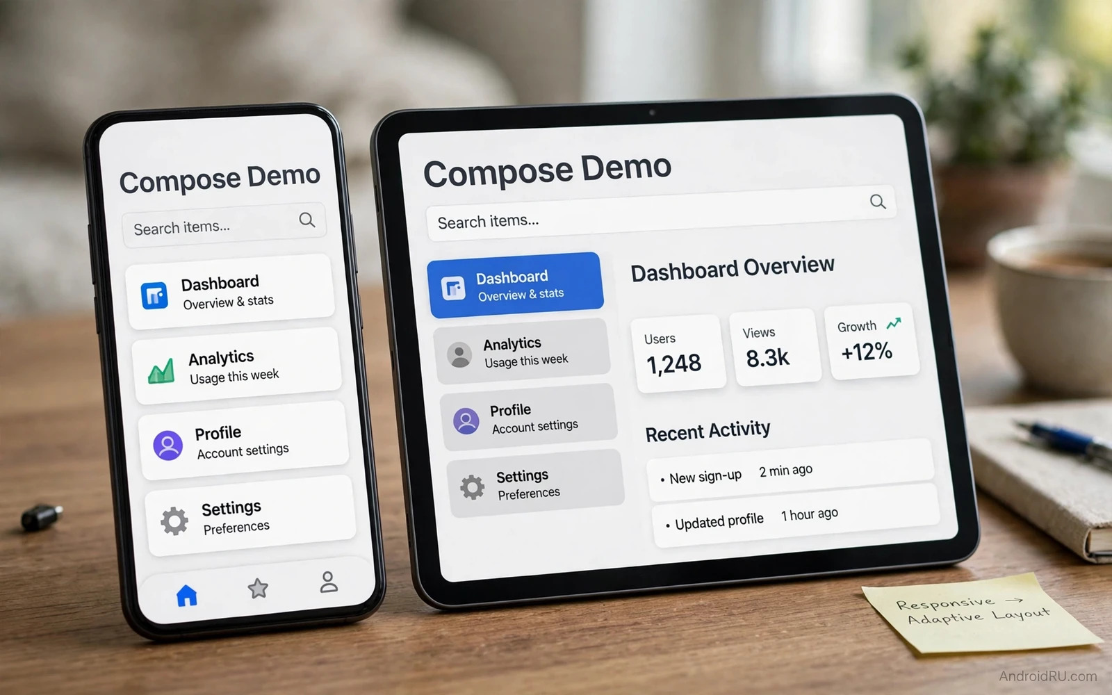
What Responsive Means in Compose
Responsive layout means that one interface adapts to different widths and heights without a separate design for every device. A phone in portrait shows a single column. A tablet in landscape shows two panes side by side. A foldable device may show a single column when folded and two panes when unfolded. A responsive Compose layout reads the available space and chooses the arrangement that fits that space. The content stays the same but the arrangement changes.
Compose makes responsive design easier because layout is code rather than a fixed XML tree for one size. A composable can branch on window size class and render a different arrangement from the same data. A list can become a grid when width grows. A bottom navigation bar can become a navigation rail when width grows further. A detail pane can appear beside a list when there is room for both. Each branch uses the same state and the same data source.
Responsive design is not only about large screens. A small phone in landscape has different constraints from a small phone in portrait. A device with large text settings needs more vertical space for the same content. A device with a display cutout needs padding that avoids the cutout area. A layout that only handles phone portrait and tablet landscape will fail on those in between cases. A layout that handles width classes and height classes and window insets handles them all.
Window Size Classes as a Starting Point
Window size classes group available width and height into compact and medium and expanded buckets. Compact width fits a single column. Medium width fits a list and detail arrangement in some cases. Expanded width fits a clear two pane arrangement. Height classes work in a similar way for vertical space. A layout can read the current size class and choose a branch. That branch decision should live in one place near the top of the screen hierarchy.
Size classes are a guide rather than a precise measurement. Two devices in the same class may still differ in exact pixels. Layout code inside a branch should still use flexible sizing rather than fixed sizes. A grid inside a medium branch should adapt its column count to the exact width. A text block inside an expanded branch should limit its line length for readability rather than stretching across the whole screen. Size classes choose the structure. Flexible components fill the structure well.
Foldable devices add a posture dimension beyond size class. A device may be flat or half open or folded. A half open device may have a hinge area that should not hold important content. Compose window APIs expose fold and hinge information where available. A layout can avoid placing a button across a hinge. It can place a list on one side and a detail on the other side when the device is half open. Posture awareness turns a foldable from a large phone into a genuinely useful two pane device.
Building Blocks for Flexible Layouts
Boxes and rows and columns are the basic building blocks. A column stacks content vertically. A row places content horizontally. A box layers content. Weight modifiers distribute available space among children in a row or column. A child with a larger weight receives more space. A child without weight keeps its natural size. Weight is the simplest tool for a layout that must stretch and shrink with the window.
Lazy grids adapt column count to width through adaptive sizing. An adaptive grid chooses how many columns fit given a minimum cell size. On a narrow phone it shows one or two columns. On a wide tablet it shows more columns without code changes for each width. Adaptive grids work well for galleries and product lists and icon grids. They keep cell size readable while using the available width fully.
Flow layouts handle content that should wrap to a new line when space runs out. A row of chips can wrap rather than clip. A row of filters can wrap rather than scroll horizontally without indication. Wrapping keeps all options visible on a narrow screen. It also keeps the layout tidy on a wide screen where the same chips fit on one line. Flow layouts reduce the need for special narrow screen designs.
Navigation That Adapts
Navigation should adapt with layout. A phone typically uses bottom navigation with a small number of destinations. A medium width device may use a navigation rail on the side. An expanded width device may use a navigation drawer with labels and icons. The destinations stay the same. The presentation changes with width. A single navigation state can drive all three presentations.
Two pane navigation needs special care. A list pane and a detail pane share one navigation state. Selecting an item in the list updates the detail pane on a wide screen. Selecting an item on a narrow screen navigates to a detail screen instead. The back behaviour must match the presentation. On a wide screen back from a detail may clear the selection rather than leaving the screen. On a narrow screen back returns to the list. Consistent back behaviour prevents user confusion.
Deep links must work in every presentation. A deep link to a detail item should open the detail pane on a wide screen and the detail screen on a narrow screen. The navigation logic should not assume one presentation. It should resolve the destination from data and let the layout decide the presentation. That separation keeps deep links reliable across devices.
Text and Content Readability
Text needs a maximum line length for comfortable reading. A paragraph that stretches across a very wide tablet screen becomes hard to read. The eye must travel a long distance to find the next line. A responsive layout should constrain text width on expanded screens. It can centre the text column or place it beside a companion pane. The remaining space can hold navigation or supplementary content rather than stretched text.
Font scaling also affects layout. A user who chooses large text needs more vertical space for the same content. A layout that uses fixed heights will clip large text. A layout that uses flexible heights will grow with the text. Compose text components measure their content and expand when needed if the parent allows it. Parents should allow growth rather than fixing heights for text containers.
Images need adaptive sizing as well. An image that fills a narrow phone width may look oversized on a tablet. An image that looks balanced on a tablet may look tiny on a phone. Responsive image handling uses aspect ratio and content scale rather than fixed pixel sizes. A hero image can use a different aspect ratio on a wide screen from the ratio on a narrow screen. That change keeps the image prominent without dominating the layout.
Handling Insets and System Bars
System bars and display cutouts and gesture areas create insets that content must respect. A layout that draws under a status bar must add top padding for content that should not hide behind it. A layout that draws under a navigation bar must add bottom padding for buttons that should stay tappable. Compose provides window insets that describe those areas. Padding modifiers can consume insets for the parts of the layout that need them.
Edge to edge design draws backgrounds under system bars while keeping content clear of them. That design looks modern but it requires careful inset handling. A background can extend to the screen edge. A button row must stay above the navigation inset. A top bar must stay below the status inset. Mixing background extension with content padding gives both a modern look and a usable layout.
Keyboard insets also matter for forms. A text field near the bottom of a screen may hide behind the keyboard when the keyboard opens. A scrollable layout that respects keyboard insets will move the field above the keyboard. A fixed layout that ignores keyboard insets will trap the field behind the keyboard. Testing forms with the keyboard open on a small device reveals this problem quickly.
Testing Across Sizes
Preview annotations in Compose can show a composable at several sizes during development. A developer can preview a screen at phone width and tablet width side by side. That preview catches obvious layout breaks early. Preview alone does not replace device testing because it does not show real window insets or real fold postures. It is a fast first check rather than a final proof.
Emulators cover a range of sizes and fold postures. A developer should test at compact width and medium width and expanded width. A developer should test in portrait and landscape. A developer should test with large text and with a foldable emulator in half open posture. Each configuration may reveal a different break. A layout that passes all of them is ready for real devices.
Real device testing should include a small phone and a large tablet when possible. A real foldable adds posture testing that an emulator approximates but does not fully reproduce. A real device also reveals performance differences. A complex adaptive layout that recomposes too often may stutter on a low end phone even when it looks fine on a flagship emulator. Performance testing belongs beside layout testing.
Connections to Nearby Topics
Responsive work connects to asset work because a layout that grows needs art that stays sharp at larger sizes and a careful reading of vector drawables versus bitmap assets helps a team choose art that scales with the layout. State work also connects because a two pane layout must keep selection state consistent when the presentation changes and the guide to app state and lifecycle events explains how that state should survive rotation and presentation changes. Storage work connects as well because a responsive settings screen may need durable preferences and the comparison of shared preferences versus Room database helps a team decide where those settings belong.
Common Mistakes to Avoid
One common mistake is hardcoding widths for tablet layouts. A hardcoded width that fits one tablet will fail on another tablet or on a foldable. Another mistake is creating a separate screen for every device size. Duplicated screens drift apart and bug fixes must be applied in several places. A third mistake is ignoring height classes. A landscape phone has limited height and a layout designed only for portrait will overflow.
Another mistake is placing important content across a fold or hinge. Users cannot tap content that sits on a hinge comfortably. A further mistake is fixing text container heights. Large text will clip and users who need large text will lose content. A final mistake is testing only on one emulator size. A layout that looks perfect at one size may break at the next size class.
// Adaptive layout sketch in Kotlin
// val windowSize = calculateWindowSizeClass(activity)
// if (windowSize.widthSizeClass == WindowWidthSizeClass.Expanded) {
//     Row { ListPane(); DetailPane() }
// } else {
//     ListPane()
// }

