

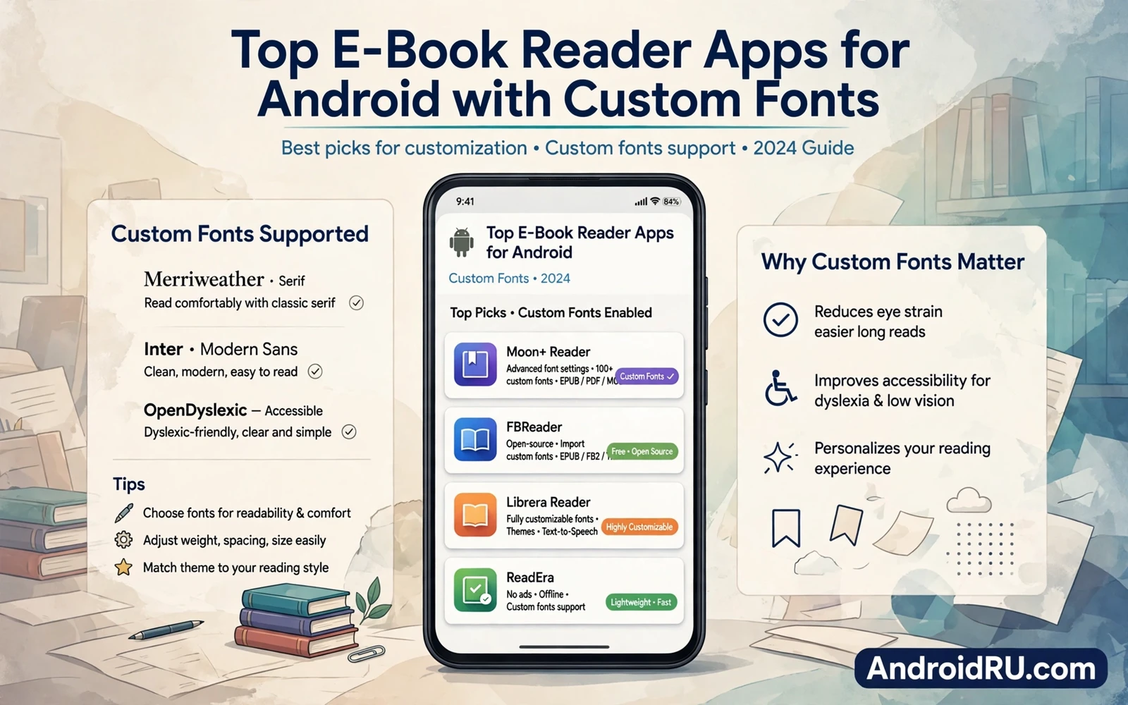
Reading on a phone should feel comfortable. A good e-book reader lets you shape the page to your eyes. You can change the font. You can change the size. You can change line spacing. You can change margins. Those controls turn a cramped screen into a calm reading space.
Custom fonts matter more than they first appear. A serif font can feel book like. A sans serif font can feel clean on a small screen. A dyslexia friendly font can help some readers a lot. A font that you love will keep you reading longer. A font that strains your eyes will push you away from a book.
Format support matters as well. Readers handle common e-book formats in different ways. Some readers handle a wide range well. Some readers focus on one format deeply. Check format support for the books that you already own. A reader that cannot open your library is not a good reader for you.
Typography Controls Worth Checking
Font size control should be smooth. A slider or a quick tap should resize text without breaking the page. A reader that jumps between a few fixed sizes feels crude. A reader with fine size steps lets you find your exact comfort point. Test size changes at night and in bright light. Comfort can shift with light.
Line spacing and margins shape readability too. Wider line spacing can help long reading sessions. Narrower margins can fit more words per screen. Wider margins can feel more book like. A reader that lets you tune both gives you real control. Tune them together rather than chasing one perfect setting.
Theme choice protects your eyes across the day. A light theme suits bright rooms. A dark theme suits night reading. A sepia theme suits long relaxed sessions. A reader that switches themes by time of day removes a manual step. A reader that lets you set a custom background color gives even more control.
Page animation affects feel as well. A slide animation feels modern. A curl animation feels book like. A plain tap advance feels fastest. Animation should never delay the next page. Test page turns at your normal reading speed. A slow animation will annoy you by chapter two.
Library And Progress Tools
Library organization becomes vital as books pile up. A reader should sort by author and title and recent reading. It should support shelves or collections. It should search inside the library fast. A messy library hides books that you own. A tidy library invites you to pick the next book.
Progress tracking helps long books feel manageable. A reader should show progress by chapter and by book. It should remember your place across devices where sync exists. It should show time left in a chapter as a gentle guide. Progress tools should motivate rather than pressure. A calm progress display beats a nagging one.
Bookmarks and highlights turn reading into study. A bookmark should save with one tap. A highlight should save with a simple drag. Notes attached to highlights should stay searchable. Export of notes helps for essays and reviews. A reader with weak notes forces you to keep a separate notebook.
Dictionary lookup helps with unfamiliar words. A tap on a word should show a definition without leaving the page. A reader with offline dictionary support helps on flights and in weak signal areas. Lookup should feel instant. A slow lookup breaks the reading flow.
Reading On Tablets And Phones
Tablets offer a larger page and a more book like feel. A reader should use tablet space well. It can show two pages in landscape. It can show a wider margin layout. It can keep controls reachable without covering text. A phone reader scaled up without tablet thought will waste that space.
Phones offer reading anywhere. A reader should keep one handed controls simple. Page turn zones should sit where thumbs rest. Settings should stay one tap away. A phone reader that demands two hands for basic turns will fail on a crowded train.
Tablets also suit document reading alongside e-books. A PDF reader with annotation tools complements an e-book reader well. Many readers switch between books and documents across a day. You can compare document handling through PDF reader and annotation apps for Android tablets when your library mixes books and documents.
Sync And Storage
Cloud sync keeps your library consistent. A book started on a phone should resume on a tablet at the same page. Highlights should sync too. Bookmarks should sync too. Sync that covers only the book file is half a solution. Test sync with a real switch between devices before you trust it.
Storage management matters for large libraries. A reader should let you choose where books live. It should show library size clearly. It should let you remove a book file while keeping notes. A reader that fills internal storage without warning will cause trouble later.
Cloud storage apps can serve as a backup layer for a personal library. A library folder synced to the cloud protects against a lost phone. It also makes moving to a new device easier. You can plan that backup layer through cloud storage apps for Android compared for Google Drive and OneDrive and keep the reader itself focused on reading.
Offline reading is a core promise of e-books. A reader should download a whole book cleanly. It should not need a connection to turn pages. It should handle a partially downloaded book gracefully. Test offline mode before a flight. A reader that fails offline fails at the moment when reading matters most.
Notes And Productivity Around Reading
Reading often leads to writing. A quote can spark an essay idea. A chapter can spark a project note. A reader that exports highlights cleanly feeds that writing. A note app that syncs across devices can receive those exports. That pairing turns reading into a productive habit.
Note taking tools that sync well make that pairing smooth. You can capture a quote on a tablet and expand it on a phone later. You can organize reading notes by book and by theme. That workflow is explored in note taking apps that sync across devices where capture and sync and organization get a fuller treatment.
Choosing Your Reader
Start with font control. Open a sample book. Change the font. Change the size. Change spacing. Change theme. If those controls feel good then the reader passes the first test. If those controls feel hidden or coarse then look elsewhere. Typography is the daily core of a reader.
Next test library tools. Import a few books. Sort them. Search them. Bookmark a page. Highlight a passage. Add a note. If those steps feel smooth then the reader fits a serious reading habit. If they feel clumsy then daily use will frustrate you.
Next test sync and offline mode. Switch devices. Read offline. Check that progress follows you. A reader that passes those tests earns a place as your main reader. A reader that fails them can still serve as a backup reader for one device.
Finally read a full chapter before you commit. A chapter reveals animation speed and theme comfort and control placement. A quick preview hides those details. A full chapter shows them. Choose the reader that disappears into the book. The best reader is the one that lets the story take over.
Custom fonts turn an e-book reader from a tool into a personal reading room. Pick a reader with fine typography control and strong library tools and reliable sync. Tune the page to your eyes. Keep notes close. Then read widely and comfortably wherever you are.
Reading Habits That Stick
Set a small daily reading goal rather than a large one. Twenty minutes a day beats a heroic weekend binge that never happens. A small goal fits into a commute. A small goal fits into a lunch break. A small goal builds a habit that survives busy weeks.
Keep the current book easy to open. Place the reader app on the home screen. Enable resume on open. Remove friction between intention and reading. A book that opens in one tap gets read. A book buried in folders gets forgotten.
Use reading sessions to disconnect from feeds. A book offers depth that short posts cannot. A dedicated reading time without notifications protects focus. Do Not Disturb during reading helps. A calm reading habit can improve sleep when it replaces late night scrolling.
Track books finished rather than pages rushed. A finished book list motivates the next pick. A page count race can push you to skim. Reading quality matters more than reading speed. A slow thoughtful book often stays with you longer than a fast skimmed one.
Share quotes and thoughts with friends who read. A shared note can start a conversation. A shared recommendation can lead to a new favorite. Reading becomes richer when it connects people. A reader with easy sharing supports that social side.
Revisit favorite passages after finishing a book. Highlights saved during reading become a personal anthology. A revisit can reveal ideas missed on first pass. A reader that keeps highlights searchable makes revisits easy and rewarding.
E-Books And Eye Comfort
Eye comfort depends on more than font choice. Screen brightness matters. Room lighting matters. Reading distance matters. Breaks matter. A comfortable font on a harsh bright screen still strains eyes. Tune brightness to room light. Take a short break each half hour.
Night reading needs a warm theme and low brightness. A warm theme reduces harsh blue light feel. A low brightness reduces glare. A dark room plus a bright screen is a harsh combination. Match screen to room for comfortable night reading.
Font choice can help with long sessions. A font with open letter shapes reads easily at small sizes. A font with tight shapes can blur at small sizes. Test fonts at your normal reading size rather than at a large preview size. Normal size testing reveals true readability.
Keep a backup reading position across devices. A phone for travel and a tablet for home can share progress. Sync makes switching seamless. A seamless switch means reading continues wherever you are. That continuity builds a stronger reading habit over time.
Try reading a sample chapter in each candidate reader before you buy books in its store. A sample chapter tests fonts and themes and page turns with real content. A sample chapter also tests dictionary lookup and bookmark saving. A reader that feels good in a sample will feel good in a full book. A reader that feels awkward in a sample will not improve with a longer book.

