

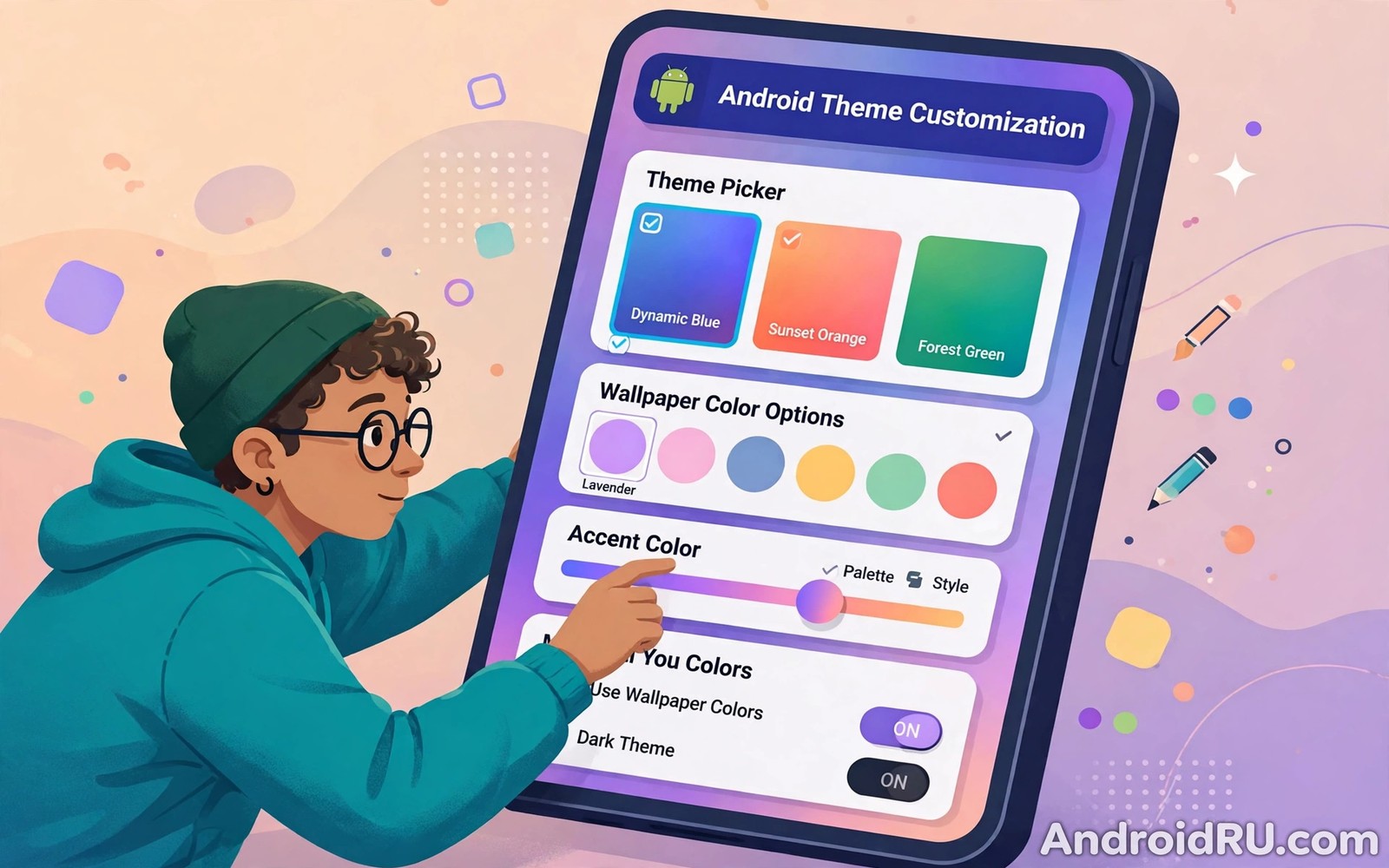
Theme customization in Android Material You lets you shape the whole phone around one personal choice. A wallpaper change can recolor the quick settings panel and the volume slider and the lock screen clock. A palette choice can soften harsh accents or sharpen a dull interface. The system does the heavy work and you only make the taste decisions.
This guide walks through the full customization path from wallpaper to widgets. You will learn which settings matter most and which ones you can safely ignore. You will also learn how to keep text readable while you chase a bold look. If you want the theory behind the colors then read about dynamic color engine basics first and return here when you are ready to apply the ideas with your own hands.
Start with wallpaper and palette
Every strong theme starts with a wallpaper that has clear color and clear contrast. A photo with one dominant hue gives the engine a confident seed and the palette feels intentional. A photo with ten competing hues gives a muddy seed and the theme feels random. Choose the wallpaper first and treat every other setting as a refinement of that choice.
Open the wallpaper and style screen and study all palette options before you tap one. Each option recolors the preview at once and you can see the effect on buttons and sliders. Pick the option that keeps small labels readable and that suits your daily light conditions. A palette that pops in a shop may glare in direct sun so test it outdoors when you can.
Themed icons are the next lever and they tie the home screen together in one move. When themed icons are on then supported icons take a single tone from the palette and they lose their brand colors. Some users love the unity and some users miss the brand colors for fast scanning. Try the mode for a full day because first impressions often change once muscle memory adapts.
Build your theme step by step
Work in this order so each change builds on the last one and you never lose track of what caused a problem.
- Set a wallpaper with one dominant hue from your gallery or from the system wallpaper picker.
- Open Wallpaper and style and pick the palette that keeps button text easy to read.
- Turn themed icons on and check the home screen and the app drawer for missing or unclear icons.
- Set dark theme to follow your schedule so the palette adapts at night without manual taps.
- Add one themed widget such as a clock or a calendar and match its size to your grid.
- Customize the lock screen clock style and pick shortcuts you actually use every day.
- Review the quick settings tiles and move your most used controls to the first row.
- Save a screenshot of the final home screen so you can restore the look after a reset.
Practical tips for a polished theme
Limit yourself to one bold accent and let neutral surfaces do the rest of the work. A theme with three loud accents fights for attention and it tires the eye fast. A theme with one accent and calm surfaces feels designed and it ages well across weeks of use. If a widget clashes then recolor it or remove it rather than adding another accent to balance it.
Match widget style to icon style so the home screen reads as one system. A rounded widget set pairs well with rounded icons and a sharp widget set pairs well with sharp icons. Mixing shapes at random makes the screen feel patched together even when the colors match. You can also explore custom widget ideas for layouts that keep this balance without crowding the grid.
Revisit your theme after a major system update because palette behavior can shift. Updates sometimes add new palette options or change how dark theme maps tones. A quick review after each update keeps your theme intentional instead of inherited. Treat the review as routine maintenance and not as a sign that something broke.
<!-- res/values/themes.xml -->
<style name="Theme.MyApp" parent="Theme.Material3.DayNight.NoActionBar">
    <item name="colorPrimary">@color/md_theme_primary</item>
    <item name="colorSecondary">@color/md_theme_secondary</item>
    <item name="colorTertiary">@color/md_theme_tertiary</item>
</style>
The snippet above follows the pattern shown in the official Android developer documentation for Material Design themes and in the Material Design guidelines for dynamic color roles. It shows how an app declares its core color roles and you should map each role to a tested tonal value before you rely on it in production.
Common mistakes
Theme problems usually come from rushing the order or from stacking too many tools at once.
- Stacking three theme apps at once. Multiple theme tools can fight over the same values and the result is unpredictable. Use one tool at a time and remove the rest.
- Ignoring icon legibility. A beautiful monochrome icon set can hide app identity at a glance. Keep brand icons for apps you open under time pressure.
- Overfilling the home screen. Too many widgets leave no breathing room and the palette loses its calming effect. Keep two or three widgets per screen at most.
- Forgetting the lock screen. A themed home screen with a clashing lock screen feels unfinished. Style the clock and shortcuts in the same session.
- Copying a screenshot theme blindly. A theme built for one wallpaper and one phone may fail on yours. Use screenshots as inspiration and tune the palette for your own device.
FAQ
Do I need root to customize Material You themes?
No you do not need root for wallpaper palettes and themed icons and widgets on supported phones. Root only matters for deep system edits that stock settings do not expose.
Why do some icons stay unthemed?
Only apps that ship a monochrome icon layer can join themed icon mode. Apps without that layer keep their normal icon until the developer adds support.
Can I save a theme to reuse later?
Stock Android does not offer a named theme save on most phones. Screenshots and notes about your wallpaper and palette choices are the simplest way to rebuild a look.
A seven day routine
A short daily routine keeps theme experiments tidy and it prevents the endless tweaking loop that ruins many setups.
- Day one: set the hero wallpaper and pick the palette with the best button contrast.
- Day two: enable themed icons and note which drawer icons stay unthemed.
- Day three: add one clock widget and check its size against your grid.
- Day four: style the lock screen clock to match the home screen palette.
- Day five: reorder quick tiles so daily controls sit in the first row.
- Day six: test the full theme outdoors in bright sunlight for glare.
- Day seven: remove one element that you never glanced at during the week.
Troubleshooting quick answers
Theme frustration usually comes from one layer fighting another and the fix is to isolate layers.
- Icons clash with widgets. A fixed color widget can fight a dynamic palette. Replace it with a themed widget or remove it.
- Lock screen clashes with home screen. The two screens were styled in separate sessions. Restyle them together in one sitting.
- Theme resets after reboot. A launcher or theme tool may fail to restore values. Check its backup setting and reapply once.
- Palette looks different in screenshots. Screen calibration and compression shift colors slightly. Judge themes on the phone screen itself.
Putting it all together
Theming is a system craft and the order of work matters as much as taste. Wallpaper first and palette second and icons third and widgets last gives each layer a stable base. Reversing the order forces rework because widgets chosen early may clash with a palette chosen late. Follow the order and the theme assembles itself.
Restraint is the final skill because a theme with room to breathe outlasts a theme packed with effects. Two widgets and one accent and calm surfaces feel designed for months. A packed screen feels exciting for a day and tiring for a month. Choose the version you can live with and not just the version that photographs well.
Review the theme seasonally rather than daily so familiarity can grow. Daily tweaks prevent muscle memory and they hide the true quality of a setup. A seasonal review catches real drift from updates while it preserves daily calm. Set a reminder each season and enjoy the quiet months between.
Real world scenarios
A freelancer rebuilds a phone theme every season to match changing work. Spring brings a green photo palette that softens long invoice days. Autumn brings an amber palette that feels warmer during evening admin. The seasonal rhythm keeps the phone feeling fresh without daily fiddling.
A new phone owner starts from stock defaults and follows the guide order in one evening. Wallpaper first and palette second and icons third gives a coherent result fast. Widgets come last and they inherit colors that already work. The owner finishes the evening with a phone that feels personal.
A shift worker needs a theme that works at 3am and at 3pm equally. A soft palette with scheduled dark mode covers both shifts without manual taps. The lock screen clock stays readable in a dark break room. The theme supports the job instead of fighting it.
Checklist before you finish
Use this checklist to confirm the theme is finished rather than merely started.
- Wallpaper choice has a clear hero color and calm zones for clock and dock.
- Palette option was tested in both light mode and dark mode.
- Themed icons are enabled and unthemed holdouts are known and accepted.
- Lock screen clock style matches the home screen palette and mood.
- Quick tiles are ordered with daily controls in the first row.
- Widgets are limited to four and each one answers a daily question.
- Final home screen screenshot is saved for future rebuilds.
- Theme was reviewed after the latest system update for behavior changes.
What changes after a month
After a month a well built theme fades into the background of daily life. You open apps without admiring colors and that is success. Admiration belongs to the first week while usefulness belongs to every week after. A theme that still demands admiration after a month is probably too loud.
Updates arrive and the theme survives them when built from system settings alone. Stock palettes and icons and widgets follow official paths. Third party hacks may break while official settings persist. Building on official paths pays off at every update.
Taste evolves slowly and the theme should evolve with it rather than against it. A palette loved in winter may feel heavy in summer. Seasonal reviews let taste shift without drama. The phone grows with its owner instead of freezing at one moment.
Teach a friend the guide order and you will reinforce your own understanding. Explaining wallpaper first and palette second clarifies why the order matters. Teaching reveals gaps in your own setup that daily use hides. The student and the teacher both leave with better themes.
Looking further ahead
A theme that survives daily life has a quiet quality that screenshots cannot capture and that friends notice before owners do. The home screen stops being a project and becomes a background for work and messages and photos. That transition from project to background is the real finish line for customization. Users who keep tweaking daily never cross that line because every change resets familiarity and muscle memory. Settling is not giving up on style but rather letting style serve life instead of interrupting it with constant decisions.
Future updates will add new palette options and new widget styles and new lock screen layouts over time. Each addition tempts a full rebuild of a working theme for novelty alone. The disciplined response is to test one new element at a time against the existing system. A new widget that earns daily glances joins the board while a new widget that merely looks fresh leaves after the trial week. That discipline keeps the theme evolving without ever collapsing into clutter or confusion again.
Conclusion
A good Material You theme is a system and not a single setting. Wallpaper feeds the palette and the palette feeds icons and widgets and controls. When each layer agrees then the phone feels calm and personal at the same time. You may also enjoy Quick Settings efficiency tips when you want another angle on the same theme.
Your next step is to rebuild your home screen in the order from this guide today. Set the wallpaper and pick the palette and theme the icons and then add widgets last. Live with the result for three days before you tweak it again.

