

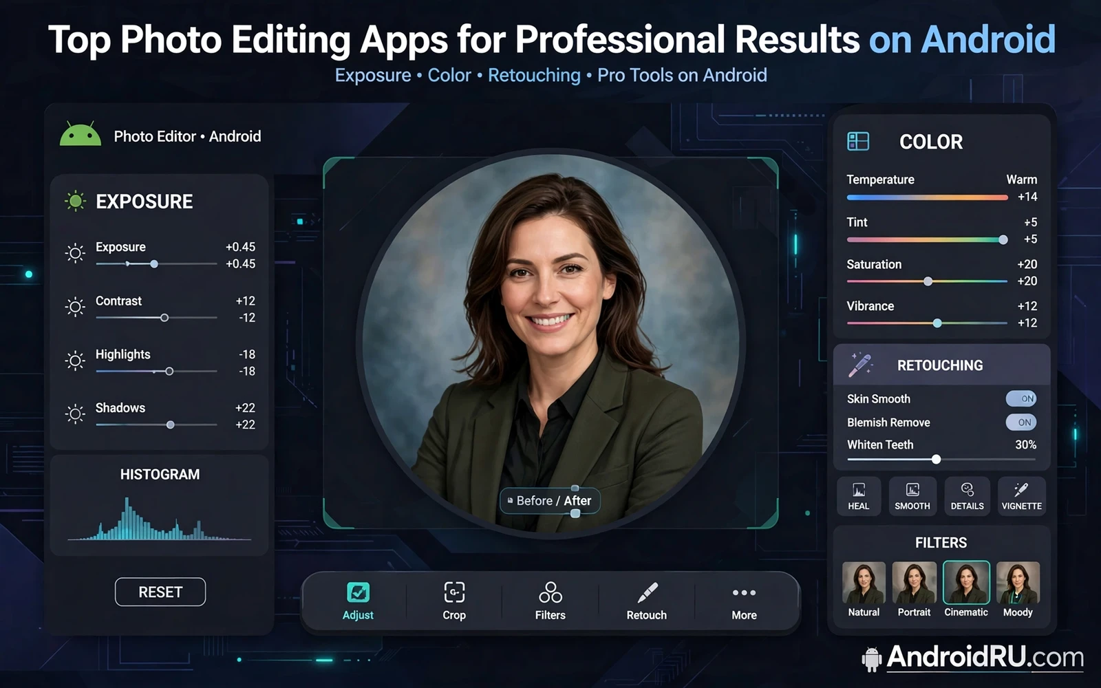
Professional results in mobile photo editing come from control and restraint rather than from the number of filters in an app. A professional edit corrects exposure and color and sharpness in a deliberate order. A professional edit removes distractions without creating obvious artifacts. A professional edit preserves natural skin texture and natural light. The best editing apps give manual control over each adjustment and let you compare before and after at full resolution. That control separates a polished image from a heavily filtered snapshot.
Start every edit with a clear intention for the image. Decide whether the photo is for print or for social sharing or for a portfolio. Print work needs higher resolution and careful sharpening. Social sharing needs strong composition at small sizes. Portfolio work needs consistent color across a series. An edit without intention drifts toward maximum saturation and maximum sharpness because those changes look dramatic at first glance. An edit with intention stops when the image serves its purpose.
Work from the best available source file whenever possible. A raw file or a high quality original preserves more detail for editing than a compressed copy. A compressed copy may already show artifacts that editing amplifies. Keep the original file untouched and save edits as a new version. Check edits at full resolution before exporting because problems invisible at thumbnail size become obvious in print or on a large screen. A disciplined file habit protects the ability to re-edit later with a different style.
Exposure Tone And Color Correction
Exposure correction comes first because a badly exposed image cannot be saved by color filters. Lift shadows gently when dark areas lose detail. Recover highlights gently when bright areas blow out to white. Avoid pushing either control to its extreme because extreme recovery creates flat grey tones and noise. Check the histogram when the app provides one because eyes adapt to a bright screen and misjudge exposure. A balanced histogram with detail at both ends usually indicates a sound exposure.
White balance sets the emotional temperature of an image. A warm balance suits golden hour portraits and cozy interiors. A cool balance suits overcast landscapes and modern architecture. Correct a color cast first when skin looks orange or blue for no creative reason. Apply creative warmth only after neutral balance looks correct. Consistency matters across a series shot in one location because mixed white balance makes a set feel accidental rather than curated.
Color grading adds style after correction rather than replacing it. Adjust saturation selectively by color family instead of raising global saturation. Keep skin tones natural while enriching sky or foliage slightly. Use split toning sparingly to add warmth to highlights and coolness to shadows. Save a successful grade as a preset for a series but adjust it per image because light changes between shots. A preset is a starting point rather than a one tap finish for every photo.
Retouching Sharpness And Detail
Retouching should remove temporary distractions while preserving permanent character. Remove a blemish or a stray hair or a dust spot. Preserve freckles and wrinkles that define a face. Use a healing tool at a zoom level that shows skin texture clearly. Blend the repair into surrounding texture rather than smoothing a large area into plastic. Step back to full view frequently because a repair that looks perfect at high zoom may look obvious at normal viewing distance.
Sharpening needs a light hand on mobile images. Sharpen after resizing for the final output size rather than sharpening a large file aggressively before export. Sharpen edges and detail areas while avoiding noise in skies and smooth backgrounds. Use masking or selective sharpening when the app supports it. Oversharpening creates halos around edges and crunchy texture that looks digital. A slightly soft image with natural texture beats a crunchy image that screams overprocessing.
Noise reduction helps high sensitivity shots but it also erases fine detail when pushed too far. Apply noise reduction to smooth areas first and protect detail areas when possible. Compare the result at full resolution for skin and fabric and foliage. Accept some grain in a low light image when the alternative is waxy skin and melted detail. Grain can feel like film character while over smoothing feels like a filter failure. Choose the lesser flaw for the subject at hand.
Video creators face the same color discipline and best free video editors for Android without watermarks benefit from stills graded with the same palette as the video. A thumbnail graded to match the video creates a coherent first impression. A thumbnail graded wildly differently promises a look the video does not deliver. Consistency across stills and video builds a recognizable visual identity for a series.
Composition Cropping And Perspective
Cropping after shooting is a second chance at composition. Remove empty edges that dilute the subject. Place the subject using a simple grid rather than centering every shot. Keep enough space in the direction a subject looks or moves. Preserve the aspect ratio needed for the final use when possible. A crop that improves composition is worth more than a filter because composition guides the eye before color is even noticed.
Perspective correction fixes converging lines in architecture and product shots. Straighten a tilted horizon before any color work because a tilted image distracts regardless of color quality. Correct vertical lines in building photos gently so the result looks natural rather than stretched. Avoid extreme correction that warps the subject into an unnatural shape. A small correction often suffices because the eye tolerates slight convergence more than it tolerates warped geometry.
Background cleanup completes composition work. Remove a distracting sign or a bright object at the edge of the frame. Darken a busy background slightly to push attention toward the subject. Blur a background only when the blur looks optical rather than painted. Check edges around hair and fine detail after any background change because sloppy edges reveal editing instantly. A clean background lets the subject carry the image without competition.
Storage and organization support professional editing because best file managers for Android in free and pro versions keep originals and edited versions in separate folders with clear names. A folder per shoot prevents edited exports from mixing with raw originals. A naming pattern with date and project makes retrieval fast months later. Editing skill means little when the best version cannot be found under deadline pressure.
Export Presets And Consistent Series
Export settings should match the destination. A print export needs high resolution and a suitable color profile. A social export needs a size that uploads fast without visible compression artifacts. A portfolio export needs consistent dimensions across the series. Export a test image and view it on the target device before exporting a whole series. A test export catches color shifts and sharpening problems early when correction is still cheap.
Presets speed series work when they encode a deliberate look. Build a preset from a fully edited representative image. Apply the preset to the next image and adjust exposure and white balance per shot. Do not apply a preset blindly to images shot under different light. A preset that works for daylight portraits may ruin a night street scene. Treat presets as a consistent starting point that still requires per image judgment.
Client delivery needs organization as much as editing skill. Deliver edited images in a clearly named folder with a simple structure. Include a small set of selects rather than every edited variant. Name files so the client can reference them easily. Keep a backup of delivered files until the client confirms receipt. Professional delivery is part of professional editing because a brilliant edit lost in a messy folder helps nobody.
Audio focused creators also need strong visuals and best audio and music player apps for Android audiophiles pair naturally with cover art edited to the same standard as the audio. A podcast cover that looks amateur undermines confidence in the recording before playback starts. A cover edited with clean color and sharp text signals the same care heard in the audio. Visual and audio quality reinforce each other in audience trust.
Professional photo editing on Android is a discipline of order and restraint. Correct exposure and white balance before creative grading. Retouch distractions while preserving character. Sharpen lightly and protect detail. Crop for composition and correct perspective gently. Export for the destination and keep originals safe. That workflow produces images that look intentional at any size without revealing the editing behind them.
- Keep the original file untouched and edit a copy
- Correct exposure before creative color grading
- Preserve skin texture during retouching
- Sharpen after resizing for final output
- Crop for composition before adding filters
- Save successful grades as adjustable presets
- Test exports on the target device first
- Organize shoots into dated project folders
A before and after habit improves editing judgment faster than any new filter. Save an unedited copy beside every edited version in the project folder. Compare the two at full resolution after a break rather than immediately after editing. Fresh eyes notice oversaturation and over sharpening that tired eyes accepted during a long session. Ask a trusted viewer which version looks more natural without revealing which one is edited. Honest feedback beats self assessment because the editor knows the effort invested while the viewer only sees the result.
A series edit session benefits from a fixed order of operations applied to every image. Correct exposure first and white balance second and color grading third. Retouch distractions fourth and sharpen last after resizing for output. A fixed order prevents the common mistake of sharpening an image and then cropping it into a different size that needs sharpening again. A fixed order also makes batch work predictable because each image passes through the same checkpoints. Predictability is what turns a collection of good images into a coherent professional series.

