

Download APK Niagara Launcher ‧ Home Screen Latest Updates, Common Complaints & App Review
I carry my phone in one hand far more often than designers seem to expect. The other hand holds a bag, a rail, or a coffee. Reaching the top corners of a tall screen always felt like a small gymnastic feat, and I dropped my phone twice in one winter before I admitted the problem was the layout, not my grip. This launcher changed that layout so everything important lived within thumb reach, and my commute immediately felt easier.
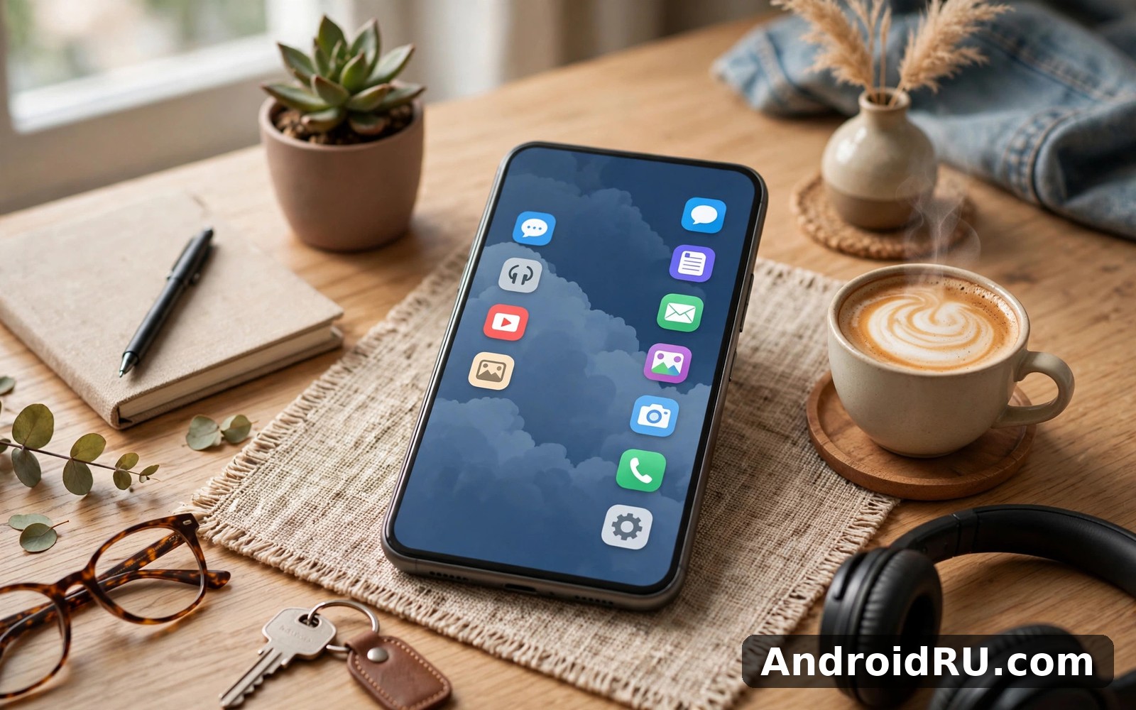
Niagara Launcher replaces the usual grid of icons and folders with a single vertical list of your apps, arranged alphabetically, with your favourites pinned at the top and notifications flowing beside the list. There are no pages to swipe through, no widget grid to maintain, and no icon packs to hunt for. The main view becomes a list you can read and tap, which sounds plain until you use it for a week.
This review covers the latest updates, the complaints that come up most often, and an honest verdict after a month of daily use. I tested it on a tall Android phone with one hand on trains, in queues, and while carrying shopping, and I compared it with two other minimalist launchers so you can see what you gain and what you give up.
What Niagara Launcher is and how the vertical home screen works
The idea is simple: your apps live in one alphabetical list down the screen, and your thumb does all the work. Swipe up or down to scroll, tap a letter on the side to jump to that part of the alphabet, and tap an app to open it. Your eight most-used apps can sit pinned at the top, so the apps you open every day are always one tap away. Everything else is a short scroll away, and the list never changes order, so your fingers learn where things live.
That consistency, and the thumb reach it gives you, is the whole point. A grid layout asks you to remember which page and which corner holds an app. A folder asks you to remember which folder you filed it in. An alphabetical list asks you to remember the first letter of the app name, which you already know. After three days I stopped hunting and started tapping without looking, which is exactly what a home screen should allow.
The alphabetical app list and one-hand thumb reach
The list is the defining feature, and it works because it respects the shape of a hand. Important controls sit low on the screen, where the thumb rests naturally, and the list scrolls with a short flick rather than a long stretch. The letter index on the edge lets you jump from A to W in one motion, and a long press on an app opens shortcuts such as composing a new message or opening a recent document.
On a phone taller than 6.5 inches, that low placement matters more than any theme or icon pack. I could reply to a message, check a map, and return home without adjusting my grip once, which is something I could never do with a grid that put half its icons at the top of the screen.
How pinned favourites work at the top of the list
Pinned apps sit above the alphabetical list in a short row of favourites. You can pin up to eight apps, and the launcher suggests the ones you open most often when you first set it up. I pinned my messages, browser, maps, camera, banking app, music player, notes and calendar, and that row covered about ninety percent of my daily opens. The rest stayed in the list below, easy to find and never in the way.
Inline notifications beside the app list
Inline notifications appear as small text lines beside the app that sent them, instead of as badges or a separate shade you must pull down. A message from a friend shows a short preview next to the messaging app; a calendar reminder sits beside the calendar; a delivery update sits beside the shopping app. You can read the important ones at a glance and ignore the rest without opening anything.
That inline style changes how often I opened apps out of habit. Instead of seeing a red dot and tapping to clear it, I read the preview, decided whether it needed me, and moved on. The main view felt calmer, and my phone stayed in my pocket more often. You can turn previews off for sensitive apps, so a private message does not show its text on the home screen.
Reading notifications without opening each app
A short swipe on a notification lets you dismiss it, and a tap opens the app at the right place. The launcher groups alerts by app, so five messages from one group chat show as one tidy line instead of five separate rows. That grouping is a small detail, but it is the difference between a readable home screen and a noisy one on a busy morning.
Latest updates to Niagara Launcher and what changed
Recent updates have focused on polish rather than new clutter. The list scrolls more smoothly on high-refresh screens, the letter index responds faster, and the settings screen is easier to navigate, with font size, icon style and notification options grouped logically. The app also handles large app libraries better: phones with more than two hundred installed apps no longer stutter when the list first loads, and search results appear as you type instead of after a pause.
One welcome change is better support for work profiles and dual apps, so a second copy of a messaging app shows clearly in the list instead of hiding behind a confusing label. Another is improved widget support through a dedicated pop-up view, which lets people who miss one or two widgets keep them without giving up the clean list. The launcher still refuses to become a widget grid, and that restraint is part of its charm.
Niagara Launcher Pro features worth knowing about
The free version covers the core list, favourites, notifications and basic themes. The paid Pro version, sold as a one-time purchase, adds more font choices, extra icon styles, weather on the home screen, and deeper customisation for the favourites row. It also adds a few power features, such as hiding apps from the list and customising the swipe gestures on the home screen.
Whether Pro is worth it depends on how much you want to tune the look. The free version is a complete launcher on its own, and I used it happily for two weeks before paying. Pro is best seen as a tip for the developers plus a few nice extras, not as a gate that holds back the features that matter.
Common complaints about Niagara Launcher and the honest answers
No launcher pleases everyone, and this one has a clear set of recurring complaints. The most common is the missing widget grid: people who live by a calendar widget, a music widget or a to-do widget feel lost without a screen full of them. The launcher answers with a pop-up widget view, but that is a compromise, not a replacement, and widget lovers should know that before they switch.
The second complaint is the learning curve for finding apps. People who organised their old home screen by habit, with a photo app on page two and a banking app in a folder, feel slow for the first few days. That slowness fades as the alphabetical order sinks in, usually by day four or five, but the first days can feel like a step backwards. The third complaint is about customisation: icon packs, themes and gestures are more limited than in a heavyweight launcher, and people who enjoy decorating their phone will find the options restrained.
Why some users miss widgets and icon grids
Widgets are genuinely useful for some routines. A glanceable calendar, a now-playing card, or a shopping list on the home screen saves taps every day, and a launcher that hides them behind a pop-up asks you to change that habit. If your day runs on three widgets, this launcher will fight you, and you should either keep a different launcher or accept the pop-up view as a daily extra step.
The grid has its fans too. A visual person may remember an app by its colour and position rather than its name, and an alphabetical list removes that visual memory. That trade is the heart of the design: the list is faster for people who think in names, and slower for people who think in pictures. Neither group is wrong; they just need different tools.
Performance and battery complaints after the latest updates
Most users report light battery use, because a launcher that shows a list does less work than one that animates widgets and live wallpapers. A few users on older phones report a short pause when the list first loads after a restart, and a few report that notification previews arrive a second later than in the stock launcher. In my month of testing on a mid-range phone, neither issue appeared often enough to matter, and a restart cleared the one slow load I saw.
Niagara Launcher vs OLauncher and AutoZen comparison
The minimalist launcher world has three names that come up again and again, and they are not the same product. OLauncher is the most extreme: a plain text list with almost no decoration, built for people who want their phone to disappear. AutoZen is a car dashboard launcher, built for driving, with large buttons and a layout you can read at a glance. This launcher sits between them: calmer than a stock launcher, but still a full home screen with notifications, favourites and a proper app list.
| Feature | Niagara Launcher | OLauncher | AutoZen Car Dashboard |
|---|---|---|---|
| Home screen layout | Vertical alphabetical list | Plain text list, very spare | Large buttons for driving |
| One-hand use | Excellent, thumb-first design | Good, simple list | Designed for car mount, not hand |
| Notifications | Inline beside the list | Minimal, text only | Large alerts for driving |
| Widgets | Pop-up view only | None | Driving widgets and shortcuts |
| Customisation | Fonts, icons, themes, Pro extras | Almost none, by design | Car-focused layout options |
| Best for | Daily one-hand use | Digital minimalism | Driving and car use |
| Learning curve | A few days | An hour | An hour |
If you want the calmest possible phone, OLauncher Minimal Af Launcher is the purer choice, and its text-only list is genuinely restful after a week. If you spend hours driving, AutoZen Car Dashboard Launcher is built for that job in a way no general launcher can match. For everyday life on foot, on a train, or in a queue, the vertical list with inline notifications is the most balanced of the three.
Who should pick OLauncher instead of Niagara Launcher
Pick OLauncher if you want your phone to do less, not more. Its list has no colours, no badges and no decoration, and that spareness helps people who check their phone too often. The trade is that you lose inline notification previews and the favourites row, so every open is a scroll and a tap. That is a fair trade for a digital detox, and a poor trade for a busy parent who needs to see a school message at a glance.
Who should pick AutoZen instead for driving
Pick AutoZen if your phone lives on a car mount. Its large buttons, driving mode, music controls and navigation shortcuts are designed to be read in a second and tapped without looking away from the road for long. It is not a daily launcher for walking around, and it does not try to be. Use it as a driving mode beside your normal launcher, and switch back when you park.
Pros and cons of Niagara Launcher after a month of use
After a month, the strengths felt settled rather than new. My thumb stopped stretching, my home screen stopped demanding attention, and I opened apps faster than I had with a grid. The phone felt calmer in my hand, and the battery did not suffer, because a list is cheap to draw. Friends who tried it on my phone understood it in under a minute, which is a rare thing for a launcher.
The limits were settled too. I missed a calendar widget on busy mornings, I missed a music widget when cooking, and I once spent a minute hunting for a setting that lived one menu deeper than I expected. None of those ended the experiment, but they are real, and they are the reason this launcher is a strong choice for some people and a wrong choice for others.
- Pros: a vertical alphabetical list puts every app within thumb reach on tall phones.
- Pros: inline notifications let you read alerts without opening each app or pulling down a shade.
- Pros: pinned favourites cover daily apps in one tap, and the list order never changes.
- Pros: a clean, calm home screen with light battery use and a fast, stable feel.
- Pros: font size and theme options help readability on the move and in bright light.
- Cons: no widget grid on the home screen, so widget lovers must use the pop-up view.
- Cons: customisation is restrained compared with heavyweight launchers and icon packs.
- Cons: the first few days feel slower while you relearn where apps live.
- Cons: a few settings sit deeper in menus than a new user would expect.
That list is the review in short: a launcher that trades decoration for reachability, and does that trade well. If reachability is your problem, the pros win easily. If decoration is your hobby, the cons will annoy you every day.
Setting up Niagara Launcher on Android step by step
Switching takes about ten minutes. Install the launcher, open it, and set it as your default home app when Android asks. The list fills itself from your installed apps, so there is nothing to import by hand. Then pin the five to eight apps you open most, choose a font size you can read while walking, and decide which apps may show notification previews on the home screen.
Give the new layout a full week before you judge it. The first day feels strange because your old muscle memory points at corners that no longer hold icons. By day three the list feels normal, and by day seven you will notice how rarely you stretch your thumb. If you still hate it after a week, switching back takes two taps in Settings, and nothing about your apps is lost.
- Install the launcher and open it, then tap Set as Default when Android asks for a home app.
- Let the alphabetical list fill itself, then pin your five most-used apps to the favourites row.
- Choose a font size and theme you can read outdoors, then pick an icon style you like.
- Decide which apps may show notification previews, and turn previews off for private chats.
- Hide any apps you never open from the list, so the alphabet stays short and readable.
- Use the launcher for a full week, then adjust the pinned row once based on what you actually opened.
Settings to change on day one for the best experience
Three settings matter most on day one. First, set the font to large if you read on the move; small text on a moving train is a recipe for squinting. Second, turn off notification previews for banking and private messaging apps, so sensitive text never sits on your home screen. Third, hide the apps you never open, such as carrier tools and pre-installed demos, so the list stays short and your thumb has less ground to cover.
A fourth choice is worth making in the same session: decide whether the clock and date sit at the top of the list or stay hidden. Some people like the time visible at a glance; others prefer a completely clean top edge. Either way, make the choice once and stop fiddling, because a home screen that changes every day never builds muscle memory.
Niagara Launcher for small hands, commuters and parents
Commuters are the clearest winners. On a crowded train, with one hand on a rail, the other thumb can scroll the list, read a notification, and open a map without a second hand. Parents holding a child get the same benefit, and people with smaller hands notice the difference on the first day, because the top of the screen stops being a place they must reach.
That said, the launcher is not only for one-hand users. Anyone who dislikes clutter will enjoy a main view that shows a list instead of a billboard, and anyone who opens the same eight apps every day will enjoy a favourites row that never moves. The design suits a calm routine: check, tap, done, phone away. If your routine is visual and playful, with widgets and wallpapers as part of the fun, the calm may feel dull, and that is a fair reason to stay with a grid.
Pairing the launcher with App Lock for shared phones
On a phone shared with children or colleagues, a calm launcher plus a lock app is a practical pair. App Lock Applock Fingerprint can lock individual apps behind a fingerprint, so a child can play a game from the list without opening your messages or your banking app. The launcher keeps the list tidy; the lock keeps the private apps private. Together they make a shared phone feel safe without hiding the apps a guest is allowed to use.
Frequently asked questions about Niagara Launcher
Is Niagara Launcher free, and what does Pro add?
Yes, the core launcher is free, including the alphabetical list, favourites, inline notifications and basic themes. Pro is a one-time purchase that adds more fonts, icon styles, weather, app hiding and extra gesture options. The free version is a complete launcher, and Pro is best thought of as extra polish rather than a missing piece.
Can I still use widgets with Niagara Launcher?
Yes, but not as a grid on the home screen. Widgets live in a pop-up view you can open with a swipe, so you can check a calendar or control music without leaving the launcher. If you need three widgets visible at all times, this launcher will frustrate you, and a grid layout is a better fit for that routine.
Will Niagara Launcher slow down my phone or drain the battery?
In my testing it did neither. A text list is light work for a phone, and the launcher used less battery than my previous grid launcher with live widgets. Older phones may pause briefly when the list first loads after a restart, but in daily use the launcher felt fast and stable, with no background drain I could measure.
Can I go back to my old launcher if I do not like it?
Yes, in under a minute. Open Settings, then Apps, then Default Apps, then Home App, and pick your previous launcher. Your apps, data and home screen layout from the old launcher are untouched, because a launcher only changes how the home screen looks, not what is installed. Try the new layout for a week knowing the exit is easy.
Verdict: should Niagara Launcher stay on your phone
If your phone feels too tall for your hand, try this launcher for a week. Let the list bring your apps down to thumb level, let the notifications sit beside the apps that sent them, and notice how much easier a crowded commute becomes. Good design should fit the body that uses it, and this launcher fits the hand you actually have rather than the hand a designer imagined.
If you live by widgets, love decorating your launcher, or think in pictures rather than app names, stay with a grid launcher and enjoy it without guilt. The right tool feels like help rather than homework, and a week of honest use will tell you which side you are on. For commuters, parents, small-handed users and anyone who wants a calmer phone, the verdict is clear: this is one of the best launchers on Android for one-hand use.
Start with the free version, pin your daily apps, set the font size, and give your thumb a week to learn the new geography. You can Click here to download the Niagara Launcher ‧ Home Screen app when you are ready, and if you want to compare the minimalist options first, Click here to download the OLauncher Minimal Af Launcher app or Click here to download the AutoZen Car Dashboard Launcher app to see which style of calm fits your day best.

