

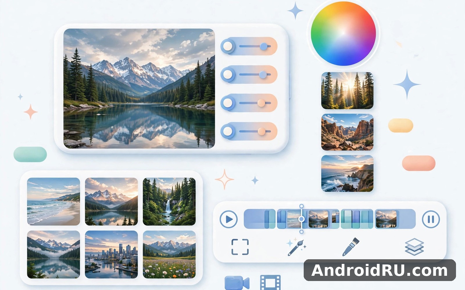
Download APK Lightroom Photo Editor Video Latest Updates, Comparison Points & App Review
I spent a rainy weekend giving this editor a proper trial, with no deadline and no rush. I opened it on my phone, imported a folder of holiday photos and a few short clips, and worked through them slowly. By Sunday evening the layout felt familiar rather than new, and I had a clear sense of where its strengths sit. That slow start mattered, because this is an app that rewards patience more than it rewards a quick tap through every menu.
This review answers the title directly. You will find what changed in recent updates, how the photo and video tools compare with rival editors, a real list of features with honest pros and cons, numbered setup steps, troubleshooting for the problems I actually met, and a verdict that depends on the kind of editor you are. If you edit photos on your phone every week, or you want one app that can tidy both stills and short clips, this is for you. If you only crop a photo once a month, some of this will be more than you need, and I say so plainly below.
What Lightroom Mobile Actually Is in 2026
At its heart, this is Adobe Lightroom for mobile, a photo editor built around non-destructive editing and colour control, with video tools added alongside the stills workflow. Non-destructive means your original file stays untouched while every change lives as a set of instructions you can undo, reset, or copy to another photo. I tested that on a portrait I had over-edited: one tap on Reset returned the untouched original, and the history of my edits stayed visible so I could step back one change at a time instead of starting again.
The app opens to a library view of your albums, with import from the camera roll, from files, and from a camera in RAW format. From there you move into the edit view, where sliders and panels sit along the bottom of the screen. The layout is dense at first, and I will not pretend otherwise. After three days I stopped hunting for tools, because Light, Color, Effects, Detail, Optics and Geometry always sit in the same order, and the masking and healing tools sit one tap away.
Photo Editing Core That Carries the App
The photo core is where this editor earns its reputation. Exposure, contrast, highlights, shadows, whites and blacks give you control over tone in a way that a single brightness slider never can. I used the tone curve on a backlit beach photo to lift the shadows without blowing out the sky, something a one-tap filter would have ruined. White balance, temperature, tint, vibrance and saturation sit in the Color panel, and the colour mixer lets you shift the hue, saturation and luminance of eight separate colours. That last tool is the one I reach for when a green landscape looks too yellow or a sunset needs its orange pulled back without touching the skin tones in the same frame.
Presets are the shortcut most people actually use day to day. A preset is a saved stack of edits, and the app ships with a starter set covering portraits, travel, food, black and white, and cinematic looks. You can also save your own preset from any edit and reuse it across a whole shoot, which is how I kept twenty photos from one afternoon looking like they belonged together. Community presets and creator packs exist too, though quality varies wildly, so I test any new preset on three different photos before I trust it on a whole album.
Video Editing Inside the Same App
Video editing is simpler than the photo side, and that is both a strength and a limit. You can trim a clip, apply a preset to it, and adjust exposure, colour, temperature and contrast in much the same way as a still. I tried this on a 20-second clip shot in a dim cafe, and a preset plus a small exposure lift made it usable for sharing without opening a separate video app. You can also copy an edit from a photo and paste it onto a video frame, which keeps a photo and a clip from the same day looking consistent.
That said, this is not a full video editor. There is no multi-track timeline, no transitions library, and no text animation or music mixing of the kind you find in a dedicated video app. If your main job is cutting short clips with captions and sound, a dedicated video tool will serve you better, and the comparison table below makes that split clear. For colour grading a clip you already shot, though, the shared preset system is genuinely handy.
How Presets Work Across Photos and Video
Presets carry over because the underlying colour engine is shared. I created a warm preset on a photo, saved it, then applied it to a video clip from the same evening, and the two matched closely enough to post side by side. The match is not pixel perfect, because video compression and motion change how colour reads, so I still nudge exposure on the clip by a small amount after applying the preset. Treat a preset as a starting point for video, not a finished grade.
RAW Files, DNG and What They Buy You
Shooting or importing in RAW, usually as a DNG file on Android, gives the editor far more data to work with than a JPEG. I compared the same scene in both formats: the JPEG fell apart when I lifted shadows by more than a stop, while the DNG held detail and colour. RAW files are larger, often 15 to 30 MB each against 3 to 6 MB for a JPEG, so they fill local space faster. I keep RAW only for shots I plan to edit seriously, and JPEG for everything else.
Latest Updates Worth Knowing Before You Edit
Recent updates to Lightroom mobile have focused on three areas: AI-assisted cleanup, blur and noise control, and faster masking. The headline addition is Generative Remove, which lets you brush over an unwanted object, a stray person, or a piece of litter, and the app fills the area with plausible background. I tested it on a street photo with a parked scooter in the corner. On a plain wall it worked cleanly on the first try. On a busy patterned background it left a soft smudge, and I had to brush a smaller area and try again. It saves time on simple removals and still needs a careful eye on complex ones.
Lens Blur is the second update that changed how I use the app. It analyses depth in a portrait or a close-up and lets you blur the background with a strength slider and a choice of bokeh shape. It is not a replacement for a fast portrait lens, and fine hair at the edge of a subject can still look slightly soft, but for a phone portrait taken in a busy market it made the subject stand out in a way a simple vignette never could. I use it at a moderate strength, around the middle of the slider, because the maximum setting looks artificial on most photos.
AI Denoise, available on the paid plan, tackles grain in low-light shots. I ran it on a night photo taken at a high ISO, and the result kept more detail than the older luminance noise slider alone. It takes longer to process, sometimes 10 to 20 seconds on a mid-range phone, and it creates a new DNG file, so I use it only on keepers. Masking has also improved: Select Subject and Select Sky now find their edges more reliably, and you can add or subtract from a mask with a brush, which fixed the two cases where the automatic selection grabbed a hat along with the sky.
Adaptive Presets and Smarter Recommendations
Adaptive presets apply different amounts of an effect to different parts of a photo, for example darkening a bright sky while leaving a face alone. The app now suggests presets based on the content of your photo, which is useful when you are stuck for a starting point. I treat those suggestions as a shortlist, not a decision, because the top suggestion for a food photo was a moody cinematic look that made the dish look cold. A suggestion is a hint, and your eye still has the final say.
Performance, Sync and Cloud Changes
Sync has become smoother in recent versions, with edits and albums moving between phone, tablet and desktop when you sign in with the same Adobe account. That sync needs a paid plan for full cloud space, and the free tier is limited, so check the current plan page before you rely on it for a whole library. On my phone, opening a large album is faster than it was a year ago, and exporting a batch of twenty edited photos now runs in the background while I keep editing. Export still heats a mid-range phone on a long batch, so I export in groups rather than all at once.
Lightroom Mobile Compared With Rival Editors
No editor wins for everyone, so here is the honest head-to-head I used to decide where this app fits. I kept the same test set for each rival: one portrait, one landscape, one low-light shot, and one 20-second clip. The table below summarises the result, and the sections after it explain the trade-offs in plain terms.
| Editor | Best for | Photo depth | Video tools | Price range | Learning curve |
|---|---|---|---|---|---|
| Lightroom mobile | Colour grading, presets, RAW photos | Very deep, curves and colour mixer | Basic trim and colour grade | Free tier, paid plan roughly 10 dollars a month | Moderate, a few days to feel fluent |
| Snapseed | Free quick edits and selective tweaks | Strong, selective brush and healing | None | Free | Easy, an afternoon |
| Picsart | Stickers, collage, social edits | Good, with many creative tools | Basic clip tools | Free tier, paid plan similar range | Easy to moderate |
| VSCO | Film-style presets and a calm feed | Good, preset-led | Basic preset and trim | Free tier, paid plan similar range | Easy |
| CapCut | Short video cuts, captions, effects | Basic photo tools only | Deep timeline, captions, music | Free tier, paid plan similar range | Easy to moderate |
The pattern is clear. If your priority is colour and RAW photo work, Lightroom mobile leads this group by a wide margin. If your priority is video, CapCut leads just as clearly, and Lightroom mobile is only a colour companion to it. Snapseed remains the best free option for a quick selective edit, and I still keep it on my phone for a fast healing brush fix when I do not want to open a full editing session. Picsart and VSCO win when the look matters more than the control, and when you want a preset that is ready in one tap.
Lightroom Against Snapseed for Everyday Photos
Snapseed is free, fast, and its selective tool lets you brighten one area with a fingertip. Lightroom mobile is deeper, with masking, curves, and batch presets that Snapseed cannot match. I use Snapseed for a single quick fix and Lightroom mobile for a set of photos that need to look consistent. If you never shoot RAW and never batch-edit, Snapseed may be all you need, and that is a fair conclusion, not a failure of either app.
Lightroom Against Picsart and VSCO for Style
Picsart gives you stickers, background removal, collage layouts, and a huge template library that Lightroom mobile deliberately avoids. VSCO gives you film-like presets with a quieter interface and a community feed. Lightroom mobile gives you control: you can build a look from scratch and save it as your own preset, rather than renting someone else’s style. The trade-off is time. A Picsart edit takes a minute, a careful Lightroom mobile edit takes five, and the extra four minutes show in the result only if you care about subtle colour.
Features That Matter Most in Daily Use
Below are the features I actually return to, in the order I use them. Each one earns its place by saving time or by doing something a simpler editor cannot do. I have left out the tools I tried once and never opened again, because a feature list that names everything tells you nothing about what matters.
Presets, Profiles and Batch Editing
Presets are the fastest route to a consistent look. I keep about twelve of my own: three for daylight, two for portraits, two for food, one for night, and a few black-and-white variants. When I return from a trip, I edit one photo carefully, save the result as a preset, then paste it across the rest of the set and adjust exposure photo by photo. That batch workflow turns an hour of repetitive editing into fifteen minutes, and it is the single biggest reason this editor stays on my phone. Profiles sit underneath presets and change how colour and tone are interpreted before your edits begin, which is a subtler tool that I use mainly for RAW files.
Masking, Healing and Selective Edits
Masking is where the app pulls ahead of free rivals. Select Subject, Select Sky, Select Background, linear gradient, radial gradient, and a brush let you edit one part of a photo without touching the rest. I use a radial gradient to brighten a face in a shaded portrait, and a linear gradient to darken a bright sky at the top of a landscape. The healing brush removes dust spots, blemishes, and small distractions, and Generative Remove handles larger objects. The healing tool works best on small areas, so I zoom in to 100 percent before I brush, and I check the result at full size before I export.
Colour Grading, Curves and the Histogram
The histogram at the top of the edit screen shows whether your shadows are crushed or your highlights are clipped, and I glance at it before every export. The tone curve lets you lift shadows, deepen midtones, and roll off highlights with separate control over red, green, and blue channels, which is how a warm sunset grade is built without turning skin orange. Colour grading wheels for shadows, midtones, and highlights add a tint to each tonal range, and I use a cool tint in the shadows and a warm tint in the highlights for evening photos. These tools sound technical, and they are, but after a week they become muscle memory.
Export, Watermark and Sharing Options
Export gives you a choice of JPEG, PNG, and TIFF, with quality and size controls, and you can add a watermark with your name or logo. I export JPEG at high quality for sharing, and TIFF only when I plan to print or to edit further on a desktop. You can share directly to social apps, save to the camera roll, or export a batch to a folder. I name my export folder by date and place, because a folder called 2026-11-beach-trip is far easier to find a month later than a folder called Export 47. If you enjoy photos and creative editing then Azar is a natural next app to try for a different kind of creative break, though it is a social video app rather than an editor, so keep your expectations separate.
Organising Albums So You Can Find Anything
Albums, flags, and star ratings are the quiet tools that save you later. I flag keepers, rate my best shots with five stars, and reject the blurred ones on the same day I import them. That ten-minute tidy-up means I never scroll through 400 unedited photos looking for the one I liked. Search by date, by camera, or by keyword also helps once your library grows past a few thousand images.
Editing on a Small Screen Without Frustration
Editing on a phone screen is a compromise, and a few habits make it bearable. I edit with brightness at a fixed level, because auto-brightness changes how an edit looks from one minute to the next. I pinch to zoom before any healing work, and I compare before and after by holding the preview button. I also edit in a shaded room rather than in direct sunlight, because glare hides shadow detail and leads to over-bright exports.
How to Set Up Lightroom Mobile Step by Step
Setup takes about ten minutes if you follow the order below. I have kept each step concrete, with the menu name and the check to make after it, because vague setup advice wastes more time than it saves. Do the steps in order, and change one setting at a time so you know what helped.
- Install the app, open it, and sign in with an Adobe account or create one with your email. Signing in is what enables sync and lets you restore your presets on a new phone.
- Grant photo access, then choose whether the app may access all photos or only selected albums. I grant full access, because picking albums one by one slows every import.
- Import a small test set first, about ten photos and one short clip, rather than your whole library. Tap the import button, pick the test folder, and wait for thumbnails to load before you edit.
- Open Settings, set your default export format to JPEG at high quality, and turn on the option to save a copy to the camera roll if you want your edits visible in your gallery app.
- Open one photo, try the Auto button once to see what the app suggests, then undo it and make the same changes by hand with Exposure and White Balance. That comparison teaches you what Auto does and where it goes wrong.
- Save your first preset from that edit, give it a clear name such as Daylight Warm, and apply it to a second photo from the same shoot to check that it travels well.
- Test a mask: tap Masking, choose Select Sky, darken the sky slightly, then tap the mask overlay to check the edge. If the edge grabs a rooftop, subtract it with the brush.
- Export the test photo and open it in your gallery app on full brightness. If it looks too dark or too warm there, adjust and export again. The gallery view is the real test, not the edit screen.
After setup, spend your first week on one feature a day rather than all of them at once. Monday for presets, Tuesday for masking, Wednesday for curves, and so on. That slow pace builds real skill, and by the end of the week you will know which tools deserve a place in your daily routine. When you want a change of pace then Upfoto AI Photo Enhancer covers that need neatly as a simpler AI-led alternative for quick enhancements.
Settings Worth Changing in Week One
Three settings matter most in week one. First, set the default import sorting to newest first, so your latest shoot sits at the top. Second, turn on the histogram if it is not already visible, because it catches clipped highlights before you export. Third, check your cloud sync and local space settings, and decide whether originals stay on the device or live in the cloud. I keep originals on the device for the current month and archive older months to cloud space, which keeps my phone from filling up without losing anything.
Pros, Cons and Who This Editor Is For
Here is the balanced verdict, with each side given its due. I have used the app for weeks, not hours, and the list below reflects that longer view. A review that only praises an app is an advert, and a review that only complains is a rant, so I have kept both sides honest.
Pros of Lightroom Mobile
- Deep colour control with curves, a colour mixer, and grading wheels that free editors cannot match, and that shows in the final image.
- Presets and batch editing save real time across a whole shoot, and your own presets travel with your account to a new phone.
- Masking and healing tools let you fix one part of a photo without touching the rest, which is the difference between a good edit and a great one.
- RAW support gives you far more room to recover shadows and highlights than a JPEG ever will.
- Sync between phone, tablet, and desktop keeps your library and edits in one place when you work on more than one device.
Cons of Lightroom Mobile
- The best tools, including AI Denoise, Generative Remove, and full cloud sync, sit behind a paid plan, and the free tier feels limited once you know what you are missing.
- The interface is dense for a beginner, and the first few sessions involve hunting for tools that later become second nature.
- Video tools are basic, with no timeline, transitions, or captions, so serious video work still needs a second app.
- Exporting a large batch can heat a mid-range phone and take several minutes, especially with Denoise or high-resolution TIFF output.
- Generative Remove and Lens Blur still struggle on busy backgrounds and fine hair, so they need checking at full size before you share.
Who It Is For, and Who Should Skip It
This editor is for people who edit photos weekly, who shoot in RAW at least sometimes, who want a consistent look across a set, and who are willing to spend a few days learning the panels. It suits travel photographers, food bloggers, small business owners who photograph their own products, and anyone who posts photos regularly and cares how colour reads. It is less suited to someone who edits one photo a month, who wants stickers and collage templates, or who mainly cuts short videos. Those readers will be happier with a simpler free editor or a dedicated video app, and there is no shame in that choice. For a third option Max Video Player HD All Format is worth a look as well if video playback and viewing matter more to you than editing.
Troubleshooting Common Lightroom Mobile Problems
Most problems I met had a simple cause, and the fixes below are the ones that actually worked, in the order I try them. I list the symptom, the likely cause, and the fix, because a fix without a cause is just guessing.
App Crashes, Freezes or Runs Slowly
Close the app fully, restart your phone, and reopen it with only the test album loaded. If it still feels slow, clear the app cache from your phone settings, and check how much free space you have, because an editor with less than 2 GB free will struggle. Large RAW files and Denoise are the usual triggers, so edit JPEG copies for a quick test and return to RAW only for keepers. If a single photo always crashes the app, export it as a JPEG from your gallery and edit the copy instead.
Presets Look Wrong or Colours Shift After Export
A preset built on a RAW file can look different on a JPEG, and an export viewed on a different screen can look warmer or darker than the edit screen. First, check the preset on three photos from different lighting conditions. Second, turn off auto-brightness while you edit, and compare the export in your gallery app rather than in the editor. Third, check your export colour space and quality settings, and export at high quality. If the shift is large, the cause is often a display setting on the viewing phone rather than the edit itself.
Sync, Sign-In and Missing Photos
If photos are missing after a sign-in, check that you signed in with the same Adobe account, that sync is turned on, and that you have a connection. Wait a few minutes, because a large library syncs in the background and the first sync is the slowest. If a preset is missing, check whether it was saved under a different account or on a device that never synced. I keep a note of my account email in my password manager for exactly this reason, because signing in with a second email is the most common cause of a mysteriously empty library.
Lightroom Mobile FAQ
What is Lightroom Photo Editor Video best used for?
It is best used for colour grading, preset-led photo editing, and RAW photo work on a phone, with basic video colour grading as a bonus. It is not the best choice for cutting a video with captions and music, or for stickers and collage. Use it where colour and consistency matter, and pair it with a dedicated video editor when the cut itself is the main job.
How much does Lightroom Photo Editor Video cost?
The app has a free tier with core editing, presets, and basic tools, and a paid plan that adds AI Denoise, Generative Remove, Lens Blur, healing on the full version, and cloud sync with extra space. The paid plan is usually priced around 10 dollars a month, with annual options that lower the monthly cost, but prices and plan names change by region, so check the current plan page in the app before you subscribe. I used the free tier for a week before I paid, and that trial told me more than any price list could.
Can Lightroom Photo Editor Video edit videos properly?
It can trim a clip and grade its colour with the same presets and sliders as a photo, which is enough for a short clip that needs a consistent look. It cannot do a multi-track timeline, transitions, captions, or music mixing, so a longer video project still needs a dedicated video editor. Think of the video tools as a colour room attached to a photo app, not as a video studio.
Is Lightroom Photo Editor Video good for beginners?
Yes, with a caveat. A beginner can open it, tap Auto, apply a preset, and get a better photo in a minute, and the free tier is enough to learn on. The deeper tools take a few days to learn, and the interface can feel crowded at first. I suggest a beginner starts with presets and exposure, adds masking in week two, and leaves curves and grading wheels until week three, when the basics feel natural.
Why do my exported photos look different from the edit screen?
The usual causes are auto-brightness changing the screen while you edit, a different display on the viewing device, and export quality or colour settings that differ from the preview. Edit with brightness fixed, export at high quality, and check the result in your gallery app at full brightness. If it still looks different on another phone, the difference is usually the other screen, not your edit, and most viewers will see the version on their own screen anyway.
Lightroom Mobile Verdict by Use Case
For a weekly photo editor who wants colour control, presets, and RAW support, this is the strongest mobile editor I have tested, and the paid plan earns its cost once you batch-edit regularly. For a casual editor who touches a photo once a month, the free tier is enough, and the paid plan is an easy skip. For a video-first creator, this app is a companion, not a home, and you should pair it with a dedicated video editor. My own routine now is Lightroom mobile for photos and colour, a separate video app for cuts, and a quick check in the gallery before I share anything. That split plays to each tool’s strength, and it has survived three months of daily use without feeling like a compromise.
If you decide to try it, start with the setup steps above, edit ten photos from one shoot, and judge it on that set rather than on a single image. A single photo can flatter any editor, and a set of ten shows whether the presets, the masking, and the export workflow actually fit your week. When you are ready, Click here to download the Lightroom Photo Editor Video app. If this one is close but not quite right, Click here to download the Azar app. Another solid choice is Click here to download the Upfoto AI Photo Enhancer app.

